Graphic
Maynard 7 Te Mātāwai
-
Pou Auaha / Creative Director
Guy Hohmann
-
Ringatoi Matua / Design Directors
Emme Jacob, Simone Speet
-
Ngā Kaimahi / Team Members
Spencer Buchanan, Franziska Steinkohl, Jordan Henderson, Eden Short, Heather Ho, Joel Beachman -
Kaitautoko / Contributors
Arekatera Maihi, Sign FX, Ngāti Whātua Ōrākei -
Client
Kāinga Ora
Description:
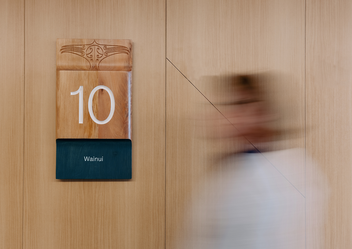
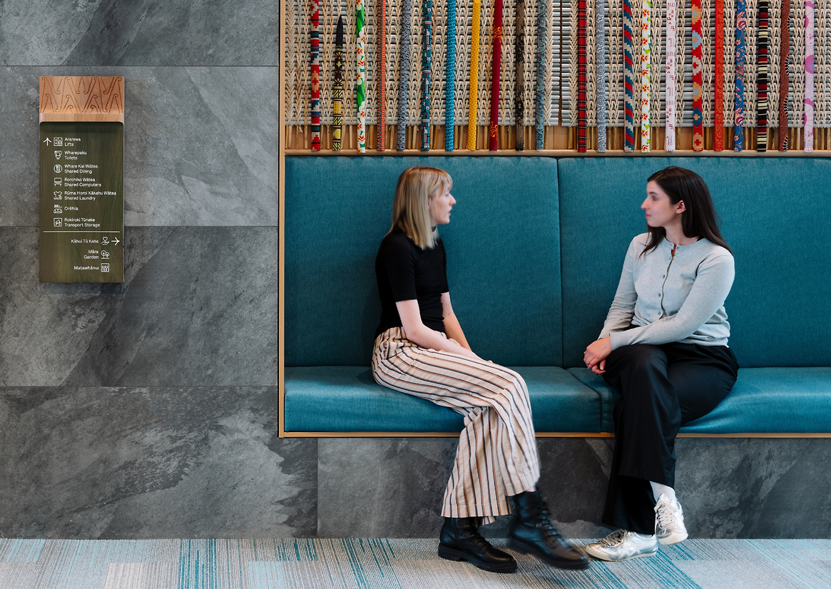
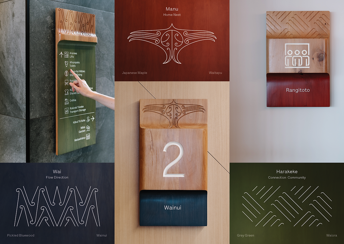
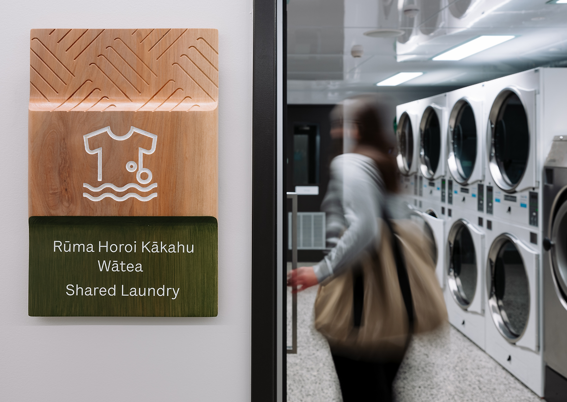
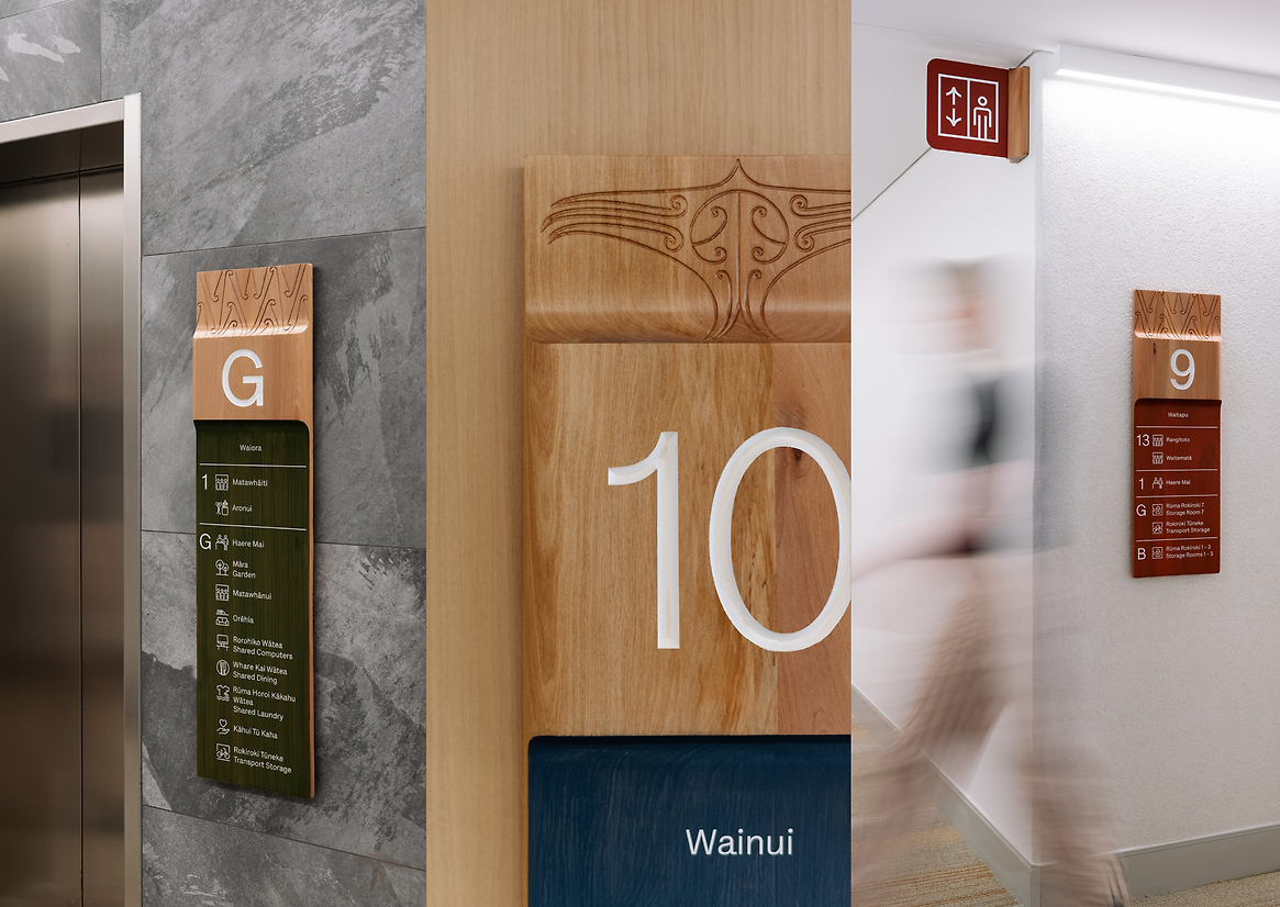
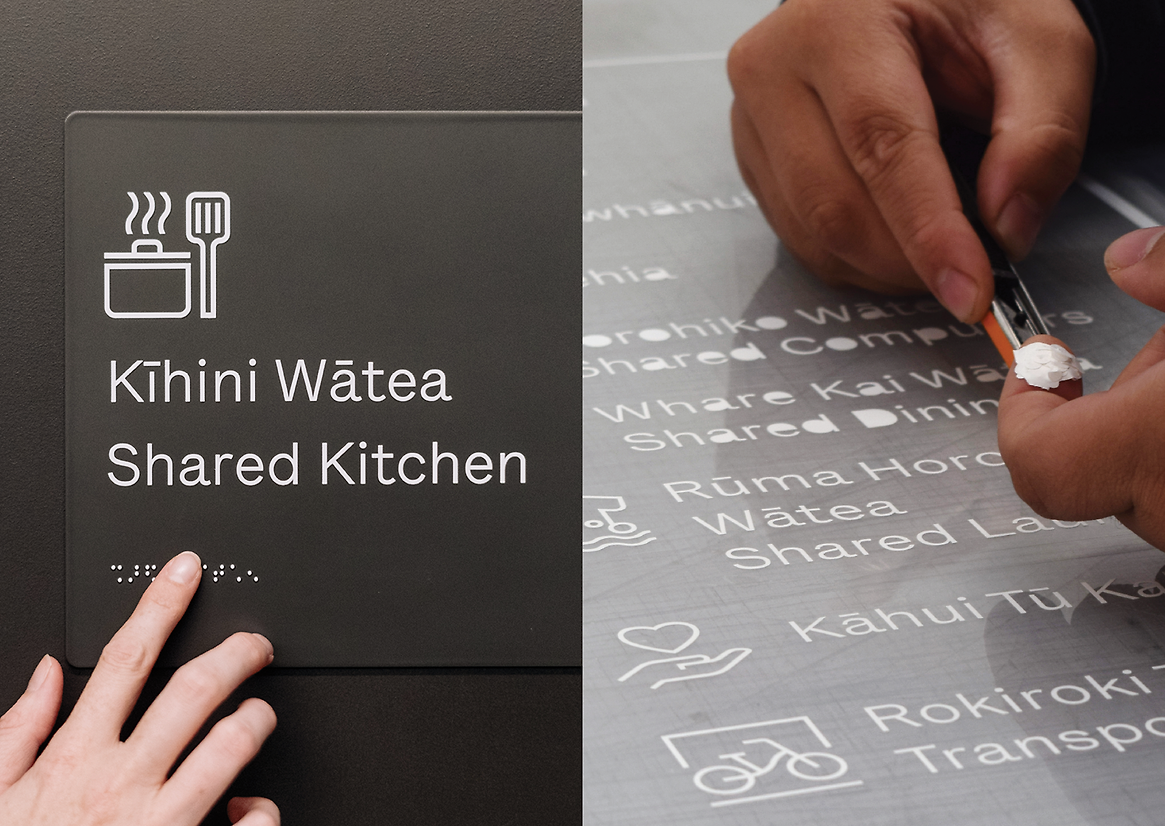
A flagship supportive housing development in the centre of Tāmaki Makaurau, Te Mātāwai has set a new standard for Kāinga Ora, delivering real social, cultural and economic benefits for the community. The site at 139 Greys Avenue consists of three adjoining buildings – Waitapu, Waiora and Wainui. Wayfinding was required to connect those who will call this place ‘home’ to all the spaces and facilities it offers, with an outcome that is instilled with inclusivity and care. Te Mātāwai has been developed in partnership with Mana Whenua, leading to a design that is structured around tikanga and the provision of housing with manaakitanga at its heart.
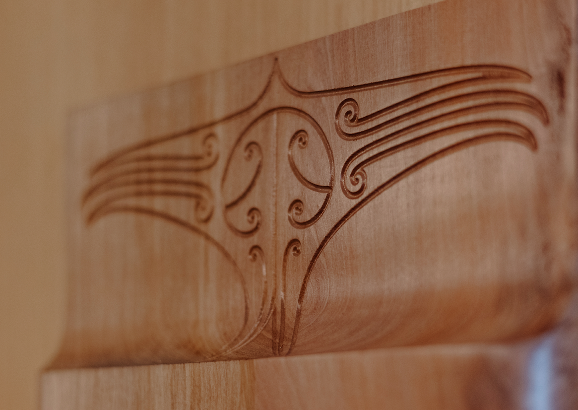
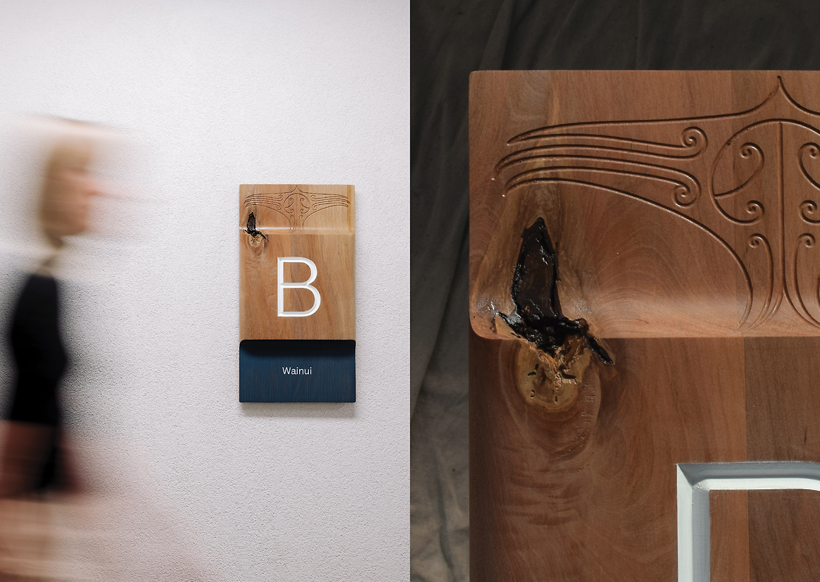
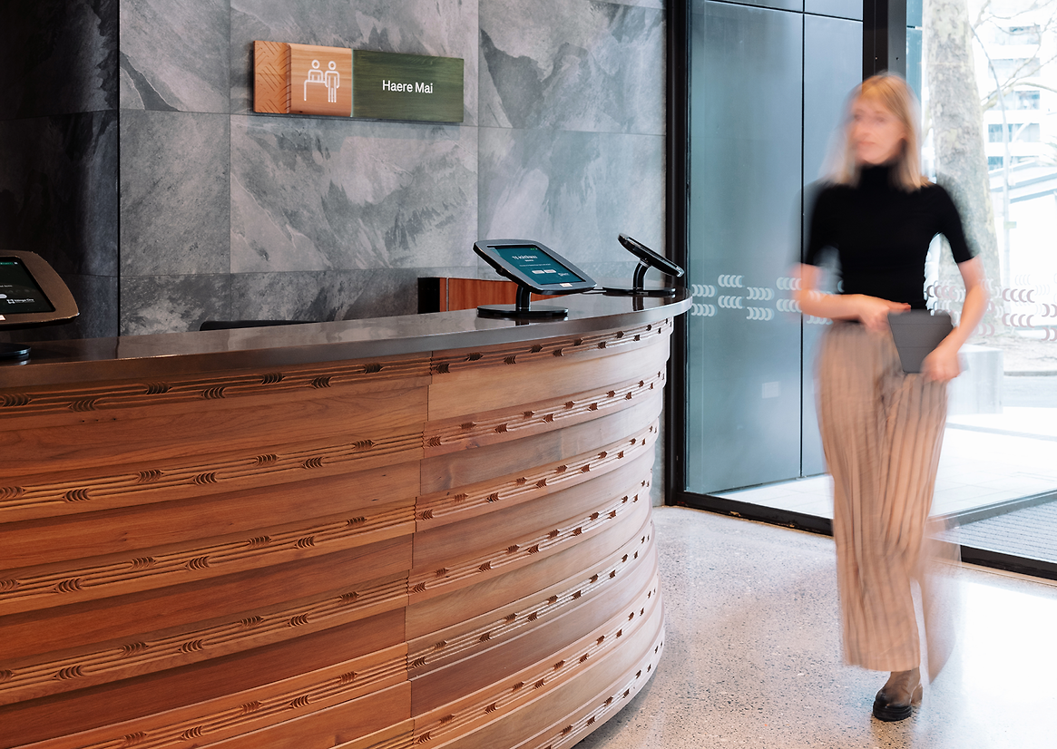
Kāinga Ora with Ngāti Whātua Ōrakei embraced an overarching vision honouring Waihorotiu, the stream which once had its headwaters beneath the project site. For early Māori, rivers were essential to life and held deep significance to tribal identity. The calming, fluid movement of the Waihorotiu and the vitality of its native bush canopy above, inspire the design elements adopted by the wayfinding. Artworks designed by Ngāti Whātua Ōrākei artist Katz Maihi adorn the signage suite, routed into the fluid formed timber. Manu | Bird artworks are used for level identification, signalling ‘home’. Wai | Water artworks feature on directional signage, referencing ‘flow’ and ‘movement’. Harakeke | Flax artworks represent connection, and are used to identify community areas.
In defining our approach to social housing wayfinding, we intentionally challenged conventional “institutionalised” outcomes. We approached our process with an open mind, seeking to understand the diverse needs and aspirations of the community. Our commitment to challenging stereotypes and avoiding limiting assumptions has led us to design wayfinding that embodies ‘craft’ and ‘care’.
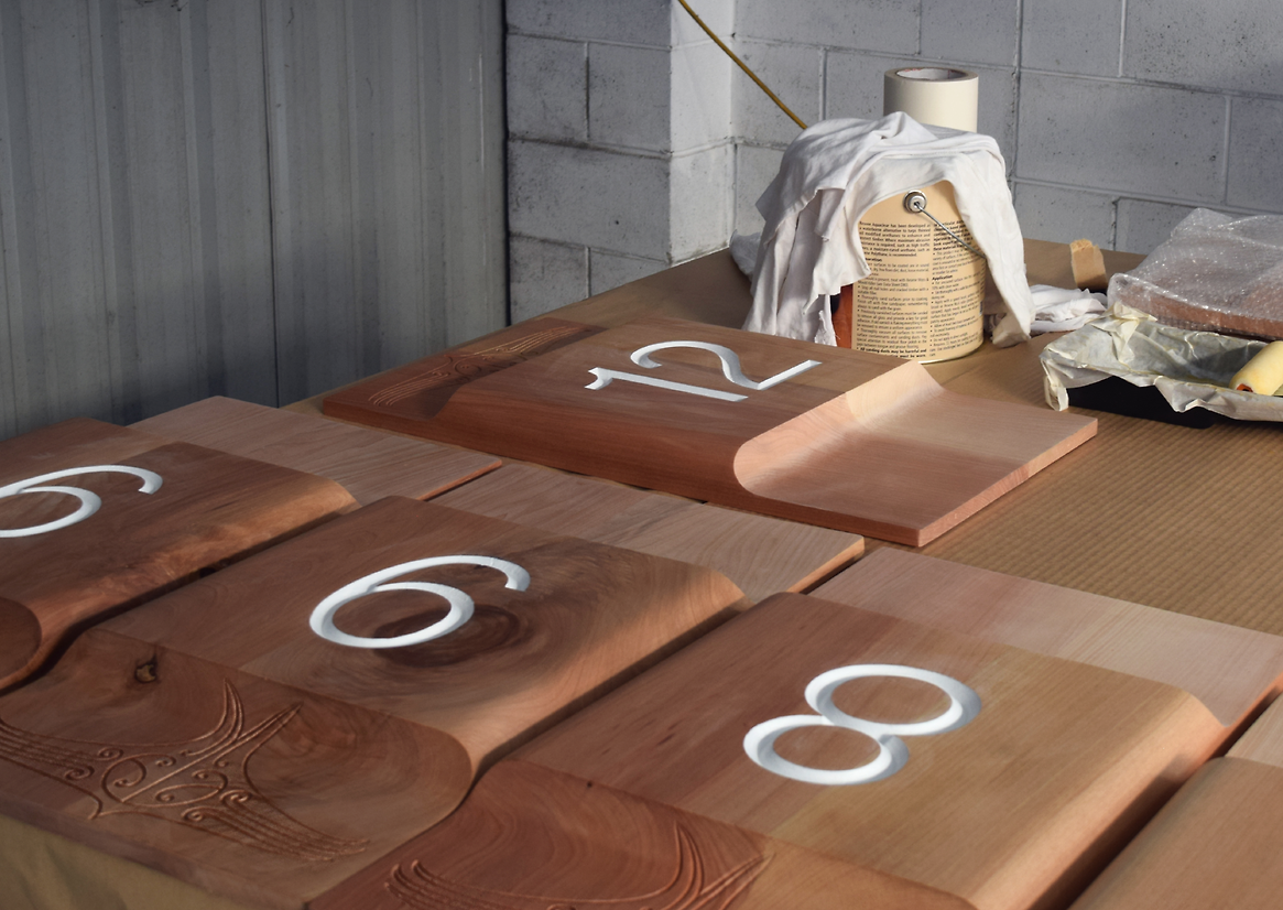
The design was not only functional but resonates with a spirit of welcome and quality. Materiality was a key element to storytelling across Te Mātāwai. As the primary material within the sign palette Tōtara, a native timber, imbues the wayfinding elements with a connection to the natural landscape. The selection of a high-quality, tactile material for these human-scale touchpoints throughout the buildings is further testament to the client’s commitment to building a culture of respect within the site. Where the building speaks through these signs, it speaks of place, and welcome, and reciprocal care. Coloured semi-opaque stains applied to each sign face bring a sense of identity and distinct character to the three buildings, whilst aiding navigation between building transitions. This material and colour application method celebrates the imperfections and variety of natural timber enhancing the sensory experience of interacting with the signage. The selection of a locally sourced native timber aligns with the client’s commitment to sustainability whilst contributing to harmonious integration with the surrounding architectural palette.
Through a thoughtful and hands-on design process, we aimed to elevate the wayfinding system beyond mere functionality, weaving place and care together with craft in seeking to ground and instil pride in the vulnerable community which Te Mātāwai serves.