Graphic
Futago Here Together, We Are Home
-
Pou Auaha / Creative Directors
Kate Owen, Karen Larson, Daniel Zika
-
Ringatoi Matua / Design Director
Julie Stoneman
-
Ngā Kaimahi / Team Members
Lauren Jones, Chelsea Smith, Simon Trewin -
Kaitautoko / Contributors
Matthew Scott, Sam Shelley, Tracey Cockburn, Suzanne Schulz, Dermot Cottuli, Linda Nicholson, Elise Parker -
Client
One Community Together
Description:
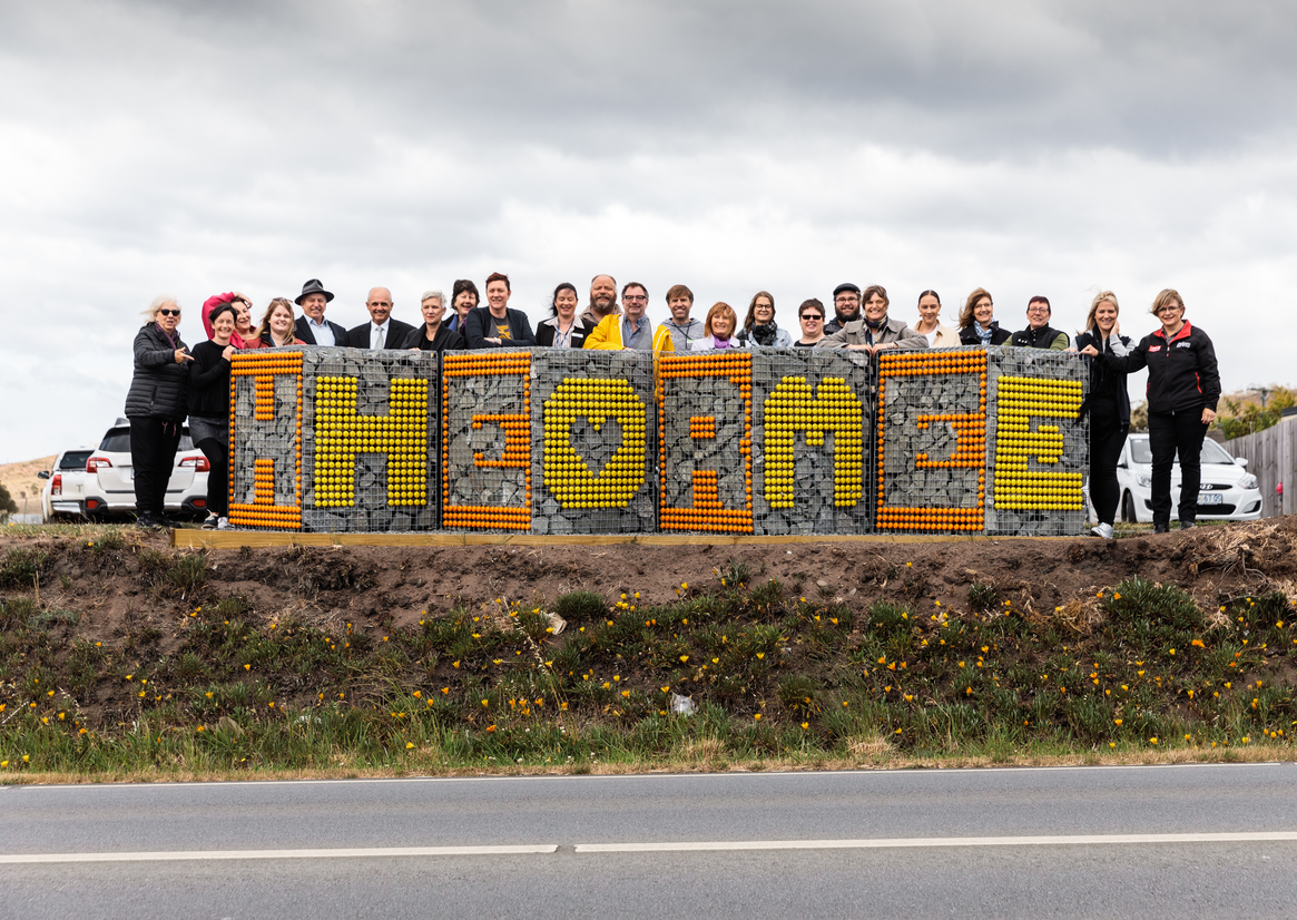
‘One Community Together’ is a collaborative community change project who approached our studio, in partnership with the local Council, to discuss ideas for signage to welcome people to ‘Clarence Plains’. Historically, the area which encompasses 4 suburbs is one of the most disadvantaged in our state, consisting largely of public housing, high crime rates and a reputation for burnt-out cars and disenfranchised youth.
The project spanned two key stages: community engagement, and creation of the artwork. The project was designed to create a welcoming and proud art piece that captures the spirit of place and lifts external perception.
We visited local festivals, school fairs, distributed posters, questionnaires and encouraged drawn and written responses to get to the heart of Clarence Plains; what makes the place what it is, why people love living there, and what can be celebrated.
Words that we heard again and again were shortlisted and then distributed as a survey for people in the community to vote on. These words ended up featuring on the welcoming artwork.
After the engagement phase, to raise the ambition of the project we invite a designer from the USA to collaborate with us. This was a bold move, and with parochialism high, a decision we had to often defend. Collaboration between our team happened through Zoom and email. We researched ideas for materials and techniques that would meet a very tight budget, permanency (vandalism-resistant) and not require engineering. We also had to scout the four suburbs for publicly owned land with high visibility.
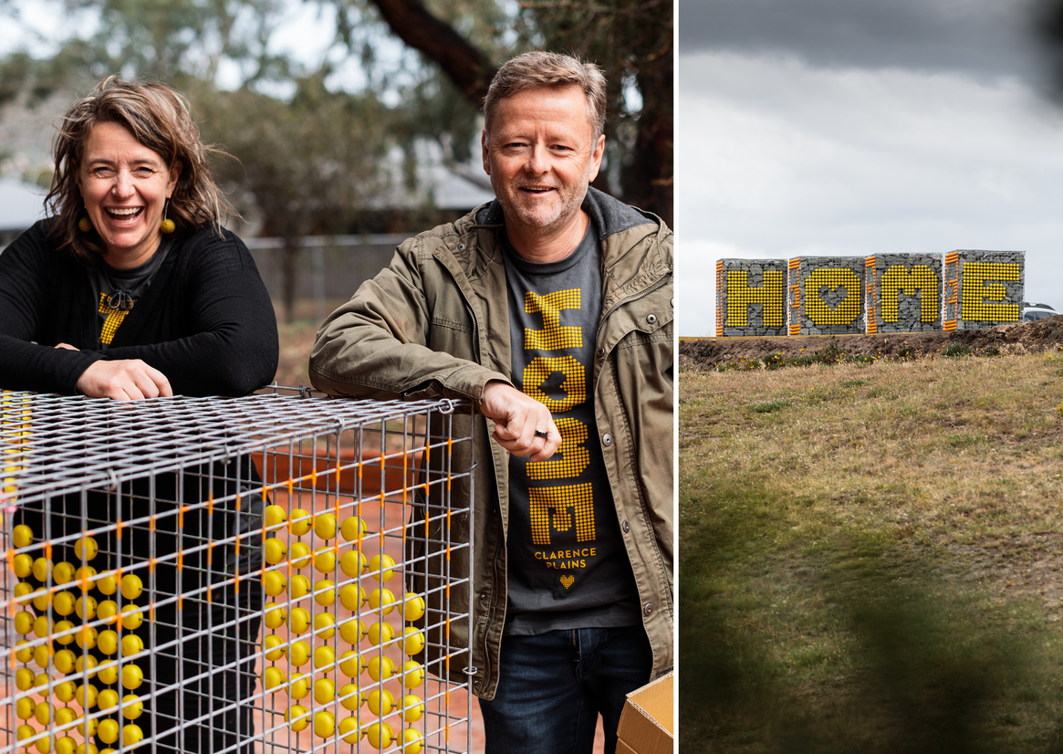
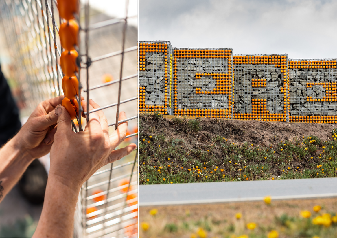
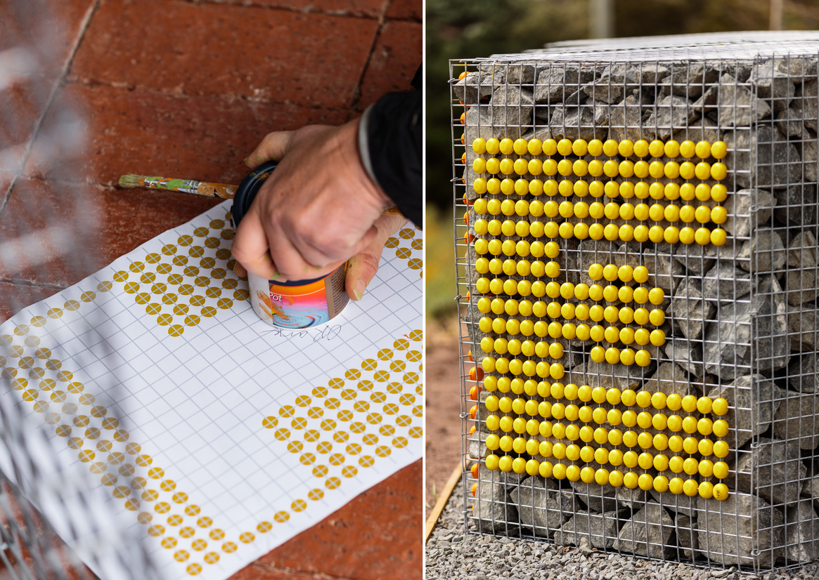
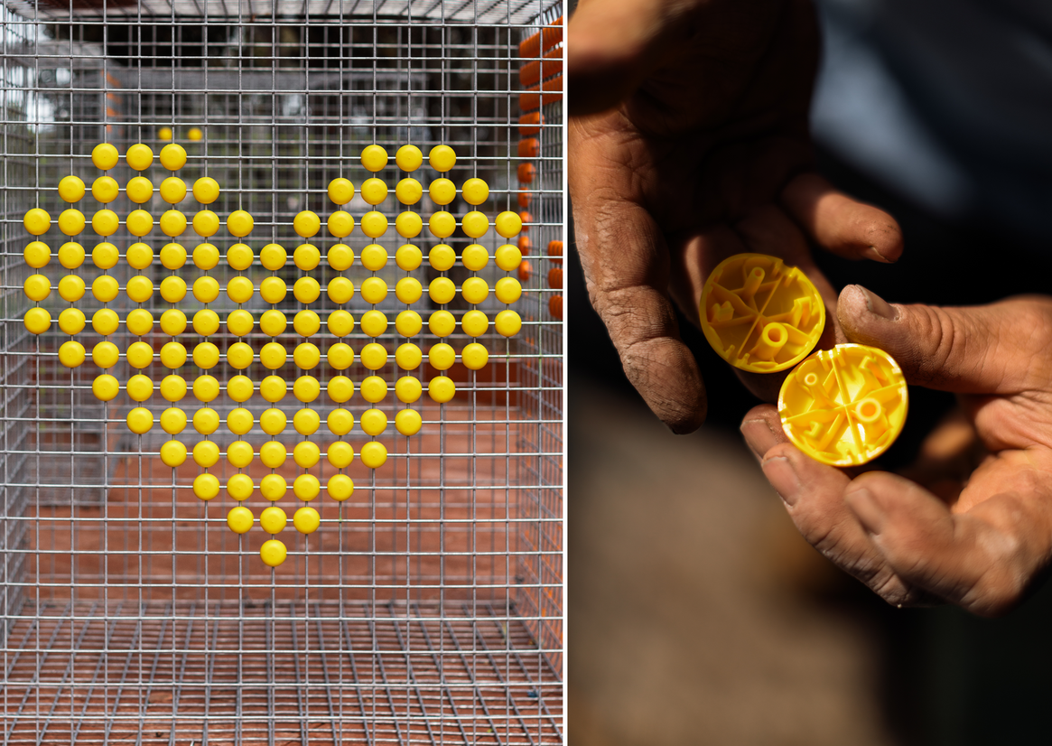
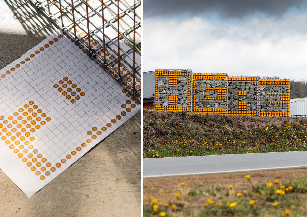
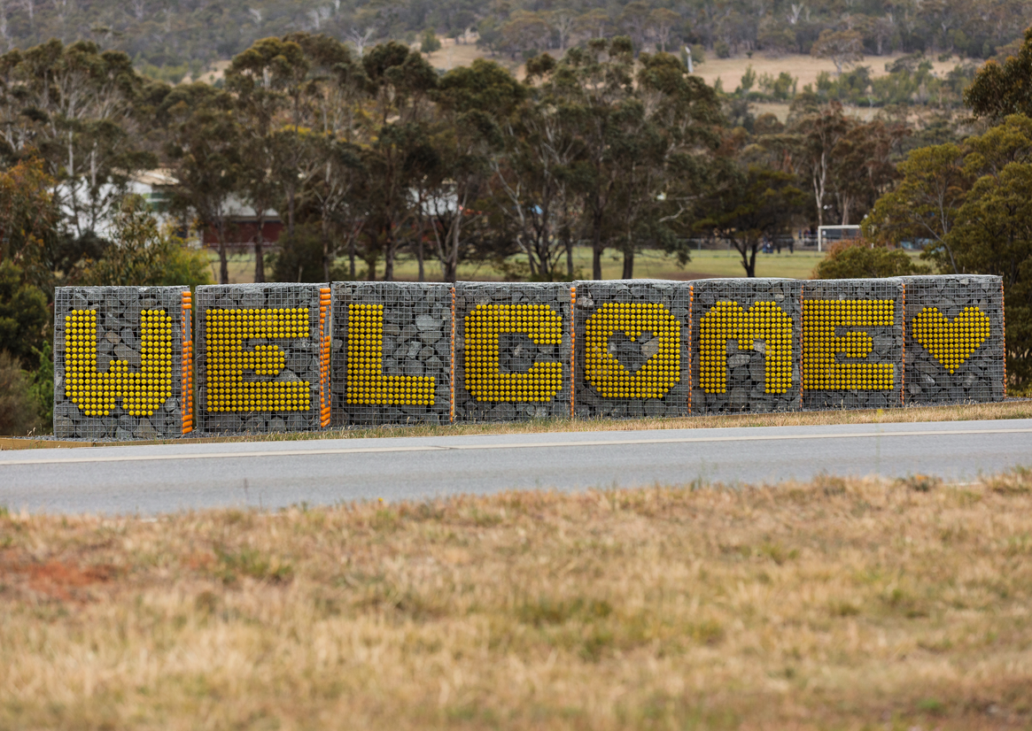
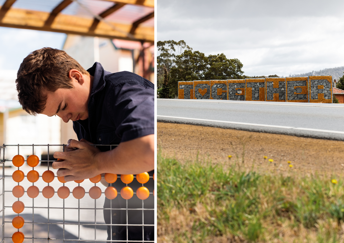
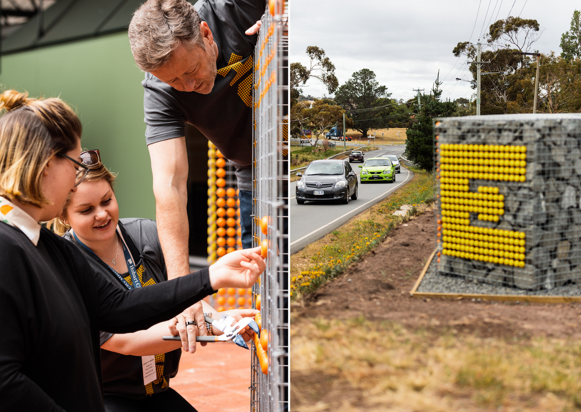
Our team eventually decided on a galvanised gabion structure, each unit being .9m square base x 1.2m high, filled with local dark grey rock, and Dutch-manufactured ‘DeDots’ as our graphic palette. The collaborating designer started work on a unique typeface based on this grid and colour palette. We presented 4 options to the community and one was unanimously chosen. The design had to consider legibility – in an area with very low literacy - and the fact it would be viewed at speed from a car, as well as be friendly and welcoming.
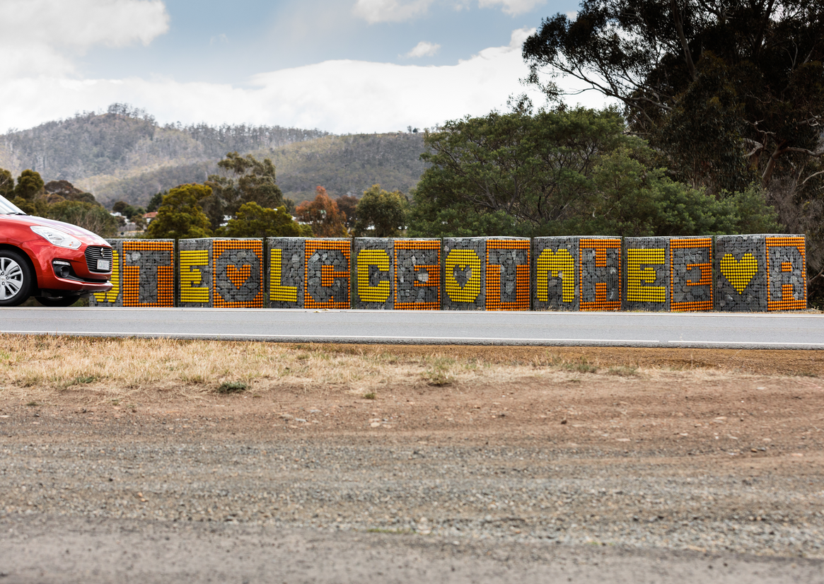
The collaborating designer travelled from Alaska to work with the community in constructing the work, which took place over a couple of weeks. The final work consists of 12 gabions and 4 words & 12,000 DeDots, which when driving past reads HERE, TOGETHER, WELCOME, HOME.
By creating a system that uses an off-the-shelf gridded mesh, and ordering thousands of extra DeDots, we’ve set the local community up with a replicable design. There are plans already to install a further 2 words, using the typographical alphabet and words gathered during the engagement phase. Not only does the work give scope to exist in external installations with this physical system, it can also be used as a graphic system for merchandise, collateral and promotional material, giving Clarence Plains a distinct, confident visual voice.