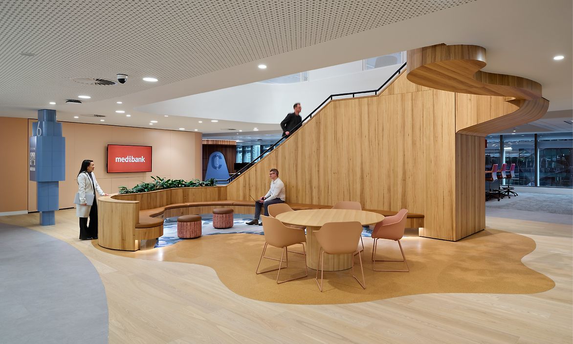
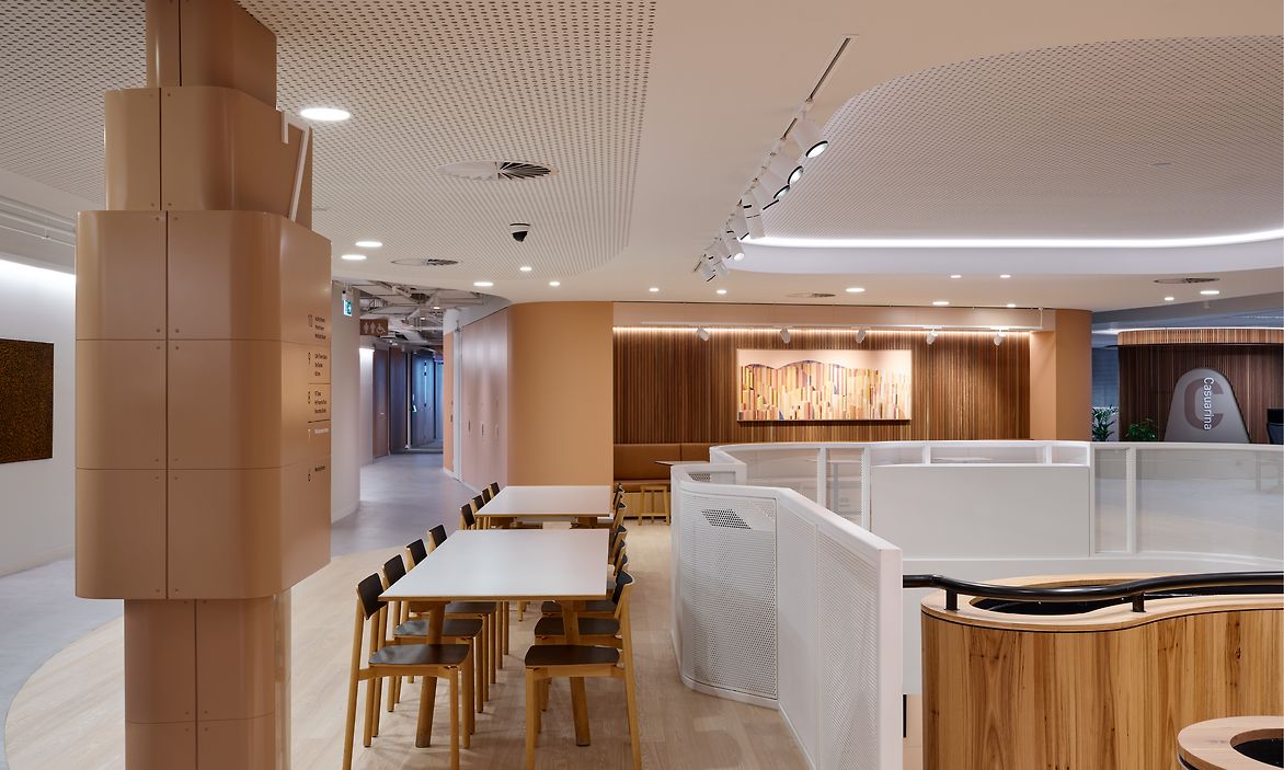
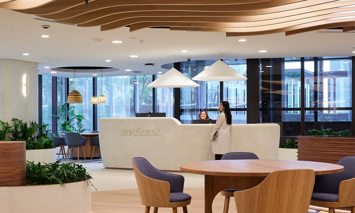
When Medibank designed its new Melbourne office, it had the opportunity to create a purpose-built workspace to support its innovative program and goal of being the healthiest workplace in Australia. Medibank’s workplace brief was to accommodate a more flexible post-pandemic workforce to cater to the diversity of the team and their different ways of working, including quiet focus areas, collaboration spaces and everything in between.
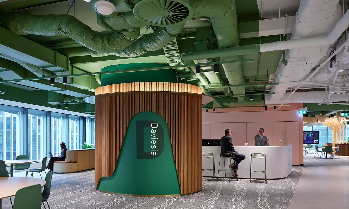
Medibank engaged Diadem to provide workplace wayfinding signage and environmental graphics across six levels at Melbourne Quarter Tower (MQT), an urban regeneration precinct. The offices were designed to reflect the brand’s purpose, “Better Health for Better Lives”, with health and wellbeing, connection to Country, and universal access being central to the design.
Medibank’s workplace brief was to accommodate a more flexible post-pandemic workforce with varying levels of focus, from calm to active areas, and solo to collaborative project spaces.
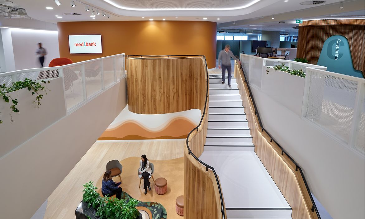
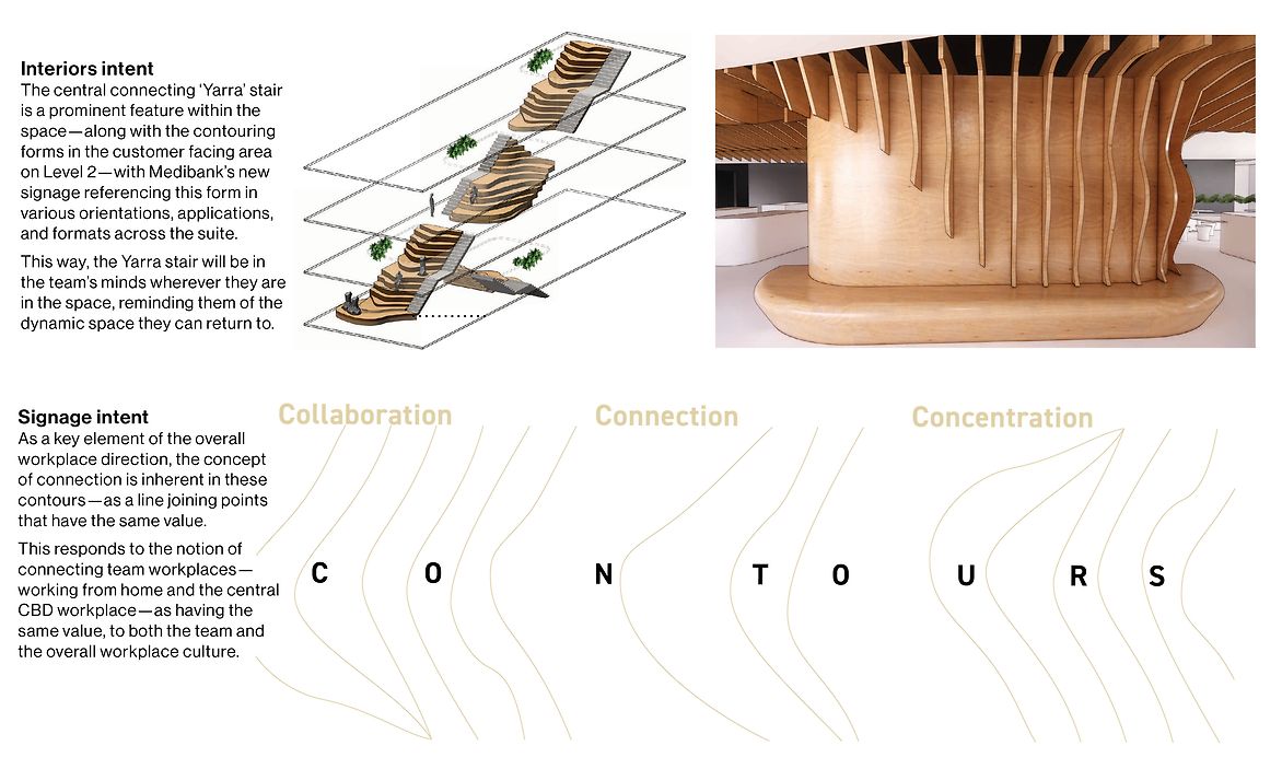
Diadem responded with a holistic wayfinding strategy that would support all users in navigating and moving around the site, with a central theme of connection—utilising the architect’s bold central stairway as the project’s backbone. This would subtly characterise the workplace as an experience beyond working from home, creating a place of collaboration and offering varying levels of concentration to aid project tasks.
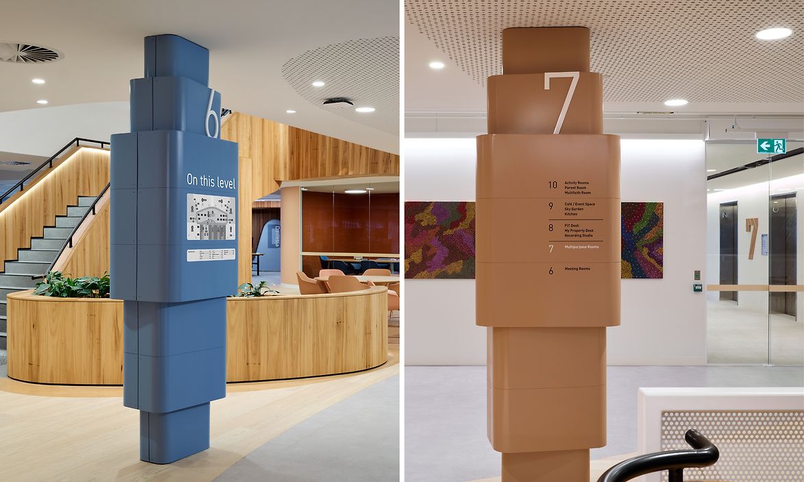
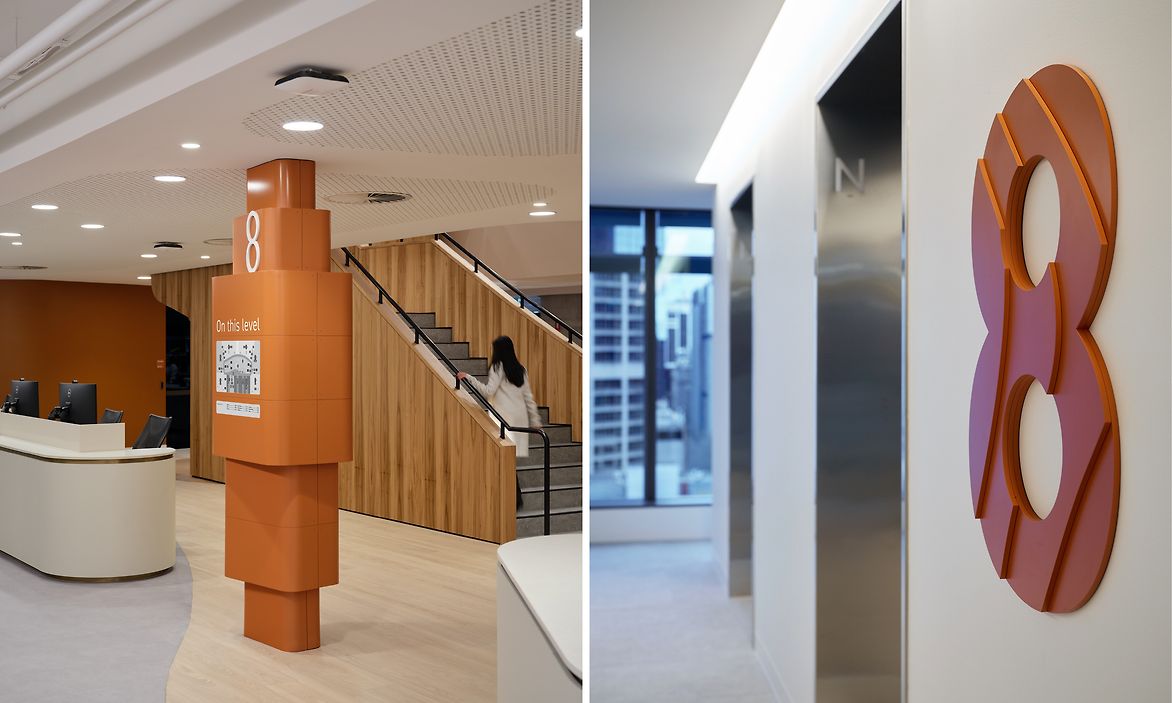
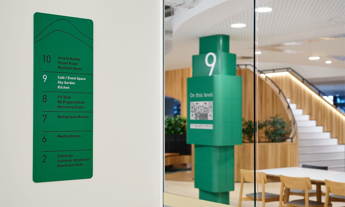
Accessibility is at the forefront of our approach, and designing for a neurodiverse workforce was a challenge we rose to. The architects responded to this need by providing a more subdued and calm environment in the lower levels and increasing the activation and stimulation as one moves up to the higher levels.
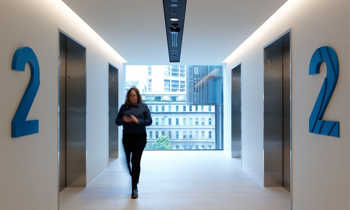
Colour played a key role in this journey. With the goal of providing intuitive wayfinding to minimise the need for signs, we devised a colour palette that responded to these changing conditions and used this consistently throughout, beginning in the lift lobbies and into the levels, supporting the central stair journey with large wayfinding totems to orient the user with a floor map and directory.
Description:
When Medibank designed its new Melbourne office, it had the opportunity to create a purpose-built workspace to support its innovative program and goal of being the healthiest workplace in Australia. Medibank’s workplace brief was to accommodate a more flexible post-pandemic workforce to cater to the diversity of the team and their different ways of working, including quiet focus areas, collaboration spaces and everything in between.
Medibank engaged Diadem to provide workplace wayfinding signage and environmental graphics across six levels at Melbourne Quarter Tower (MQT), an urban regeneration precinct. The offices were designed to reflect the brand’s purpose, “Better Health for Better Lives”, with health and wellbeing, connection to Country, and universal access being central to the design.
Medibank’s workplace brief was to accommodate a more flexible post-pandemic workforce with varying levels of focus, from calm to active areas, and solo to collaborative project spaces.
Diadem responded with a holistic wayfinding strategy that would support all users in navigating and moving around the site, with a central theme of connection—utilising the architect’s bold central stairway as the project’s backbone. This would subtly characterise the workplace as an experience beyond working from home, creating a place of collaboration and offering varying levels of concentration to aid project tasks.
Accessibility is at the forefront of our approach, and designing for a neurodiverse workforce was a challenge we rose to. The architects responded to this need by providing a more subdued and calm environment in the lower levels and increasing the activation and stimulation as one moves up to the higher levels.
Colour played a key role in this journey. With the goal of providing intuitive wayfinding to minimise the need for signs, we devised a colour palette that responded to these changing conditions and used this consistently throughout, beginning in the lift lobbies and into the levels, supporting the central stair journey with large wayfinding totems to orient the user with a floor map and directory.