Justin Crook, Brad Scahill, Sarah Campbell, Blair Johnston, Amy Phillips
Kaitautoko / Contributor
Rana Partridge
Client
Warren and Mahoney
Description:
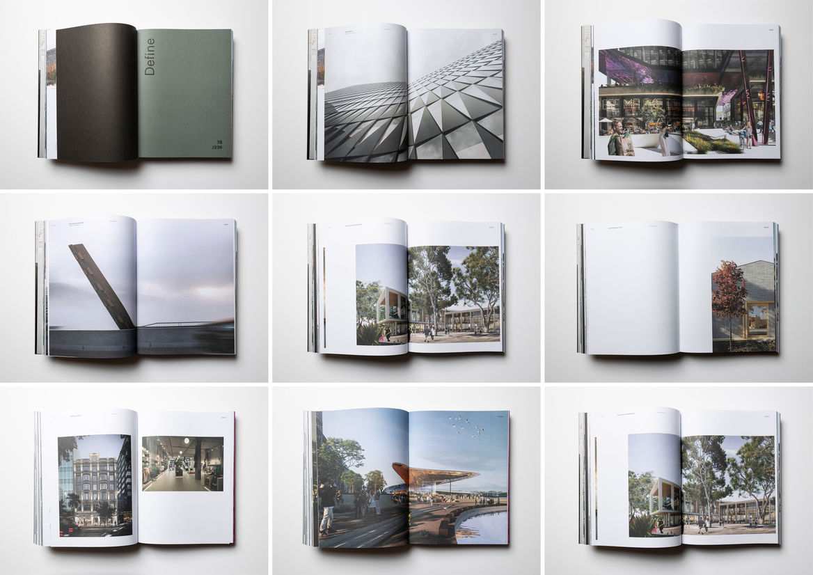
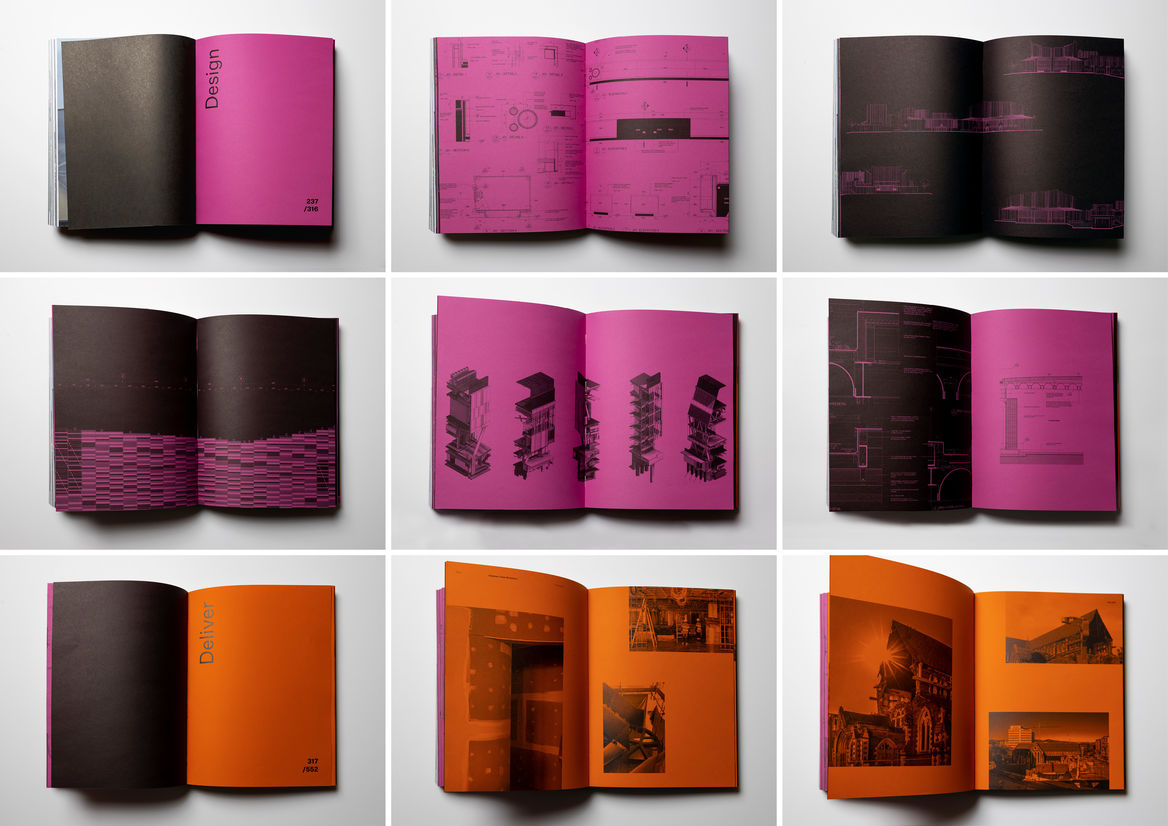
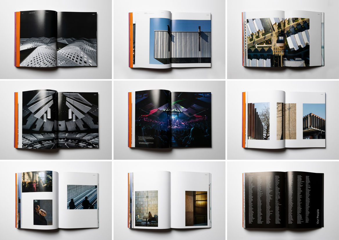
The studio biennial is designed to challenge, provoke and inspire; to raise awareness of design work occurring beyond individual horizons and to build a sense of pride in collective achievement. In an increasingly digital world it is a physical, tactile record of a team of 320’s contribution to placemaking and design across Australasia - its weight and substance carries meaning.
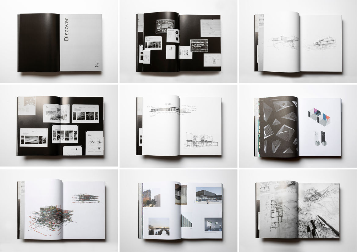
This publication takes a broad view of design and is structured to reflect the varied phases of our process - from ideation to implementation. It encompasses everything that we do as creatives - conceptual ideas, technical execution, strategy and communication.
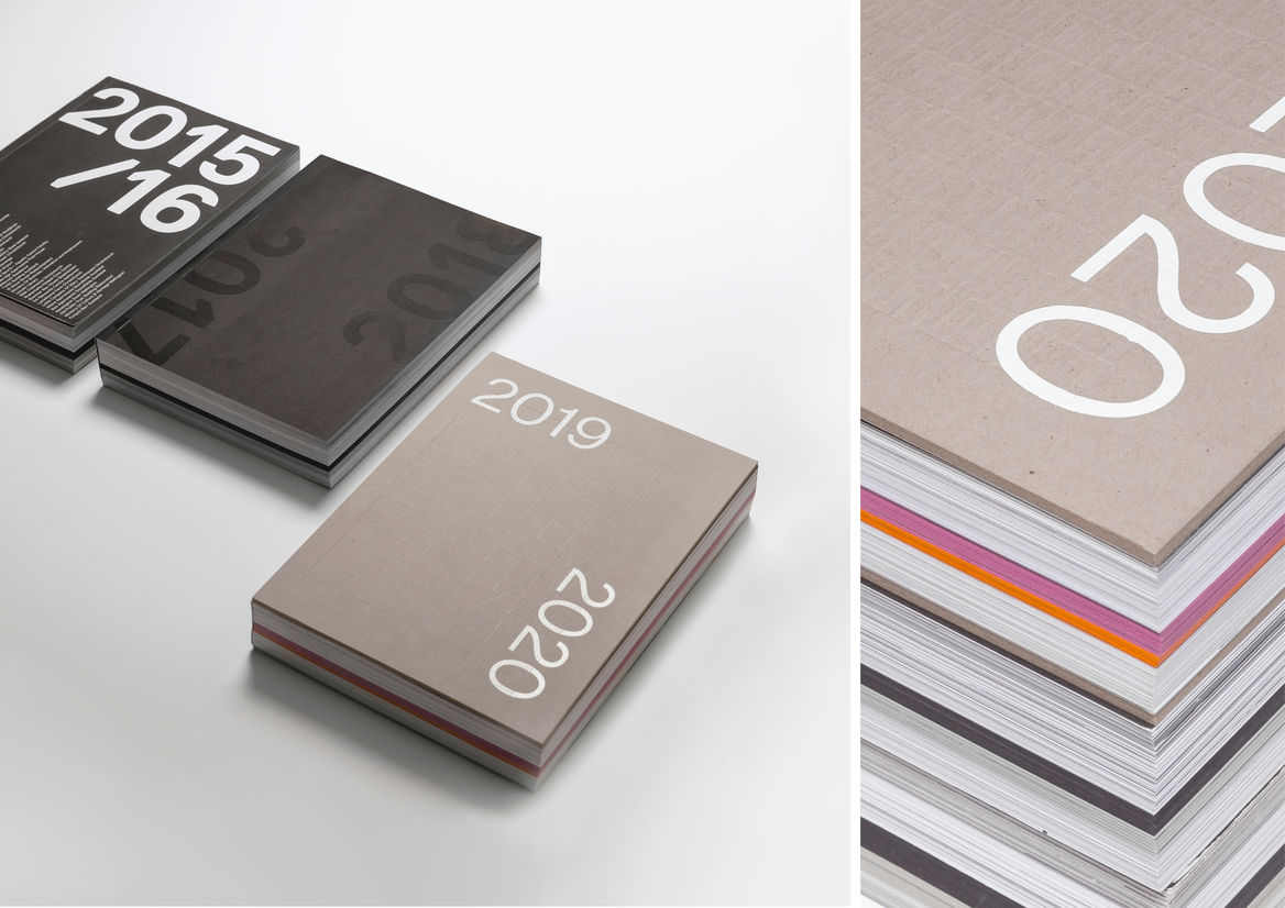
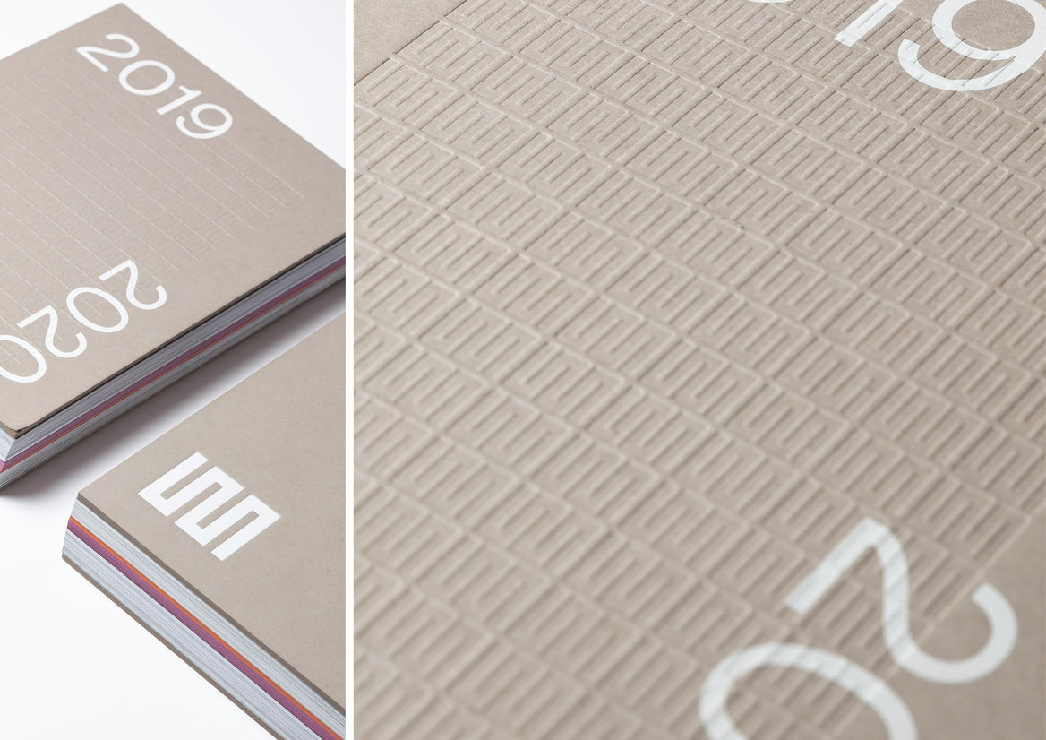
Collectively, the rhythm of individual publications over time continues to describe an international design practice of influence. The 2019-2020 biennial stands as the third edition in the series. It retains a consistent design intent with its predecessors: the gravitas that comes with the weight of 500 pages sequenced in order of design process; a flush-cut 200mm x 270mm format; paper stocks and image treatments that change the further into the book the reader gets.
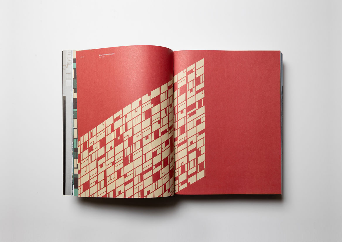
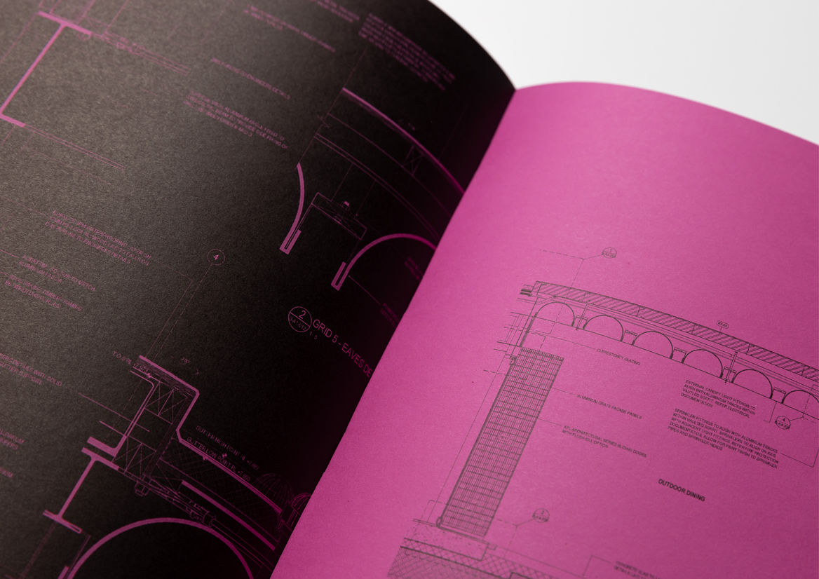
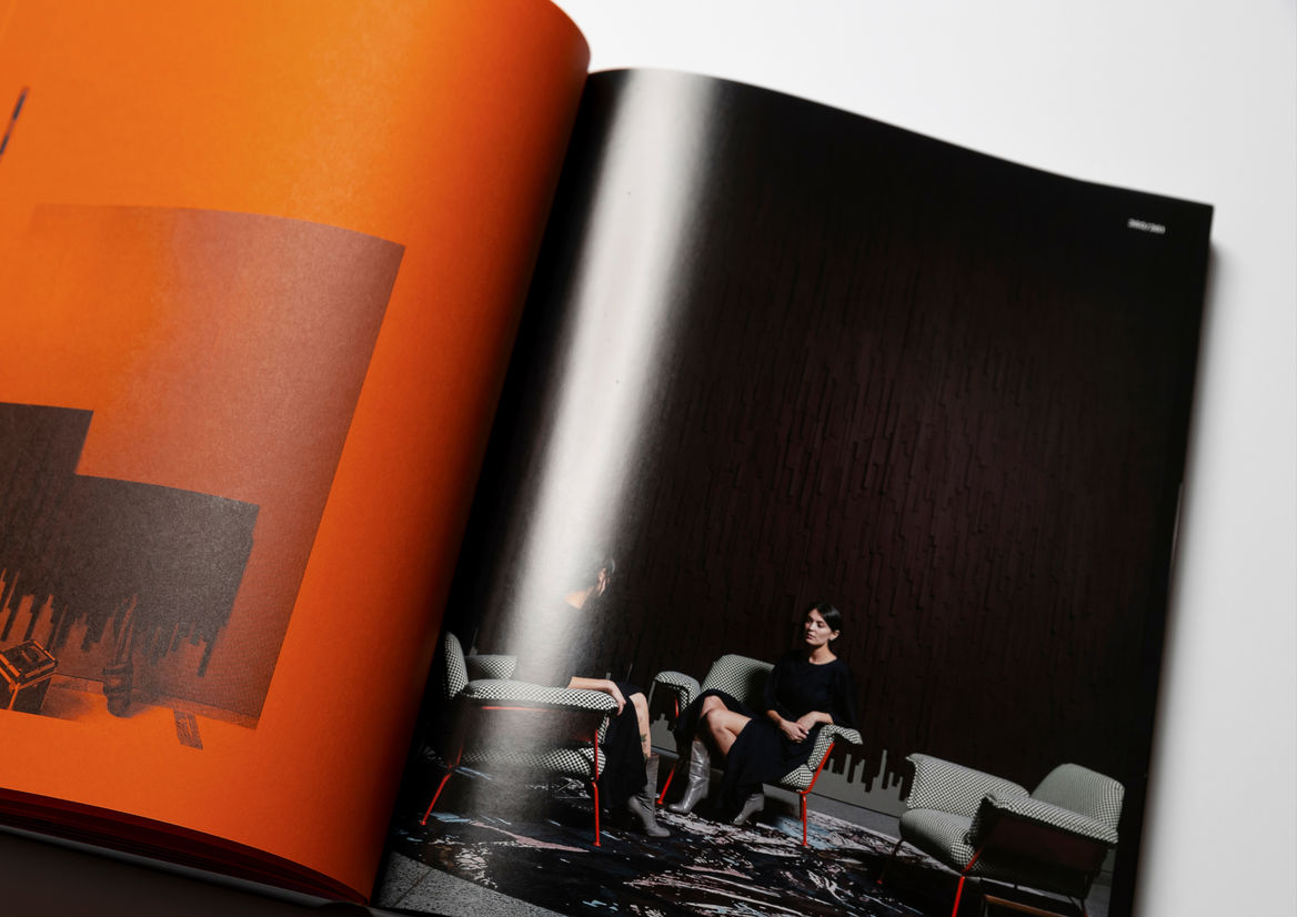
A significant design move for this publication was to shed the traditional black and white format of previous editions. Intended to reflect the energy and momentum felt within the design industry, the biennial visually and functionally responds to the need to embrace identity, sustainability, craft and technology. We are in a time of change, and combined with the collaboration of our diverse backgrounds, perspectives and skillsets – the energy is loud, confident and filled with optimism. A vibrant, almost conflicting injection of orange and pink paper stocks translates this trajectory visually, enabling the more dynamic design drawings and construction process work to float off the page in a striking and unexpected way.
While the flush-cut hard cover increases production complexity, it adds substance, durability and weight. The cloth spine introduces a textural contrast, and ensures the binding stands up to extensive use. These tactile features are elevated through the embossed pattern on the front cover using the brand’s logomark. The biennial itself is refreshed as a sustainably-sourced book using FSC certified paper, highlighted through a recycled cover stock.
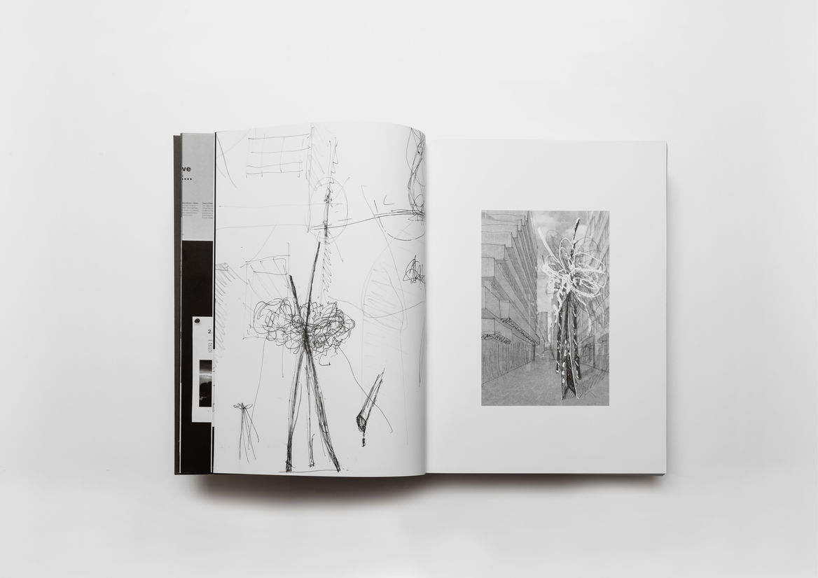
Core to the success of this publication is the curation and creative direction of our visual assets. Typography and format are considered in a way that avoids distraction, clutter or unnecessary noise. Our visuals are heroed with an approach that enables us to tell a vivid story - not only of realised projects, but of people, place, experience and process. The variation of these visuals is tailored for relevance to each project, an exercise that required careful consideration.
2020 will forever be the year of COVID-19, a global disruption the likes of which we have not witnessed in our lifetimes. It has forced us to examine how we design, how we collaborate, communicate, and to embrace digital technologies. The biennial provided an opportunity to reintroduce the tactile experience of our work.
Description:
The studio biennial is designed to challenge, provoke and inspire; to raise awareness of design work occurring beyond individual horizons and to build a sense of pride in collective achievement. In an increasingly digital world it is a physical, tactile record of a team of 320’s contribution to placemaking and design across Australasia - its weight and substance carries meaning.
This publication takes a broad view of design and is structured to reflect the varied phases of our process - from ideation to implementation. It encompasses everything that we do as creatives - conceptual ideas, technical execution, strategy and communication.
Collectively, the rhythm of individual publications over time continues to describe an international design practice of influence. The 2019-2020 biennial stands as the third edition in the series. It retains a consistent design intent with its predecessors: the gravitas that comes with the weight of 500 pages sequenced in order of design process; a flush-cut 200mm x 270mm format; paper stocks and image treatments that change the further into the book the reader gets.
A significant design move for this publication was to shed the traditional black and white format of previous editions. Intended to reflect the energy and momentum felt within the design industry, the biennial visually and functionally responds to the need to embrace identity, sustainability, craft and technology. We are in a time of change, and combined with the collaboration of our diverse backgrounds, perspectives and skillsets – the energy is loud, confident and filled with optimism. A vibrant, almost conflicting injection of orange and pink paper stocks translates this trajectory visually, enabling the more dynamic design drawings and construction process work to float off the page in a striking and unexpected way.
While the flush-cut hard cover increases production complexity, it adds substance, durability and weight. The cloth spine introduces a textural contrast, and ensures the binding stands up to extensive use. These tactile features are elevated through the embossed pattern on the front cover using the brand’s logomark. The biennial itself is refreshed as a sustainably-sourced book using FSC certified paper, highlighted through a recycled cover stock.
Core to the success of this publication is the curation and creative direction of our visual assets. Typography and format are considered in a way that avoids distraction, clutter or unnecessary noise. Our visuals are heroed with an approach that enables us to tell a vivid story - not only of realised projects, but of people, place, experience and process. The variation of these visuals is tailored for relevance to each project, an exercise that required careful consideration.
2020 will forever be the year of COVID-19, a global disruption the likes of which we have not witnessed in our lifetimes. It has forced us to examine how we design, how we collaborate, communicate, and to embrace digital technologies. The biennial provided an opportunity to reintroduce the tactile experience of our work.