Graphic
Stuart Geddes 27 Graphic Design Work Pty Ltd 3 Ziga Testen Studio 7 Dale Frank, Artist: Artworks 2006–2023
-
Pou Auaha / Creative Directors
Stuart Geddes, Žiga Testen
-
Ringatoi Matua / Design Directors
Stuart Geddes, Žiga Testen
-
Client
Neon Parc and Perimeter Editions

Description:
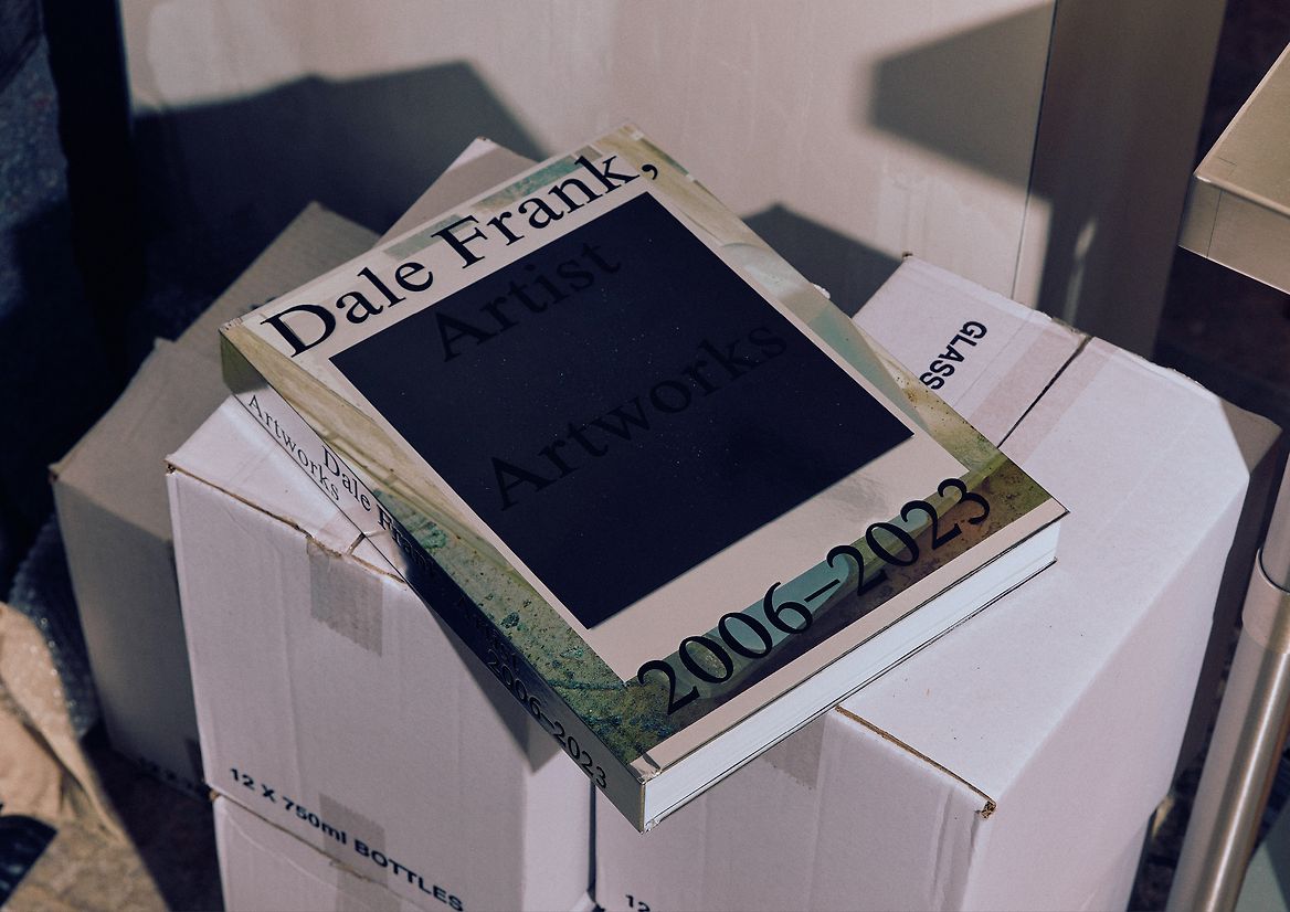
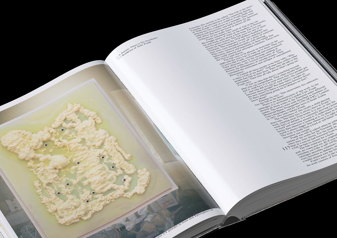
Dale Frank is one of Australia’s most distinctive, prolific and colourful artists. Colourful in his palette and colourful as a character – a documentary film has just been released about Dale titled ‘Nobody’s Sweetie’. Across almost 40 years, Dale has worked across performance, painting, sculpture, film, and botanical gardening, but he is best known in recent years for his large abstract paintings and assemblage sculptures. This book was commissioned to capture the contemporary Dale Frank, and his prolific output over the last two decades.
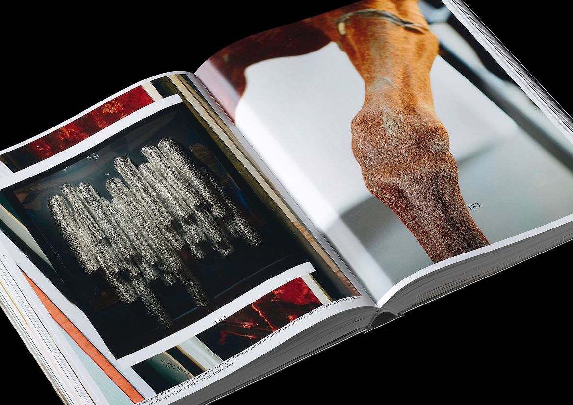
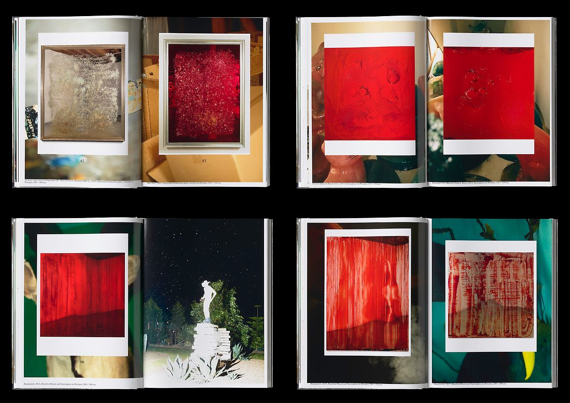
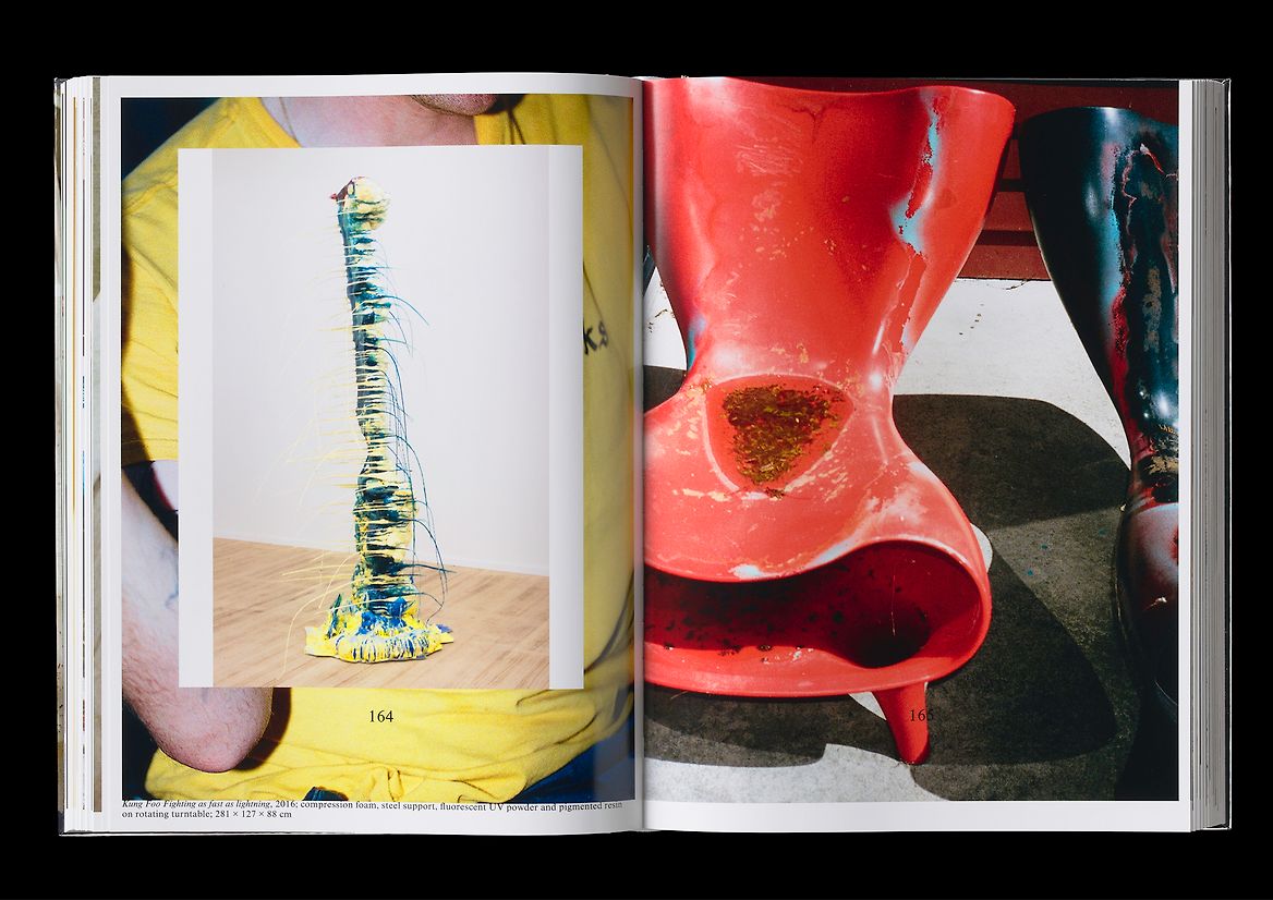
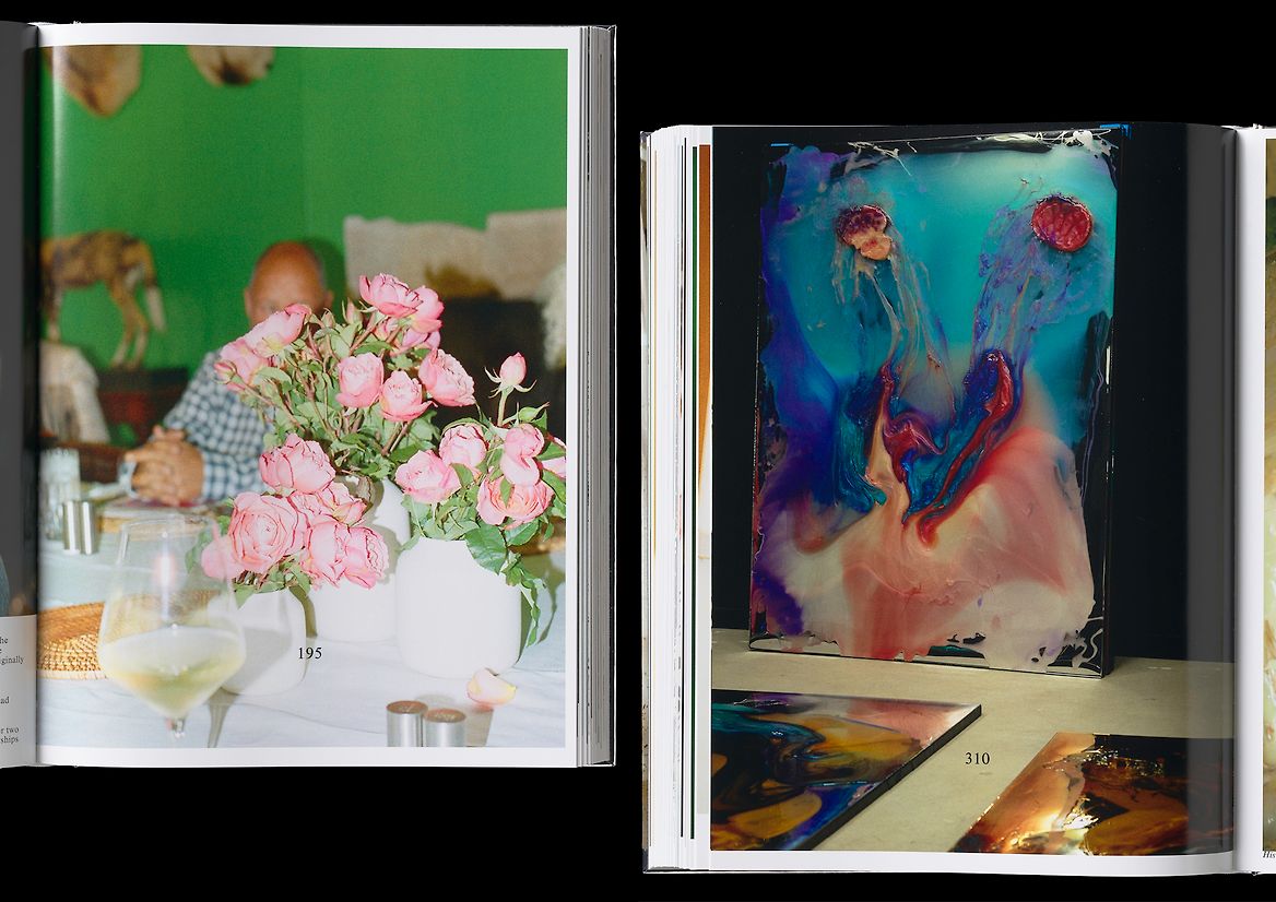
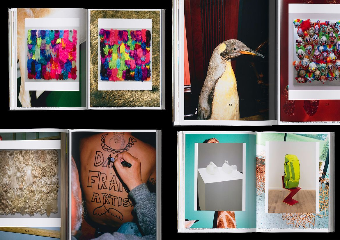
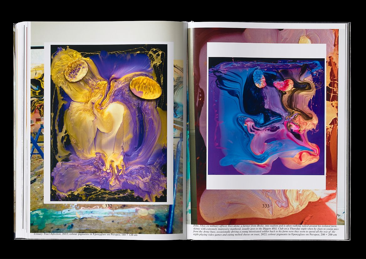
Frank’s work is so baroque and varied and relentless that we struggled to imagine it as any kind of conventional art book, with works on a white page. We were imagining what setting would contextualise Frank’s work when we discovered a Vogue Interiors shoot of Dale’s house, a colonial mansion in rural New South Wales, that Dale restored and has filled with a gigantic collection of taxidermy and is complementing with a 50 hectare botanical gardens. This context gave us a way into the work and the book.
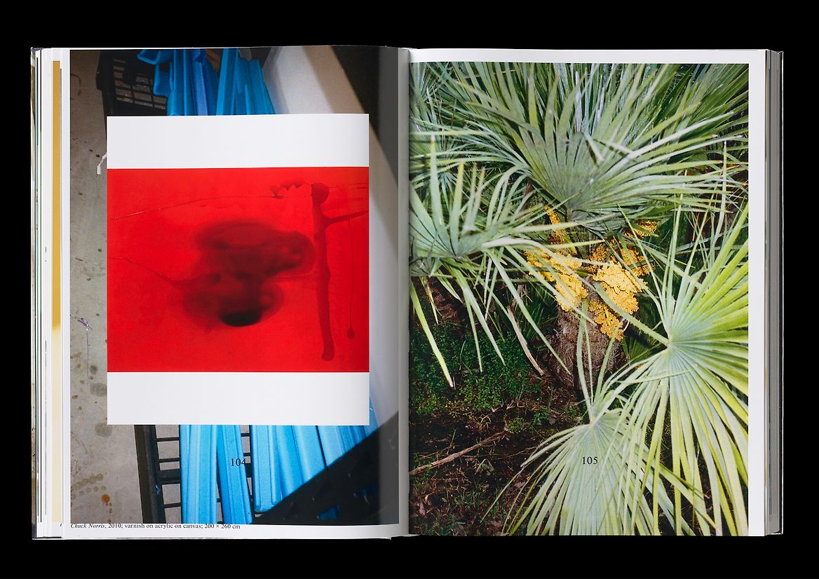
We set Dale’s house and studio and gardens (and occasionally Dale himself) as the backdrop to the work. We did this by enlisting British photographer Ben Morris and sent him up the river to Dale’s house for a couple of weekends to shoot 400 pages of background. What came back was a midpoint between Juergen Teller and Wake in Fright. This body of photography captures something of the artist without trying to be reductive or biographical. The book is composed as an oscillation between Dale’s works and this backdrop, at a huge scale. This oscillating composition is done quickly and intuitively, almost crudely. The typography throughout is a coarse cut of Times, set with little fanfare across essays and work titles – the type needed to be not pretty, but quick and deliberate and relentless. The scale and volume and shiny reflectiveness of this book nod towards Dale’s work. The book is printed on heavy high-gloss paper using an extended-gamut CMYK printing process that almost captures Dale’s flourescents and epoxys and enamels and resins.
Judge's comments:
Achieving what could be chaotic with crafted finesse. The book challenges the conventions of artist monographs, immersing the reader in the artist’s world with its bold and brace moves, immaculate production qualities and larger than life size.