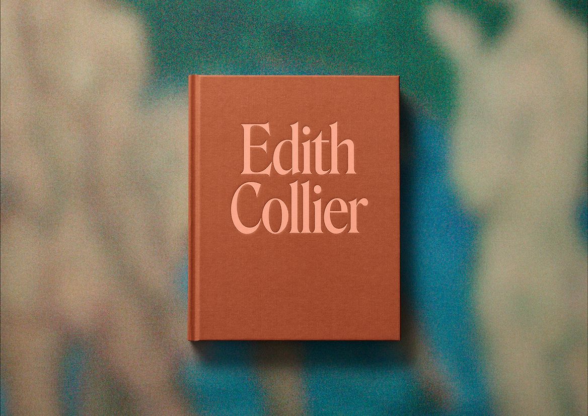
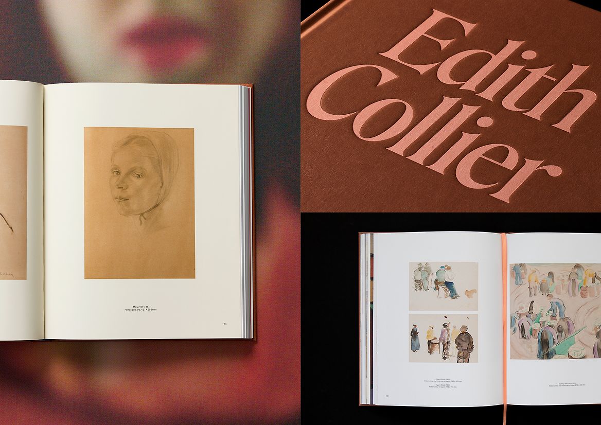
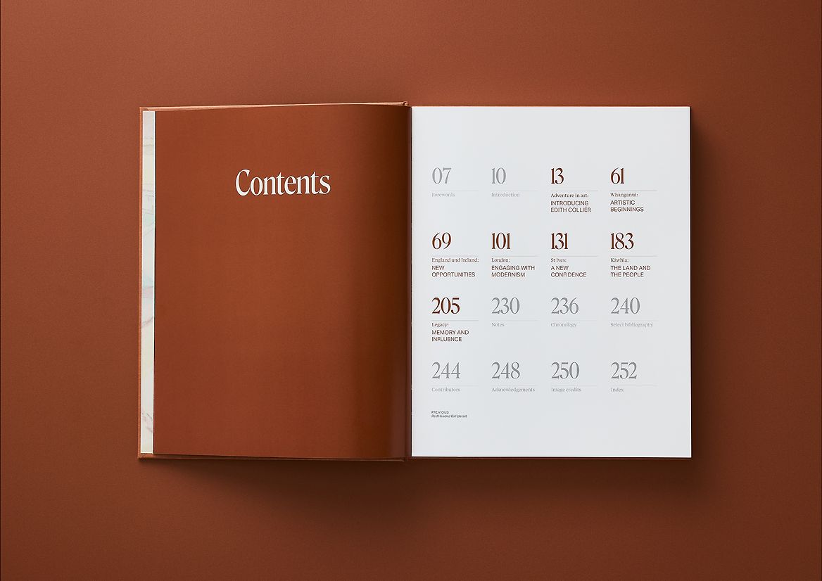
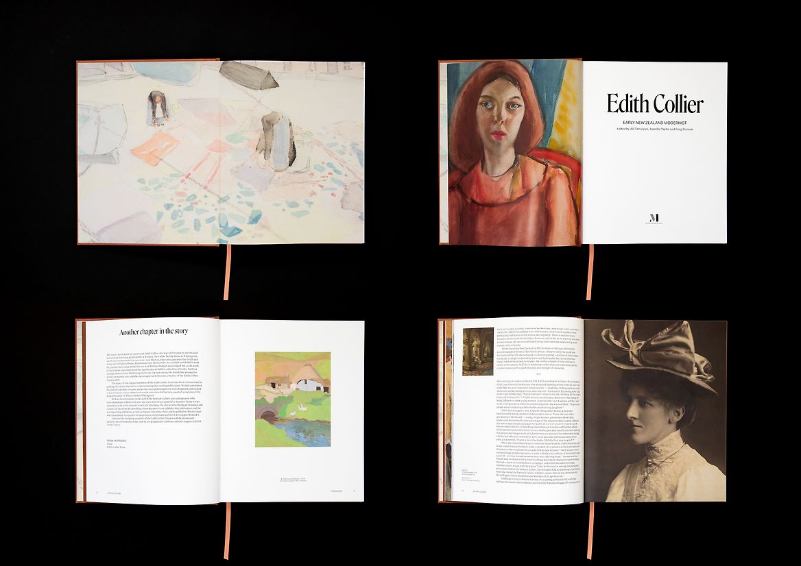
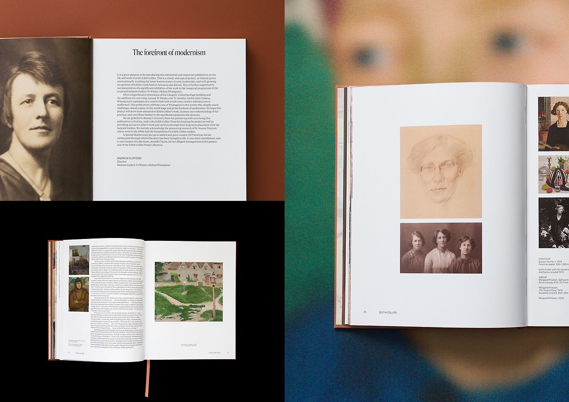
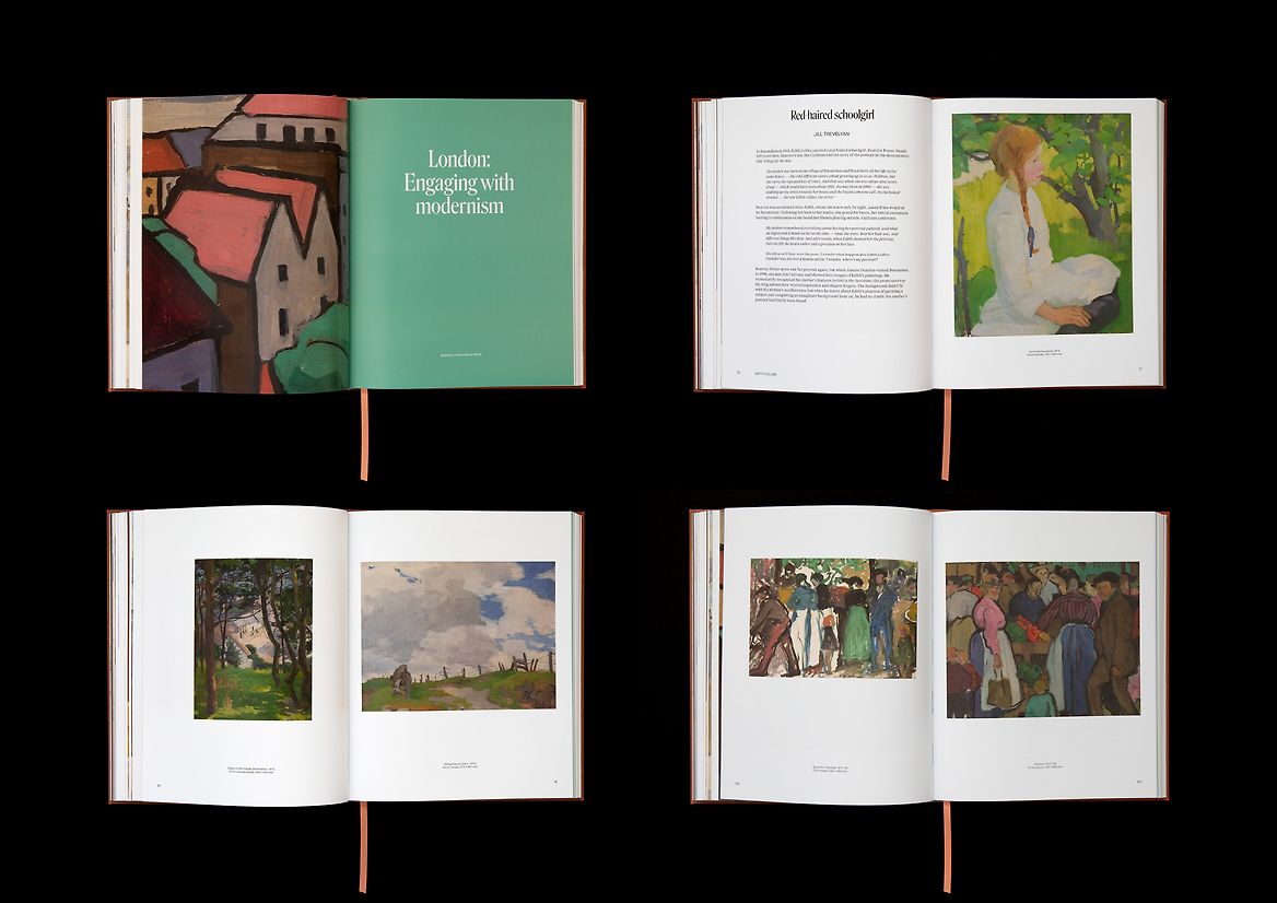
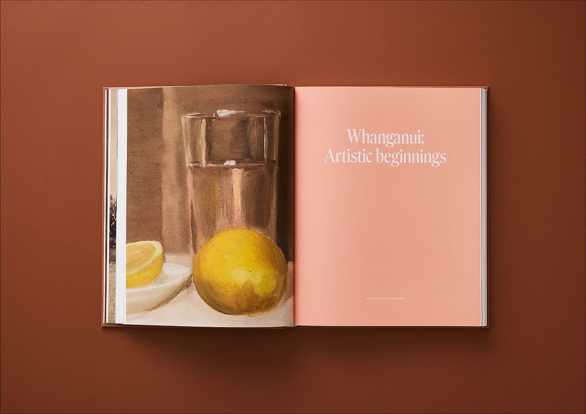
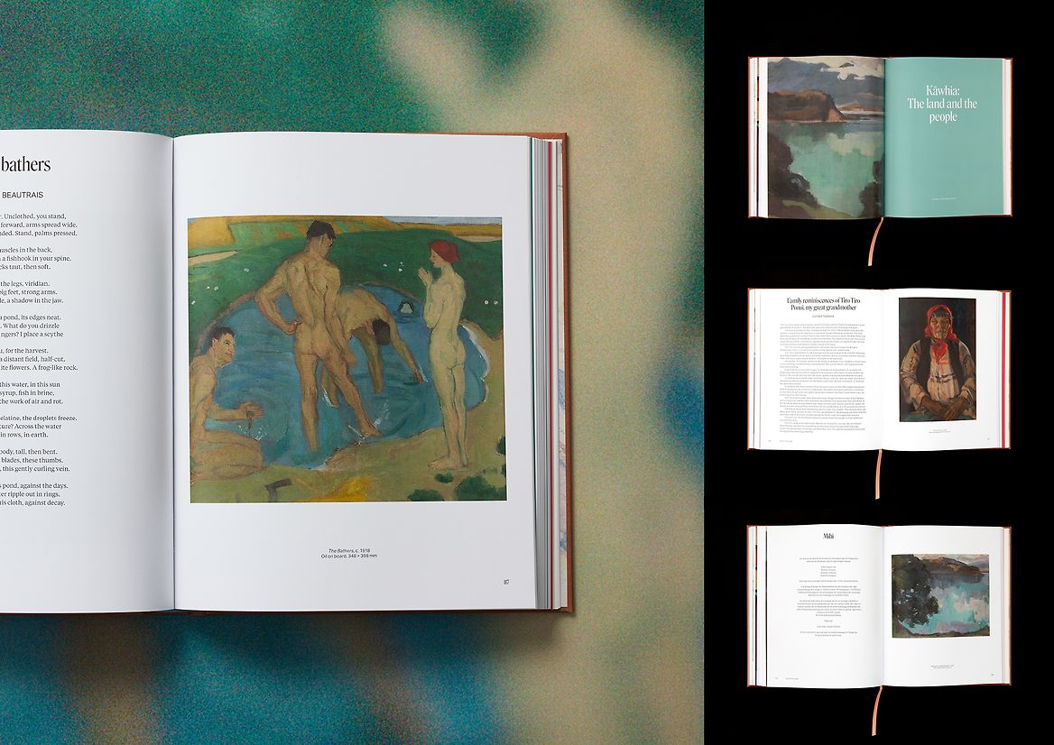
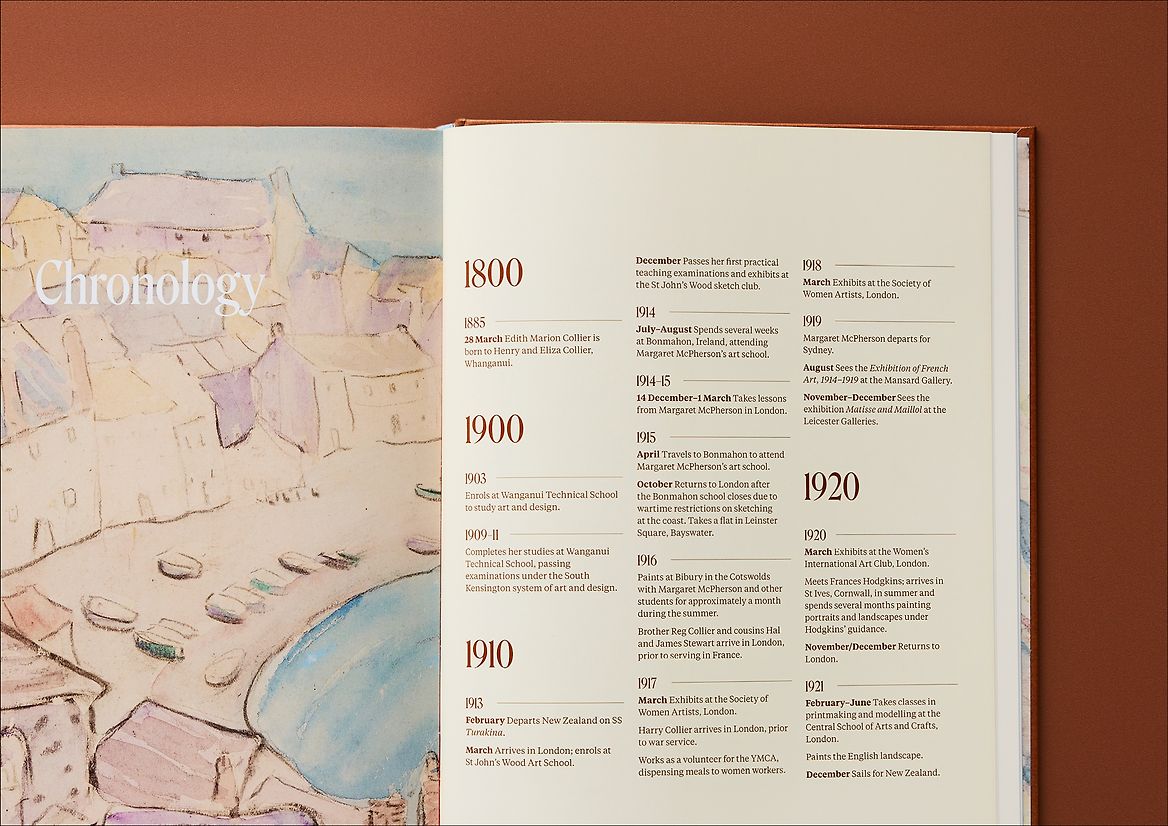
The design captures the tension in Edith Collier’s life between artistic ambition and familial expectation. Roslindale, a display typeface rooted in her era, balances sharp strength with rounded softness, reflecting both her courage and her constrained role. Centred, left-aligned text references traditional plate layouts while contemporary sans serif details add a modern touch. The bold cover speaks plainly—just her name—set in a powerful serif, with burnt sienna and pink expressing her creative voice and domestic ties. Colours throughout are drawn from her works in Ireland and Kawhia. Tiempos, a nod to Aotearoa, grounds the text in Collier’s homeland.
Description:
The design captures the tension in Edith Collier’s life between artistic ambition and familial expectation. Roslindale, a display typeface rooted in her era, balances sharp strength with rounded softness, reflecting both her courage and her constrained role. Centred, left-aligned text references traditional plate layouts while contemporary sans serif details add a modern touch. The bold cover speaks plainly—just her name—set in a powerful serif, with burnt sienna and pink expressing her creative voice and domestic ties. Colours throughout are drawn from her works in Ireland and Kawhia. Tiempos, a nod to Aotearoa, grounds the text in Collier’s homeland.