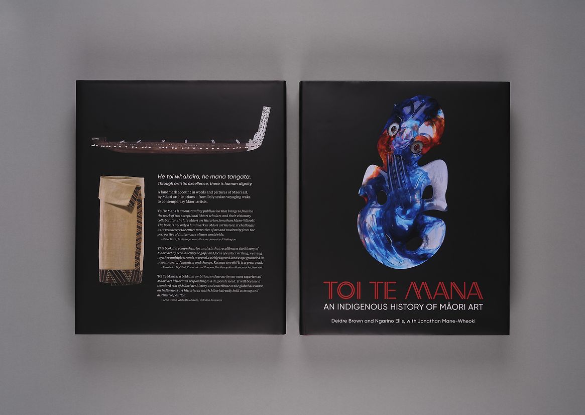
Toi Te Mana is a history of Māori art, written and designed by Māori, given to the world.
Toi Te Mana invites readers to climb on to the waka for a remarkable voyage – from ancestral weavers to contemporary artists at the Venice Biennale, from whare whakairo to film, and from Te Puea Hērangi to Michael Parekōwhai.
Toi Te Mana explores a wide field of art practice: raranga (plaiting), whatu (weaving), moko (tattoo), whakairo (carving), rākai (jewellery), kākahu (textiles), whare (architecture), toi whenua (rock art), painting, photography, sculpture, ceramics, installation art, digital media and film. It does so over a long time period – from the arrival of Pacific voyagers 800 years ago to contemporary artists in Aotearoa and around the world today. Through wide-ranging chapters alongside focused breakout boxes on individual artists, movements and events, Toi Te Mana is a waka eke noa – an essential book for anyone interested in te ao Māori.
At the centre of the design vision for Toi Te Mana is the unique Māori typeface – Mana – designed specifically for this publication. This font is part of an ongoing typographic journey within the design practice. The whakapapa of Mana began in 1993, when a plaque design for the John Bevan Ford sculpture Ko Kupe took inspiration from letters Māori used on pou (posts) and heke (rafters). In 2001 the 6 hand-drawn letters were expanded into a complete alphabet forming the celebrated Parihaka typeface. For Five Māori Painters (2014), the high-contrast type design was transformed into a square, straight-edged, inline serifed font – inspired by the negative space in Kāi Tahu rock art, and the haehae of toi whakairo. 2018 saw a slab-serif style introduced for whakataukī in the Te Papa Ōtākaro/Avon River Precinct Literary Trail.
Mana, an inline geometric sans-serif typeface, was drawn in 2024 and appears on the Toi Te Mana jacket, case, and throughout the book as chapter and section headings.
The signature colour of the design is whero (red) – as part of the traditional whero-pango-mā (red-black-white) colourway. Whero, like kōkōwai (red ochre), can represent the blood spilled during the separation of Rangi-nui (Sky Father)and Papa-tū-ā-nuku (Earth Mother) by their children. Combining these forms and colours creates a spiritually-charged vision that is unmistakably Māori – while wrapping the taonga in a colour long-used by Māori as a spiritual protectant.


Description:
Toi Te Mana is a history of Māori art, written and designed by Māori, given to the world.
Toi Te Mana invites readers to climb on to the waka for a remarkable voyage – from ancestral weavers to contemporary artists at the Venice Biennale, from whare whakairo to film, and from Te Puea Hērangi to Michael Parekōwhai.
Toi Te Mana explores a wide field of art practice: raranga (plaiting), whatu (weaving), moko (tattoo), whakairo (carving), rākai (jewellery), kākahu (textiles), whare (architecture), toi whenua (rock art), painting, photography, sculpture, ceramics, installation art, digital media and film. It does so over a long time period – from the arrival of Pacific voyagers 800 years ago to contemporary artists in Aotearoa and around the world today. Through wide-ranging chapters alongside focused breakout boxes on individual artists, movements and events, Toi Te Mana is a waka eke noa – an essential book for anyone interested in te ao Māori.
At the centre of the design vision for Toi Te Mana is the unique Māori typeface – Mana – designed specifically for this publication. This font is part of an ongoing typographic journey within the design practice. The whakapapa of Mana began in 1993, when a plaque design for the John Bevan Ford sculpture Ko Kupe took inspiration from letters Māori used on pou (posts) and heke (rafters). In 2001 the 6 hand-drawn letters were expanded into a complete alphabet forming the celebrated Parihaka typeface. For Five Māori Painters (2014), the high-contrast type design was transformed into a square, straight-edged, inline serifed font – inspired by the negative space in Kāi Tahu rock art, and the haehae of toi whakairo. 2018 saw a slab-serif style introduced for whakataukī in the Te Papa Ōtākaro/Avon River Precinct Literary Trail.
Mana, an inline geometric sans-serif typeface, was drawn in 2024 and appears on the Toi Te Mana jacket, case, and throughout the book as chapter and section headings.
The signature colour of the design is whero (red) – as part of the traditional whero-pango-mā (red-black-white) colourway. Whero, like kōkōwai (red ochre), can represent the blood spilled during the separation of Rangi-nui (Sky Father)and Papa-tū-ā-nuku (Earth Mother) by their children. Combining these forms and colours creates a spiritually-charged vision that is unmistakably Māori – while wrapping the taonga in a colour long-used by Māori as a spiritual protectant.