Graphic
Monash University Museum of Art A Practice for Everyday Life Renee So: Provenance
-
Pou Auaha / Creative Director
A Practice for Everyday Life
-
Ringatoi Matua / Design Director
A Practice for Everyday Life
-
Client
Monash University Museum of Art
Description:
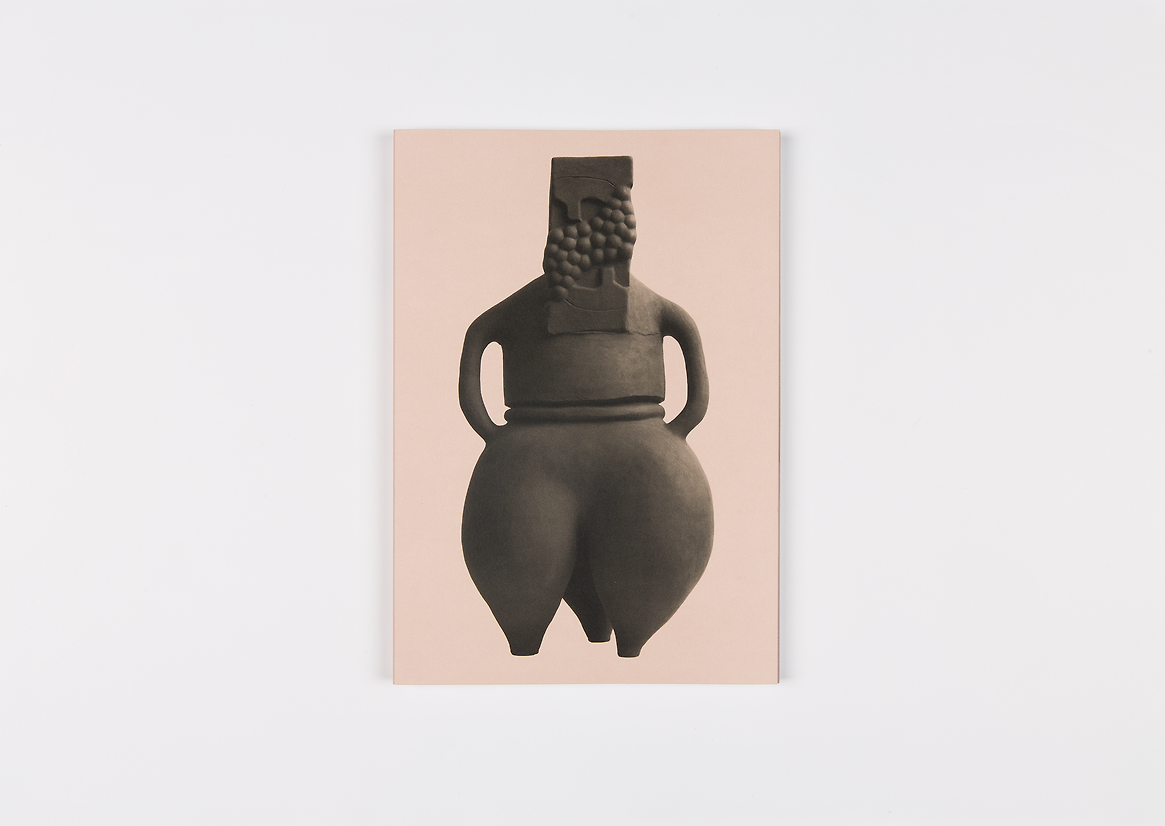
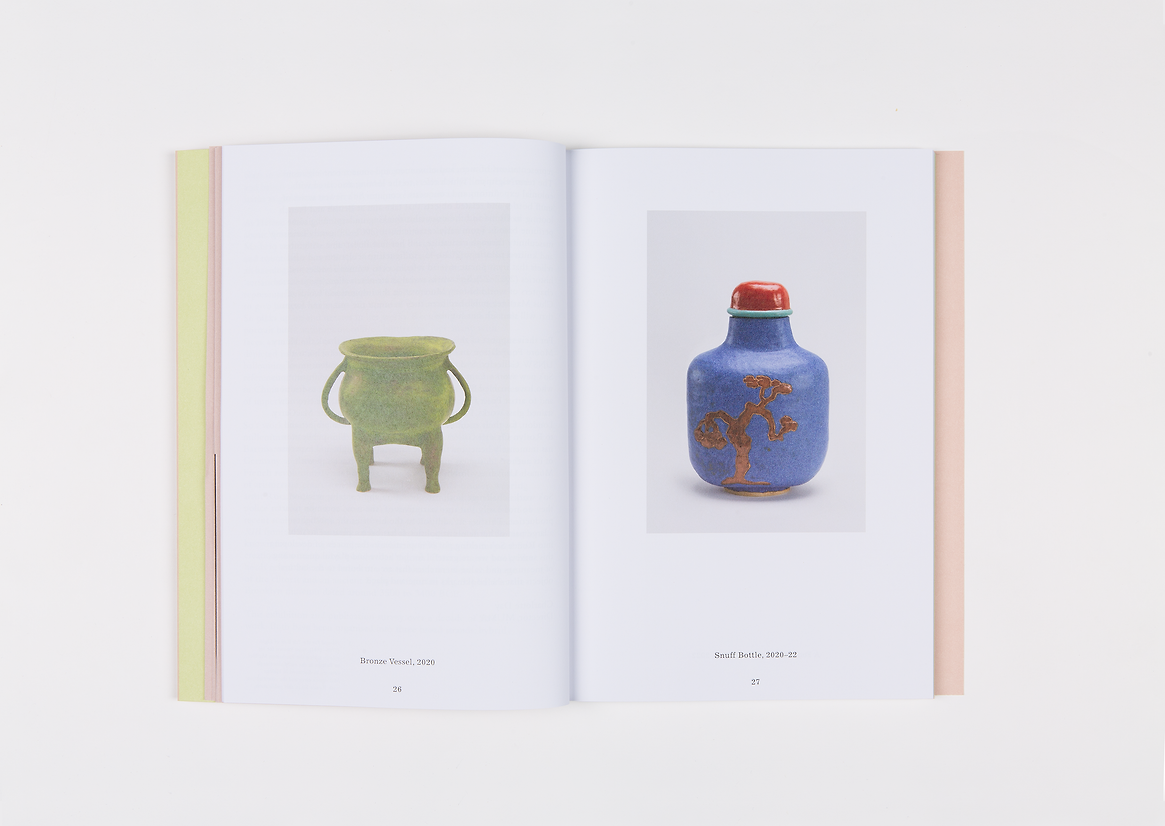
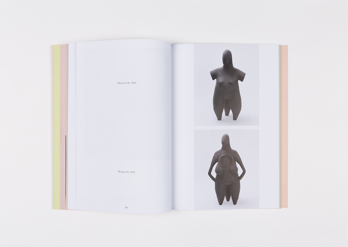
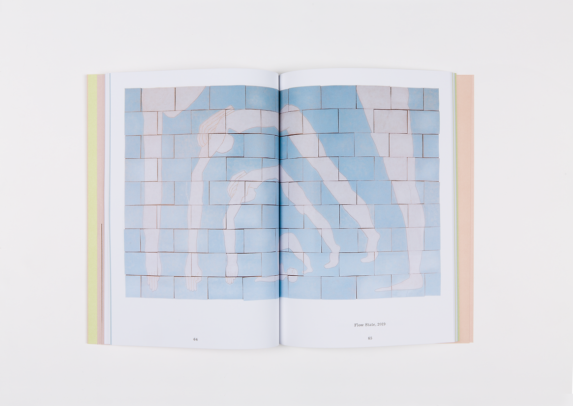
Artist Renee So’s idiosyncratic practice in ceramics and textiles, and occasionally furniture and glass, is inspired by art history, collections in museums and gendered symbolism. Her work is distinguished by its embrace of craft methods and cross-cultural thinking, an underlying sense of the comedic and a persistent feminist worldview.
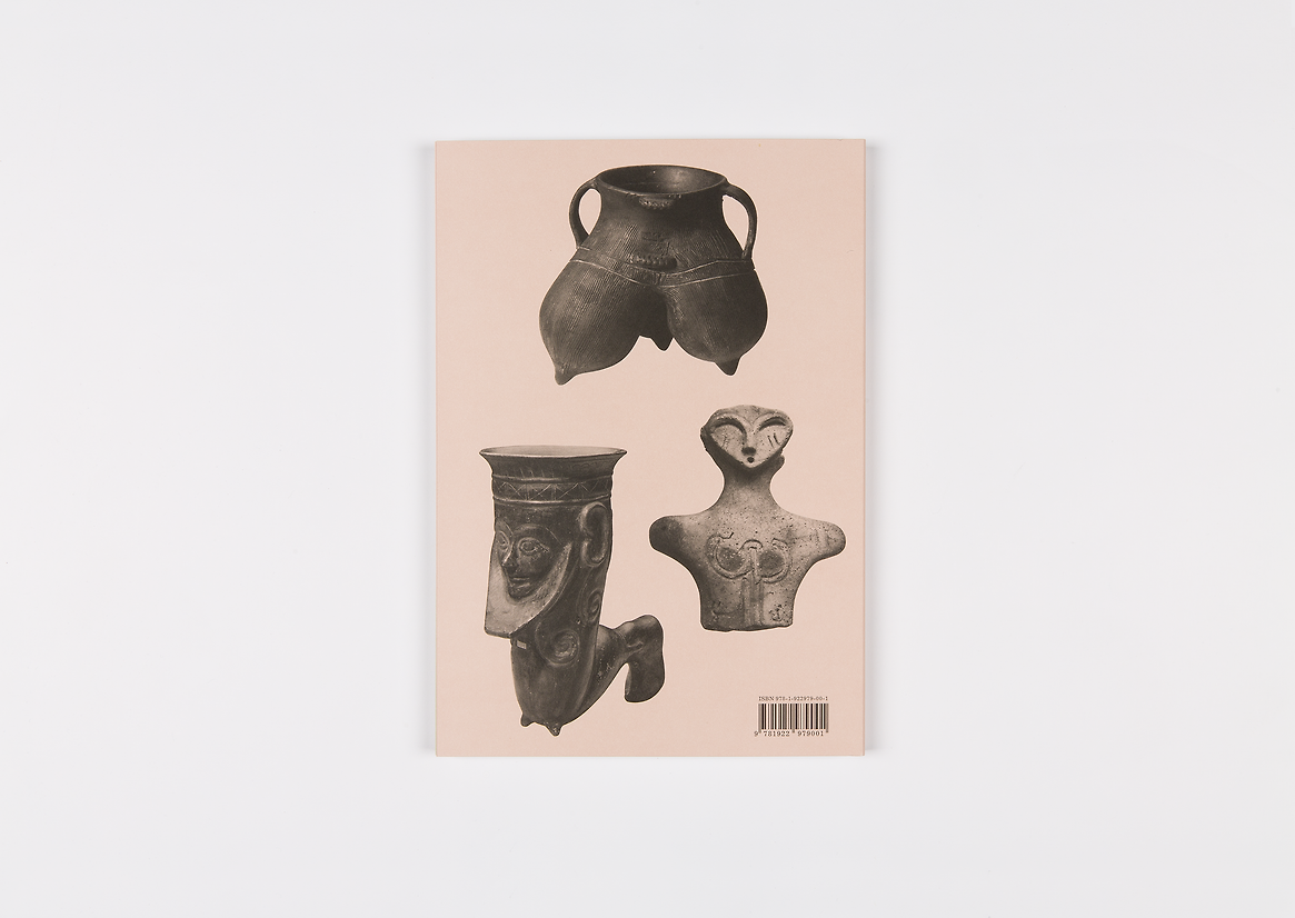
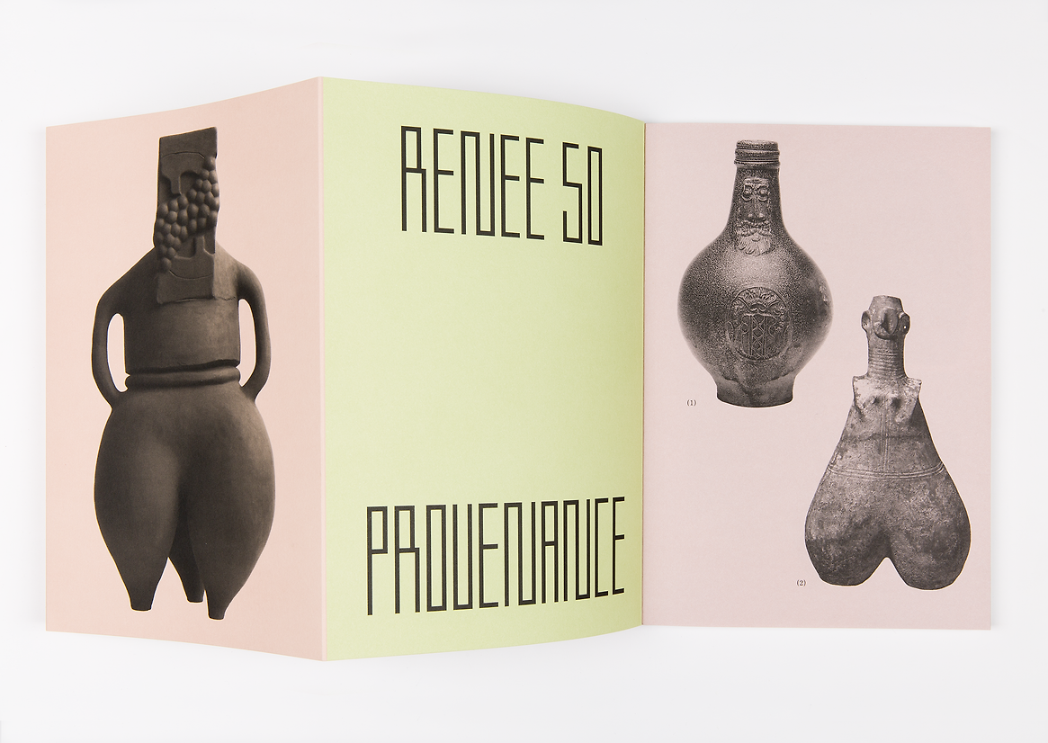
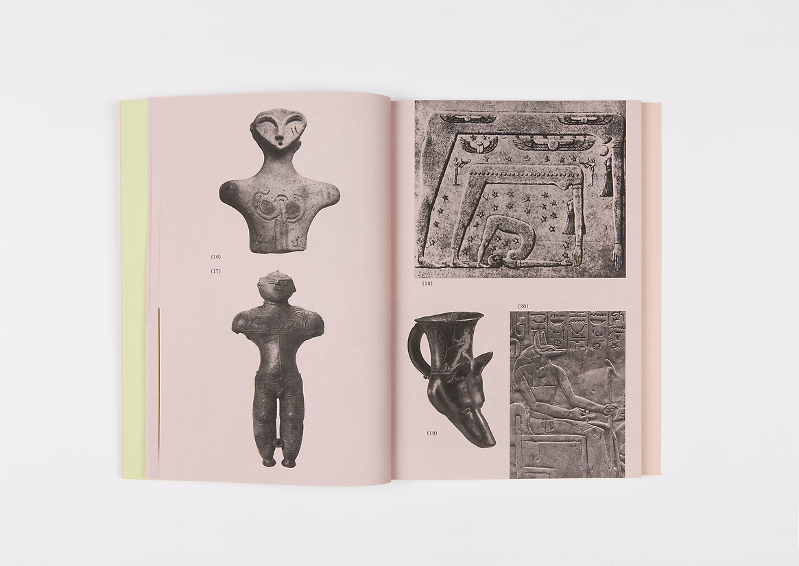
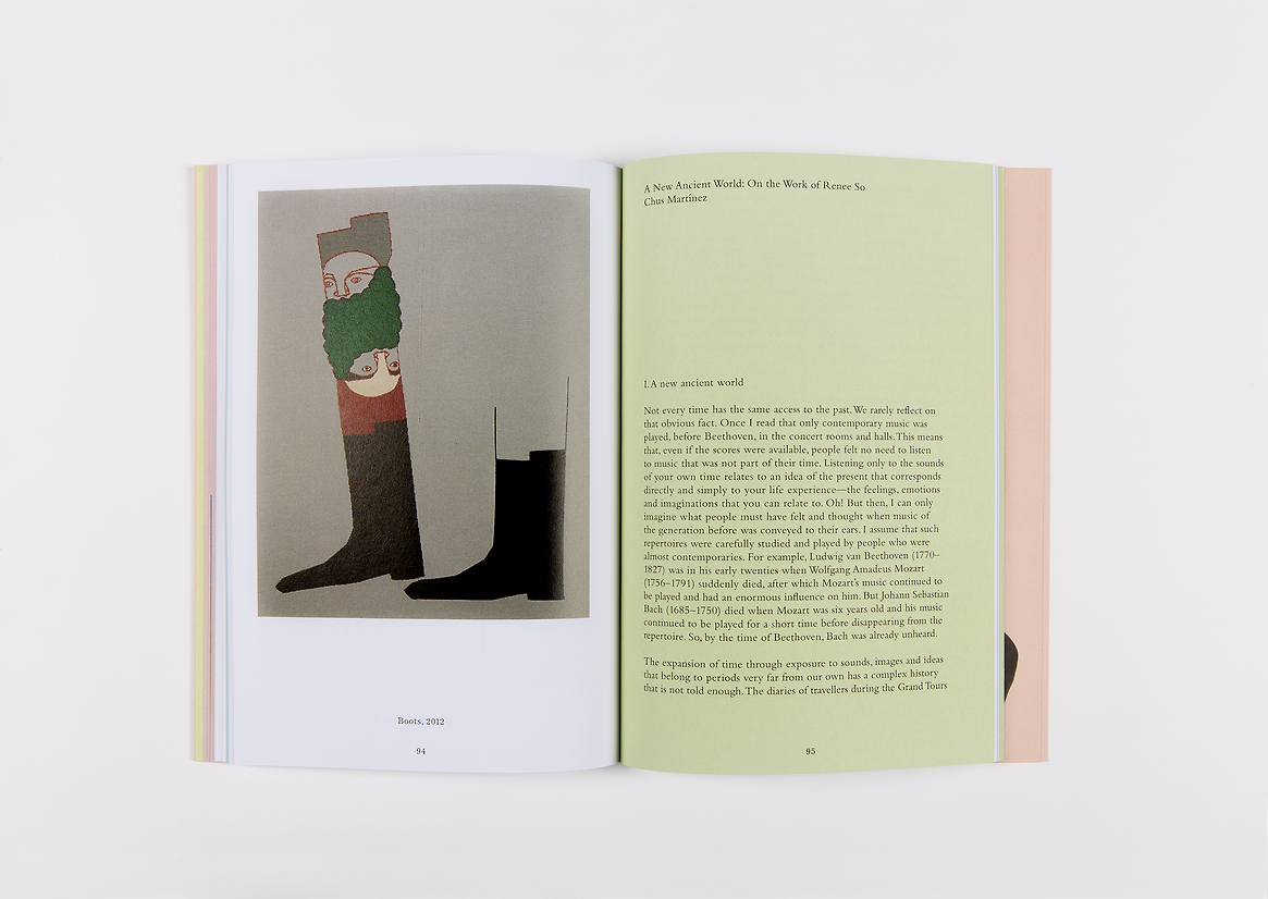
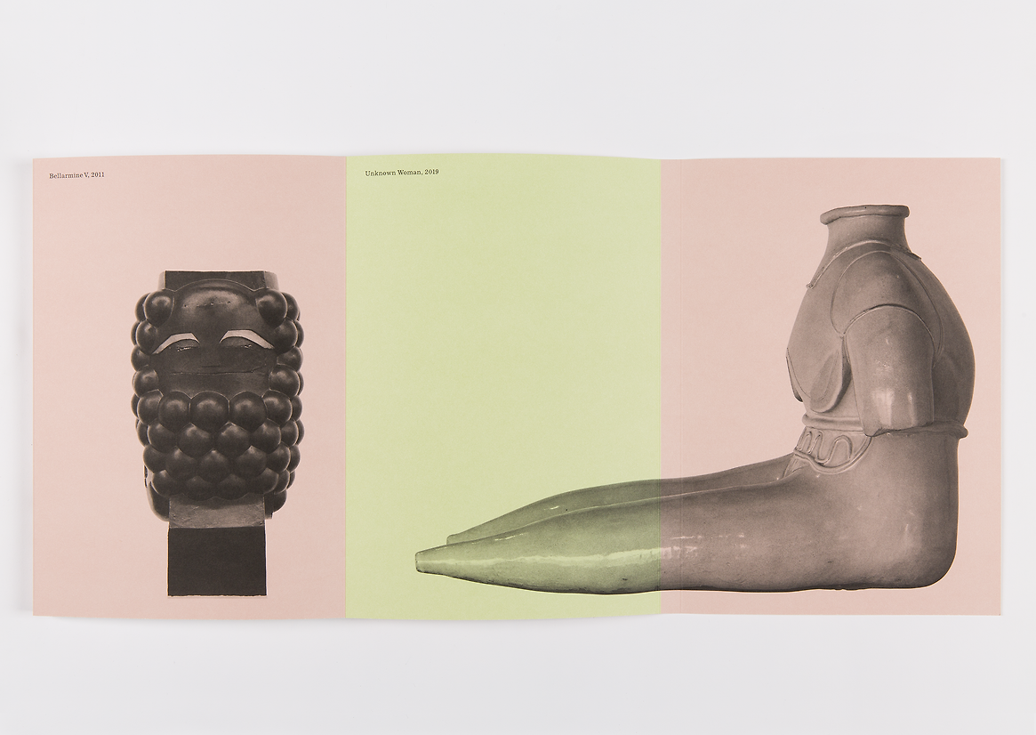
Produced to accompany the artist’s major 2023 survey exhibition at Monash University Museum of Art, Melbourne, ‘Renee So: Provenance’ showcases more than a decade of the artist’s work alongside new writing by Hélène Maloigne and Chus Martínez and a conversation between So and exhibition curator Charlotte Day. It also features illustrations of the diverse art historical influences that inspire So’s works—from the earliest known ceramics to German drinking jugs and objects looted from Yuanmingyuan (the Qing Dynasty Old Summer Palace) by the British and French in the mid nineteenth century.
As interpretations of objects and artefacts from around the world, So’s works have the appearance of being both ancient and contemporary. We approached the design by incorporating a visual index to the artist’s historical sources at the front of the book, with cut-out objects and images that resemble the plate sections of early twentieth-century museum catalogues and encyclopaedic reference books. We used a long fold-out cover with full-page images to lend So’s objects a sense of monumentality and scale (like classical sculpture), giving readers a sense of immersing themselves in the artist’s world. We gave the front cover’s charismatic figurative vessel a clear spot varnish with a grain texture that evokes the tactility of an unglazed pot. The saturated pastel colours that cycle through the book (cover and interspersed text sections) echo and complement the flat colours of the artist’s cartoon-like ‘knitted paintings’ and ceramic glazes. We chose to give each of So’s artworks a strong singular presence by reproducing them on their own in full colour, or in pairs that convey the way that she works with repeated ideas and motifs.
The typographic characteristics across book, from the numbered, cut-out works to formal plates and centred captions (in Excelsior) on the pages, were inspired by formal layouts of twentieth-century reference books, and were balanced with the fresh colour palette and scaled up serif typeface (Bembo, a classic bookface). The large title typeface we drew was inspired by So’s textile works, with their strong square grid structure, and acted as a counterbalance to the museum/encyclopaedic languages explored elsewhere in the book.