Graphic
Mahi Tahi Studio 2 Upon Returning: A Collection of Piano Pieces
-
Pou Auaha / Creative Director
Luke McConnell
-
Kaituhi Matua / Copywriter Lead
Sarah Munro
-
Kaitautoko / Contributors
David Sidwell (Curator), Gravitas Media (Printers) -
Client
Ramp Press (Wintec)
Description:
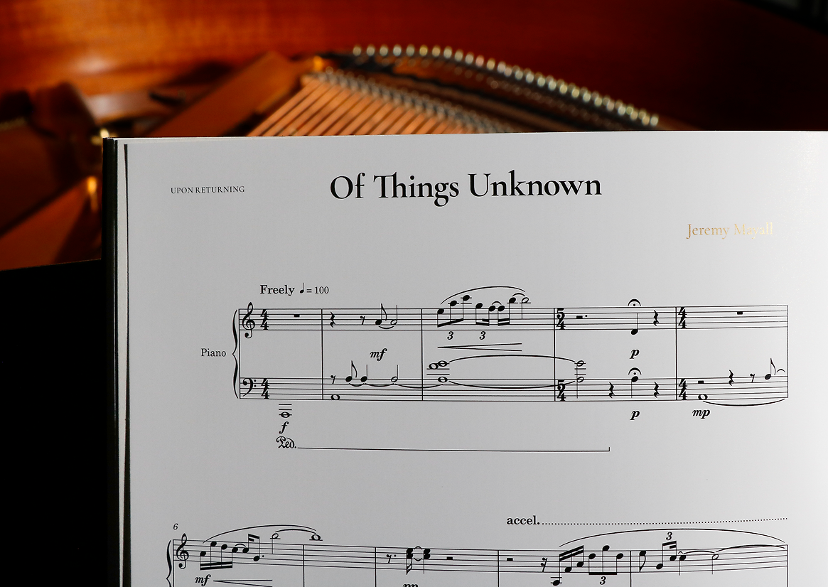
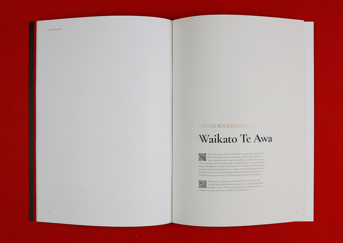
Upon Returning is a piano book that reimagines the design of sheet music through a typographic lens, exploring the shared visual language of music notation and graphic design. Created in collaboration with eight composers from the Waikato, each returning to and completing an unfinished piano piece, the project is both a cultural record and a quiet act of reflection. The brief also included an introductory essay by artist Sarah Munro and studio recordings of each work, accessible via QR code.
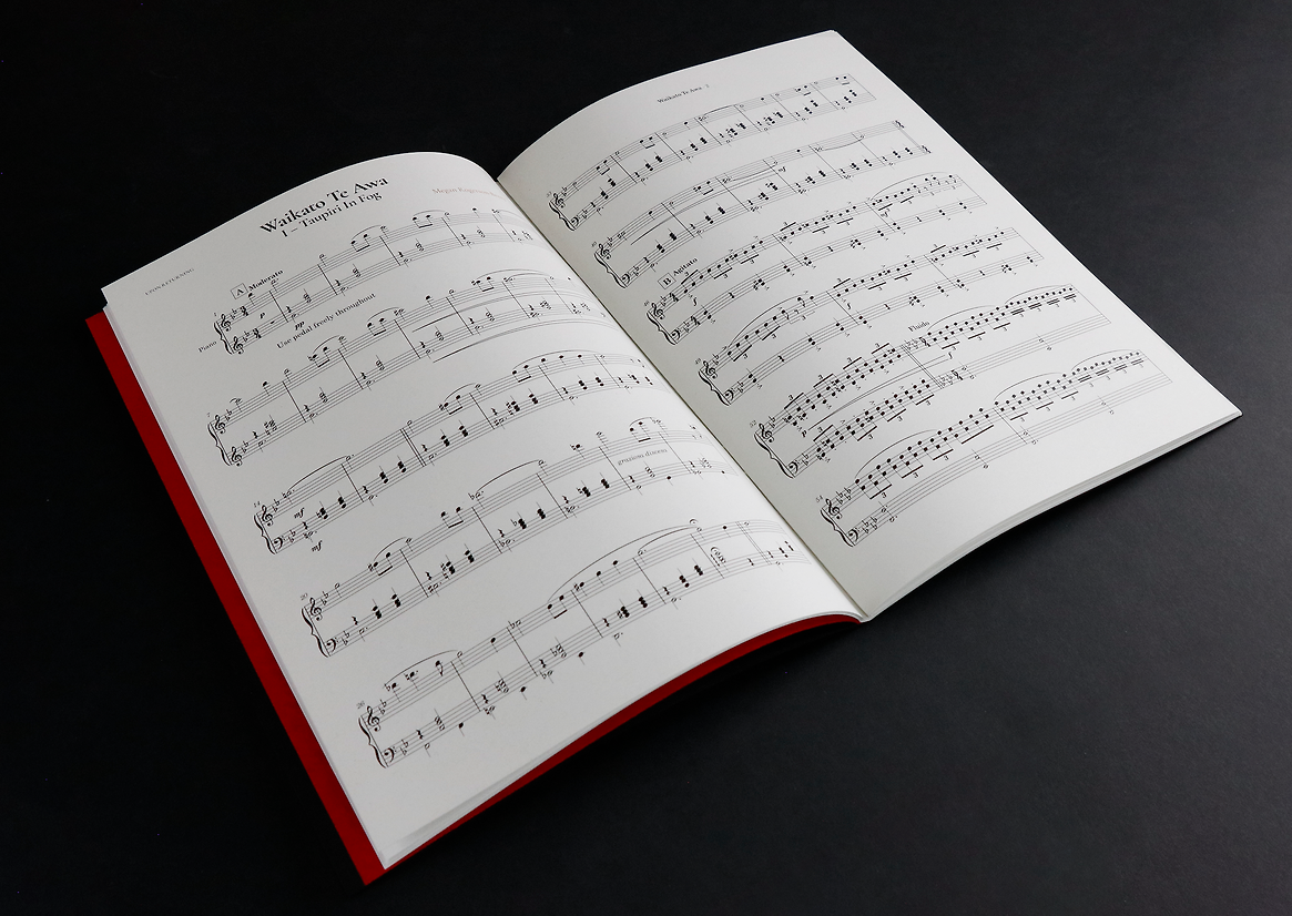
The design centres on the idea of return; composers revisiting old work, the essay meditating on creative re-engagement, and readers invited to circle back, repeat, and pause. Rather than treat sheet music as static content to be packaged, the book approaches notation as a system of symbolic, spatial, and rhythmic meaning. This concept guided the visual language of the publication.
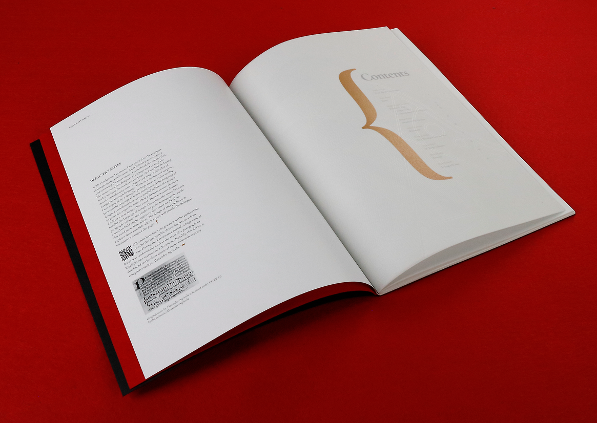
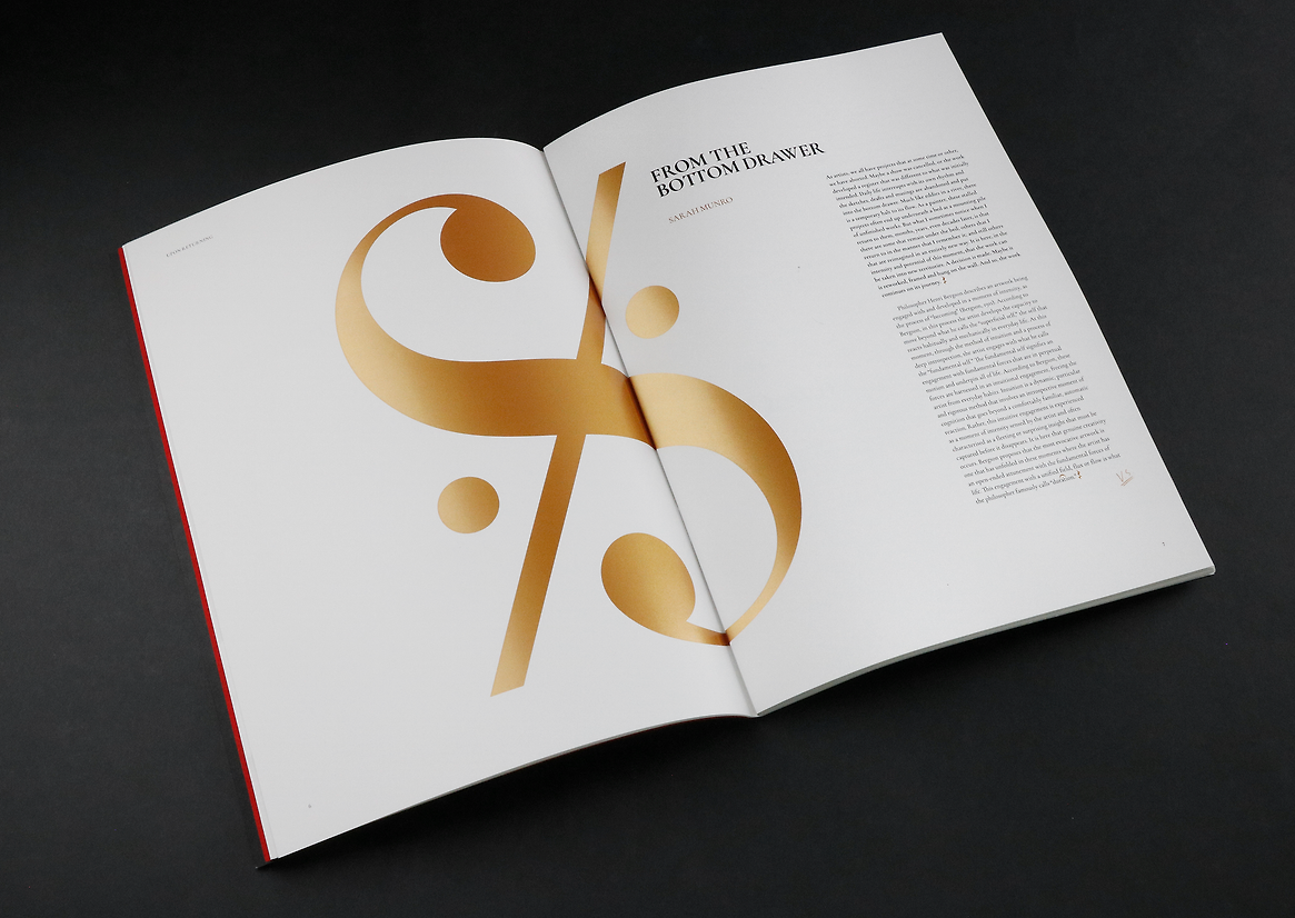
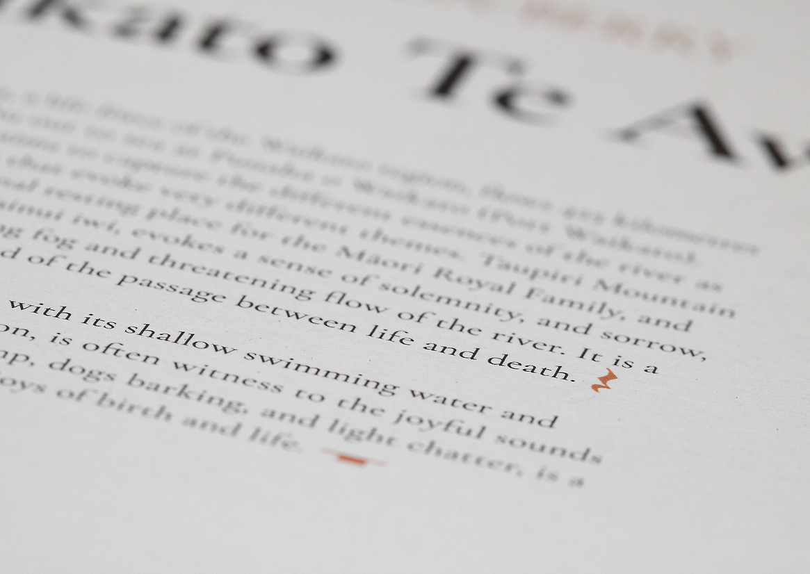
Custom glyphs drawn from musical notation (such as segno, coda, fermata, and rests) are used throughout the book as navigational and expressive devices. For musicians, these symbols suggest repetition, pause, continuation - embedded ways of interpreting a score. In this context, they function as subtle cues for reading, acting like a ‘secret code’ intuitive to those fluent in music, and decorative or curious for others.
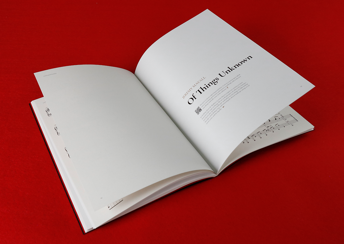
The rhythm of the book is carefully constructed. Rest marks are used to structure paragraph and page breaks, emphasising space and silence. A fermata symbol encourages the reader to dwell for a moment. “V.S.” (volti subito – turn quickly) guides the reader to the second half of the essay. These devices align the pace and structure of reading with the experience of musical performance.
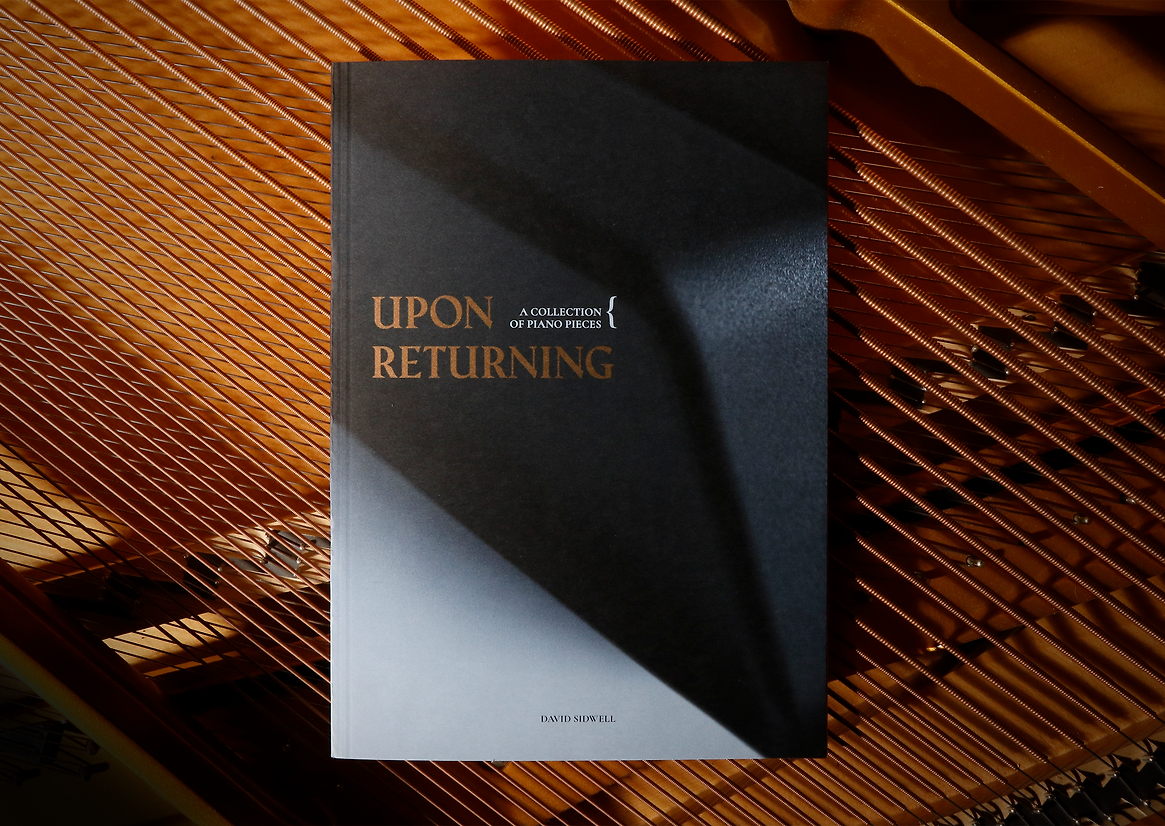
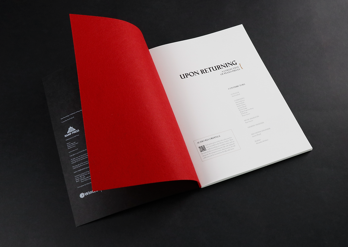
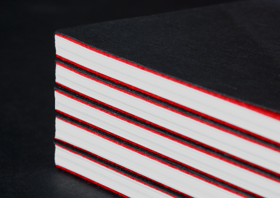
A grand piano was the inspiration for the materials and palette. The cover is black uncoated stock, printed with white and brass-toned metallic ink, showing a close-up of a piano key. Red felt flyleaves nod to the instrument’s internal lining. A subtle use of a frosted stock echoes the morning fog of the Waikato, a recurring image in the composers’ recollections, forging a sensory connection to the whenua. The book uses alternating paper stocks to signal transitions, providing tonal and tactile variation. This added production complexity, especially with saddle-stitch binding and variable-length compositions, requiring detailed planning and prototyping.
Audio recordings are embedded via QR codes integrated into drop cap-like initials, a visual reference to 15th-century music printing and a quiet tribute to the layering of past and present.
Recognised nationally for its innovative use of digital print and craftsmanship, the book defies its modest budget. Through experimentation with layered metallic ink, inverted white-on-black printing, and carefully arranged stock transitions, it shows what’s possible when design ambition meets technical expertise. Achieved through close collaboration with a specialist printer, the result balances precision with creative risk.
Ultimately, Upon Returning is not just a book of music; it is an exploration of how design can embody rhythm, structure, and emotion. The result is a thoughtful, regionally grounded work that elevates the composers’ voices and reflects on the beauty of unfinished things made whole.