Graphic
Graphic Design Work Pty Ltd 3 Stuart Geddes 27 Ziga Testen Studio 7 Let’s Go Outside: Art in Public
-
Pou Auaha / Creative Directors
Stuart Geddes, Žiga Testen
-
Kaitautoko / Contributors
Charlotte Day, Callum Morton and Amy Spiers (eds), Melissa Ratliff -
Client
Monash University Museum of Art, Monash Art Projects and Monash University Publishing
Description:
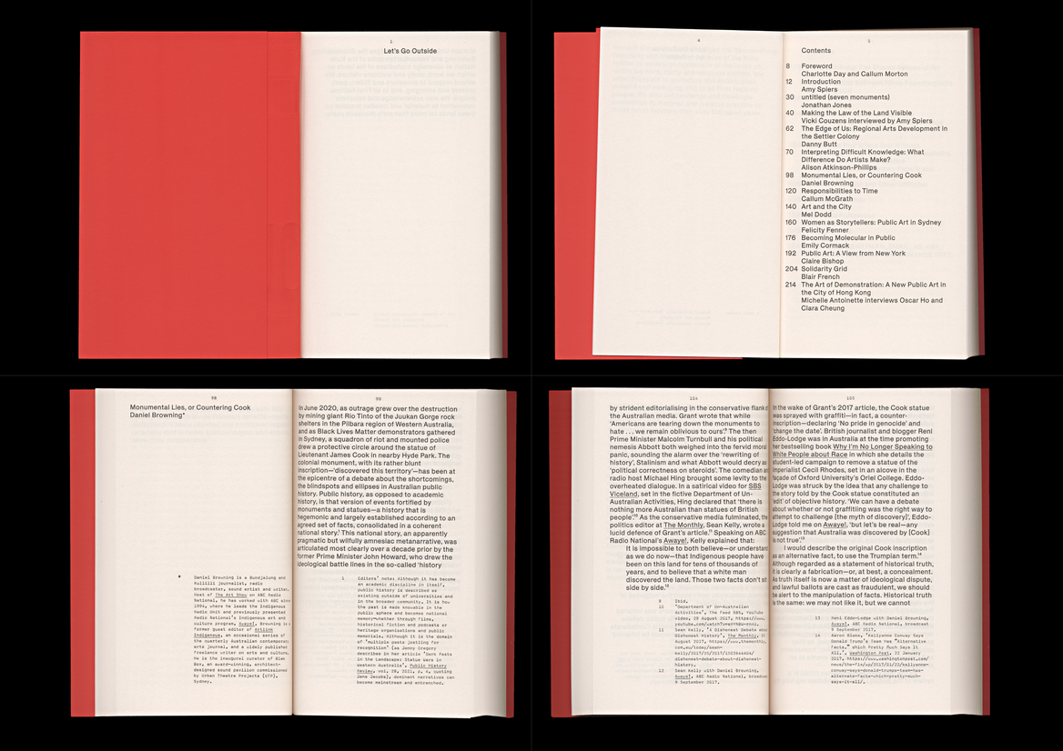
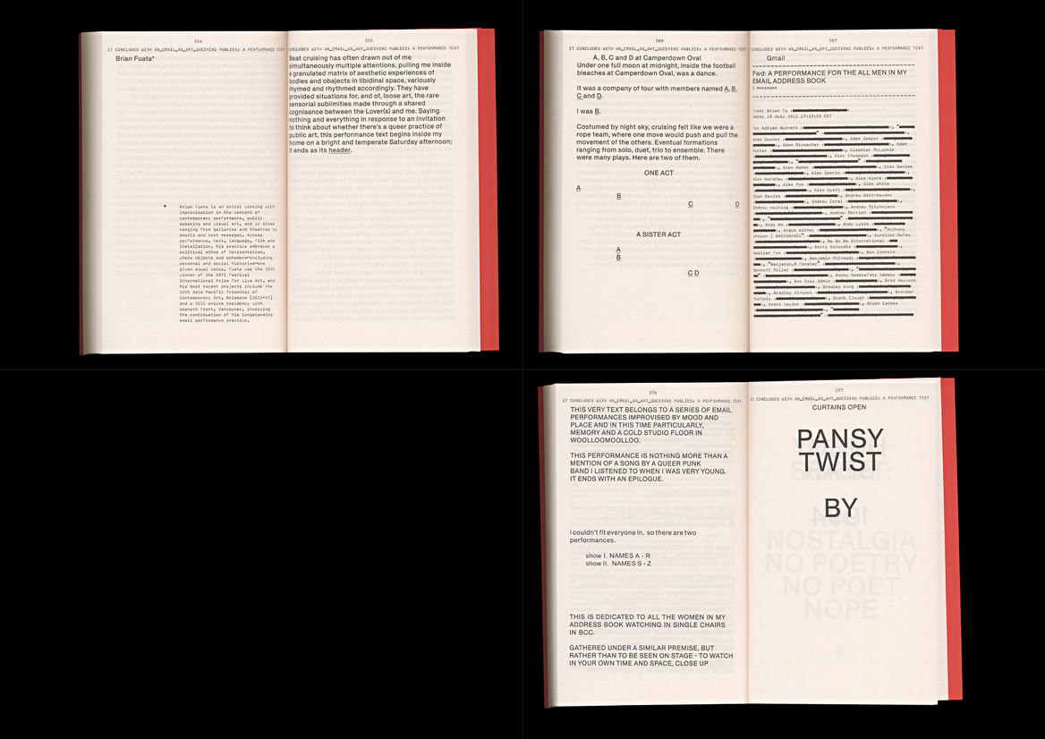
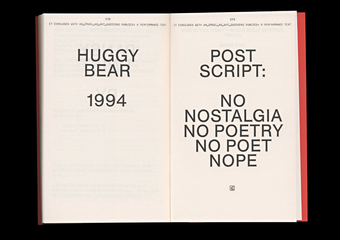
Let’s Go Outside is a reader, a collection of essays, on the topic of Public Art, or Art in Public. The genesis of the reader was a symposium held at Monash University (Melbourne) and presented by Monash University Museum of Art (MUMA) and Monash Art Projects (MAP). After the symposium, the reader was developed through further research and scholarship.
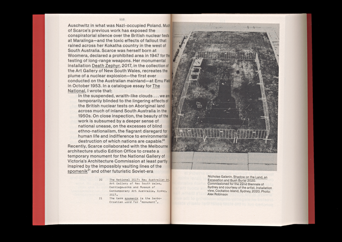
The design of the book plays with the idea of a typography in public, imagining type that has spent time outside, and is variously public, imperfect, messy, eroded, aged. We first worked with Helveesti – a typeface derived from a Soviet-era knock-off of Helvetica with exaggerated photo-typesetting light-traps. It looks pinched, a little faded, a little out of sorts. We paired this with Magda, a slightly wonky typewriter, distressed in the 90s, so aged in a different way. And finally we made the cover with another kind of public type, using Pirelli – designed from the elongated lettering used on roads, so drivers can read them at speed. Imagine it driven over by thousands of cars a day. The combination of the three provides a nice contrast between notes, body copy and cover, when printed they appear warm and readable. Physically it’s an unassuming and purposeful reader, a helpful pocket book, but the cover is all foil on a richly-coloured stock, making it more physical, sculptural.