Graphic
Extended Whānau 63 Reuben Paterson
-
Pou Auaha / Creative Director
Tyrone Ohia
-
Ngā Kaimahi / Team Member
Eva Charlton -
Kaitautoko / Contributors
Reuben Paterson, Aaron Lister, Karl Chitham, Kirsty Baker -
Client
City Gallery Wellington Te Whare Toi
Description:
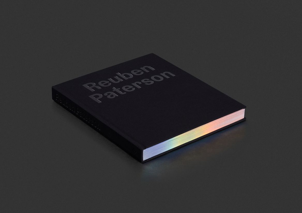
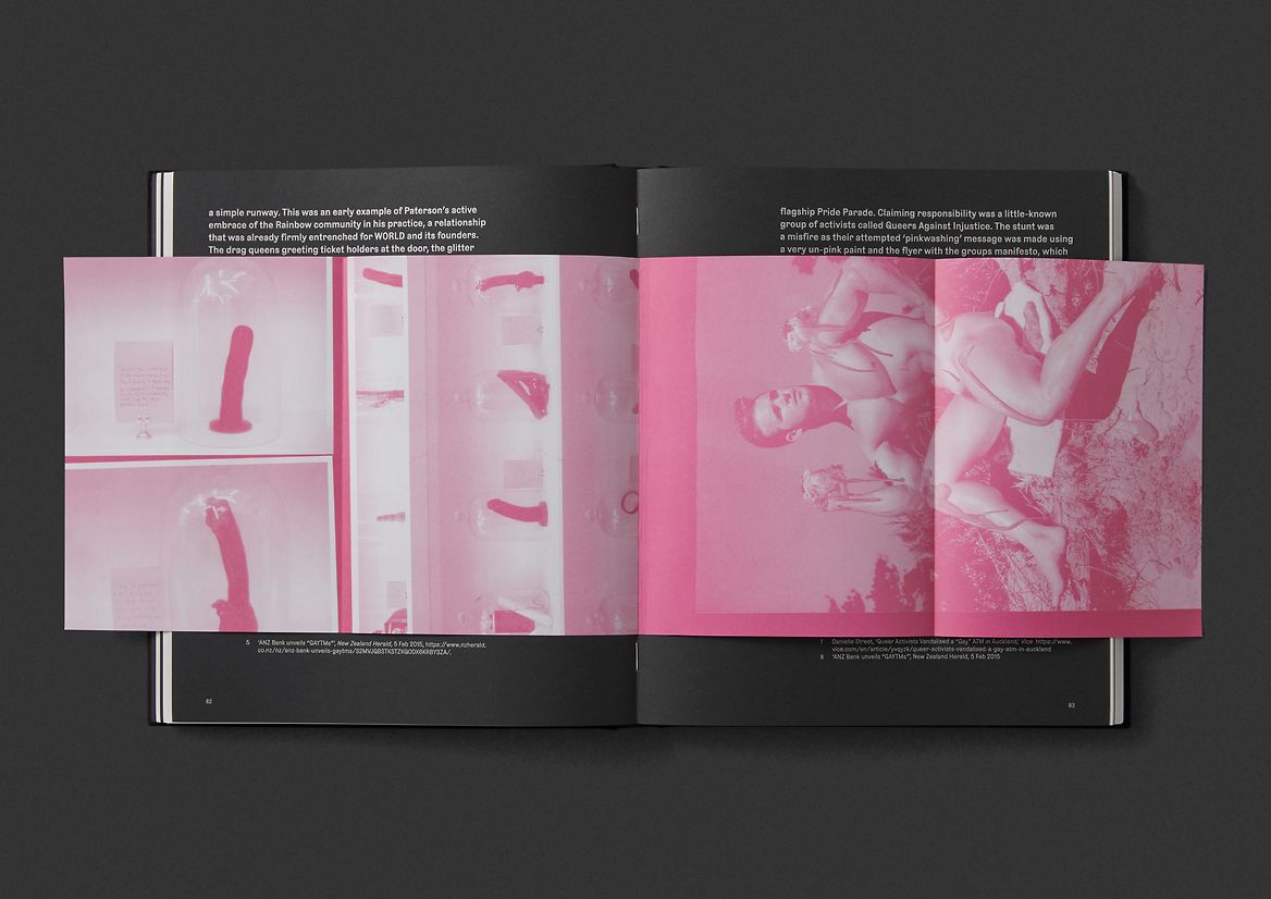
Reuben Paterson, one of Aotearoa's most acclaimed Māori artists, has been dazzling viewers for the past two and a half decades with his dynamic works. We were approached to design his first major book. The purpose of the book was to showcase his work to date, celebrate a recent major retrospective at City Gallery Wellington Te Whare Toi, and to help the artist promote his work and establish himself in the US and NYC art scene.
A key challenge was to design a book that appropriately captured the many facets of Reuben and his practice in a way that would connect with a more global audience. Often utilising glitter, sequins and crystals as art mediums, his body of work sparkles, reflects, refracts and delights in dazzling ways, often exploiting the properties of light. Exploring the idea of light in relation to the materiality of his artworks, and complex themes of Māori whakapapa and identity, became key.
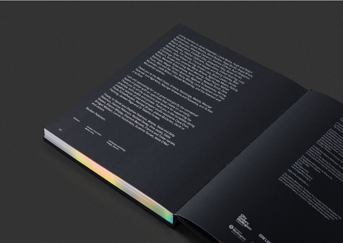
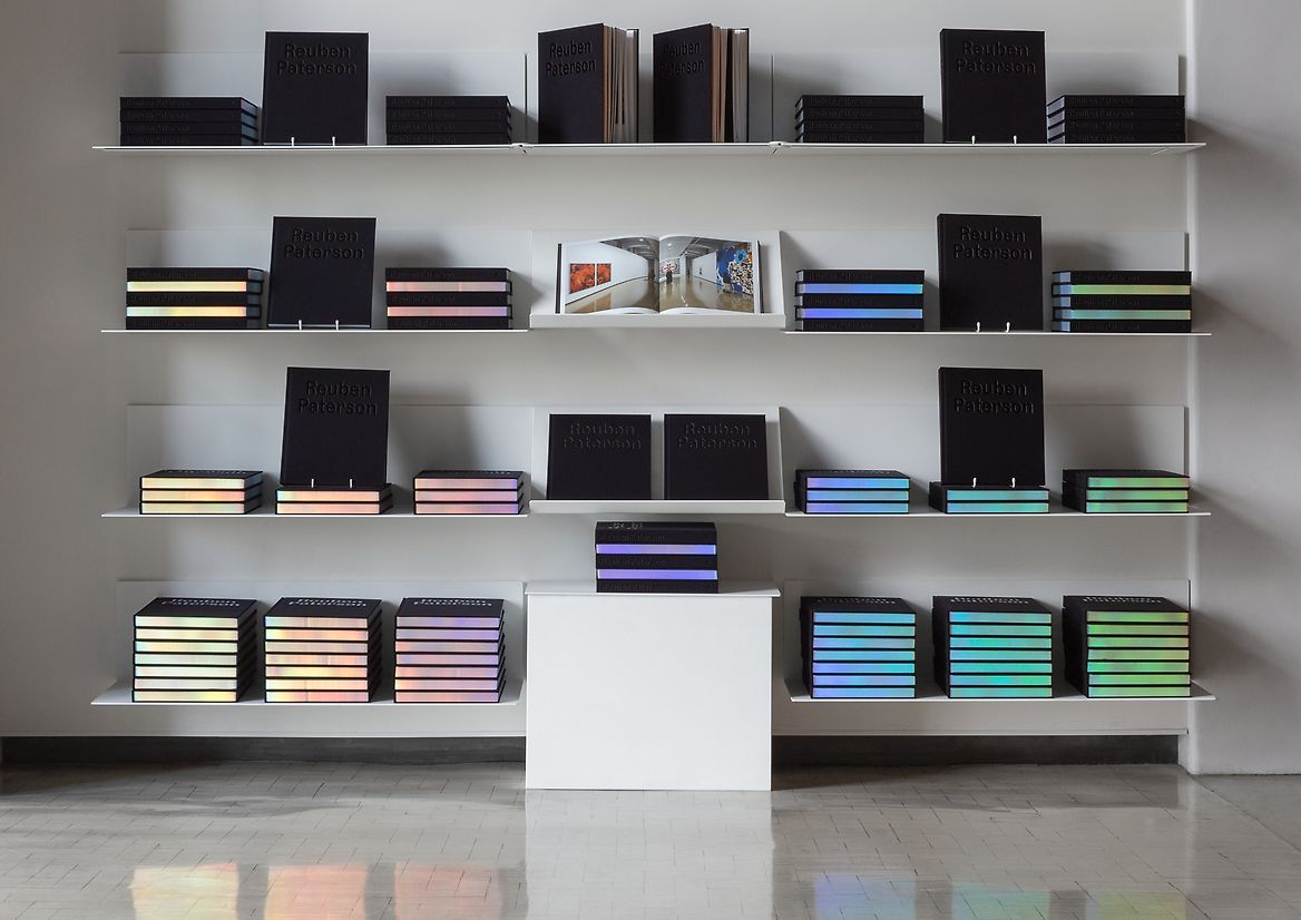
From a Māori perspective, the story of light is wrapped up in our creation stories, moving from te kore (the void) and te pō (the darkness), into te ao mārama (the world of light). This dynamic plays out multiple times throughout the book. Initially, the black fabric cover embodies the absence of light, but the darkness quickly makes way for a dynamic light show through the iridescent guilding on the page edges. A glimmering presence when on display, the book literally casts rainbows of light, paying homage to Reuben's whakapapa, his artworks, and subtly flying the flag for queer identity.
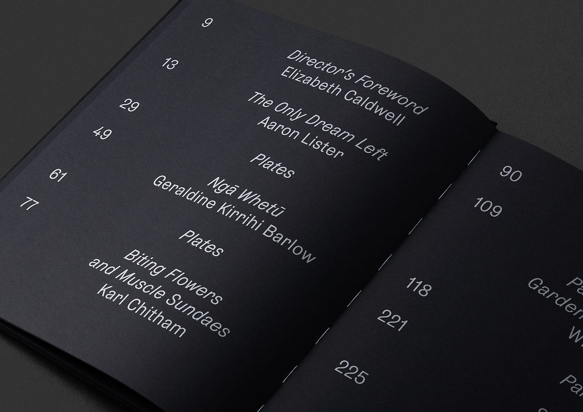
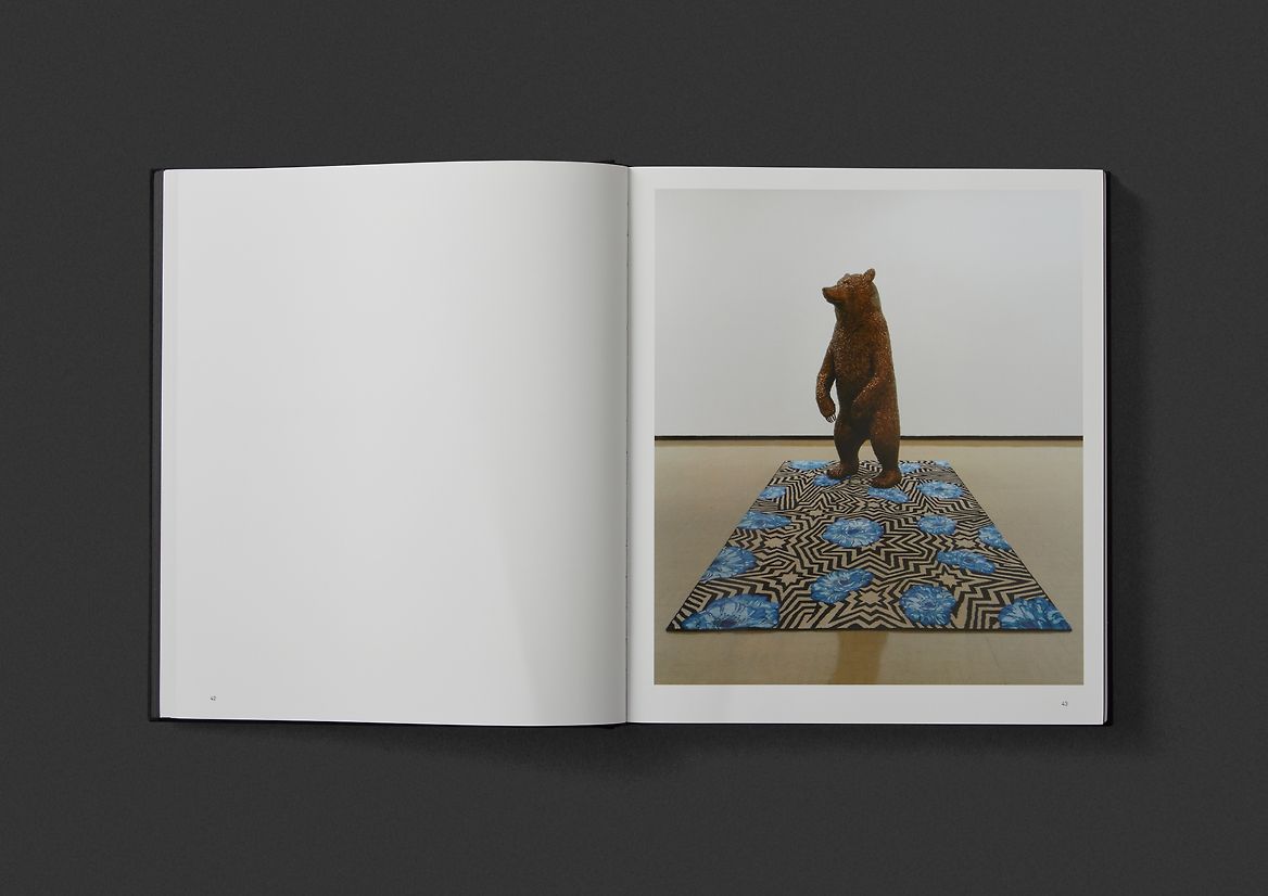
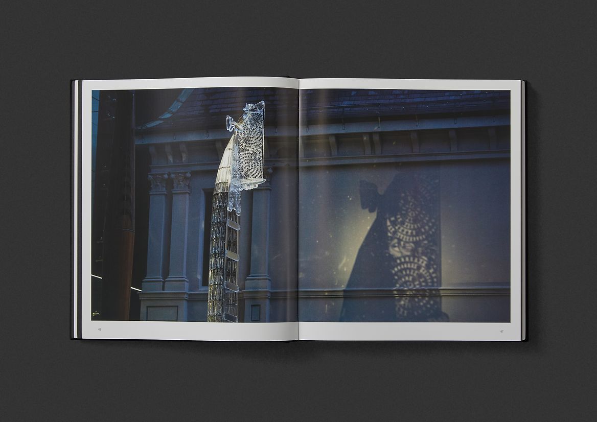
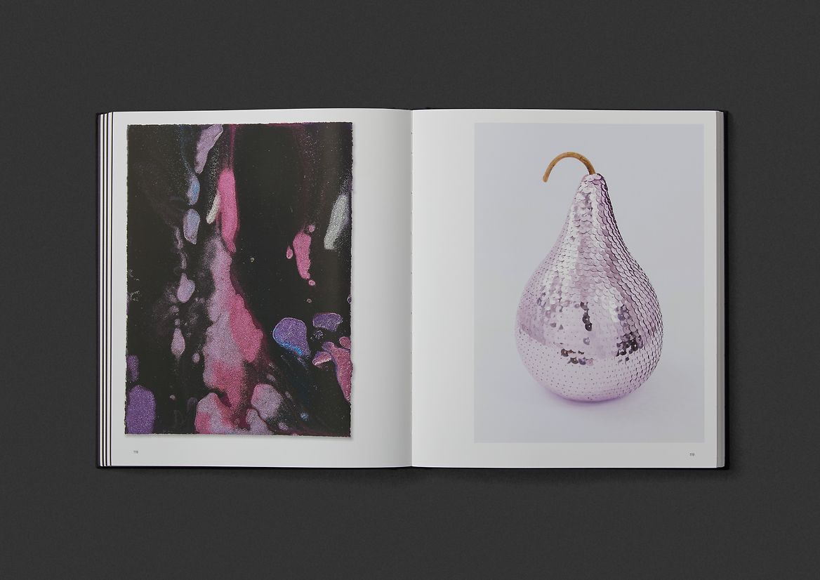
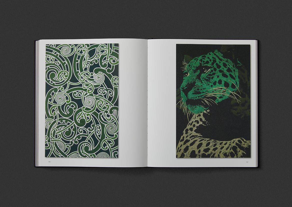
Within the book, sections continue to cycle between darkness and light. All of the texts are printed in metallic silver ink on black paper, offering a muted space for digesting essays. While the plate sections are full colour on gloss white, dramatically spotlighting the artwork images. Further moments of enlightenment occur through interactive foldouts that offer more personal glimpses of the artist and his practice.
From the cover, through to the last page, the book's type and layout treatments are very classical in style. This was an intentional decision helping to position the artists often dazzling and outrageous practice within a global context in which it deserves to be recognised.