Tyrone Ohia, Eva Charlton, Rob Lewis, Max Quinn-Tapara
Client
Marinade Journal
Description:
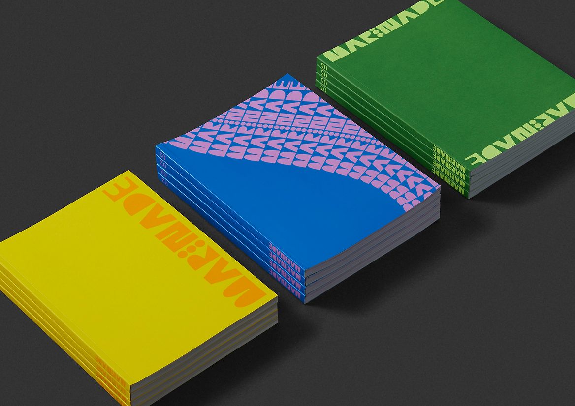
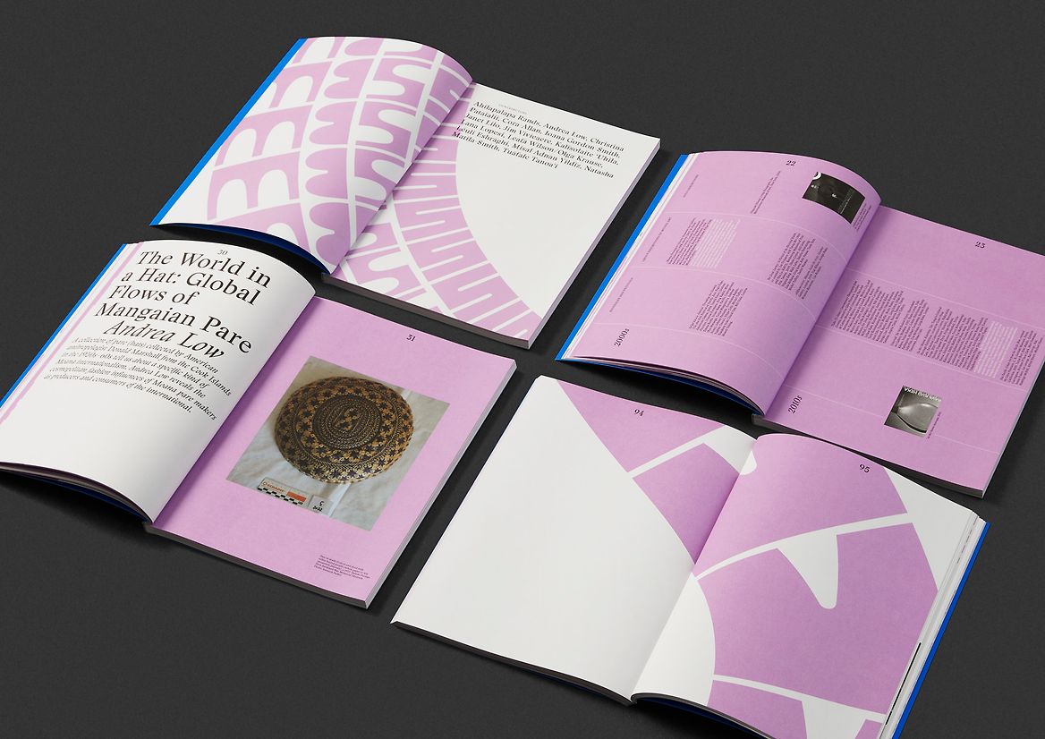
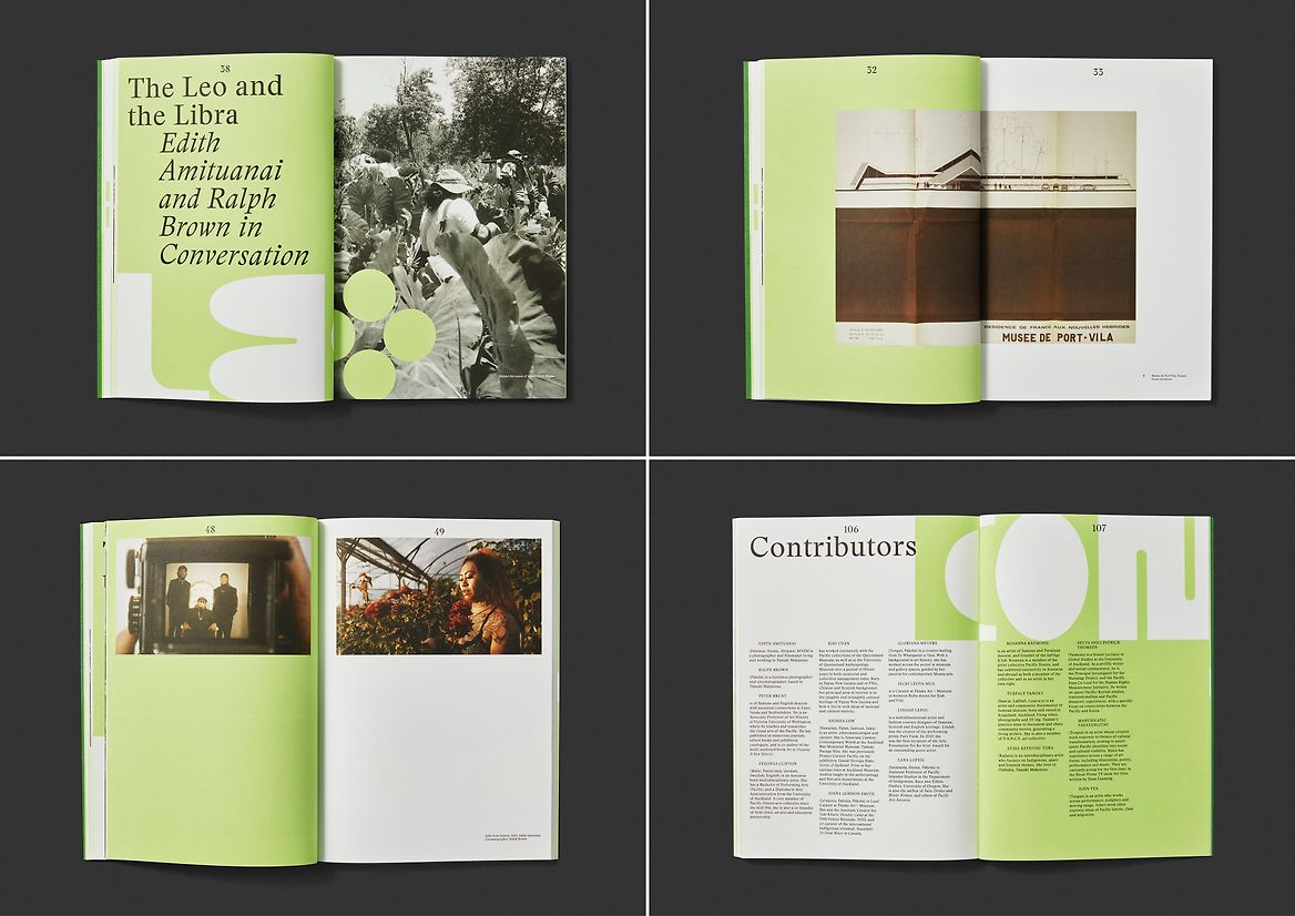
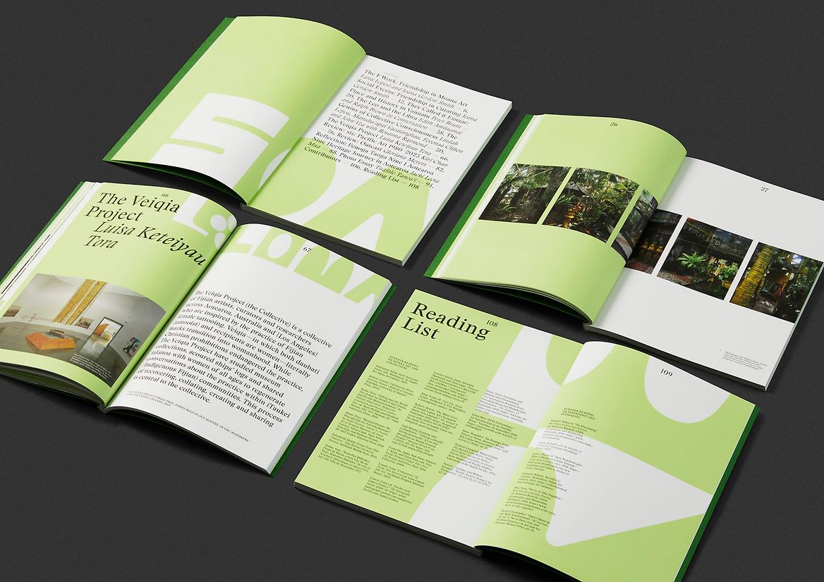
Marinade: Aotearoa Journal of Moana Art is an arts journal co-edited by Ioana Gordon-Smith and Lana Lopesi. It marks the overdue need for more writing on Pacific art, and is the first Aotearoa journal focused explicitly on Moana arts from Aotearoa.
We were asked to design the journal on the premise that we would be setting up an identity system for Marinade that would continue to grow and surprise as each new issue hit the shelf.
Through kōrero with the editors, a clear design personality for the journal was developed. One that shunned the weight and responsibility of being 'the official journal' for Moana Arts in Aotearoa, and instead had a sense of freedom. Marinade is intellectually curious, wacky, chunky and daring. It adds weight to imagination and creativity. It's bigger than the frame, and is free to be what it wants to be.
With this character in mind, we went about designing a custom alphabet to fit the description. One that doesn't take itself too seriously. A full character set was created, and the journal's masthead was set in this flamboyant font.
So far, three issues have been published. With each issue the theme is interpreted through the behaviour of the Marinade typeface. Sometimes the letters become huge visual artefacts, and other times they become a flowing pattern of words and shapes that collide with the copy and imagery. For each issue, vibrant and surprising colour schemes are worked up, and different image treatments are explored to reflect content, and keep people guessing. The counterweight to this is the copy typesetting. While it does have an attitude, it is much more behaved in its attention to craft and the finer details.
For us, the combination is a breath of fresh air in the world of arts journals. One that has fun, but still heavily respects the job it has to do.


Description:
Marinade: Aotearoa Journal of Moana Art is an arts journal co-edited by Ioana Gordon-Smith and Lana Lopesi. It marks the overdue need for more writing on Pacific art, and is the first Aotearoa journal focused explicitly on Moana arts from Aotearoa.
We were asked to design the journal on the premise that we would be setting up an identity system for Marinade that would continue to grow and surprise as each new issue hit the shelf.
Through kōrero with the editors, a clear design personality for the journal was developed. One that shunned the weight and responsibility of being 'the official journal' for Moana Arts in Aotearoa, and instead had a sense of freedom. Marinade is intellectually curious, wacky, chunky and daring. It adds weight to imagination and creativity. It's bigger than the frame, and is free to be what it wants to be.
With this character in mind, we went about designing a custom alphabet to fit the description. One that doesn't take itself too seriously. A full character set was created, and the journal's masthead was set in this flamboyant font.
So far, three issues have been published. With each issue the theme is interpreted through the behaviour of the Marinade typeface. Sometimes the letters become huge visual artefacts, and other times they become a flowing pattern of words and shapes that collide with the copy and imagery. For each issue, vibrant and surprising colour schemes are worked up, and different image treatments are explored to reflect content, and keep people guessing. The counterweight to this is the copy typesetting. While it does have an attitude, it is much more behaved in its attention to craft and the finer details.
For us, the combination is a breath of fresh air in the world of arts journals. One that has fun, but still heavily respects the job it has to do.