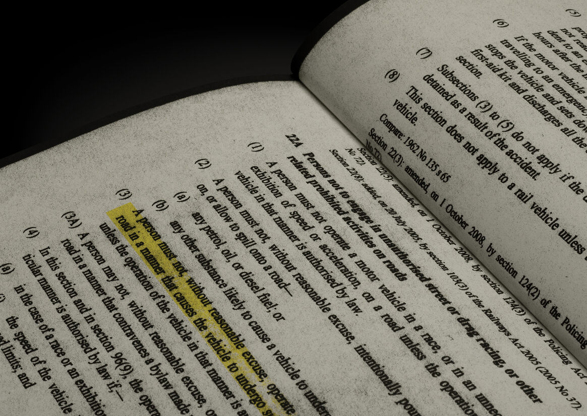
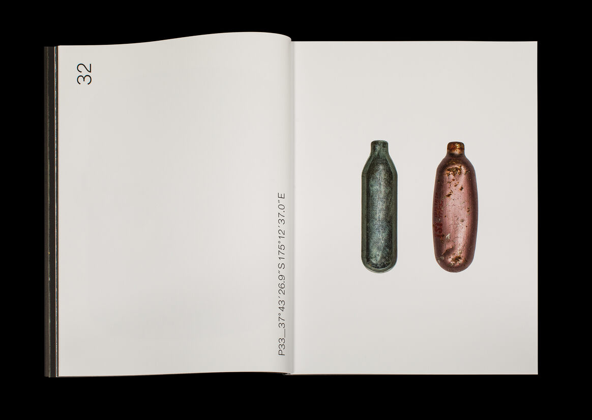
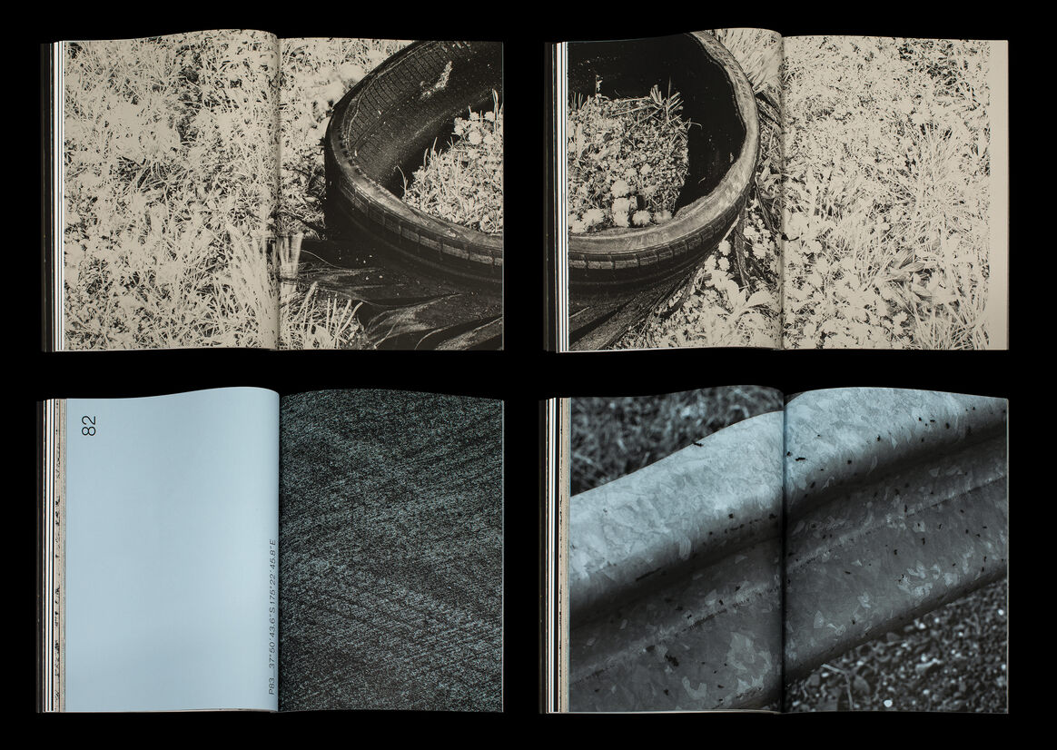
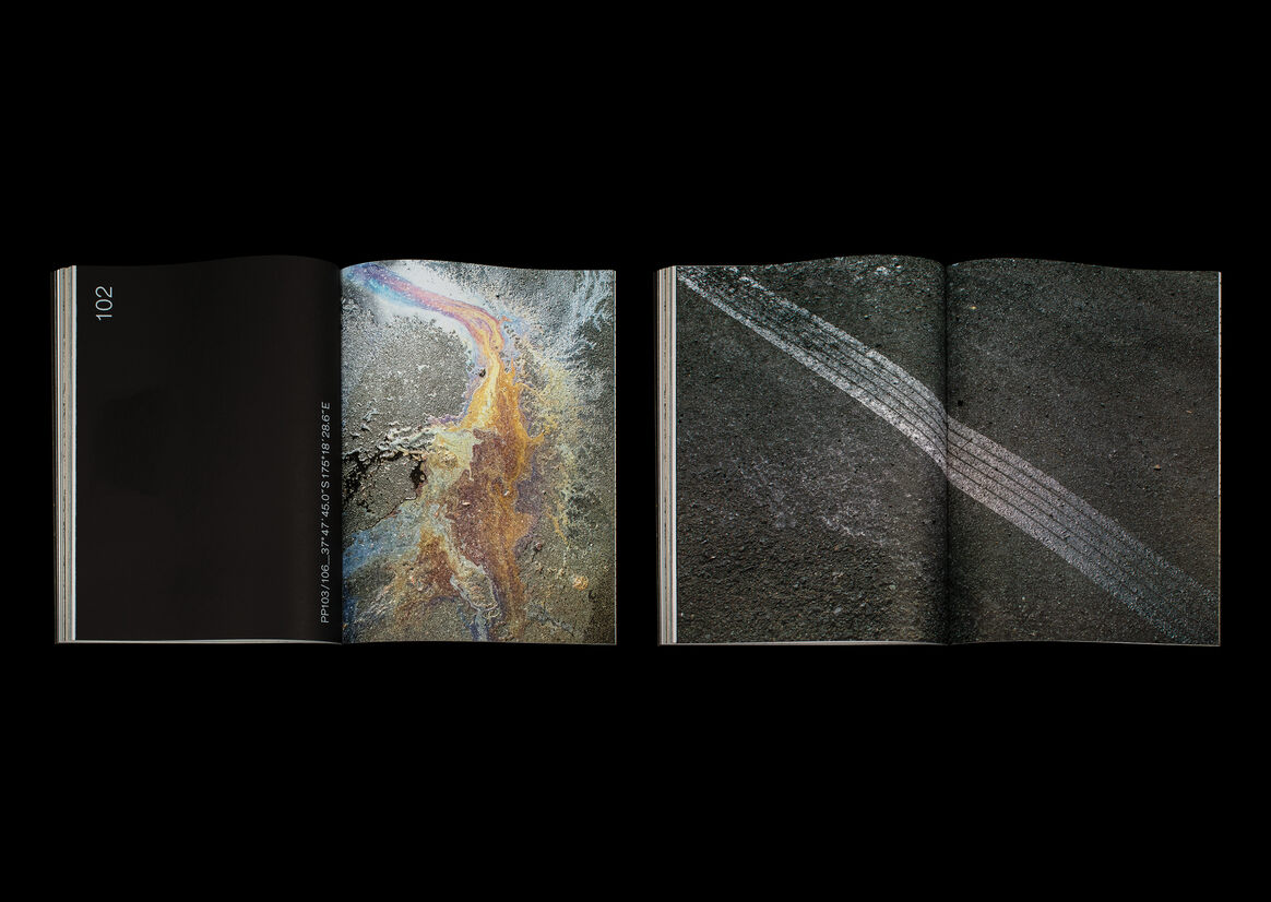
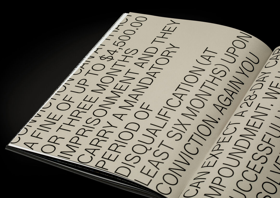
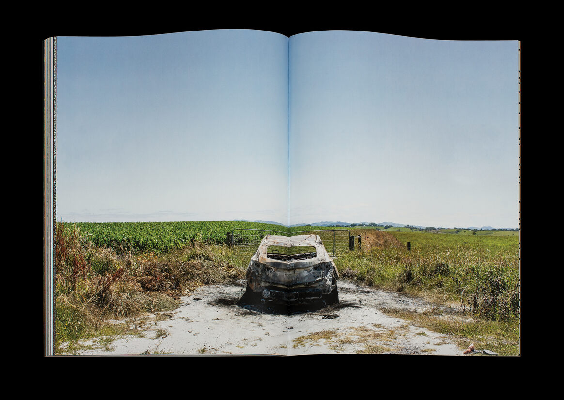
The design of SLT is primarily about a collaborative exploration of materials and print processes to reflect a speculative post-event narrative. We wanted to playfully explore the violent, ugly act of the burnout with the often beautiful, or at least curious, traces found by the photographer in the following days. Utilising the GPS coordinates for the captions anchor these found artefacts to specific sites and create a sense of forensic exploration. The insertion of legal documentation and texts also provide clues.
The cover binding is unconventional and is abrasive in the tradition of the ‘auto-destructive’ sandpaper covers of the Situationists, eliciting a sense of public nuisance. The book is primarily set in a nocturnal space with the reversed mono-linear sans serif reminding us of typography found on tire walls and the fixed tire widths of the burnout marks themselves. Type is orientated vertically to maximise long line lengths and set at scale to carry a sense of loudness.
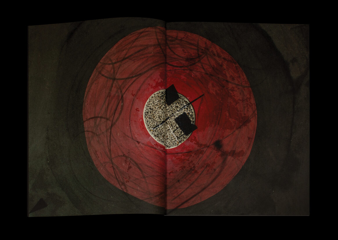
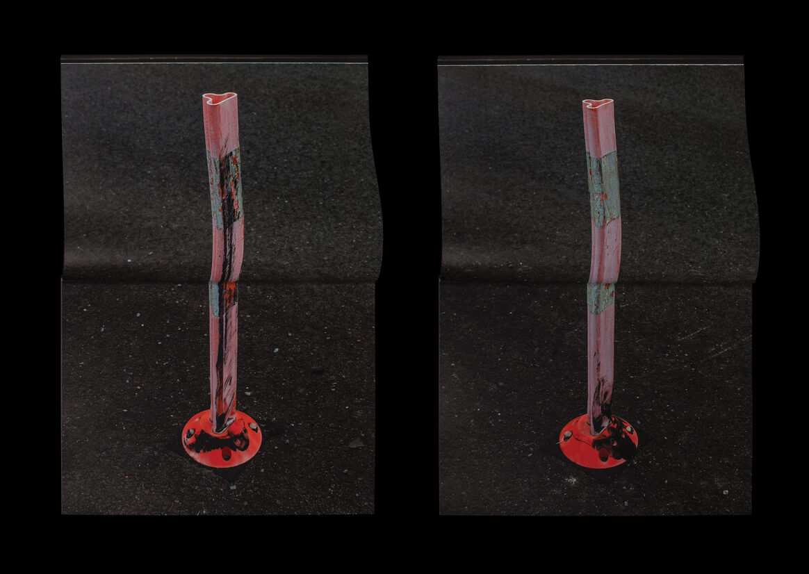
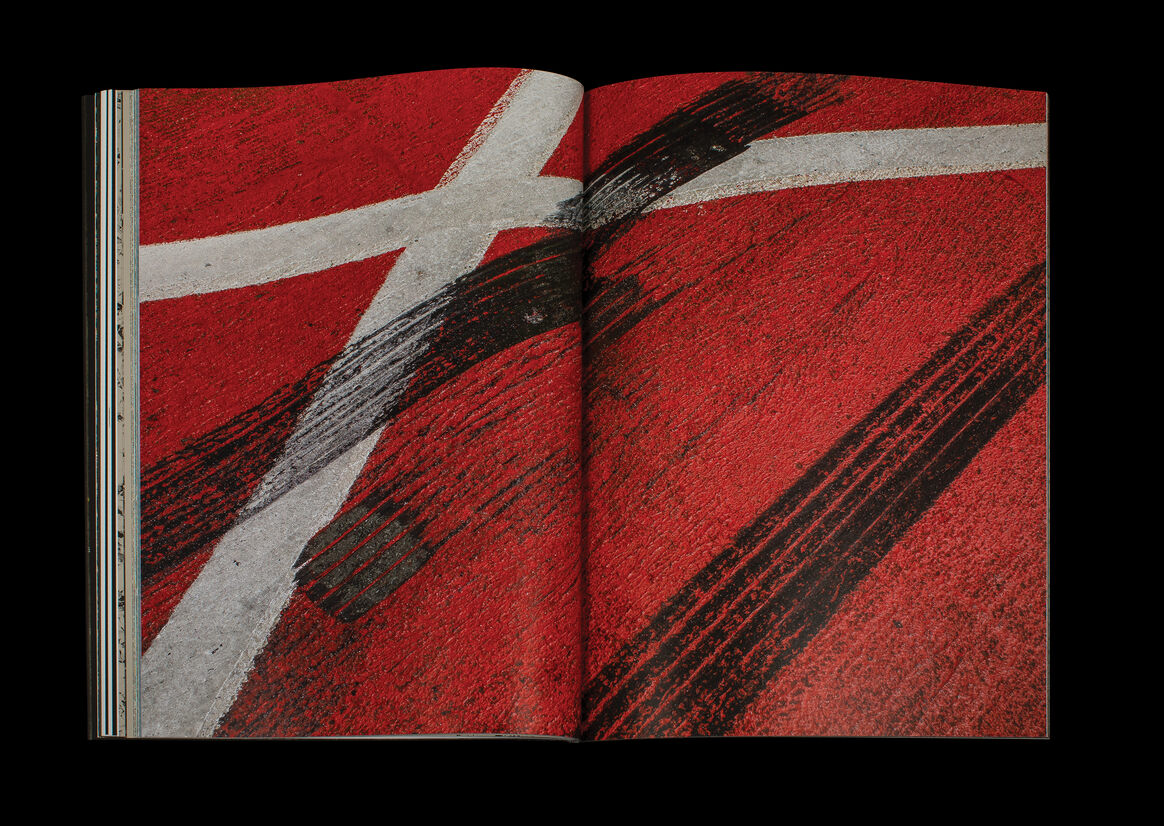
The use of various paper stocks convey multiple narratives inserted at key moments in the book for dynamic pacing and experience. The pristine white coated paper evokes a gallery or laboratory space, re-contextualising and fetishising the objects — some of which have molten jewel-like qualities. The gestural burnout marks and hyper-detailed asphalt make us think of Brutalist and Abstract Expressionist mark-making traditions. Plain uncoated stocks assume the aesthetic of utility while the metallic stock heightens the incandescent sheen of spilt petroleum. The overprinted blue paper captures the stillness and beauty of a moonlit evening, belying the extreme violence, acridity and visceral destruction of the burnout.

Description:
SLT
The design of SLT is primarily about a collaborative exploration of materials and print processes to reflect a speculative post-event narrative. We wanted to playfully explore the violent, ugly act of the burnout with the often beautiful, or at least curious, traces found by the photographer in the following days. Utilising the GPS coordinates for the captions anchor these found artefacts to specific sites and create a sense of forensic exploration. The insertion of legal documentation and texts also provide clues.
The cover binding is unconventional and is abrasive in the tradition of the ‘auto-destructive’ sandpaper covers of the Situationists, eliciting a sense of public nuisance. The book is primarily set in a nocturnal space with the reversed mono-linear sans serif reminding us of typography found on tire walls and the fixed tire widths of the burnout marks themselves. Type is orientated vertically to maximise long line lengths and set at scale to carry a sense of loudness.
The use of various paper stocks convey multiple narratives inserted at key moments in the book for dynamic pacing and experience. The pristine white coated paper evokes a gallery or laboratory space, re-contextualising and fetishising the objects — some of which have molten jewel-like qualities. The gestural burnout marks and hyper-detailed asphalt make us think of Brutalist and Abstract Expressionist mark-making traditions. Plain uncoated stocks assume the aesthetic of utility while the metallic stock heightens the incandescent sheen of spilt petroleum. The overprinted blue paper captures the stillness and beauty of a moonlit evening, belying the extreme violence, acridity and visceral destruction of the burnout.