Graphic
TBWA 2 Alistair McCready Melanoma Font
-
Pou Auaha / Creative Directors
Shane Bradnick, Guy Roberts
-
Ringatoi Matua / Design Directors
Emily Osborne, Simone Louis, Mike Davison
-
Ngā Kaimahi / Team Members
Catherine Harris, Kate Heatley, Mark Paisey, Jonny Kofoed, Alistair McCready -
Kaitautoko / Contributors
Alistair McCready, Jonny Kofoed -
Client
Melanoma New Zealand
Description:
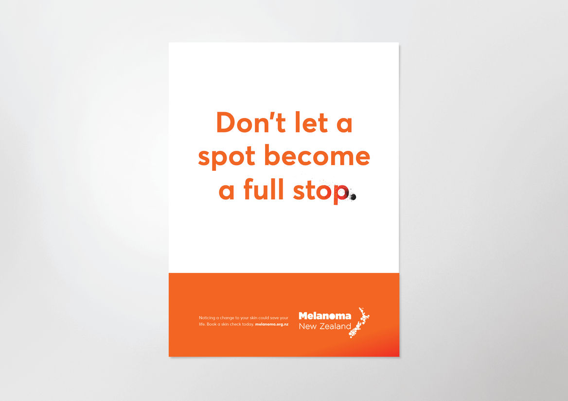
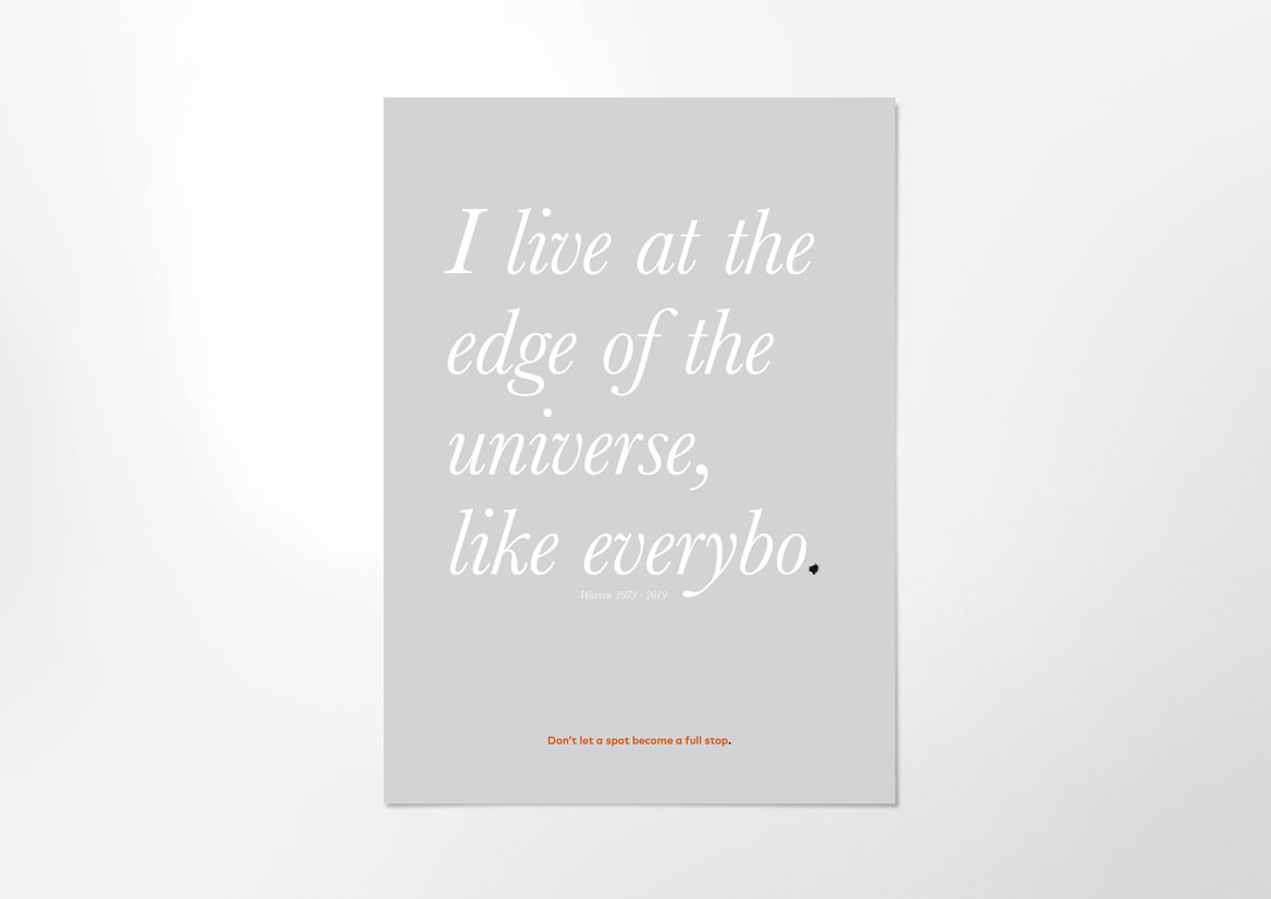
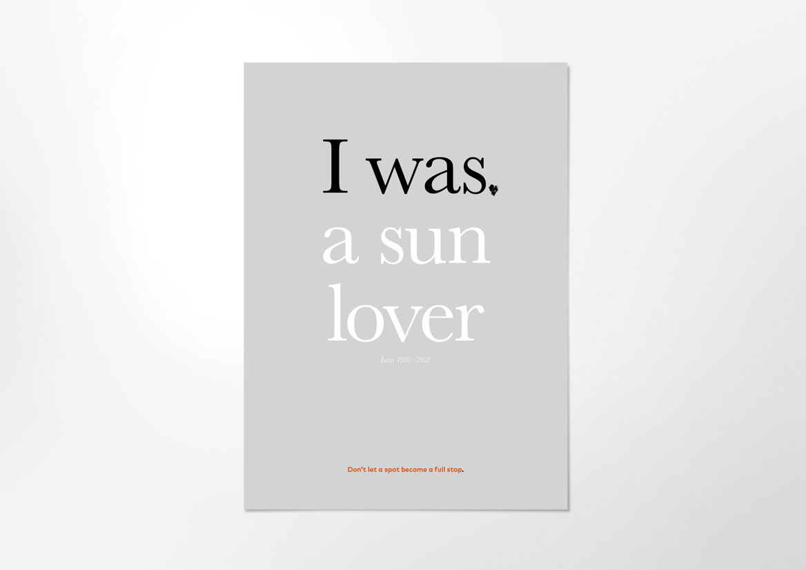
New Zealand has the highest per capita rate of Melanoma in the world. More people die of Melanoma than on our roads. But if detected early, there is a good chance of survival - which can be as simple as noticing changes to spots on your body. Unfortunately, these changes often go undetected.
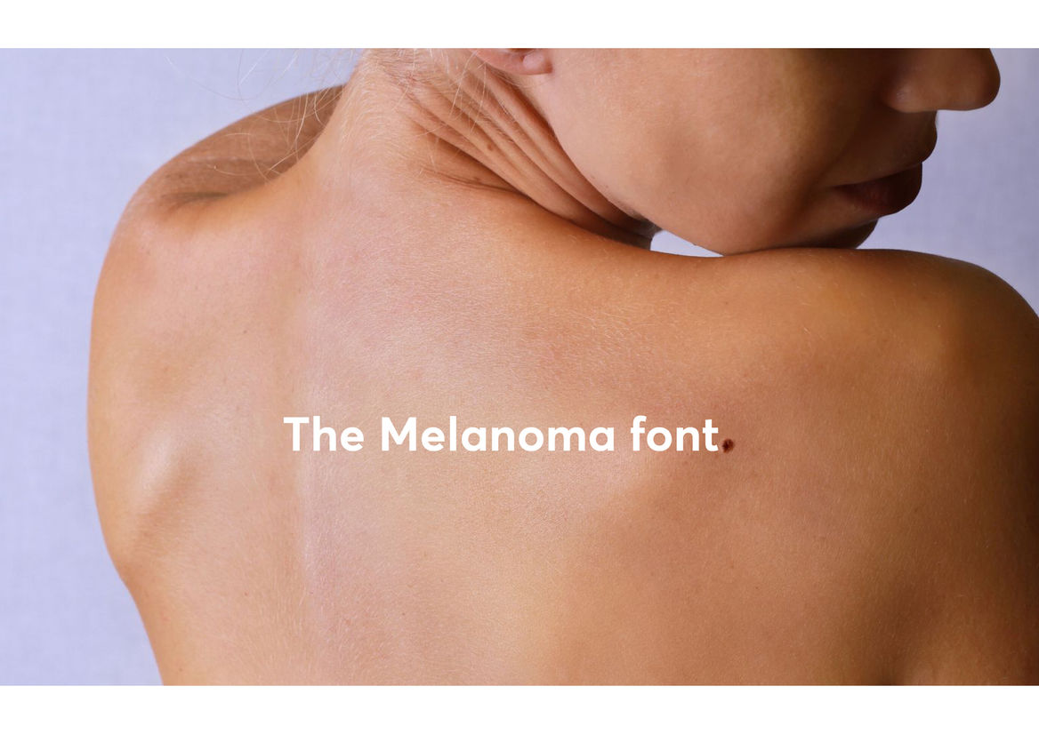
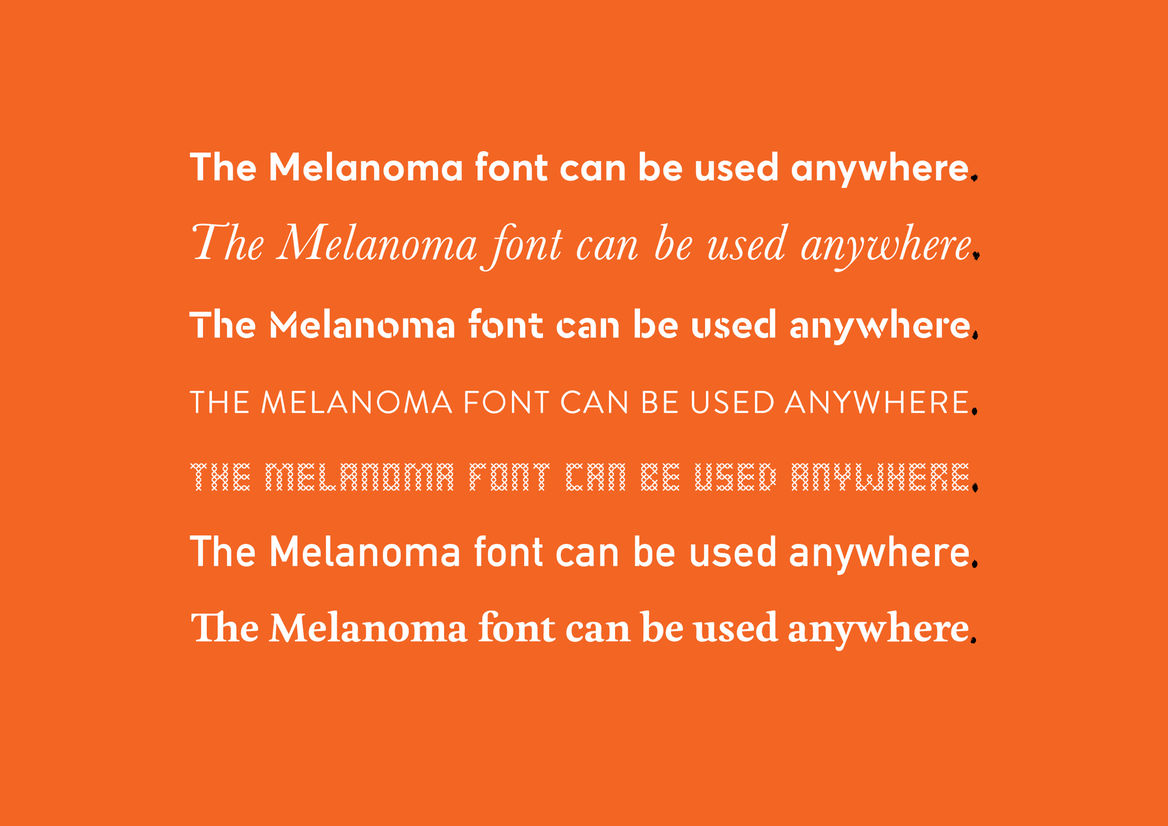
The Melanoma Typeface is a font that taught an entire nation to take a second look at their spots.
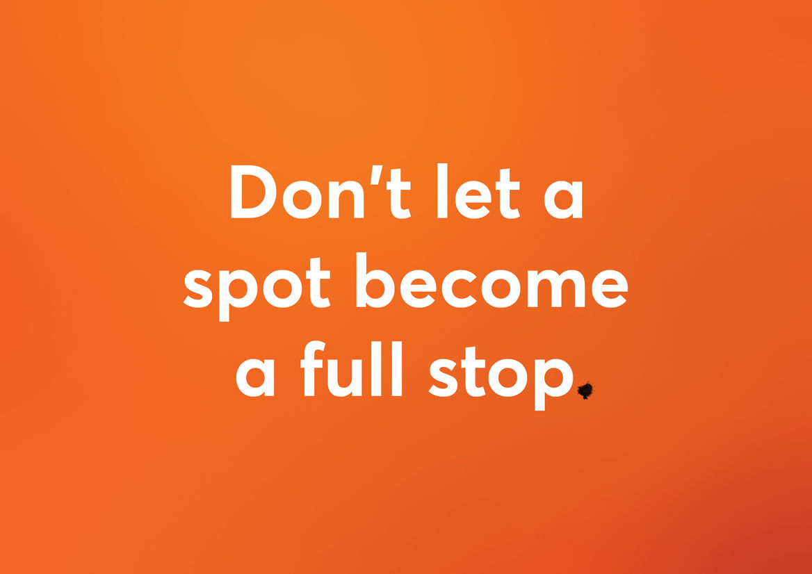
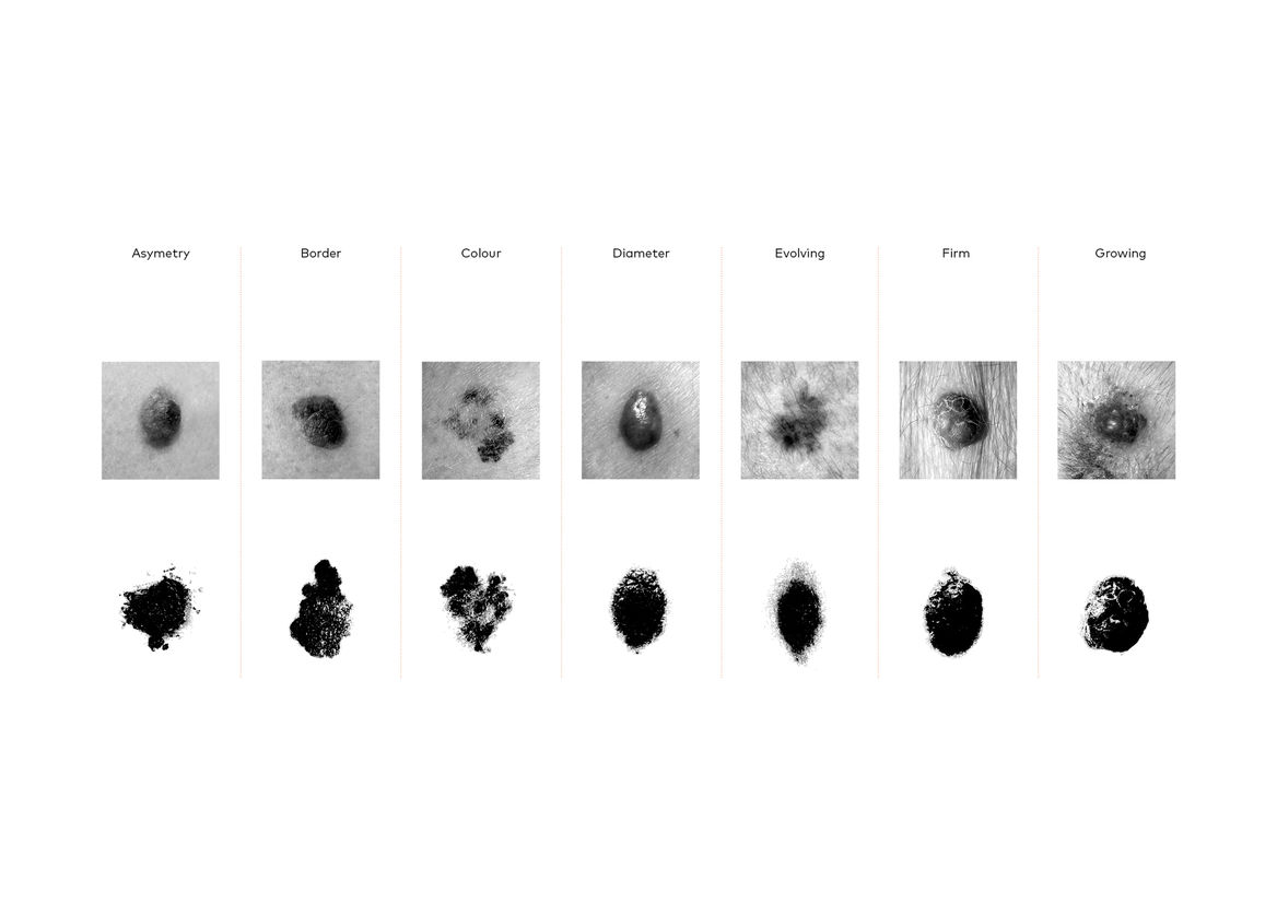
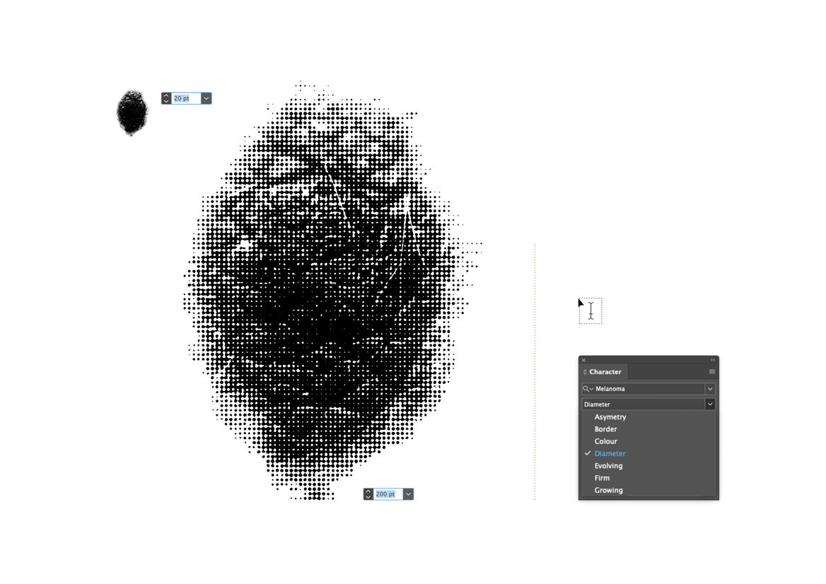
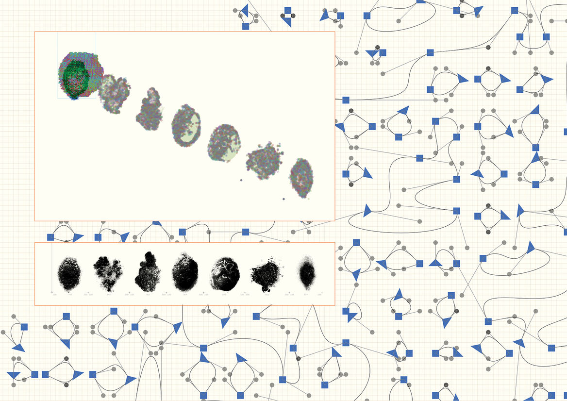
We created a usable font, made up of seven glyphs of a single character - the full stop. Each glyph was designed in partnership with New Zealand medical professionals to accurately represent one of the visual symptoms of Melanoma. When viewed at a small size, the glyphs all look like slightly misshapen full stops. But as point size increased, more and more detail is revealed in each character, until the true nature of each spot is impossible to ignore.
These seven simple characters could turn any piece of design or messaging into a melanoma awareness campaign, simply by swapping out their full stop for ours.
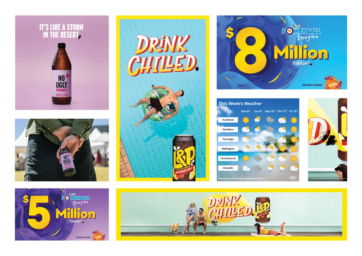
Because everything was wrapped up in a small .TTF file, it was easy to provide to brand and design partners to incorporate into their own communications. We were able to provide the font to Coca Cola, NZ Lotteries, OOHMA NZ, Metservice and other brands over the summer period, and they were all able to use The MelanomaTypeface in their comms without otherwise interfering with their brand guidelines.
Our Melanoma Typeface transformed regular communications into an educational piece, showing the public that a cancerous spot can hide in plain sight.