Graphic
studio juniper 3 Gin Drinkers Line: Three Colours
-
Pou Auaha / Creative Directors
Christina Biliouri, Danai Issaris
-
Ringatoi Matua / Design Director
Christina Biliouri
-
Ngā Kaimahi / Team Member
Danai Issaris (Photography & Post Production) -
Client
Gin Drinkers Line
Description:
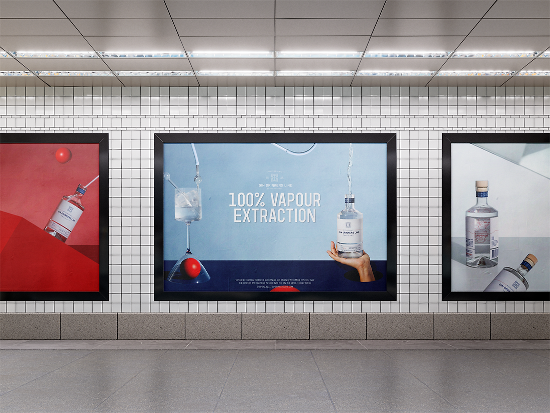
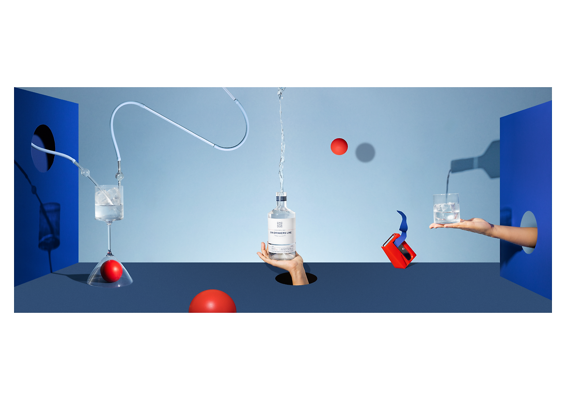
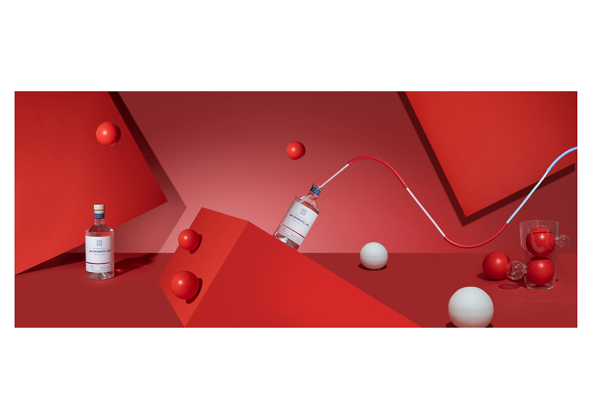
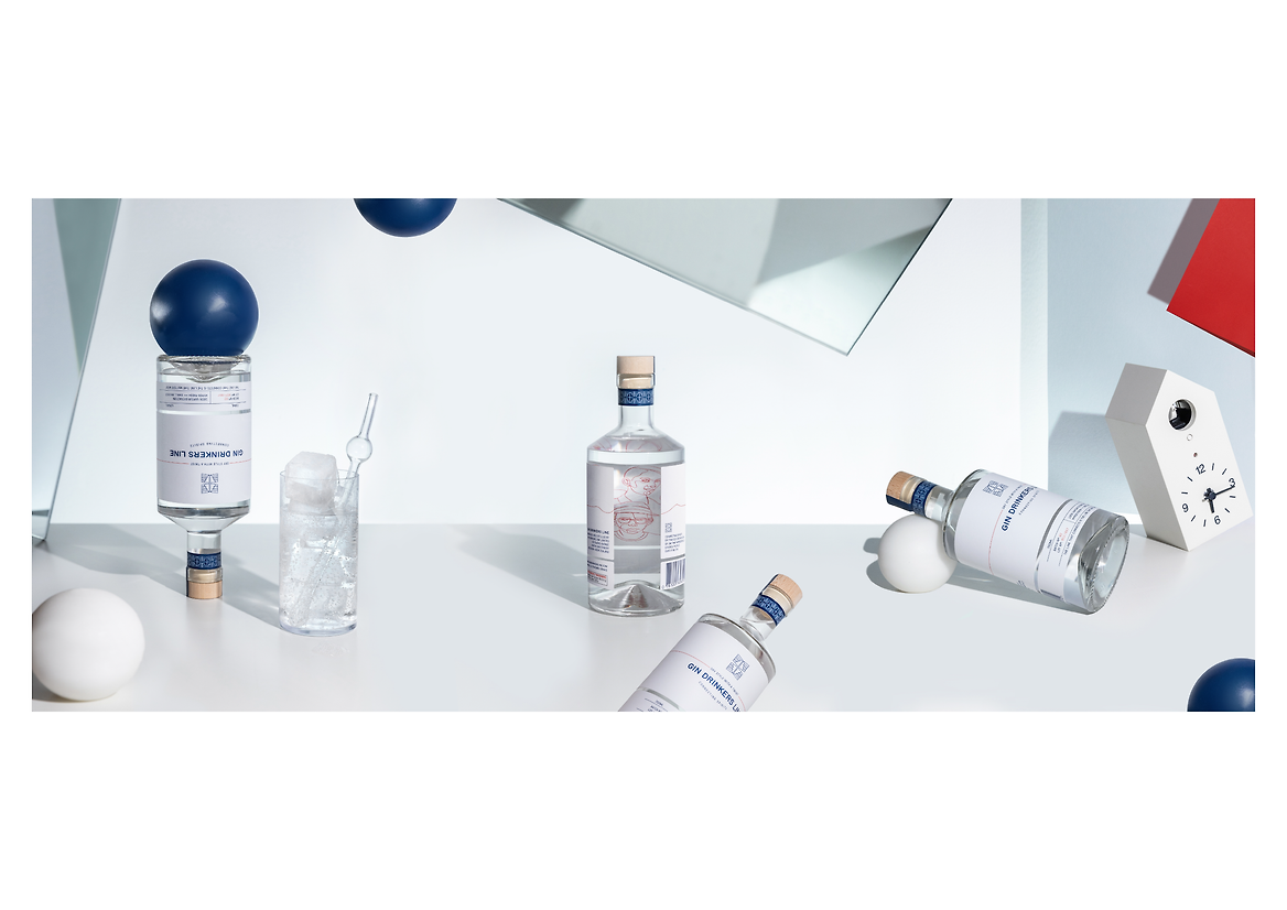
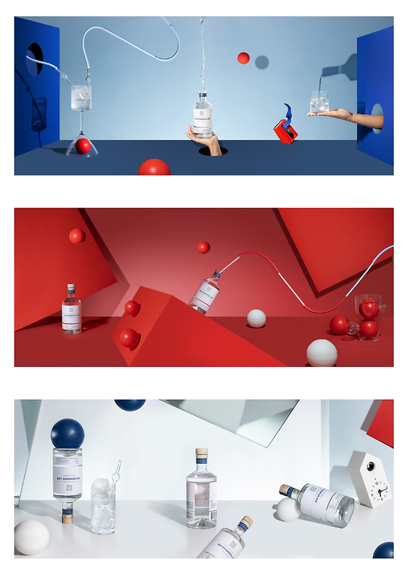
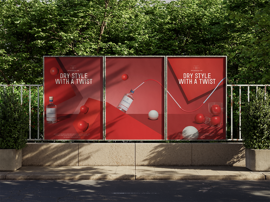
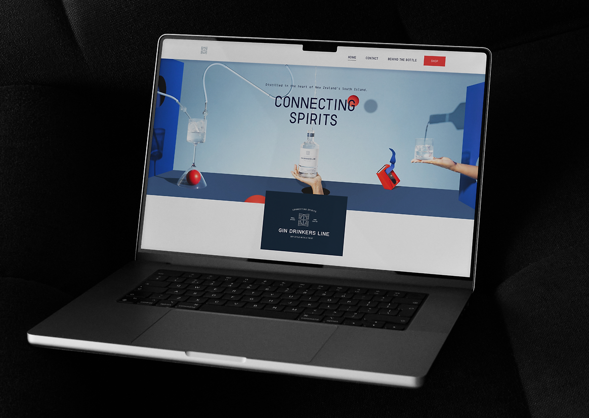
Gin Drinkers Line is a London-style gin with a distinct South Island character—crafted using 100% vapour extraction and positioned at the intersection of heritage and innovation. The client approached us with a bold brief: create a campaign that would define the brand visually, emotionally, and conceptually—while also preparing it for expansion into international markets. The result is Three Colours, a surreal and modular campaign inspired by the interconnected Three Colours trilogy of Krzysztof Kieślowski and the spatial paradoxes of M.C. Escher.
Rather than rely on traditional lifestyle photography or simple bottle-centric shots, we developed a visual world built around three colour-coded atmospheres: blue, red, and white. Each palette evokes a specific emotional tone—freshness, intensity, and purity—and serves as a chapter in a broader visual narrative. Within each chapter, modular compositions were designed to suggest transition, connection, and transformation. Repeating motifs—paradoxical gravity, folded surfaces, suspended forms, quirky hand-made glassware—appear across colour sets, creating continuity without repetition.
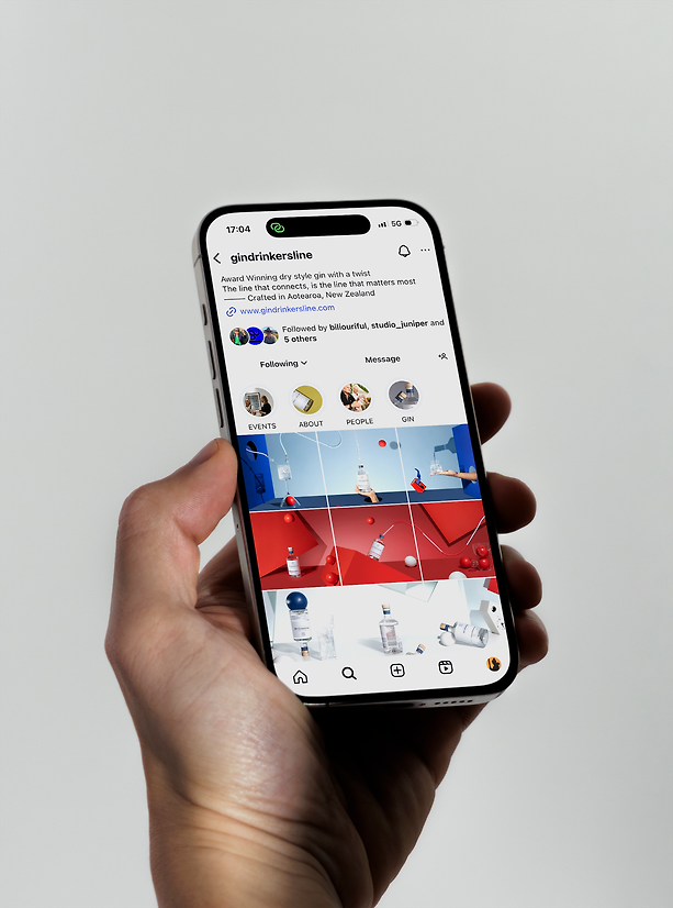
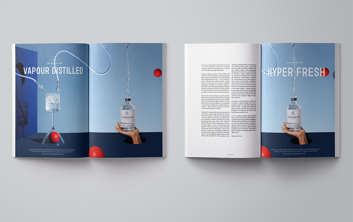
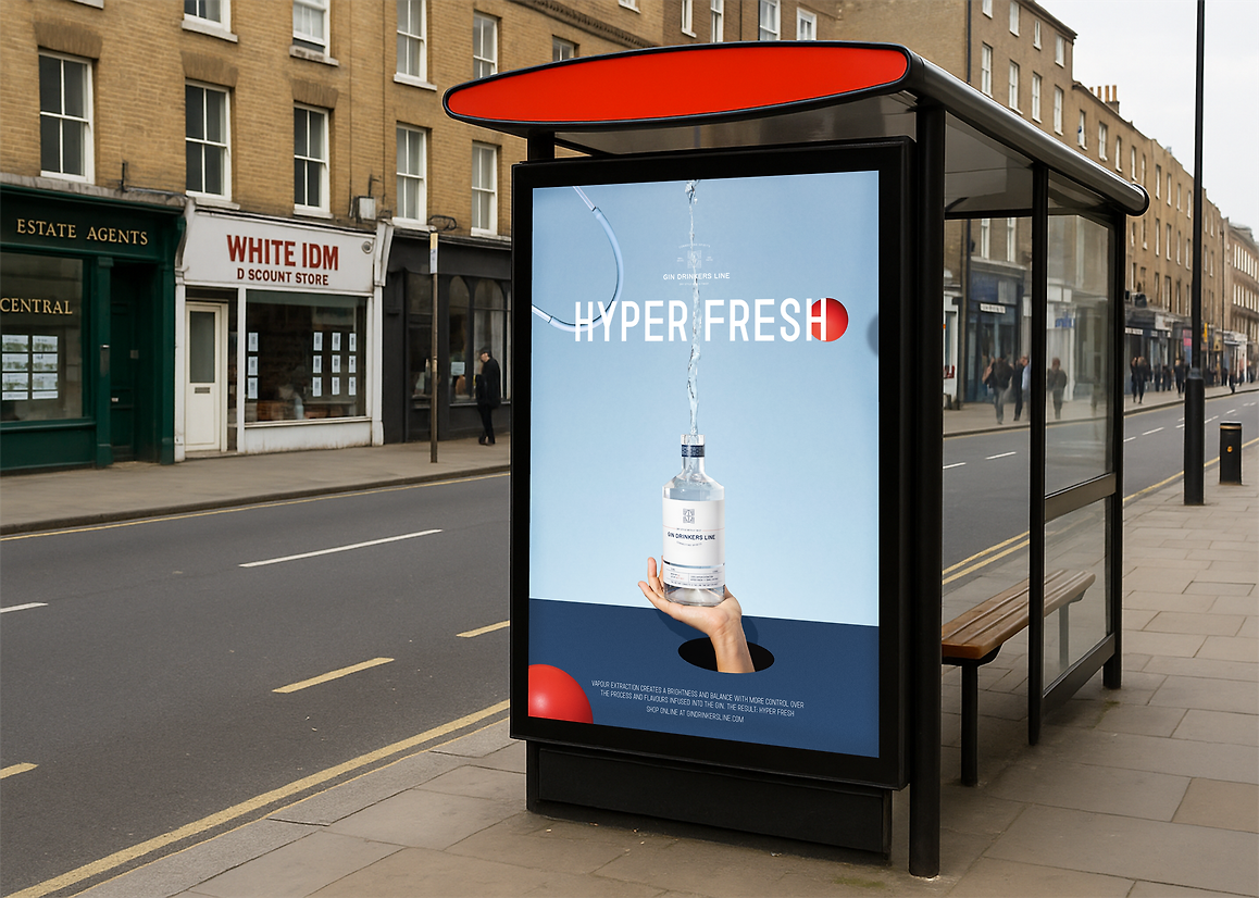
Our approach was deliberately non-literal. We aimed to create images that feel symbolic rather than explanatory—at once architectural and surreal, minimal and richly textured. The gin bottle itself can even be absent from the final poster created from the key imagery. Instead, its essence is embedded in material, shadow, and form. The images function not just as content but as a system—designed to adapt seamlessly across mediums, from billboards to packaging, social posts to editorial features. Technically, the campaign required a disciplined level of craft: sculptural set builds, precise lighting, and calibrated colour to ensure visual cohesion across all formats.
What elevates the work is the strategic use of ambiguity. Each image walks a careful line between constructed logic and dream logic—spaces that look almost real but feel slightly off. This ambiguity invites curiosity and interpretation. It allows viewers to find their own meaning within the campaign rather than be told what to see. In a spirits category crowded with visual noise, Three Colours asserts a quieter confidence.
This project campaign reflects our belief in design as narrative and brand as atmosphere. It’s not just a campaign to be seen—it’s one to be explored.