Credits
-
Pou Auaha / Creative Directors
Anna Yates, Brad Collett, Billy McQueen
-
Ringatoi Matua / Design Director
Nathan Chambers -
Kaituhi Matua / Copywriter Leads
Anna Yates, James McHoull
-
Ngā Kaimahi / Team Members
Aarush David, Martin Spencer, Gonzalo Deza, Luke Harvey, Maria Lokshina, Farin Dickinson, Andy Foulds, James McHoull, Maria Hodgson, Ben Marshall, Florence Noble – TV Director, Ngawaka Walters - Music Producer, Xanthe Price, Renate Tauetau, John Cooper, Sage Haggart, Ellie Dudgeon
-
Client
Taco Bell


Description:
TACO BELL
CHEESY, CRUNCHY, SPICY, FRESH.
Taco Bell is a well-known, well-loved global brand. But when it launched in New Zealand in 2019, Taco Bell was an anomaly. Part American and part Mexican, the brand had no history or legacy with Kiwis. And after the initial launch, there was a downward sales trend that needed a reset.
The purpose: To re-launch and rejuvenate Taco Bell in New Zealand. Our goal was to re-establish the brand and its products in the minds of Kiwis by cutting through the bustling QSR market with a new positioning and refreshed look. We aimed to make Taco Bell more than just a novelty in a new market, transforming it into a "must-try" craveable meal option. Our objectives were to boost sales, increase brand awareness and consideration, and clarify the menu, while standing out with a fresh, easy-to-understand communication system for everyday Kiwis.
Idea: Cheesy. Crunchy. Spicy. Fresh. It’s a mouth-watering product description that doubles as a campaign tagline, which we turned into a song about how bloody good Taco Bell’s Mexican-inspired creations really are. Built around a music track composed by talented local musician Ngawaka Walters, this campaign serves up a feast of food and ‘tude to Taco Bell’s Gen-Z audience, delivering maximum crave with a side of quirky Kiwi humour. But more than just the obvious food cues – the campaign also stands for cheesy, crunchy, spicy and fresh moments in life:
Cheesy - doing your own thing and owning it
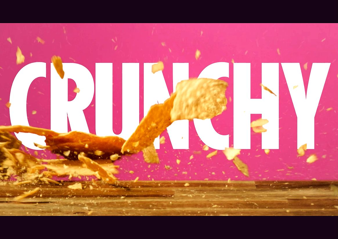
Crunchy - when you live in the moment, it’s always crunch time.
Spicy - there’s a little cheeky in all of us.
Fresh - fresh trends and fresher ingredients.
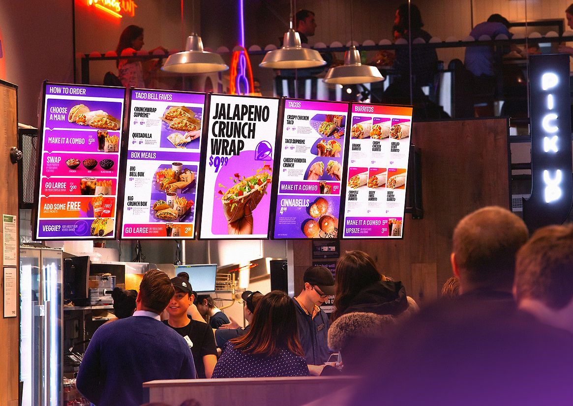
The new positioning gave us a guide to then strip away any excess layers in the global brand (where it was complicated and didn’t align with the positioning or caused it to be a barrier for Kiwis) allowing for more punch and quicker understanding of the food, core messaging, and overall experience with a compelling design and messaging framework.
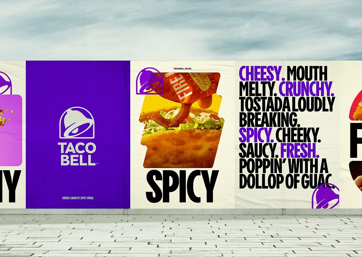
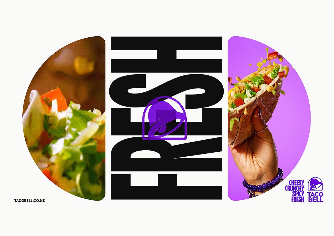
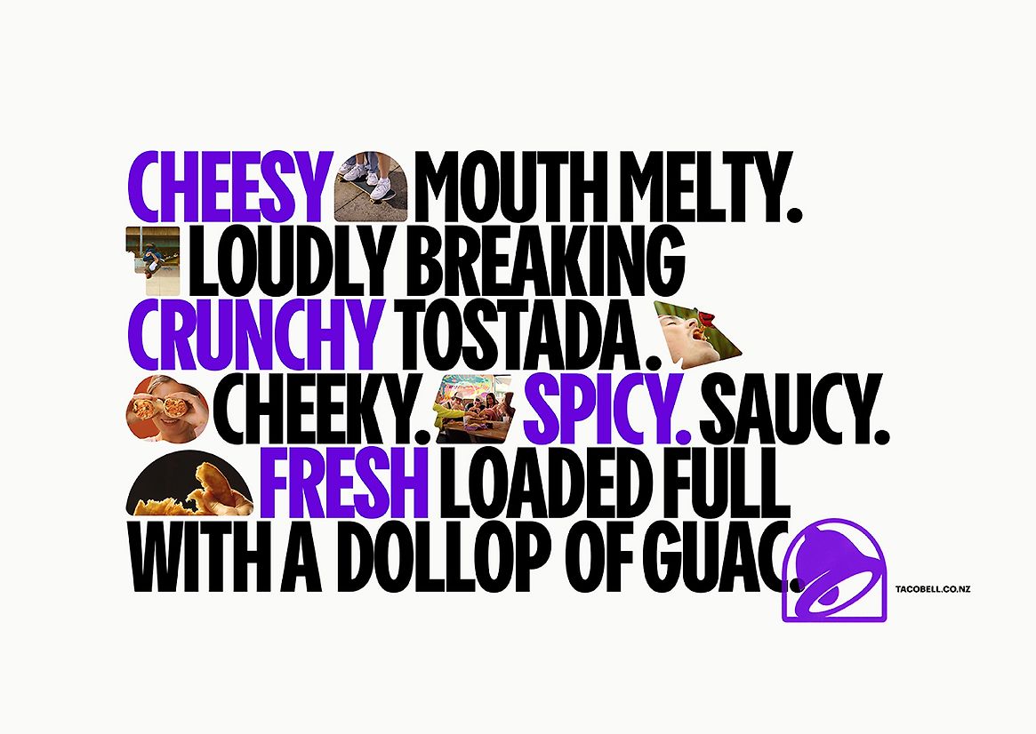
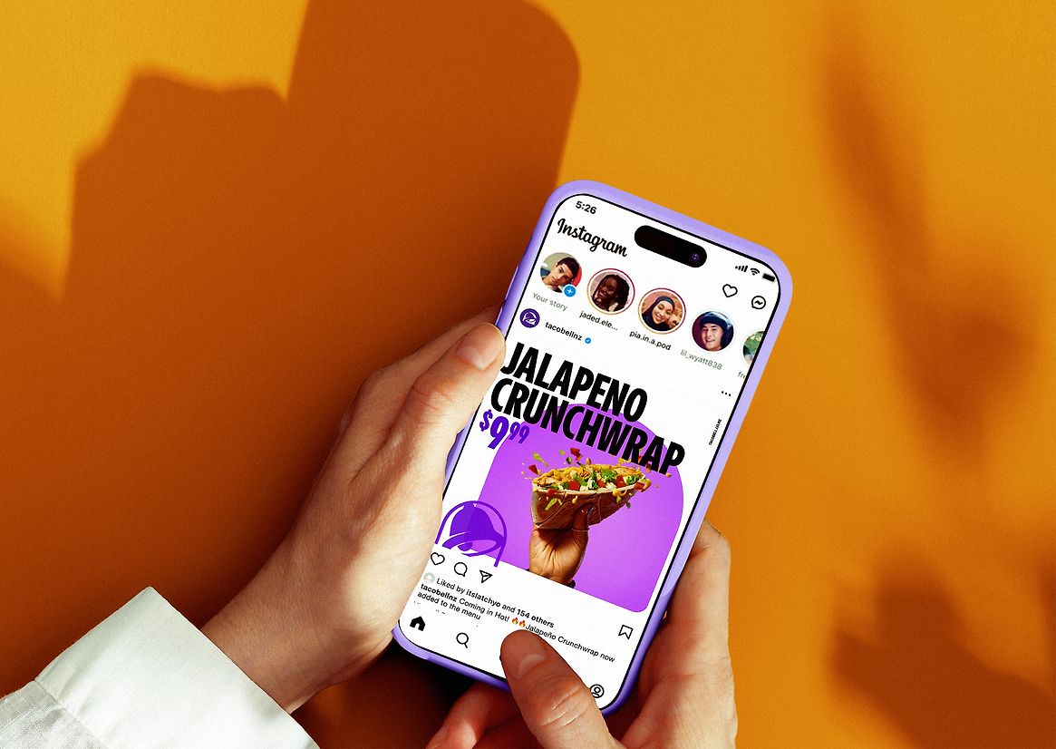
Part of simplifying the brand was inspired by the unique shapes and flavours of the food. So, we created a system of shapes representing the unique Mexican food as a symbolic short-hand, that celebrates and houses the food images – people eating the food, the colours, and the core messaging at a glance.
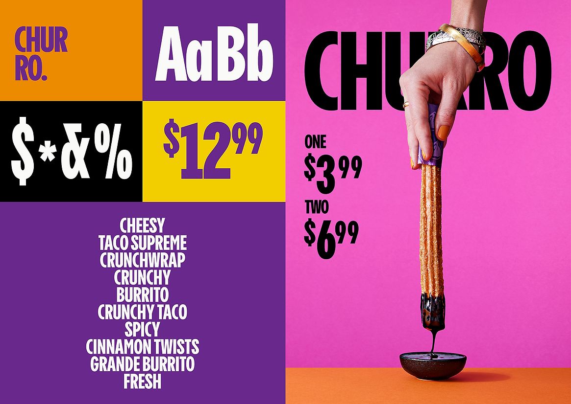
The simplification process also involved taking 5 different typefaces and messy graphic layering – to create one bold, unapologetic typeface and look – no waffle. Combined with the shapes, explosive colour palette, and clear positioning – the food photography was also purposely shot using their vibrant brand palette in backgrounds, helping to convey one of the four food cues and giving the look a colourful flexibility (not just limited to monochromatic Taco Bell purple but helping the menu items be unique). A stronger foundation for the typography to work at its best and for the brand to stand on its own.
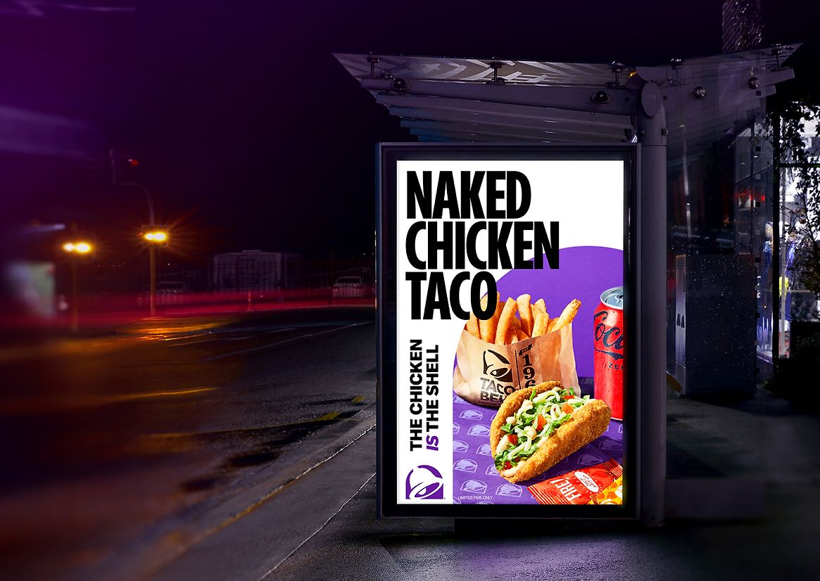
Refining the design down even more we used white space - along with the typography, shapes, and colours - to give the brand breathing space, and allow the shapes to stand out so that signature bursts of Taco Bell purple could work harder stamped by the bell icon, and the Cheesy, Crunchy, Spicy, Fresh line to now be boldly and unmistakably Taco Bell.
The marketing and brand rollout was driven by social films, TV, online, outdoor media and in-store. A custom soundtrack was also made working with Ngawaka Walters to take the repositioning further and stick in people’s minds. Through the mediums of TV and online films, social content & short clips, POS, OOH, and in-store media – with irresistible images of food, people, culture, enjoyment, bursts of bright colour and freshness. The refrain of the hip-hop track looping helps cement Cheesy, Crunchy, Spicy, and Fresh in the NZ psyche. A brand that now has a sound, taste, feel and look as something uniquely Taco Bell.