Graphic
RUN 22 Treasure our Whānau
-
Pou Auaha / Creative Director
Raymond Otene McKay
-
Ringatoi Matua / Design Director
Laura Cibilich
-
Ngā Kaimahi / Team Members
Maria Philp, Russell Hooton-Fox, Ariana Stone -
Kaitautoko / Contributors
Joseph Qiu, Vinnie Carter, Rangi McLean -
Client
Immunisation Advisory Centre
Description:
The Immunisation Advisory Centre (IMAC), alongside the Ministry of Health, needed a unique creative campaign to promote their annual flu vaccination programme. The concept had to work across a wide range of media.
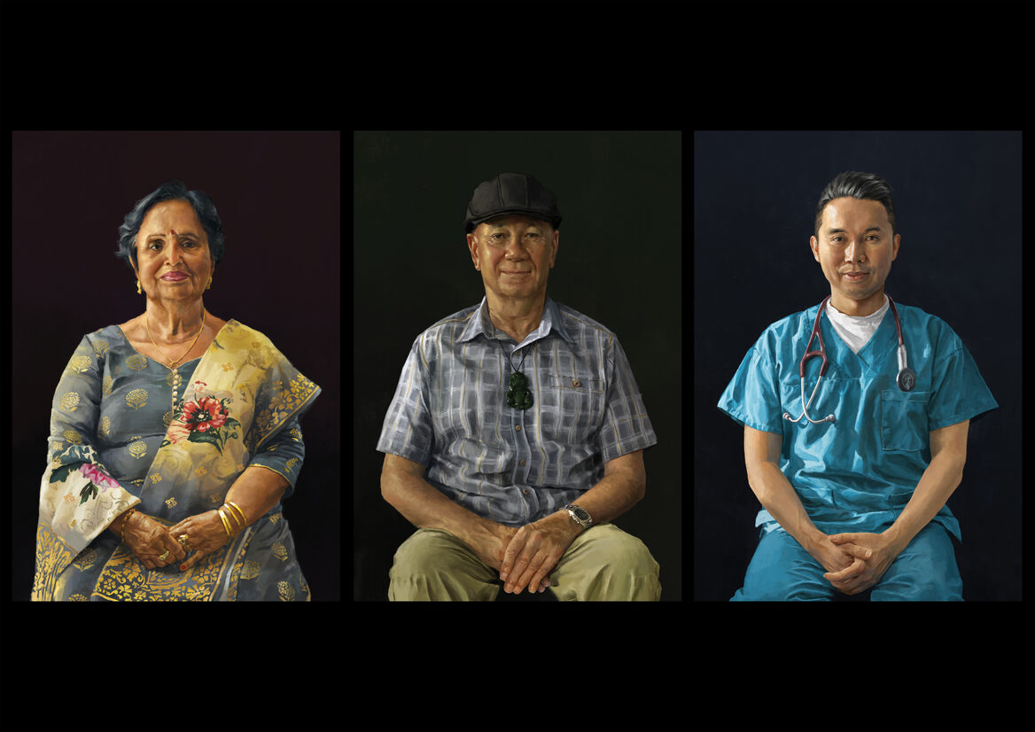
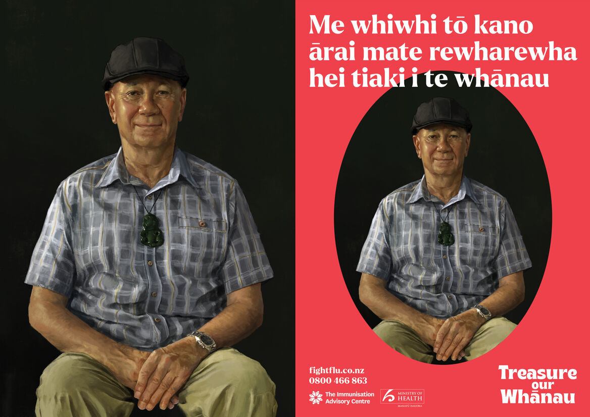
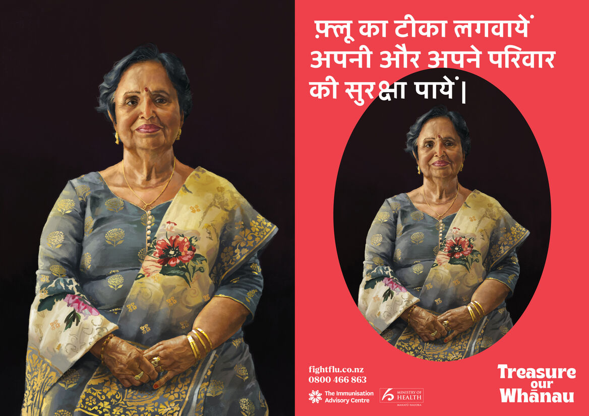
Māori and Asian kaumātua (elders) aged 65+ were the primary audience for the campaign, which also needed to be easily adaptable for different audiences in future years.
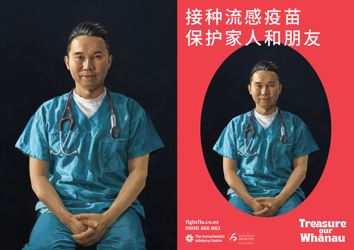
Along with the client, we took part in community consultations, involving visiting marae and kaumātua groups. We were able to engage with the Māori community, kanohi ki te kanohi, and understand cultural nuances, whakawhanaungatanga, and draw upon whakapapa. Asian Family Services were also consulted, drawing upon multiple audiences within this, including Chinese, Korean and Indian.
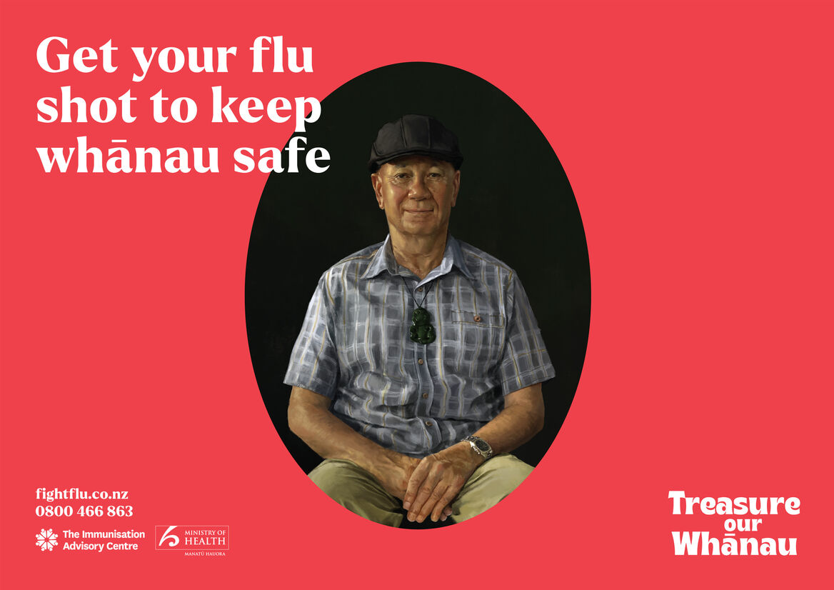
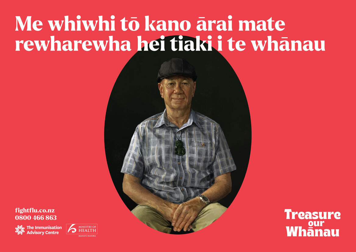
Listening to these groups, one thing that came across consistently throughout all the conversations was that whānau members wanted to make sure their elders were getting their flu shot and vice versa as their family were so precious to them. This insight led to the campaign strategy of everyone treating their whānau like the taonga (treasure) they are, in a reciprocal way – leading with the line ‘Treasure our Whānau’.
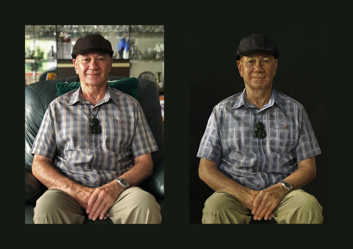
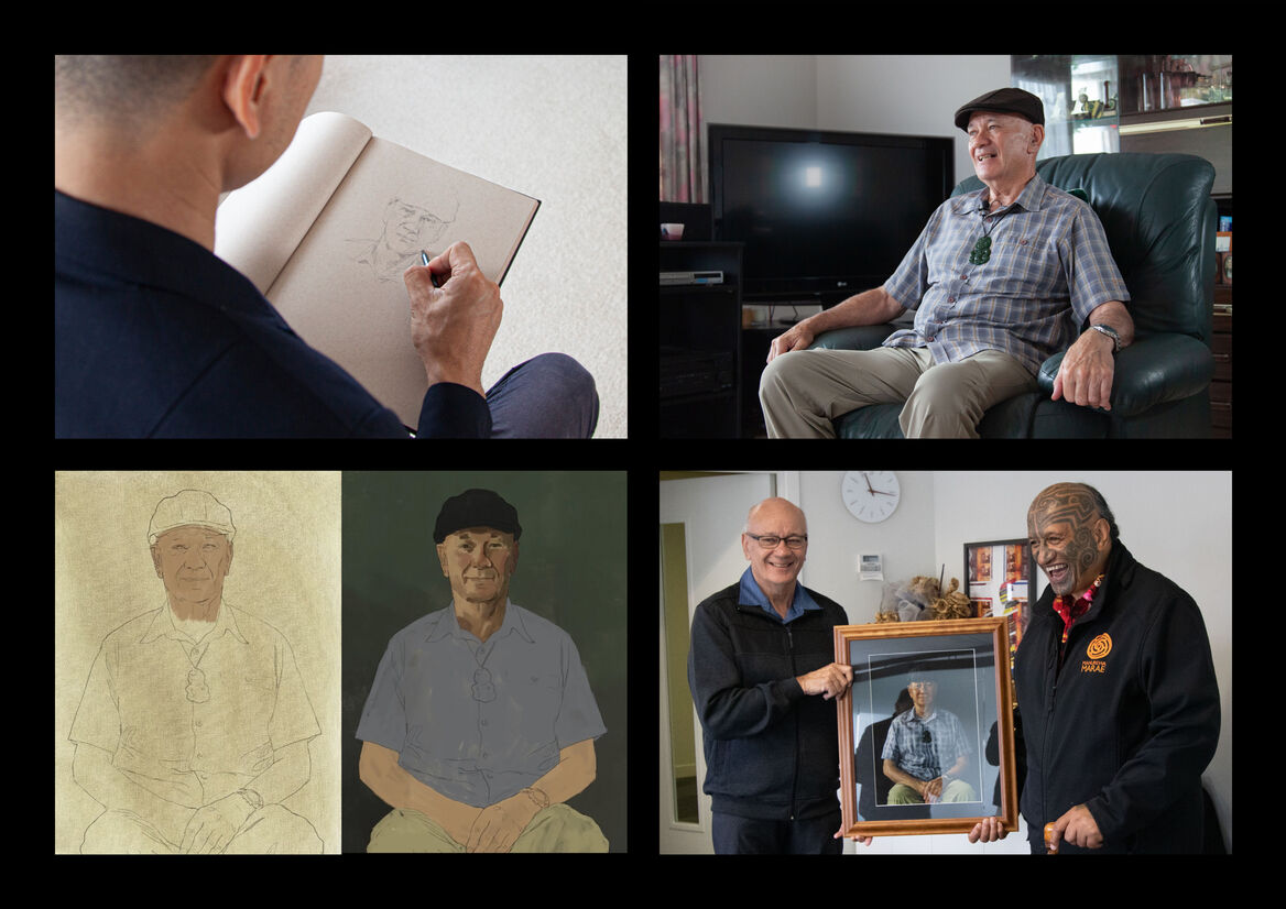
This concept of treating whānau as the taonga extended into how we might visualise that. We thought about how people treasure the ones they love – they make memories and take photos. We based the campaign graphics around a beautiful portrait. A portrait that puts effort and craft to work in showing just how much people mean. Reminiscent of traditional Māori portraiture of the past, these portraits were of real people, who are part of the communities we were talking to with this campaign.
The portraits were paired with a versatile and modern design aesthetic across all campaign collateral, including digital ads, print ads and various other collateral. This was brought to life through the portraits, and gave the campaign a uniqueness, creating it’s own warm visual identity. This included using a bold, bright red colour and modern typography, which also had to meet accessibility guidelines – particularly important for the older audience it needed to reach.
With longevity and versatility being important to this campaign, the design can be easily tailored to different audiences in future years by updating the portraits.
After the campaign production wrapped, we gifted the participants with their very own framed portrait, for them and their whānau to keep as a taonga, to display proudly in their home.