Graphic
Re 45 All Blacks and Black Ferns
-
Pou Auaha / Creative Directors
Andy Thomas, Marcy Banbury, Shannon Bell -
Pou Rautaki / Strategic Lead
Richard Nordlund
-
Ringatoi Matua / Design Director
Maxine Allen -
Kaituhi Matua / Copywriter Lead
Katherine Fischer
-
Ngā Kaimahi / Team Members
Maddy Merzvinskis, Dante Bernard -
Kaitautoko / Contributors
Kerry McKenzie, Luke Bell-Booth, Ashleigh Johansson -
Client
Kerry McKenzie


Description:
Our brand refresh for the All Blacks and Black Ferns brand, developed in close collaboration with New Zealand Rugby, unites the teams with bold, distinctive identities that feel ready for the world stage.
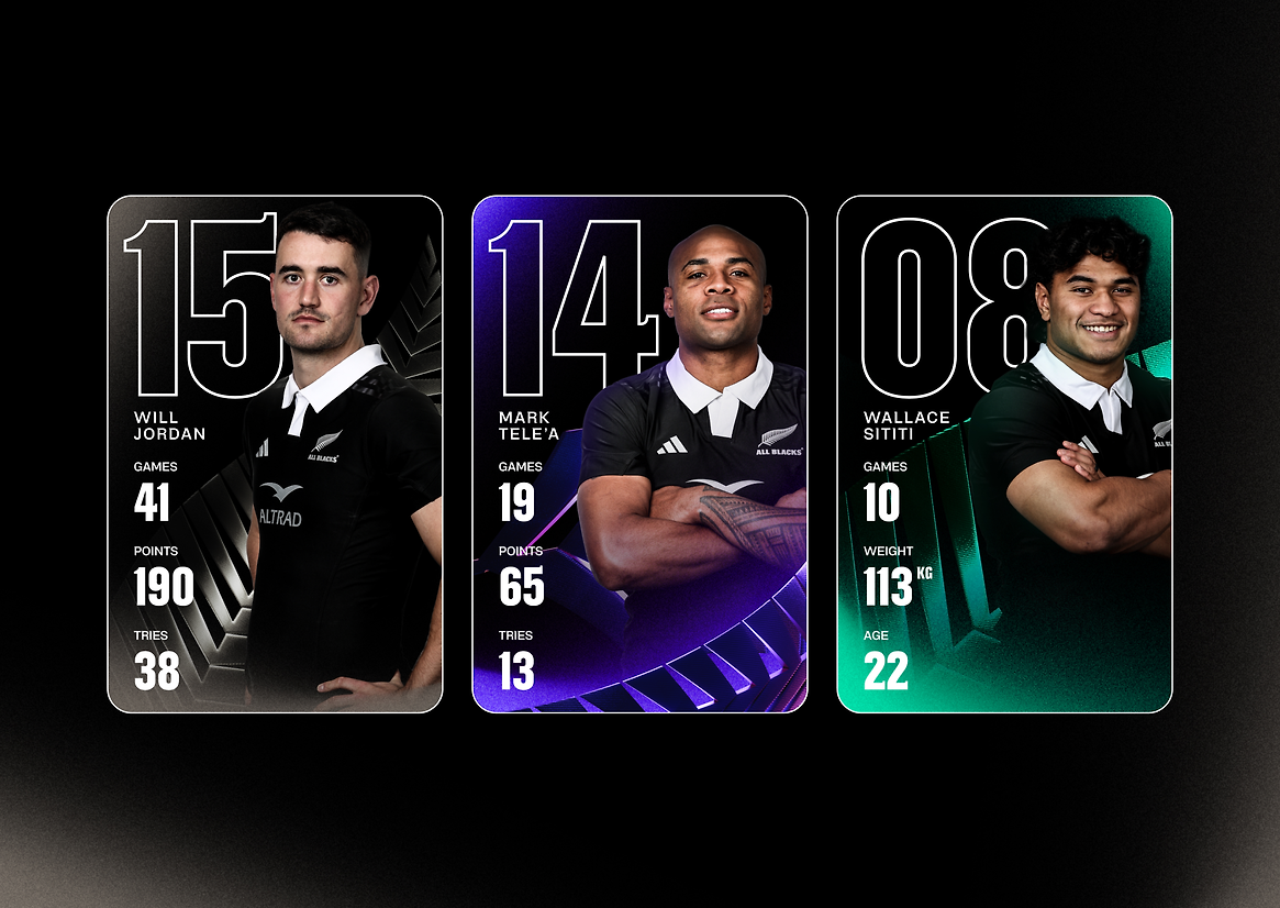
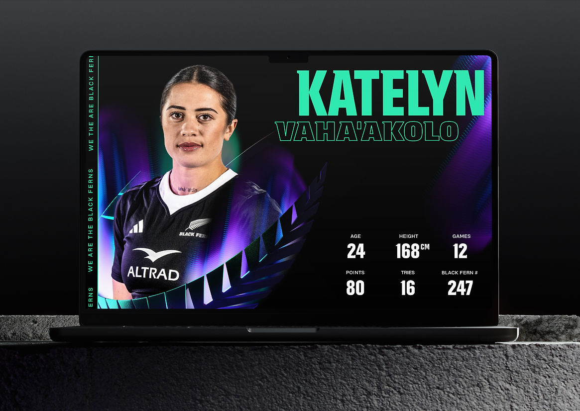
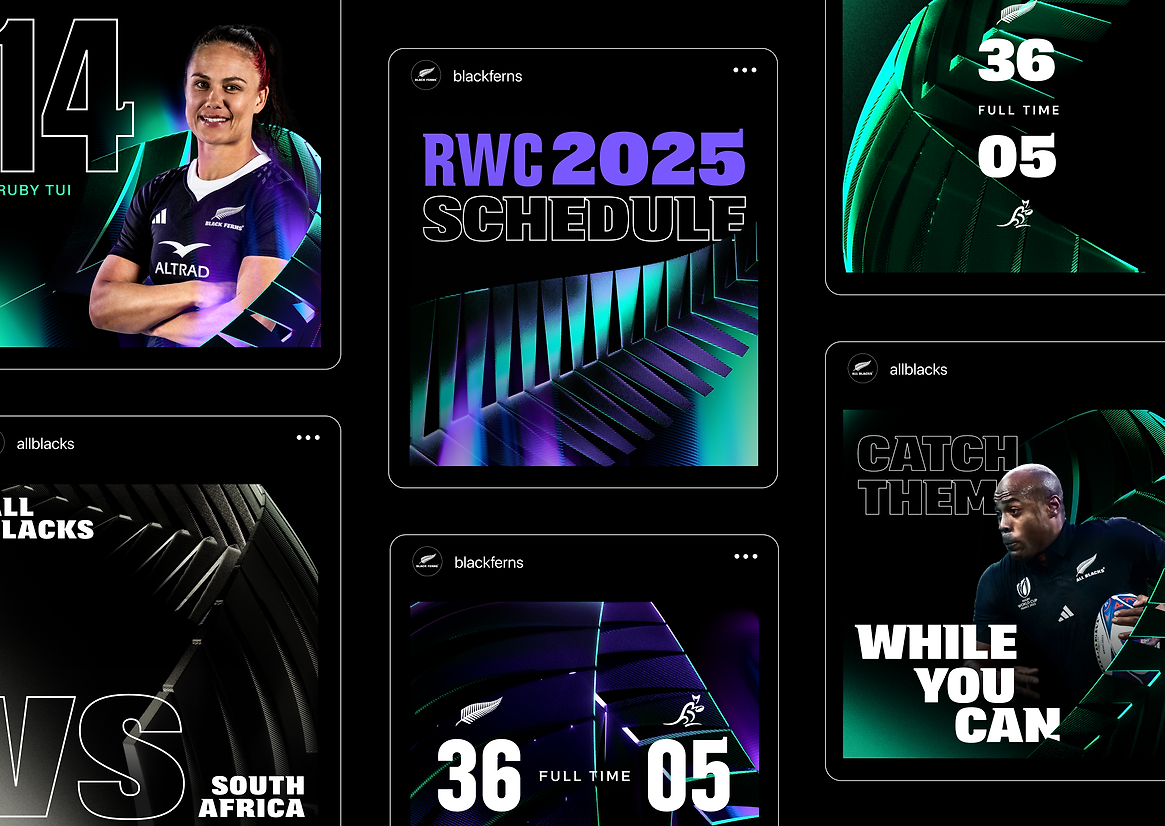
The identity is all about ‘embracing the power of black,’ with a stadium-inspired lighting system to give the teams’ signature colour more depth and contrast.
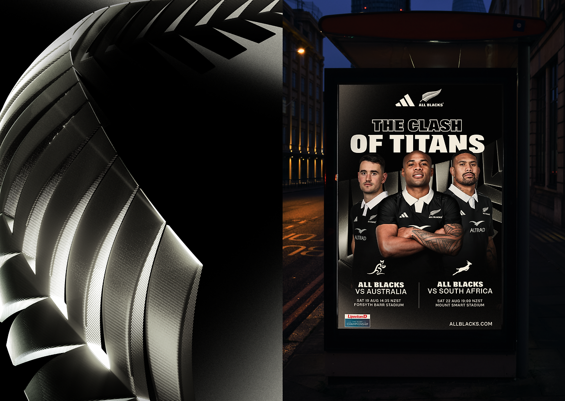
That’s when the fern steps into the light. It isn’t just a logo, it’s a legacy. And when something carries that much cultural significance, it’s a powerful asset — but it needs to be given the respect it deserves.
Working closely with New Zealand Rugby, we’ve put the iconic fern at the forefront of the brand. It’s no longer just a logo, but brought to life in 3D carbon-fibre, strong and light, graceful yet sharp. There’s a sense of mystique as it emerges from the darkness. And it moves with fluidity, catching the light and illuminating our players.
As the hero of our identity, the 3D fern feels alive and full of energy. It’s big. It’s bold. And it’s a perfect reflection of two larger-than-life teams, ready to take on the world.