Graphic
Re 45 FutureDeluxe Optus Yes Expressions – Poetic landscapes of Australia
-
Pou Auaha / Creative Directors
Andy Thomas, Shannon Bell
-
Ringatoi Matua / Design Director
Nick Hill
-
Ngā Kaimahi / Team Members
FutureDeluxe, Zelig Sound -
Client
Optus







Description:
Telecommunications company Optus needed to re-energise its brand, starting with its iconic ‘Yes’ mark. ‘Yes’ has been part of the Optus brand since the ’90s, but over time it had lost meaning. The brief was to reposition ‘Yes’ at the core of the Optus brand, and communicate what Yes means to Australians through compelling animation for retail, TV and digital applications.
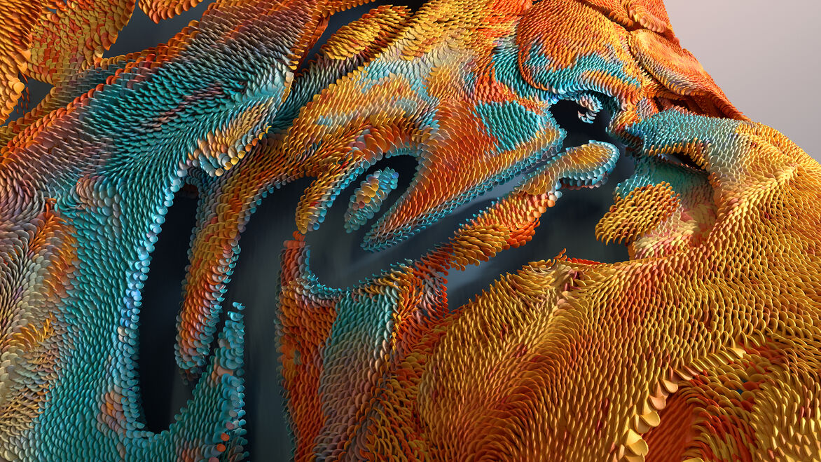
For Optus, ‘Yes’ stands for a distinctly Australian sense of optimism. The idents are inspired by Australian environments, from the outback to beaches and cities. The abstract design of each ident is inspired by the nostalgic moods and sensations of Australian life, from the cool breeze that soothes us on a hot summer’s day, to that calming feeling of standing in shallow waters at the beach, to the unique Australian light and how it changes through the day.
Each ident is built from interweaving layers; integrating a fleeting moment when the Yes mark blooms and reveals itself. Through fluid and effortless motion, the idents capture the poetry of the spaces of Australia and the ease and optimism of engaging with Optus in Australia.
Judge's comments:
Yes from us! (We loved the way it used 3D technology in a creative and typographic way, which was super clever and engaging).