Credits
-
Pou Auaha / Creative Directors
Jef Wong, Anzac Tasker, Alistair McCready -
Pou Rautaki / Strategic Lead
Mike Pepper -
Pou Taketake / Cultural Leads
Ephraim Russell, Edward Ellison, Paulette Tamati-Elliffe, Megan Pōtiki, Komene Cassidy, Te Rūnaka o Ōtākou, Kati Huirapa Rūnaka ki Puketeraki
-
Ringatoi Matua / Design Directors
Liam Ooi, Caitlin Rassie -
Kaituhi Matua / Copywriter Lead
Sam O’Flaherty
-
Ngā Kaimahi / Team Members
Kathryn Cunningham, Chloé Griveaud, Nicky Lloyd, Tim Long, Philip Kim, Jade Sullivan -
Kaitautoko / Contributors
Shelley Winsor, Hone Paul, Tony Ballantyne, Suzanne Ellison, Todd Gordon, Bailey Hancox, Tor White, Bethany Ryan , Lucy Bell, Chas Carroll, Hannah Beede, Madison Henry Ryan, Anthony Hos, Māui Studios, Jason Low
-
Client
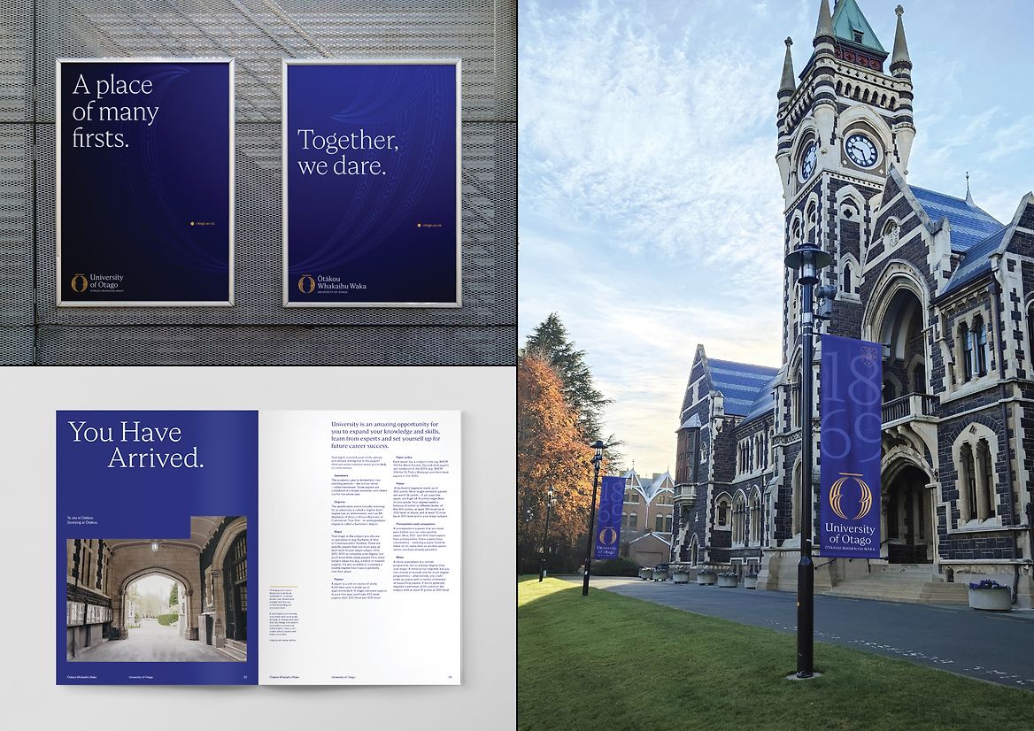
University of Otago / Ōtākou Whakaihu Waka
Description:
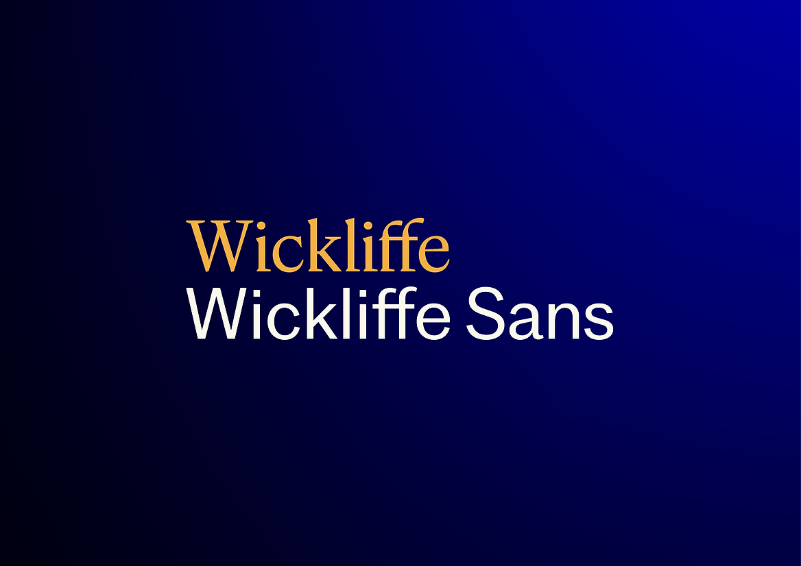
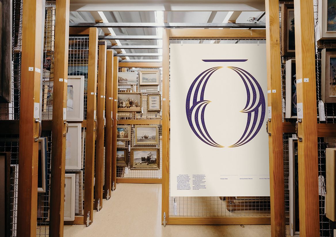
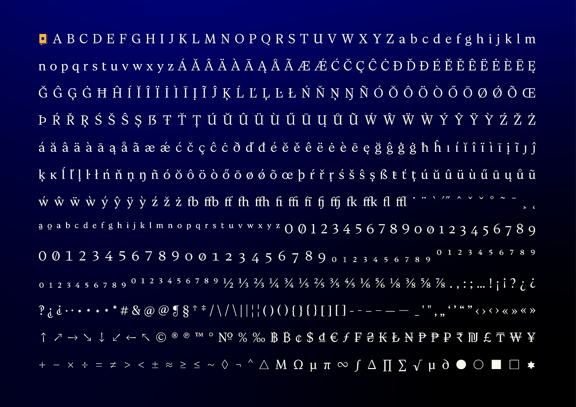
Wickliffe and Wickliffe Sans are two interrelated typefaces designed specifically for The University of Ōtākou, as part of a large scale restorative re-brand and re-naming process.
On the 23rd of March, 1948, the ship John Wickliffe sailed into the waters of Ōtākou harbour carrying 92 passengers. Many see this event as an arrival of reciprocity for the region, with fruitful relationships forming between these early settlers and local Māori. The Wickliffe Type Family pays homage to these early bonds, in the spirit of remaining part of an individual origin story while collaborating to form a new and cohesive whole.
Through the creative lens of “Together We Dare”, two bespoke typeface families were created that pay homage to the past through a forward-focused lens. Each design is considerate to the other, while remaining completely unique by way of their own design foundations.
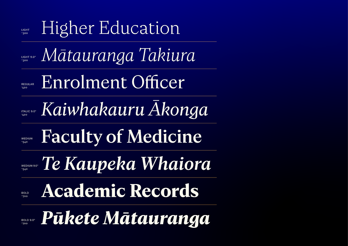
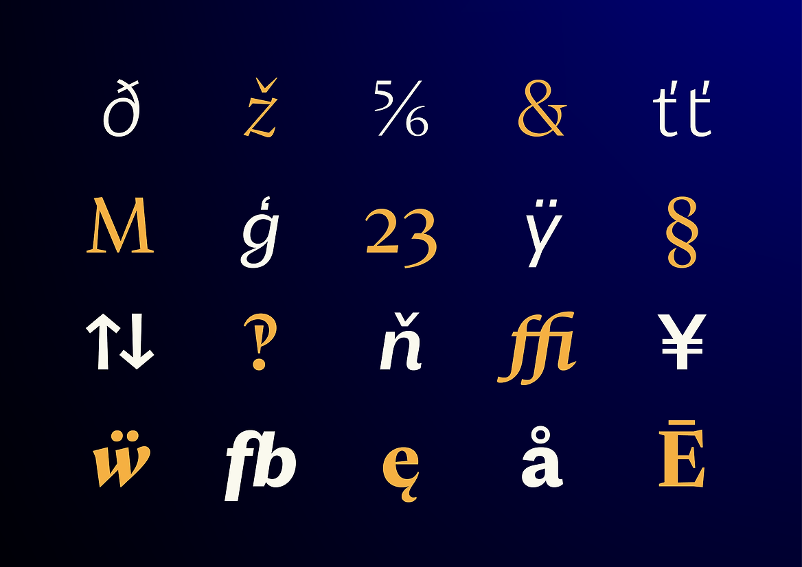
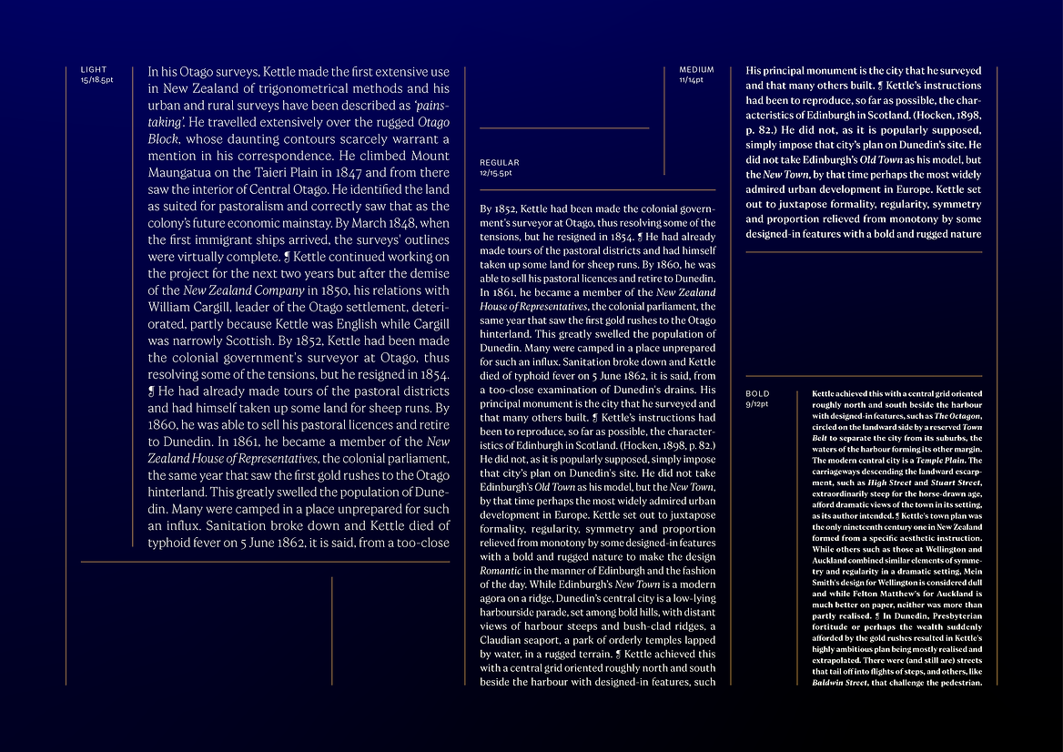
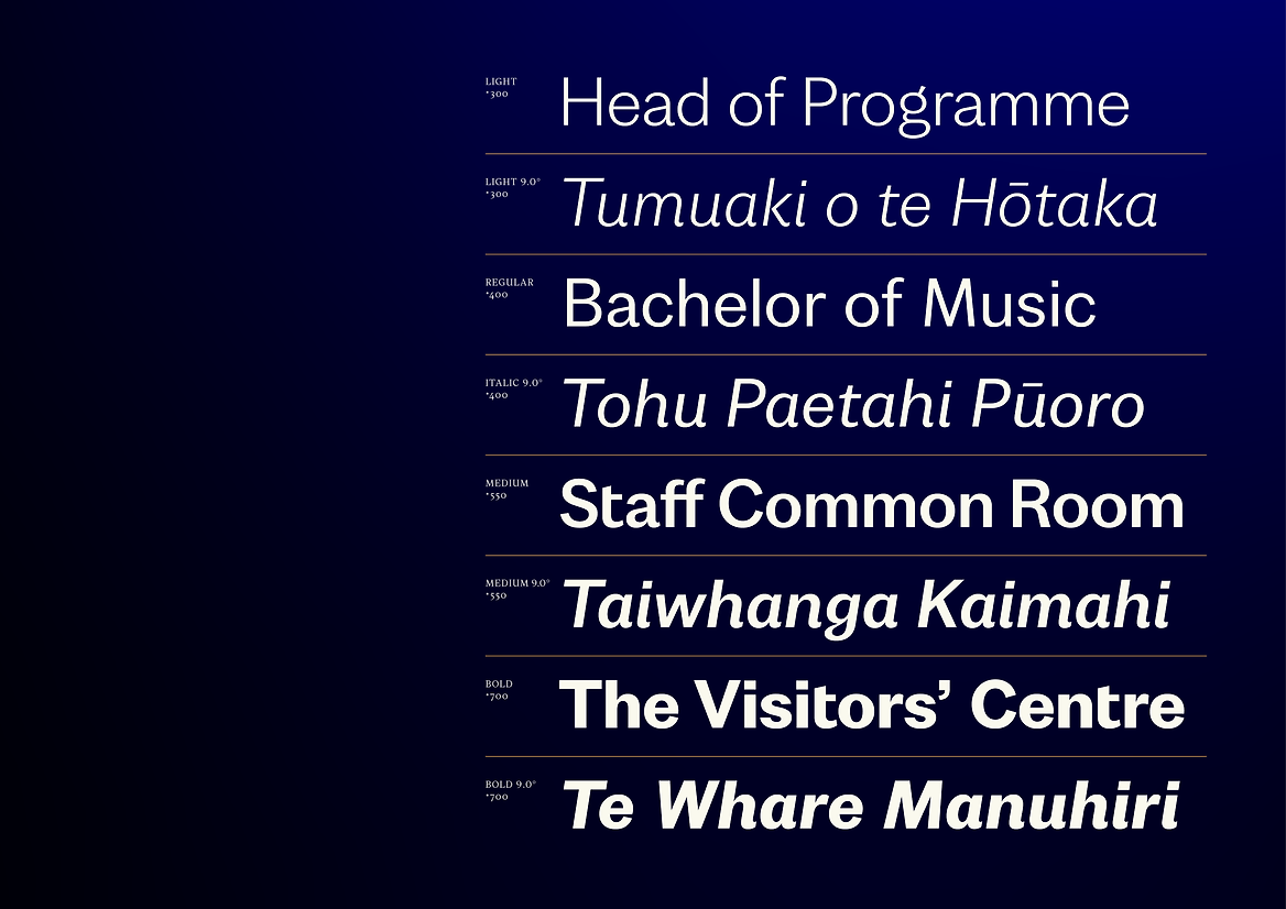
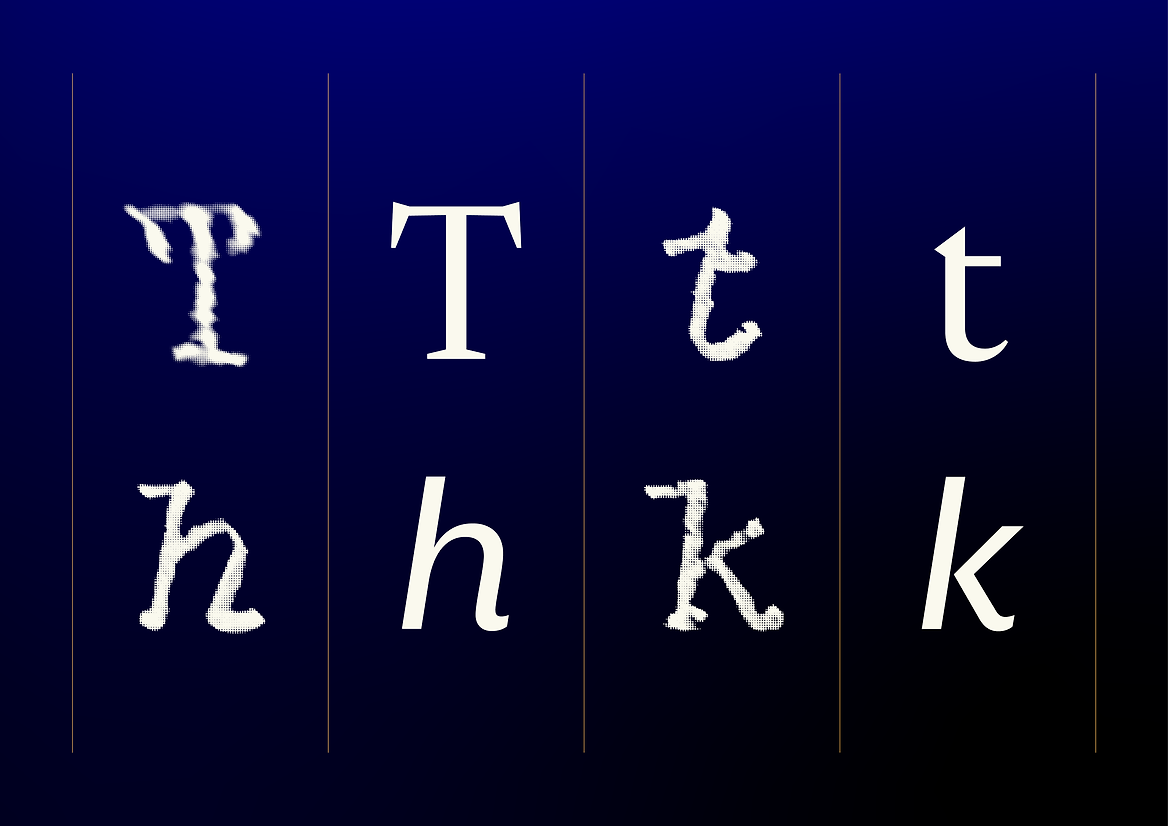
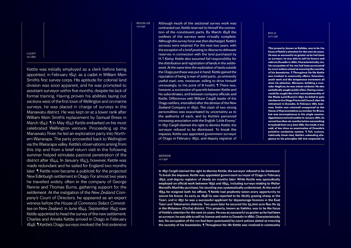
Wickliffe’s basic structure is influenced by the handwriting of the prominent surveyor Charles Henry Kettle, a key figure in the design and formation of the city of Dunedin. By evaluating the way Kettle’s pencil would strike the page, we were able to break apart the reinterpret the rhythm of the serif format, treating each stroke as an equal part of the letterform system. Due to the handwritten origin of these characters, the lowercase and corresponding numerals are therefore drawn from the same pen-first approach, resulting in a unique and modern take on what are otherwise very ubiquitous shapes.
The Wickliffe Type Family is conceived with the objective to deeply resonate with the university's refreshed identity and foster connection to both its physical location and academic aspirations. This typeface acknowledges the university's rich historical roots and aligns with its forward-focused vision as a leading research institution. By representing the university's ethos, the Wickliffe Type Family enhances communication and reinforces the university's revised brand identity.