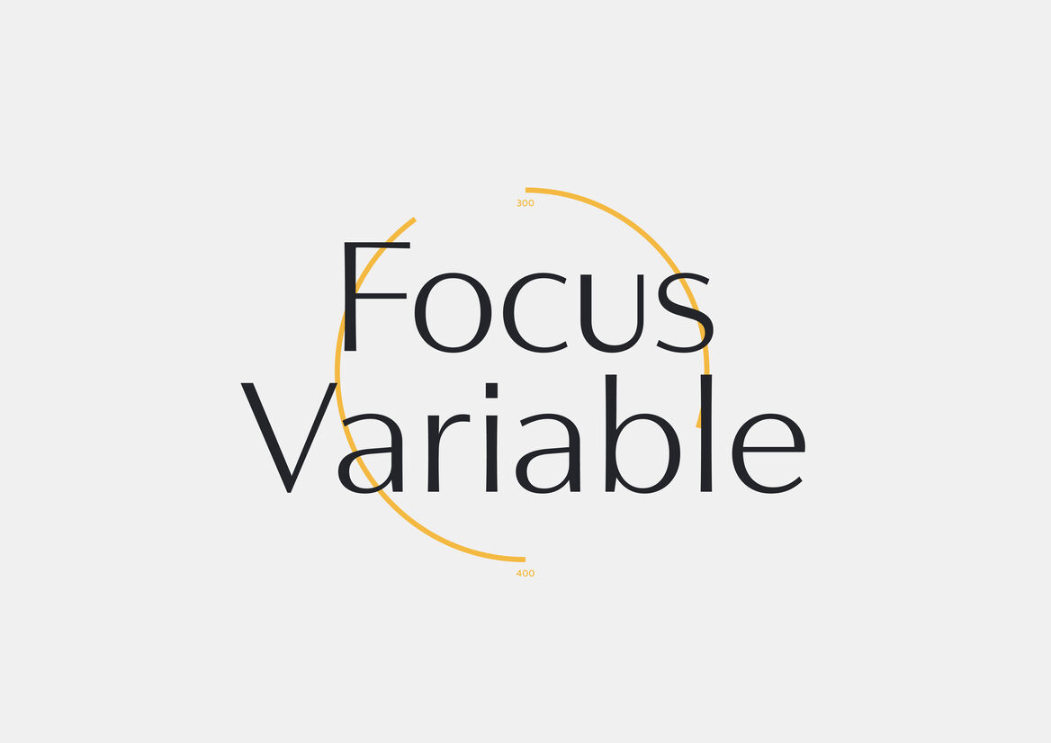
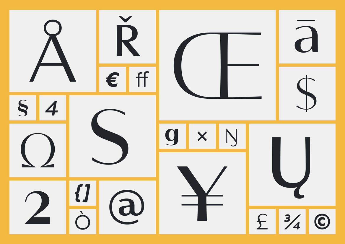
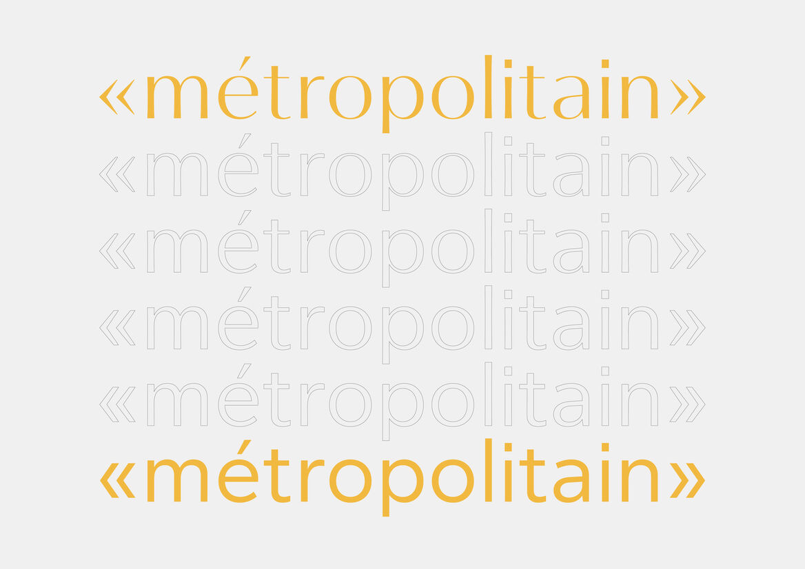
Focus is a screen-first variable typeface built around both weight and contrast axes, commissioned by Focus Features in celebration of their 20th year. Each letterform offers both geometric and contrasted alternatives, underpinned by a classical Roman proportion.
During the initial consultation process, a parallel was drawn between the adjustable focal point on a camera, and the potential for a variable optical axis within a typeface. This helped inform both the scope of the type as well as a numeric naming structure for each preset style.
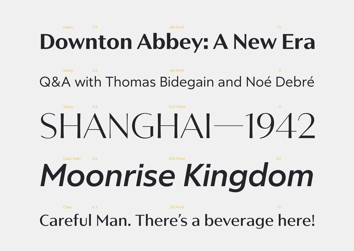
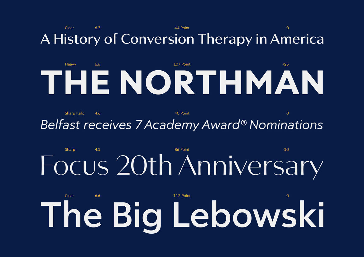
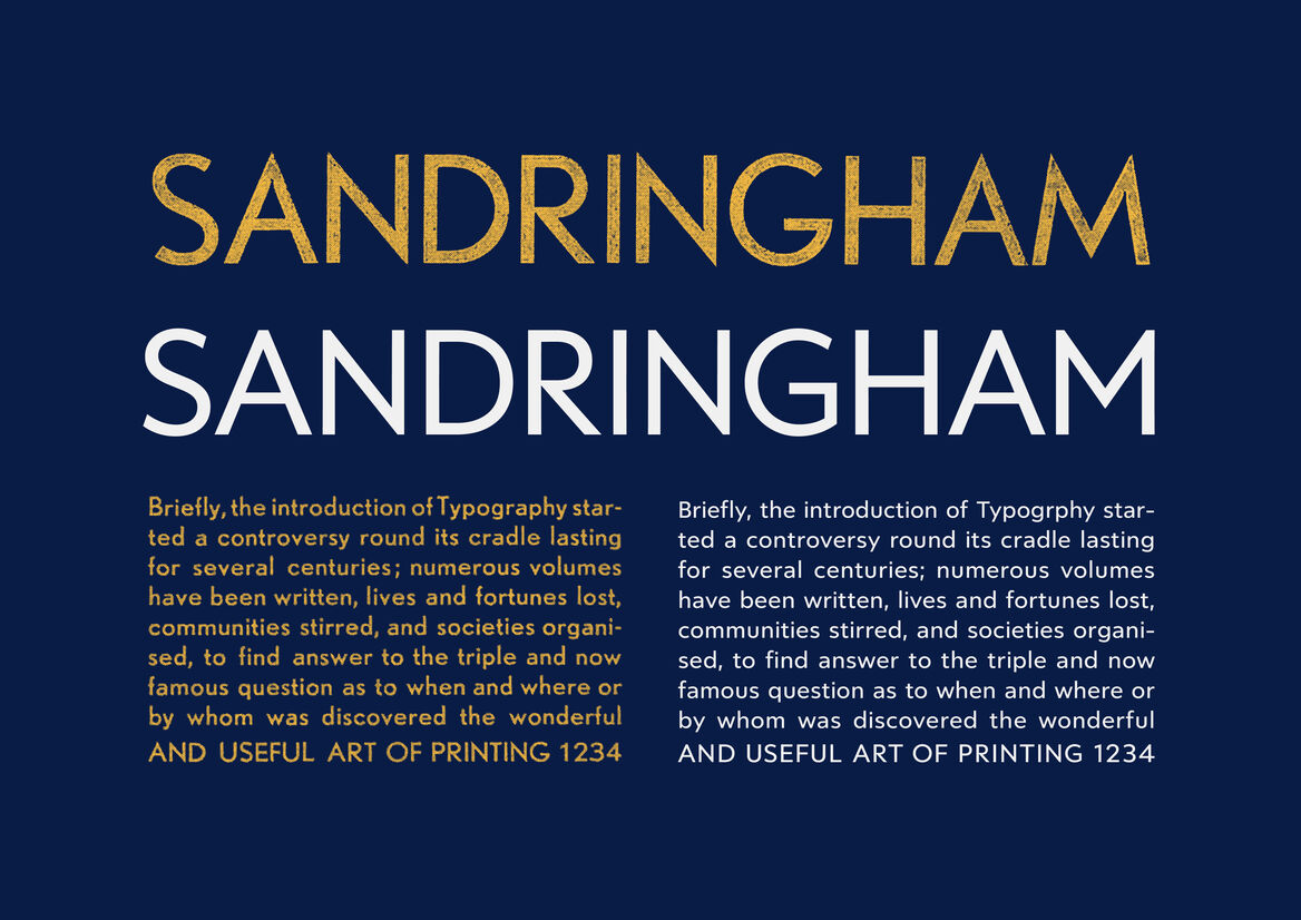
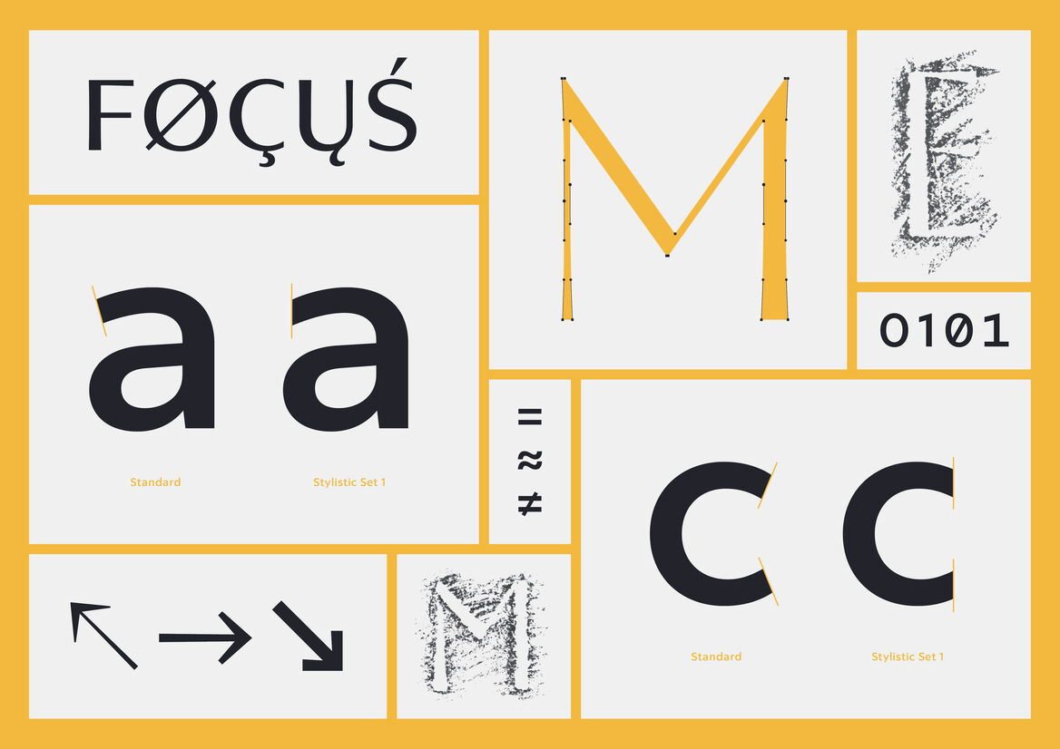
Along with the prevailing ‘thick and thin’ notion of a contrasted sans serif, a flared stem offered a more traditional tone — significant of calligraphic equivalents such as Herman Zapf’s mighty ‘Optima’. To complement these classical proportions and allow for common letter-width independent of style, ‘Nobel Grotesque’ offered insight toward a more simplified, geometric cut. The result is 12 individual preset font files, along with a singular variable font file capable of everything else in between.

Description:
Focus is a screen-first variable typeface built around both weight and contrast axes, commissioned by Focus Features in celebration of their 20th year. Each letterform offers both geometric and contrasted alternatives, underpinned by a classical Roman proportion.
During the initial consultation process, a parallel was drawn between the adjustable focal point on a camera, and the potential for a variable optical axis within a typeface. This helped inform both the scope of the type as well as a numeric naming structure for each preset style.
Along with the prevailing ‘thick and thin’ notion of a contrasted sans serif, a flared stem offered a more traditional tone — significant of calligraphic equivalents such as Herman Zapf’s mighty ‘Optima’. To complement these classical proportions and allow for common letter-width independent of style, ‘Nobel Grotesque’ offered insight toward a more simplified, geometric cut. The result is 12 individual preset font files, along with a singular variable font file capable of everything else in between.