Graphic
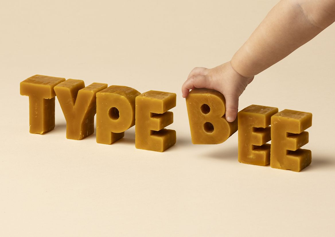
Milk 75 Type Bee
-
Pou Auaha / Creative Directors
Anthony Hos, Sarah Melrose -
Pou Rautaki / Strategic Leads
Sarah Melrose, Ben Reid
-
Ringatoi Matua / Design Director
Ethan Lowe -
Kaituhi Matua / Copywriter Leads
Judah Finnigan, Bronwyn Williams
-
Ngā Kaimahi / Team Members
Harriet Campbell, Alyssa Miller, Jemima Christie-Limbrick, Gemma Scott, Josh Daly, Adeline Chua, Jacinta Conza -
Client
Honeysticks
Description:
Honeysticks began in Aotearoa New Zealand with a simple goal: to make safer crayons for kids – using 100% natural beeswax and nothing nasty. Backed by NZTE, they’ve since become the #2 crayon brand in the world, second only to petroleum-based giant Crayola.
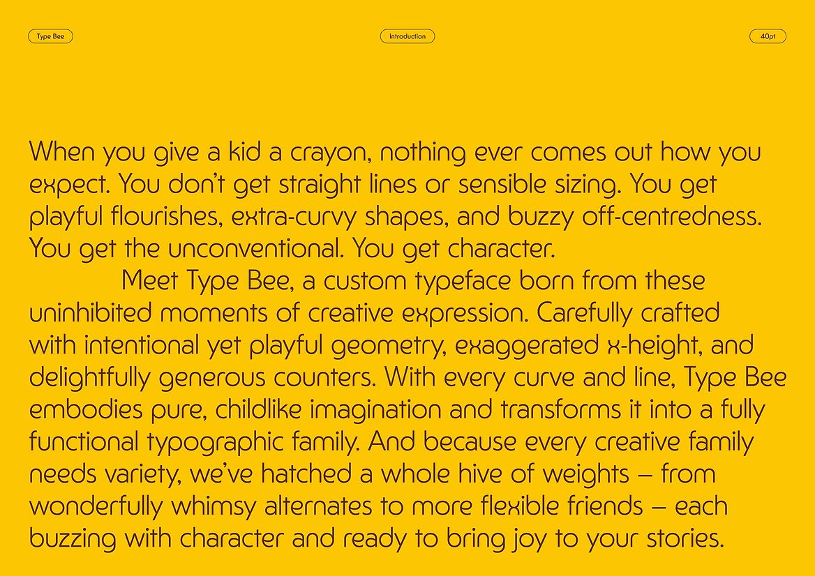
Led by our overarching brand idea “A World of Pure Creation”, Honeysticks exist to inspire the next generation of children with safe, sustainable tools for creative play. But when it comes to the words, most of the reading is naturally carried out by the adults in their lives. For the more conscious shoppers, legible claims and credentials can be essential factors in a purchase decision. Our challenge was to develop a typeface that might appeal to both preschooler and parent – both functional and just-plain-fun.
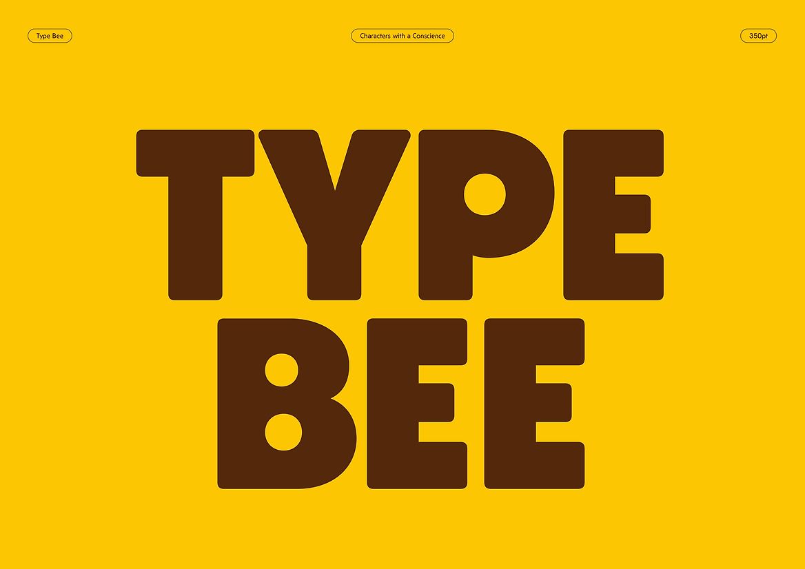
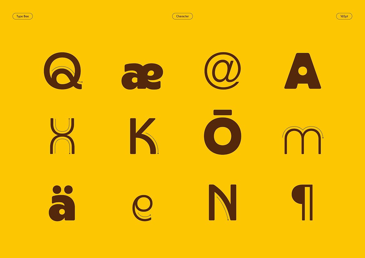
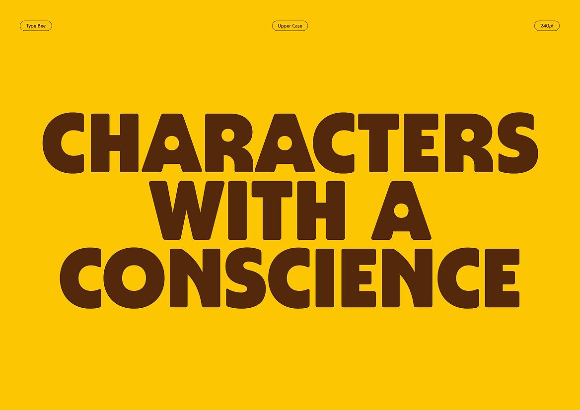
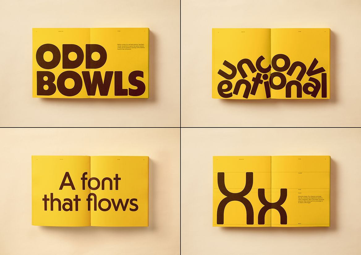
Introducing Type Bee, a custom typeface expressive enough to embody the Honeysticks ethos of pure creativity, while robust enough to deliver consistently across all brand touchpoints. Inspired by the instinctive, spontaneous markings of kids at play, each letterform is intentionally unconventional and quirky. A sense of childlike wonder is expressed through playful geometry, exaggerated x-heights, circular bowls and hive-shaped curves. Extra-rounded and ultra-approachable, Type Bee’s distinct forms convey a sense of larger-than-life originality.
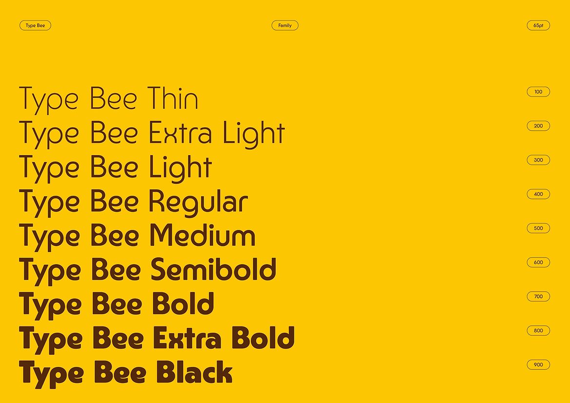
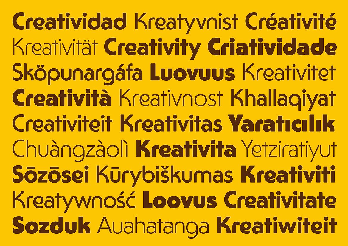
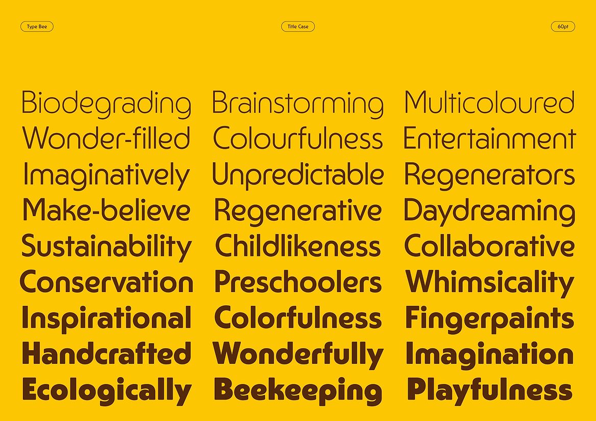
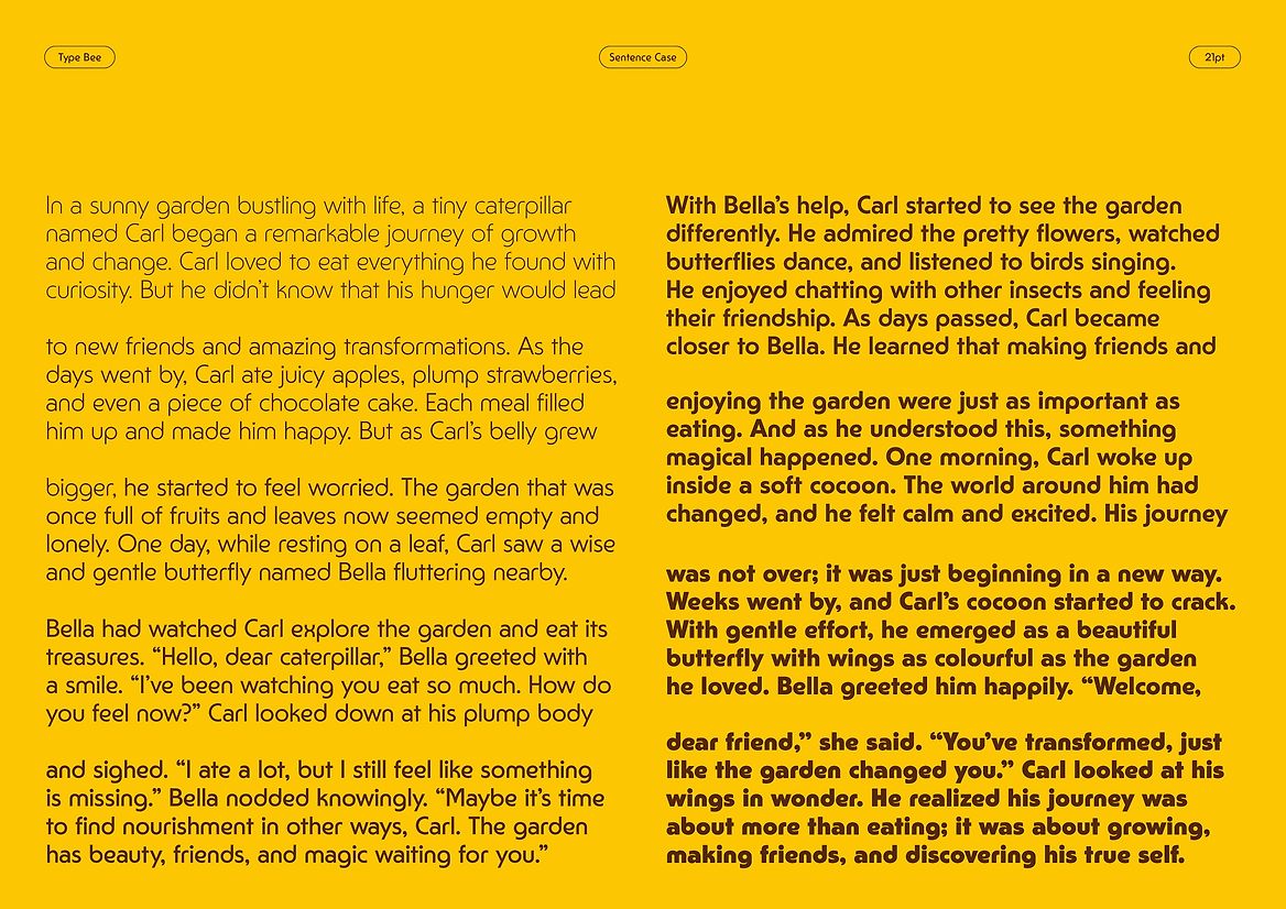
Available in nine weights, from Thin to Extra Bold, alongside a hive of whimsical alternates, Type Bee delivers flexibility and fun without ever compromising on typographic integrity. Even within the limited real estate of packaging, this typeface is designed to work hard – bold and bouncy for our characterful headlines, robust and readable for long-form copy blocks.
Type Bee is more than a typeface. It’s the very essence of Honeysticks distilled – the perfect balance of purpose and play, sweetness and substance. On its own, it stands as an emblem for the joys of creative expression, making room for idiosyncrasies and imperfections, and acknowledging that the creative process rarely ever follows a straight line. Free-spirited and fun-loving, it inspires future creators and makers to follow their own buzz.
Judge's comments:
Successfully carries the personality of the brand in the letterforms. Childlike, but not childish.