Graphic
Milk 68 So Type
-
Pou Auaha / Creative Directors
Anthony Hos, Sarah Melrose
-
Ngā Kaimahi / Team Members
Kate Forsythe, Gemma Scott, Adeline Chua -
Kaitautoko / Contributors
Kate Phillips, Michael Crampin -
Client
Sanitarium Health & Wellbeing Company
Description:
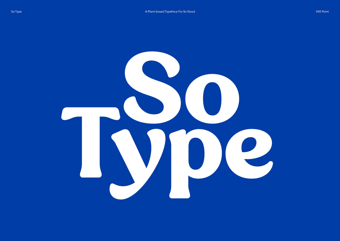
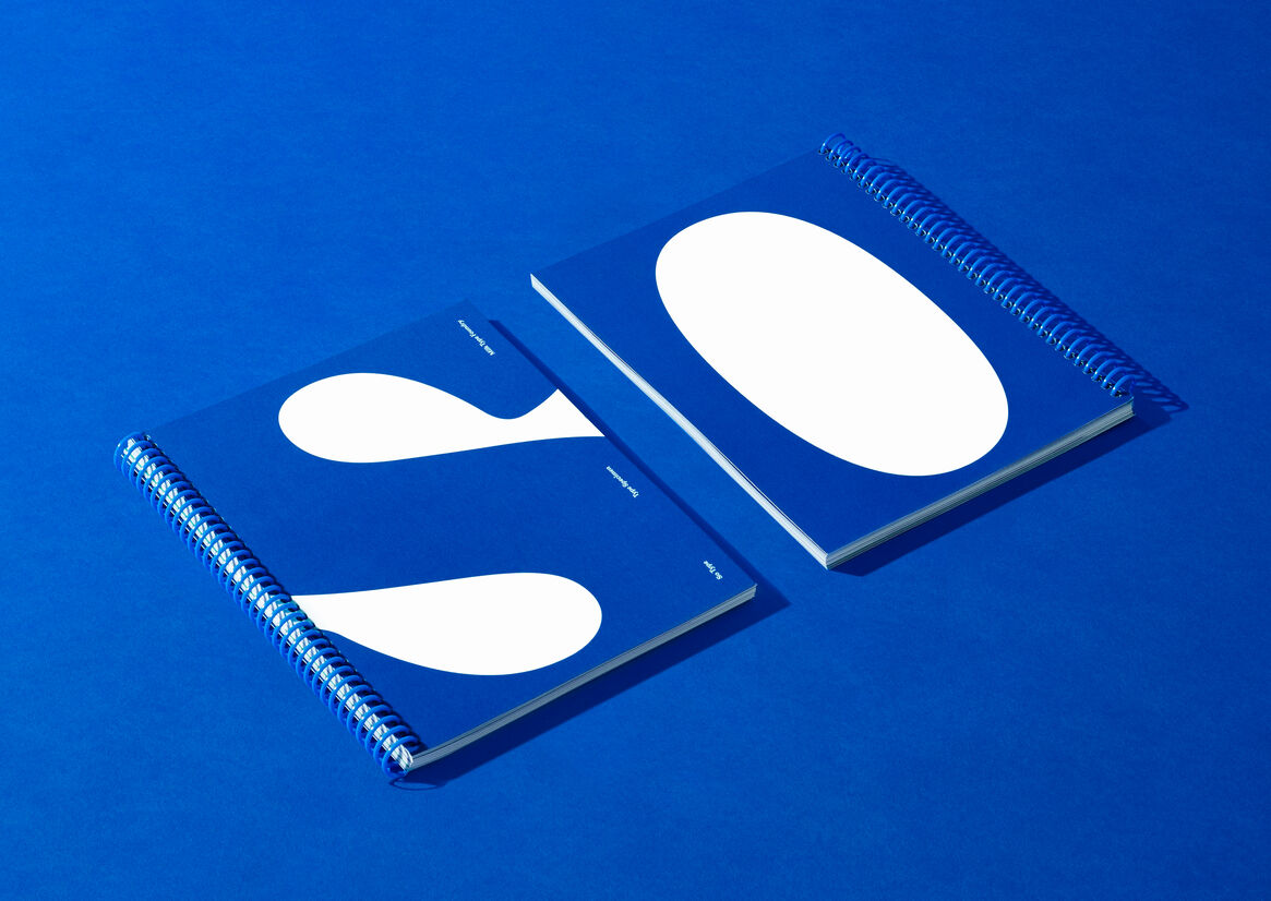
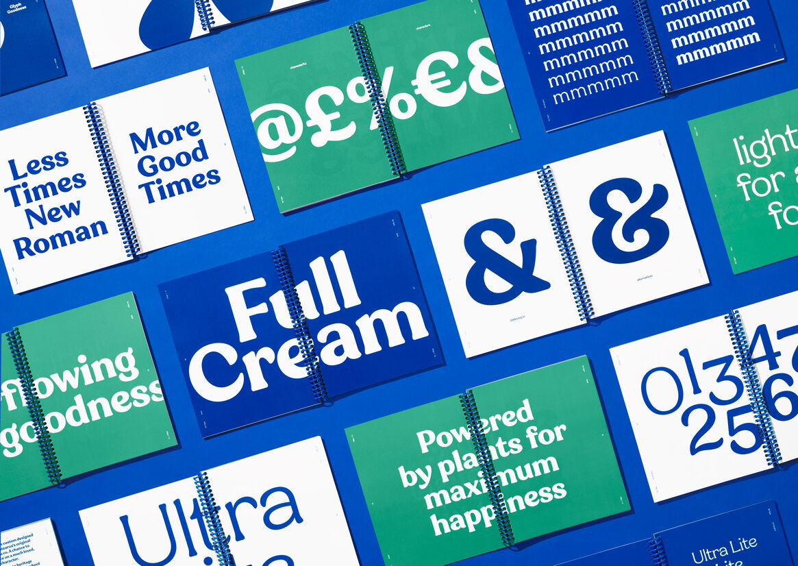
So Good had undergone a full flavoured, all-round character refresh based on the idea of ‘The Joy of the Moment’. With So Good’s ageing, fading assets needing more life, individuality, and relevance for a new conscious consumer, typography and iconography was the main source for re-discovering its true nature. Key to the identity was ‘So Type’ –a bespoke typeface grown organically and specifically for the brand - letterforms overflowing with plant-based goodness at the heart of this joyful character.
The brand idea of Joy of the Moment created an opportunity for typography to talk to both sides of the brand - So Good’s plant-based milk goodness, and the tasty joy it brings every day. We wanted So Good to have the brand idea baked into to every curve, serif and line, talking to the small things that make moments memorable. By crafting joyful iconic, typographic moments into the brand’s core elements, we could add a few ‘smile-in-the-mind’ nods and winks, reflecting the small things that bring us a daily sense of joy.
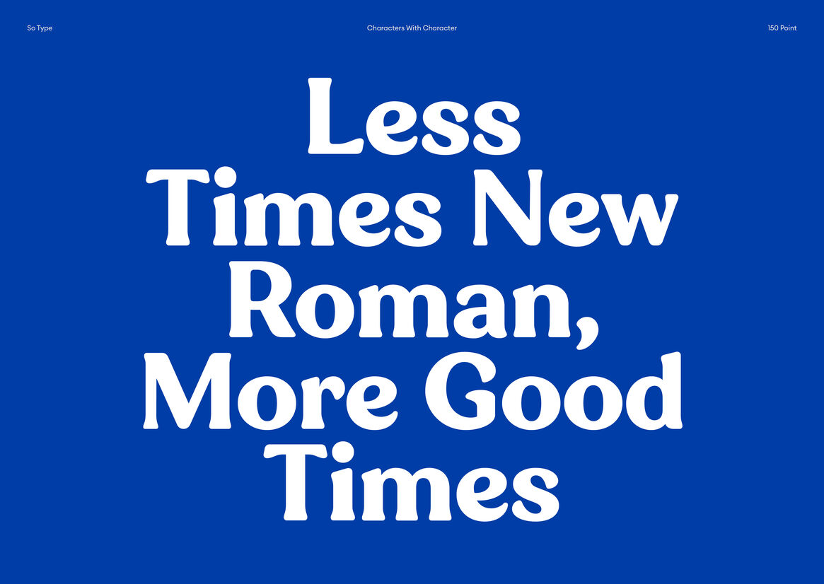
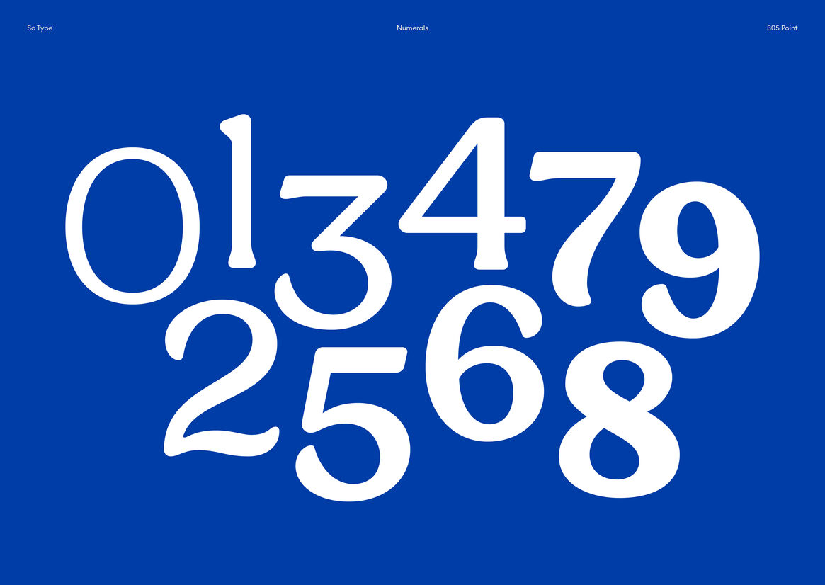
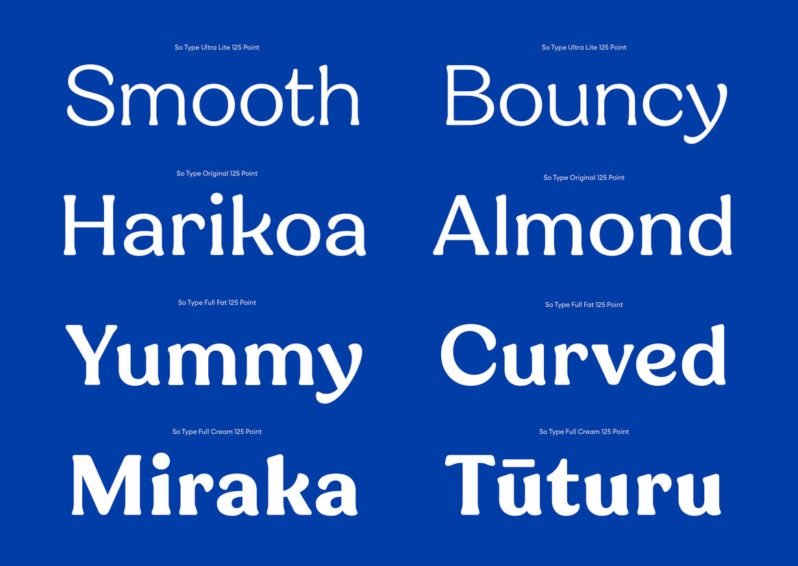
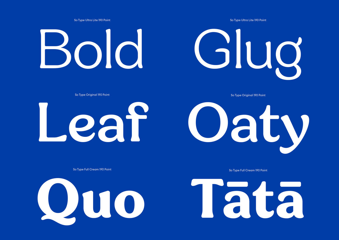
So Type was custom designed to be easy to get to know and fun to be around. A homage to heritage of softer serifs and old school characters from the 1970s that still taste good now. Playful quirks, wholesome forms, and loveable lines found in Cooper, ITC Souvenir, ITC Clearface and Windsor, are at the heart of ‘So Type’. To bring it into the moment, we added a fresh twist of nature - so typography could grow naturally and move playfully, with leaf like terminals, nature inspired ascenders and deliciously smooth serif’s, blended into one singular design.
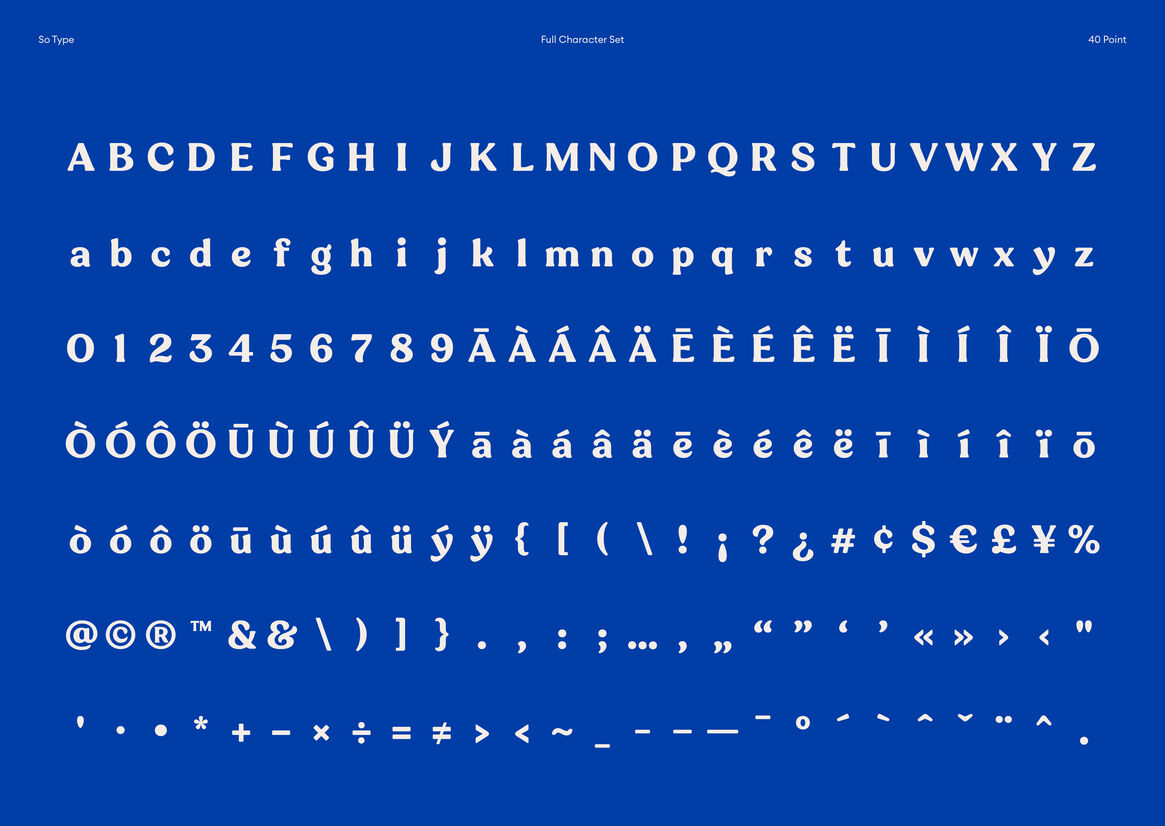
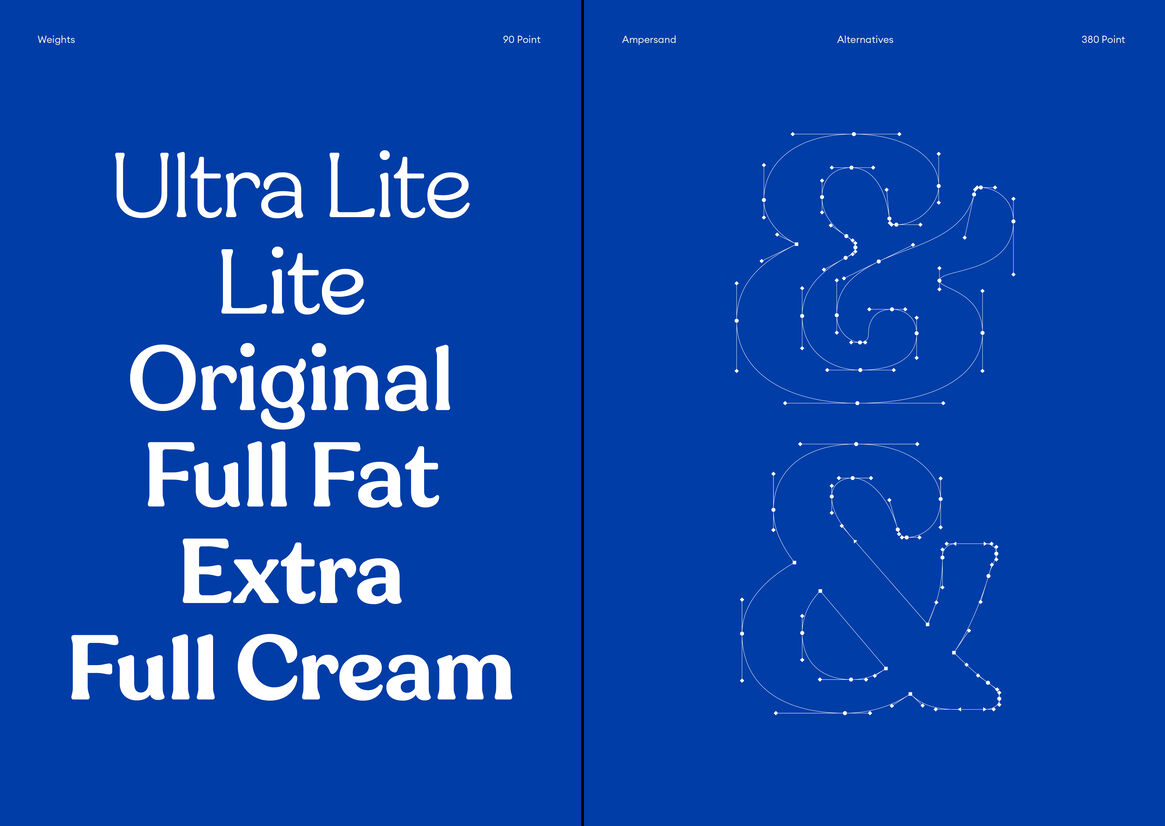
To be specific… plant-based forms feel milky as much as leafy, and the narrower serifs are less serious, more contemporary in tune with the brand shift. Variability is flexibility and weights can change via a sliding scale, a tilted counter form axis adds movement – making letterforms dance and at bolder weights, high stroke contrasts bring an ooey gooey, ‘full cream’ wholesome feel. We created seven delicious weights – from the most full cream, to full fat, through to ultra-lite.
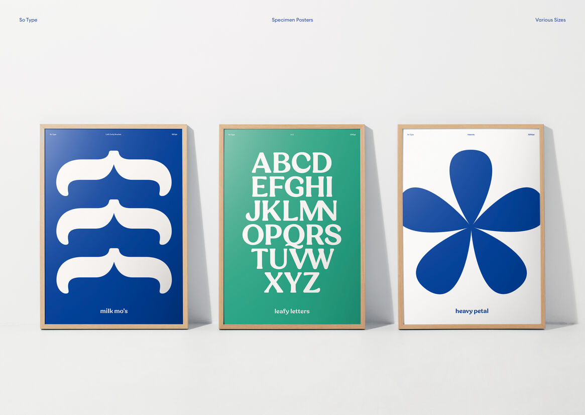
So Good’s icons were re-crafted and reframed in their use. Leaf forms are prominent within the So Good design system, so the typeface as our visual voice had to reflect these forms and adopt a plant-based visual aesthetic. The ‘So Good Leaf’, is seen both as a trust mark or sign off, while free to be extended as a range of organic forms, to create a diverse flexible and expressive language. Type, icons and their mixes, are central to a joyful character, that’s chatty, uplifting, and fun – just how we want people to feel.