Graphic
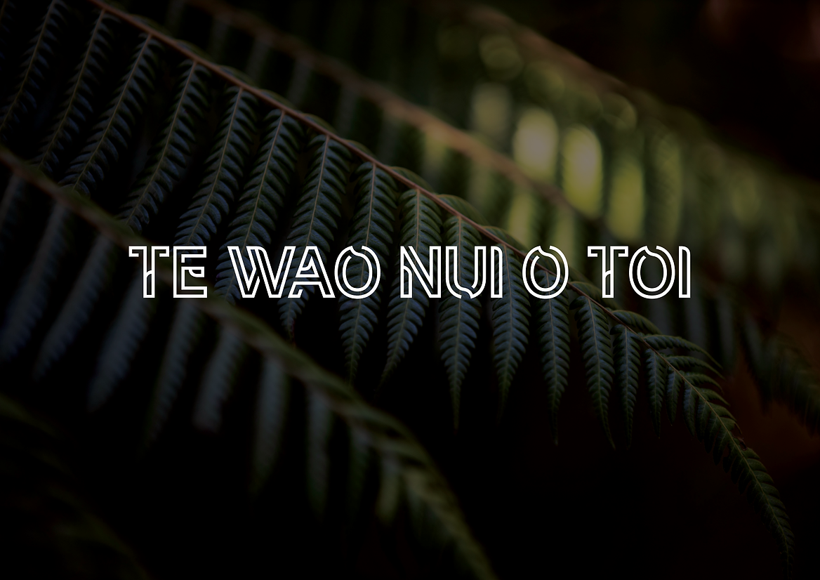
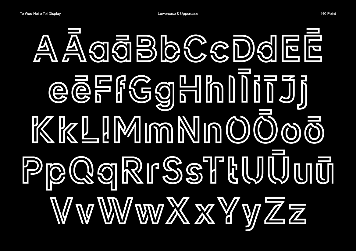
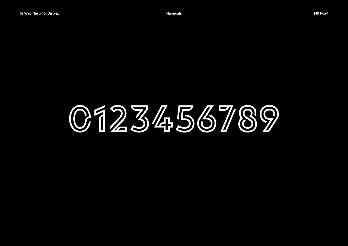
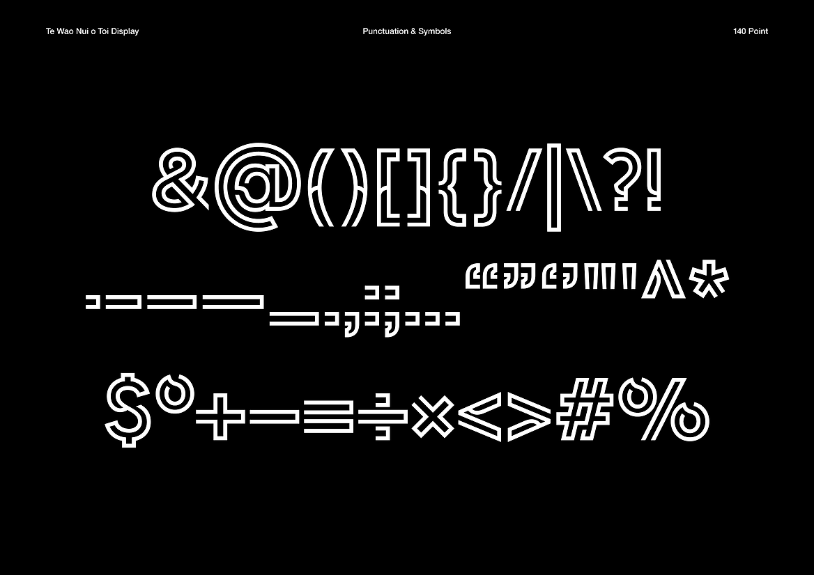
Toi Mai Ohu Ahumahi Te Wao Nui o Toi Display
-
Ringatoi Matua / Design Directors
Libby Silson, Graham Tipene, Sanjiv Menon
-
Kaitautoko / Contributors
Anton Matthews, Vijay Patel -
Client
Toi Mai Ohu Ahumahi Workforce Development Council
Description:
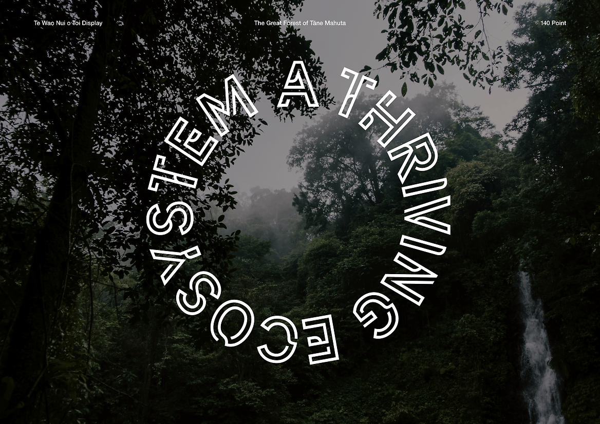
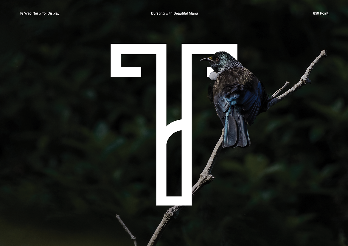
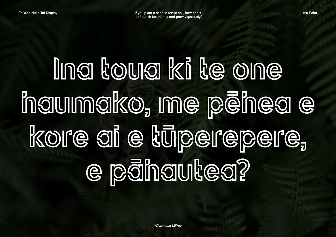
Created for the brand identity of Toi Mai Ohu Ahumahi Workforce Development Council, Te Wao Nui o Toi Display is a bespoke typeface that draws inspiration from the diverse, healthy, and thriving ecosystem of Te Wao Nui a Tāne (The Great Forest of Tāne Mahuta). It embodies the complex interconnection of the diverse workforces within Ngā Peka o Toi – of Toi Māori, Toi Pāho, Toi Ora, Toi ā-Ringa, Toi Puaki, Toi Whānui – the Creative, Cultural, Recreation and Technology industries of Aotearoa that Toi Mai represents. As an organisation that normalises te ao and mātauranga Māori in all its mahi, Toi Mai has used the natural display typeface in its corporate publications.
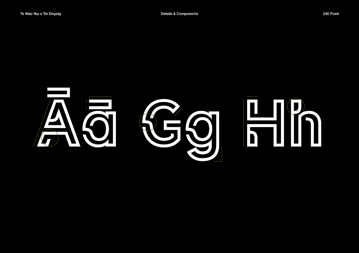
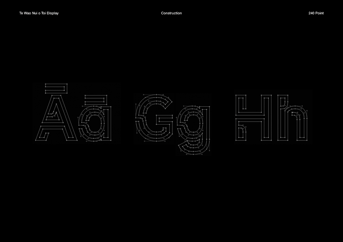
A mātauranga Māori approach to design was taken to influence the visual articulation of the typeface. As part of the creative process, we always go back to the reo – being able to understand the intricacies of the reo guided the design towards the right outcome. The typeface explores themes of growth, circularity, evolution and interrelationship to reflect the whakaaro of Te Wao Nui o Toi. Each character follows a continuous cycle, continuous line. Each form allows space, space to grow, while being part of the wider ecosystem. Rounded and linear components illustrate the many personalities within Ngā Peka o Toi, expressing a truly bespoke and distinctive display typeface for Toi Mai.
The typeface plays a critical role in allowing Māori to proudly see their own world view and ethos reflected in Aotearoa’s type design scene that currently has an absence of mātauranga Māori.