Graphic
Klim Type Foundry 29 The Epicene Collection
-
Pou Auaha / Creative Director
Kris Sowersby
-
Ngā Kaimahi / Team Members
Noe Blanco, Dave Foster -
Kaitautoko / Contributor
Kelvin Soh
Description:
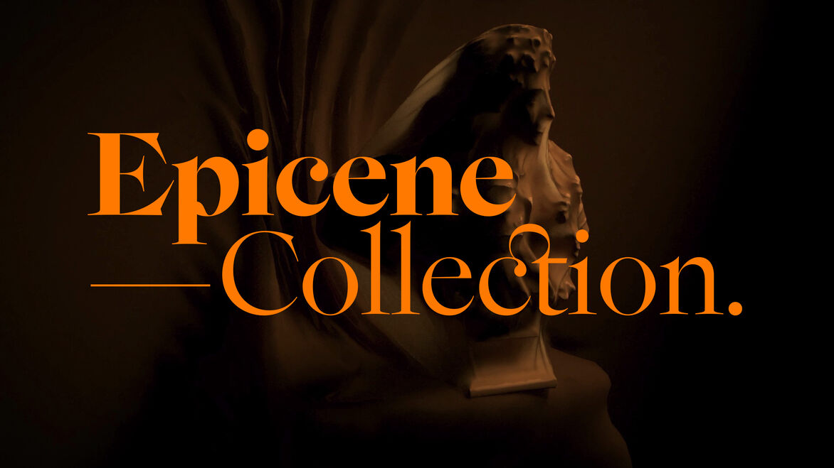
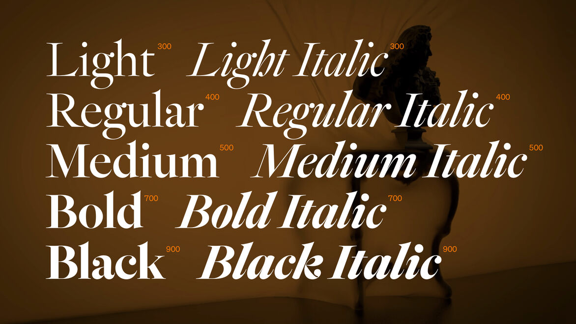
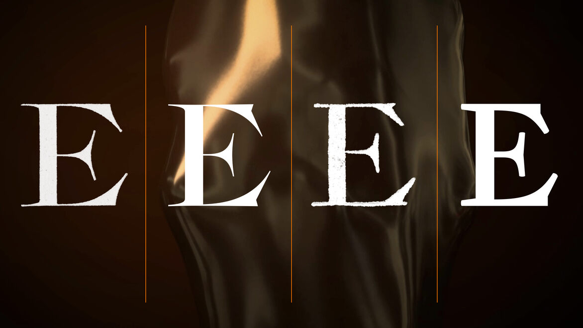
The Epicene Collection is a Baroque-inspired serif typeface family.
—
Taking its name from Susan Sontag’s infamous essay, Notes On “Camp”, epicene means to lack gender distinction, to have aspects of both or neither. In applying this notion to a typographic context, we are calling out the tendency that codes modern, functional or ‘neutral’ visual forms as ‘masculine’, while equating anything ornate or decorative with ‘feminine’ traits.
—
The gendering of ornamentation seems borne of cultural amnesia or myopia: decorative fabrics and accessories are commonly worn by both men and women today, especially by non-Europeans; highly-decorated illuminated manuscripts were made when men dominated artistic production; and during the 18th century, lace, leggings, wigs and high heels were worn equally by men and women.
—
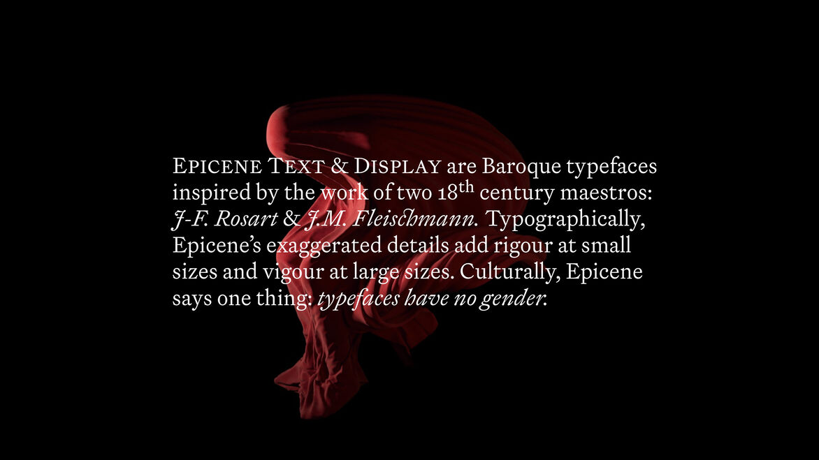
Building out from 18th century European typographic traditions, Epicene is a proposition and its own counter-proposition, a reconciliation of the work of rival typographers Jacques-François Rosart and Johann Michael Fleischmann. It is an expressive and functional type family featuring text and display variants with a generous range of weights.
—
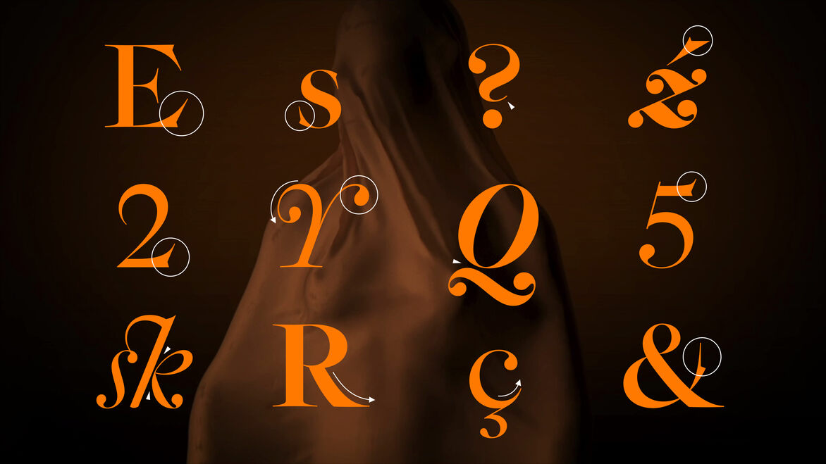
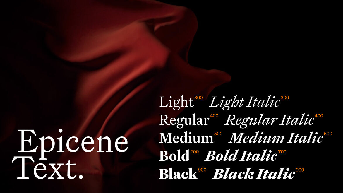
Epicene Text is inspired by Fleischmann’s types. They are deliberate and focussed but energised through cheekiness and a sly wink manifested in small details.
—
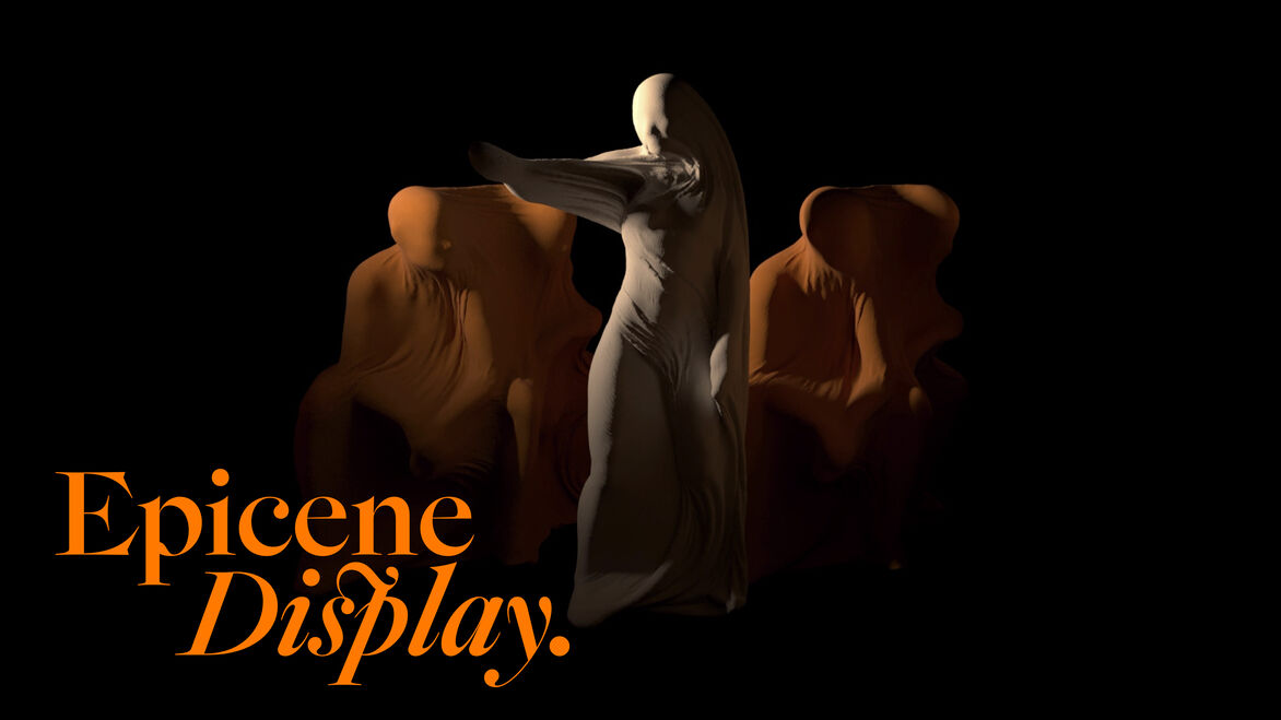
Epicene Display, in the spirit of Rosart, is instead given license to perform with a smaller obligation to function. Taut, refined curves terminate in exaggerated, overhanging serifs while fluid italics are suddenly interrupted with bombastic swoops and curls. These letterforms are designed to be seen as much as read.
—
While attentive to history, Epicene is not a revival typeface. It is an experiment in modernising Baroque letterforms without muzzling their ornamental idiosyncrasy nor falling into the trap of gender codifications.
—
Judge's comments:
This is a vigorous and wonderfully researched piece of work.
Originating a type from this specific genre for a modern output is a difficult ask, and this is no exception. No doubt the outcome of long and thorough process — the result is an elegant and very functional type family.