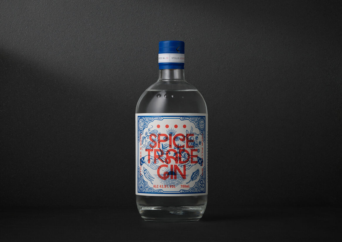
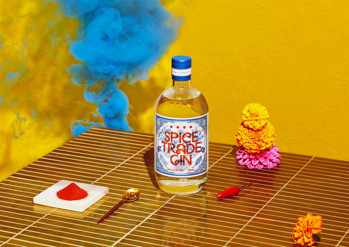
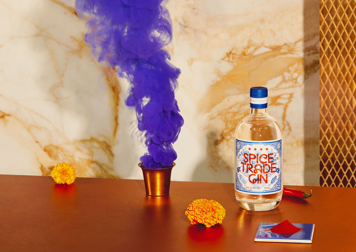
What happens when modern Australian gin-makers from Melbourne’s Yarra Valley serendipitously meet modern Indian gin-makers from the island of Goa? The answer… Spice Trade Gin: the fourth Distiller Series gin created by Four Pillars—Australia’s leading craft gin maker—in partnership with Goa’s Stranger & Sons. A loud, fun, and fresh celebration of a shared love of Indian food and flavours—Spice Trade Gin is a vibrant and aromatic gin that provided a creative opportunity to visualise the trading of spices, gin recipes, and cultural ideas between two modern and colourful countries.
The approach needed to capture the creative merging of the two cultures—both the modern and traditional, and the chaos and order—to fully represent the youthful, creative energy found in both cultures.
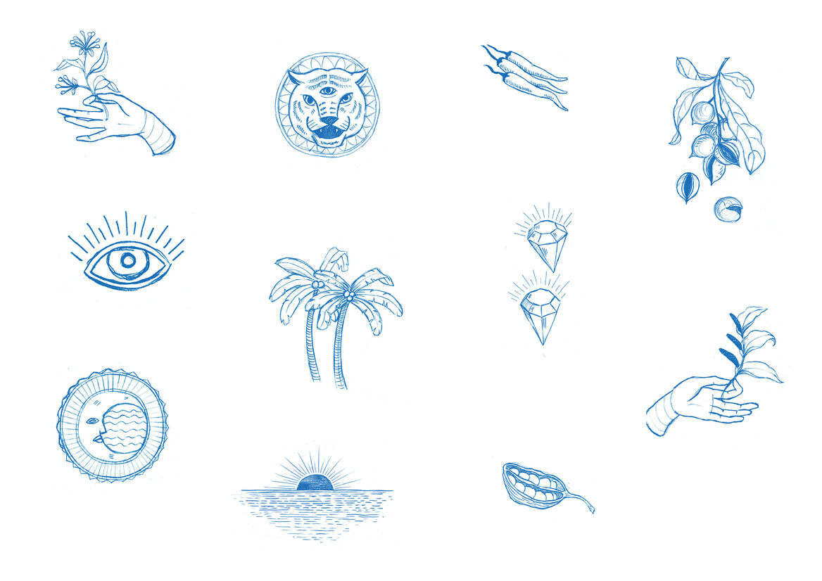
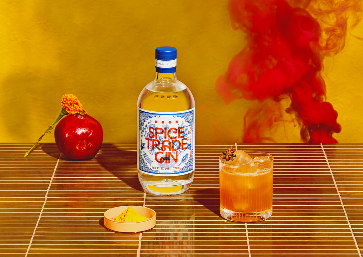
The backdrop to the label design was inspired by the blue and white azulejos ceramic tiles found prominently on the streets of Goa, India. This detailed illustration depicts the story of the gin’s conception, being the long distance ‘trade’ of native spices and botanicals necessitated by the COVID travel restrictions.
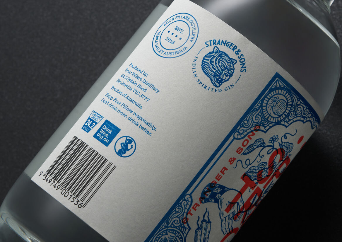
This story unfolds playfully across all corners of the label—drenching every spare centimetre with mythological-meets-cosmical metaphors. The upper corners feature the sun and moon—brand elements from Stranger & Sons—which in this context represent the geographical distance between the two countries. The lower corners feature symbolic creatures, representing both gin producers—the Stranger & Sons three-eyed tiger and a snake weaving between the famous Four Pillars dots, symbolising the creative life force of the Australian brand.
Juxtaposed and overlaid onto the illustration is the bold red typography. Red for the colour of the Australian Soil and the typeface playing homage to the classic steel signage often found in Indian flea markets.
Together these myriad elements should fight against one another, however, through careful placement, the label achieves a high sense of symmetry and harmony.

Description:
What happens when modern Australian gin-makers from Melbourne’s Yarra Valley serendipitously meet modern Indian gin-makers from the island of Goa? The answer… Spice Trade Gin: the fourth Distiller Series gin created by Four Pillars—Australia’s leading craft gin maker—in partnership with Goa’s Stranger & Sons. A loud, fun, and fresh celebration of a shared love of Indian food and flavours—Spice Trade Gin is a vibrant and aromatic gin that provided a creative opportunity to visualise the trading of spices, gin recipes, and cultural ideas between two modern and colourful countries.
The approach needed to capture the creative merging of the two cultures—both the modern and traditional, and the chaos and order—to fully represent the youthful, creative energy found in both cultures.
The backdrop to the label design was inspired by the blue and white azulejos ceramic tiles found prominently on the streets of Goa, India. This detailed illustration depicts the story of the gin’s conception, being the long distance ‘trade’ of native spices and botanicals necessitated by the COVID travel restrictions.
This story unfolds playfully across all corners of the label—drenching every spare centimetre with mythological-meets-cosmical metaphors. The upper corners feature the sun and moon—brand elements from Stranger & Sons—which in this context represent the geographical distance between the two countries. The lower corners feature symbolic creatures, representing both gin producers—the Stranger & Sons three-eyed tiger and a snake weaving between the famous Four Pillars dots, symbolising the creative life force of the Australian brand.
Juxtaposed and overlaid onto the illustration is the bold red typography. Red for the colour of the Australian Soil and the typeface playing homage to the classic steel signage often found in Indian flea markets.
Together these myriad elements should fight against one another, however, through careful placement, the label achieves a high sense of symmetry and harmony.