Graphic
Houston 25 Toyota Asia Pacific Brand
-
Pou Auaha / Creative Directors
Alex Toohey (Executive Creative Director), James Calpis (Creative Director)
-
Ngā Kaimahi / Team Members
Stuart O'Brien, Cara Meade, Kyle De Raedt, Shani Mun, Nathan Wren -
Client
Toyota Asia Pacific
Description:
Opportunity
Toyota is one of the world’s strongest brands. And yet, times of considerable change and competition demand brave thinking to maintain market leadership, and continue connecting with new generations of customers.
For the first time in its history, Toyota’s Japanese headquarters set a new global vision, transforming from a car company to a mobility company; working towards ‘Mobility for All’, to better connect with tomorrow’s drivers.
How each global region embodied the vision was their own decision to make. Our objective was to interpret ‘Mobility for All’ to create a regional brand to unite all 17 Toyota APAC markets, to create a stronger, more relevant, and more resilient regional brand – expressing Toyota’s story with character, emotion, and style.
Approach
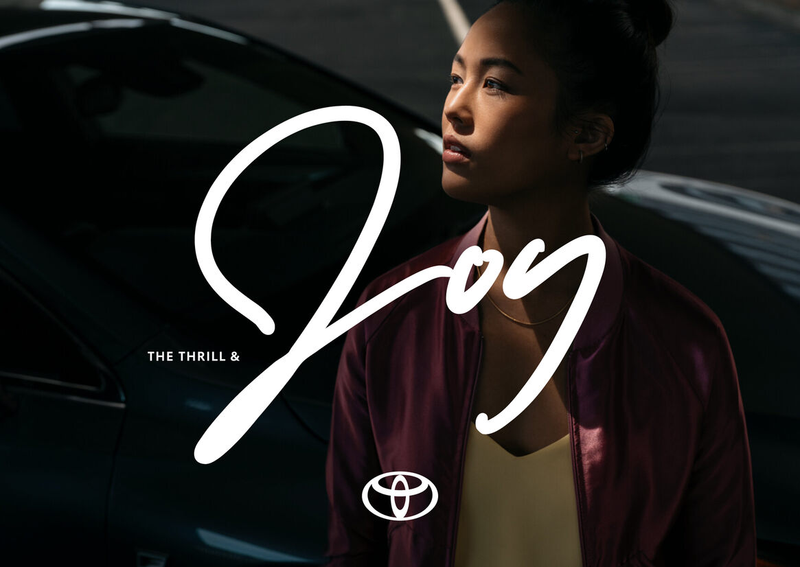
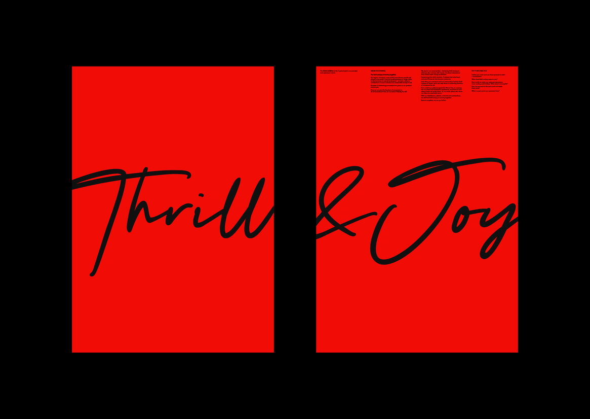
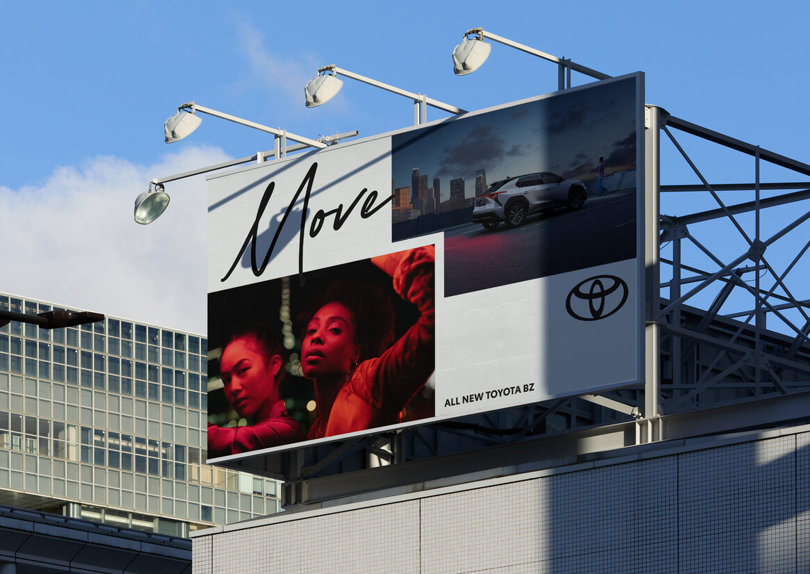
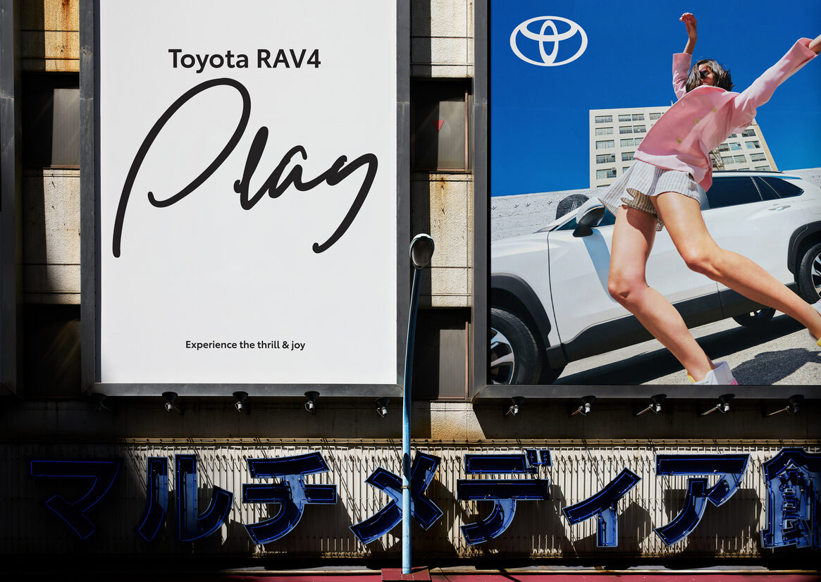
Inspired by Toyota’s customer, united by the common mindset to keep individually and collectively moving forward, we established a brand concept built on the positioning ‘The thrill and joy of moving together’, a creative platform engineered to embed missing elements of excitement and emotion across the entire brand.
This idea translated to a fluid, free-flowing, dynamic visual brand expression; a creative thread drawing audiences through all Toyota touchpoints and moments with a sense of joy, excitement and positive energy.
Execution
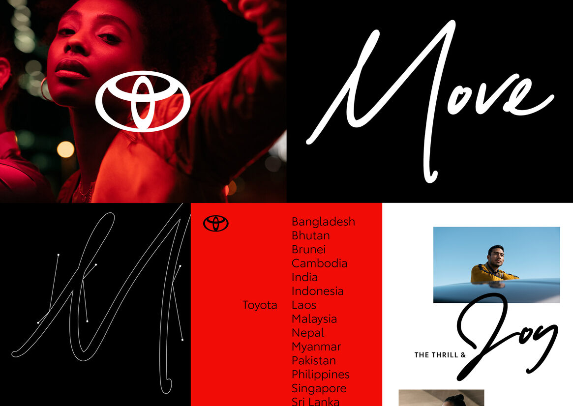
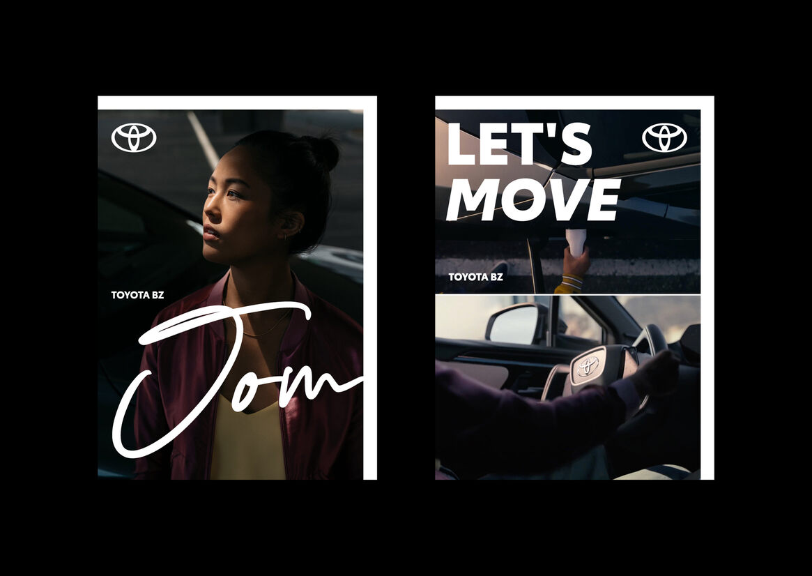
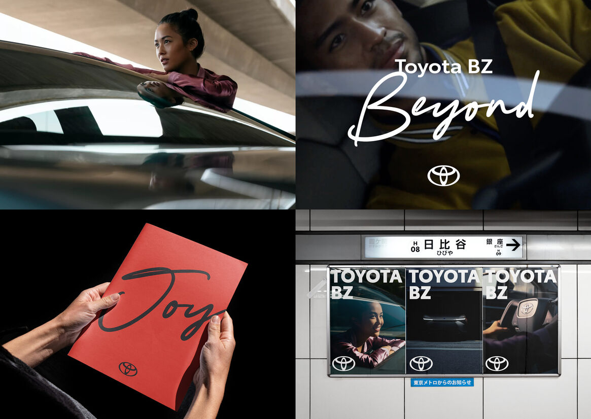
Core to the Toyota Asia rebrand was the introduction of a handwritten script typeface bringing Toyota’s new global vision of ‘Mobility for All’ to life.
The irreverent script typography was designed to amplify action-inspired messaging, applied with freedom and attitude, disrupting the underlying design grid to ‘dial up the volume’ across communications.
Crafted with a world-renowned script typographer in collaboration with our creative team, the process to develop the typeface focused on creating expressive yet legible glyphs to connect a highly diverse region with a sense of freedom and human emotion, as demonstrated in successful application across multiple APAC languages.
A flexible toolkit of logo variations, typefaces, graphic devices, primary and secondary colour palettes, photography, iconography and illustration further celebrate a sense of freedom and inspire creativity.
Results
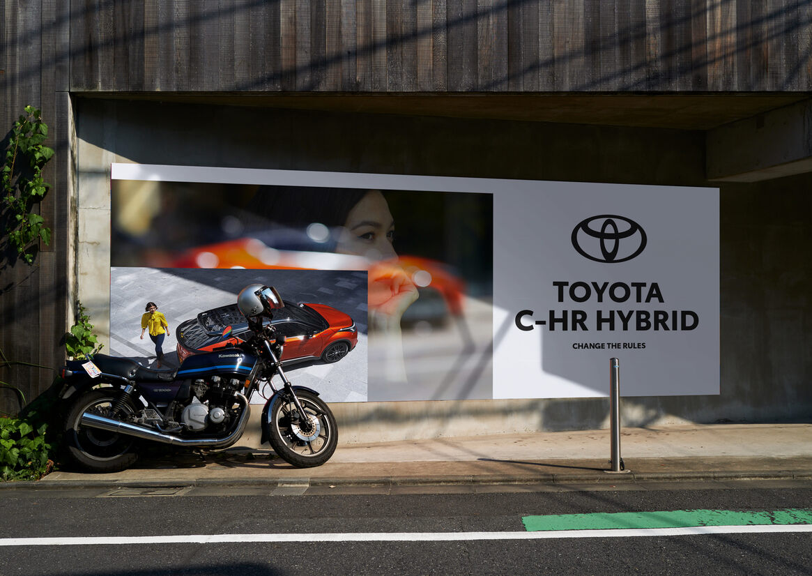
We launched the transformation to all team members and agencies across 17 markets, guiding the development of every class of communication. From brand, product and retail advertising, physical interactions in dealerships or call centres, press releases or CSR initiatives, through to recruitment, every single touchpoint was considered an opportunity to reinforce who Toyota is, and what they believe.
Our flexible, intuitive design system delivered as comprehensive guidelines enabled markets to execute the brand vision ‘Mobility for All’ beyond traditional communications and customer touchpoints: to all classes of products, channels and services, successfully reframing the Toyota brand from being a marketing tool, to an all-of-business responsibility.
From print to digital formats, our suite of design elements delivered a consistent regional strategy, whilst allowing the flexibility to celebrate local market nuance.
The business impact is significant. In the words of our client, “Getting 80% of the markets to unite would have been an amazing result. Having all 17 markets enthusiastically aligned is a huge achievement and a testament to the project.”