Graphic
Houston 36 QT Hotel Singapore
-
Pou Auaha / Creative Director
Alex Toohey -
Pou Rautaki / Strategic Leads
Stuart O'Brien, Daye Moffit
-
Kaituhi Matua / Copywriter Lead
Mikey Thebridge
-
Ngā Kaimahi / Team Members
Cate Patterson, Ticky Lan, Stacey Saunders, Dana Rogers -
Kaitautoko / Contributors
Jill Tran, Terence Chin, Stephen Grace -
Client
QT Hotels & Resorts
Description:
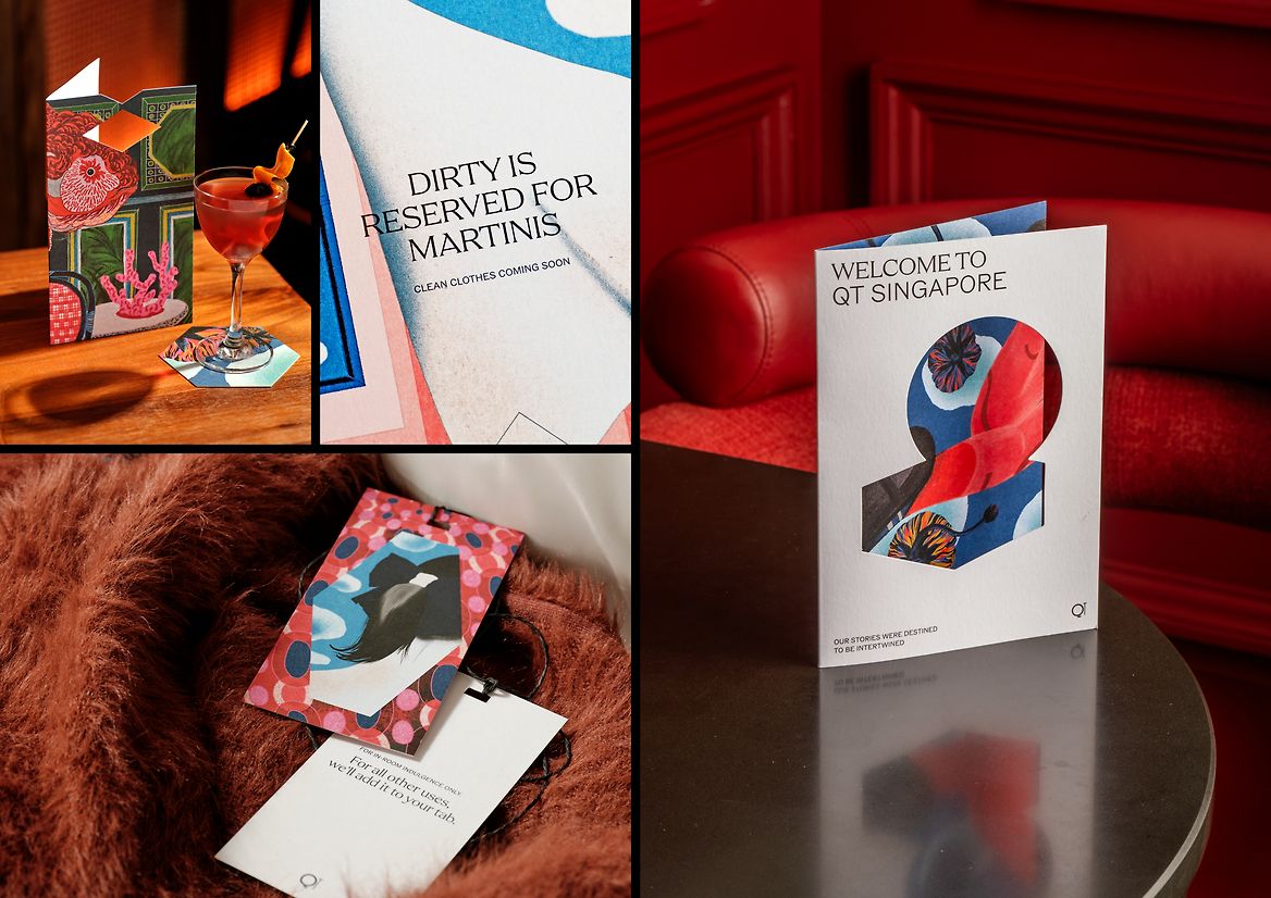
QT Hotels has always been defined by curiosity. From their spaces to their experiences, the brand has sought to offer guests new perspectives on the cities they’re staying in – and this shines through proudly (and sometimes loudly) in their visual identity toolkit.
Yet in recent years, as the boutique hotel sector became more crowded, QT found itself grappling with how to balance its playful nature with an approach that felt captivating and considered – rather than just louder or more outrageous.
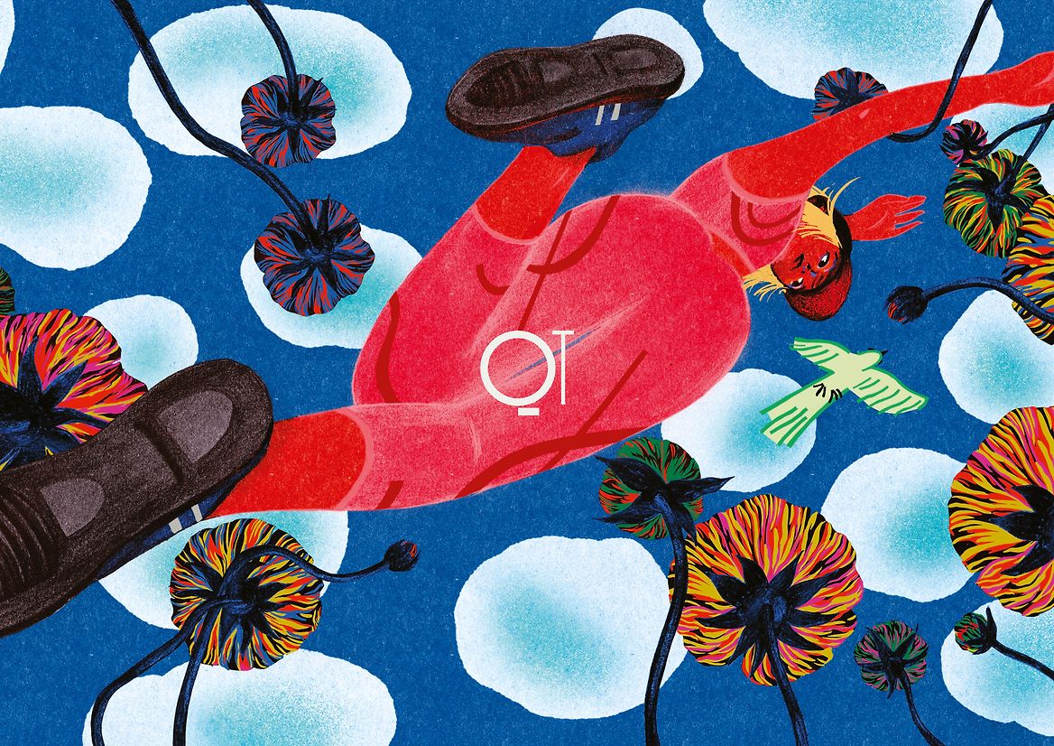
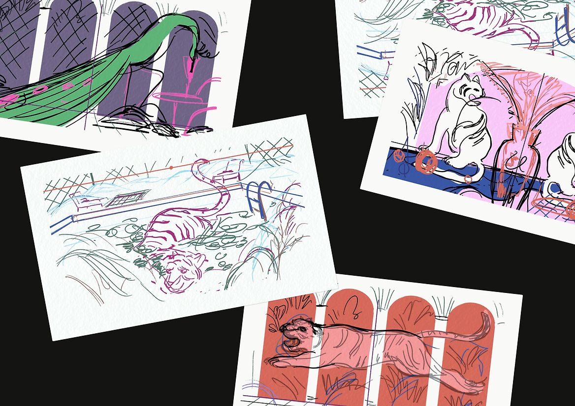
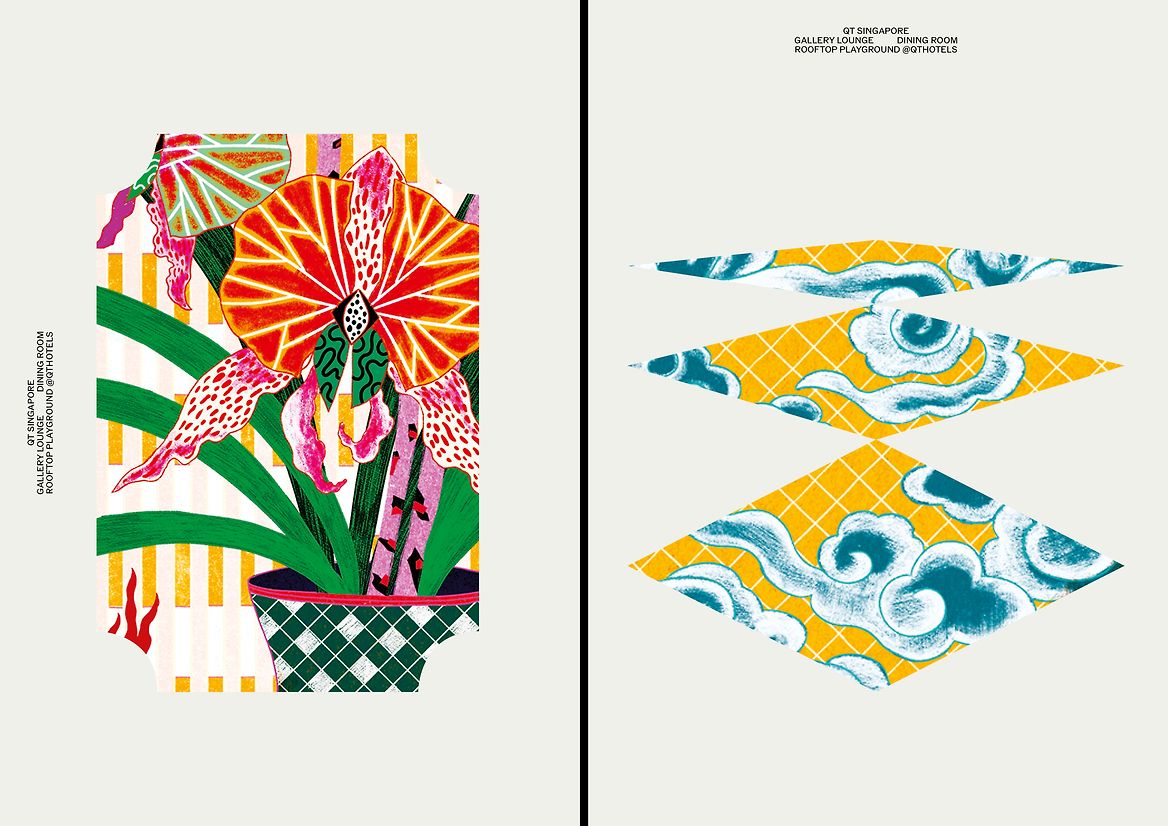
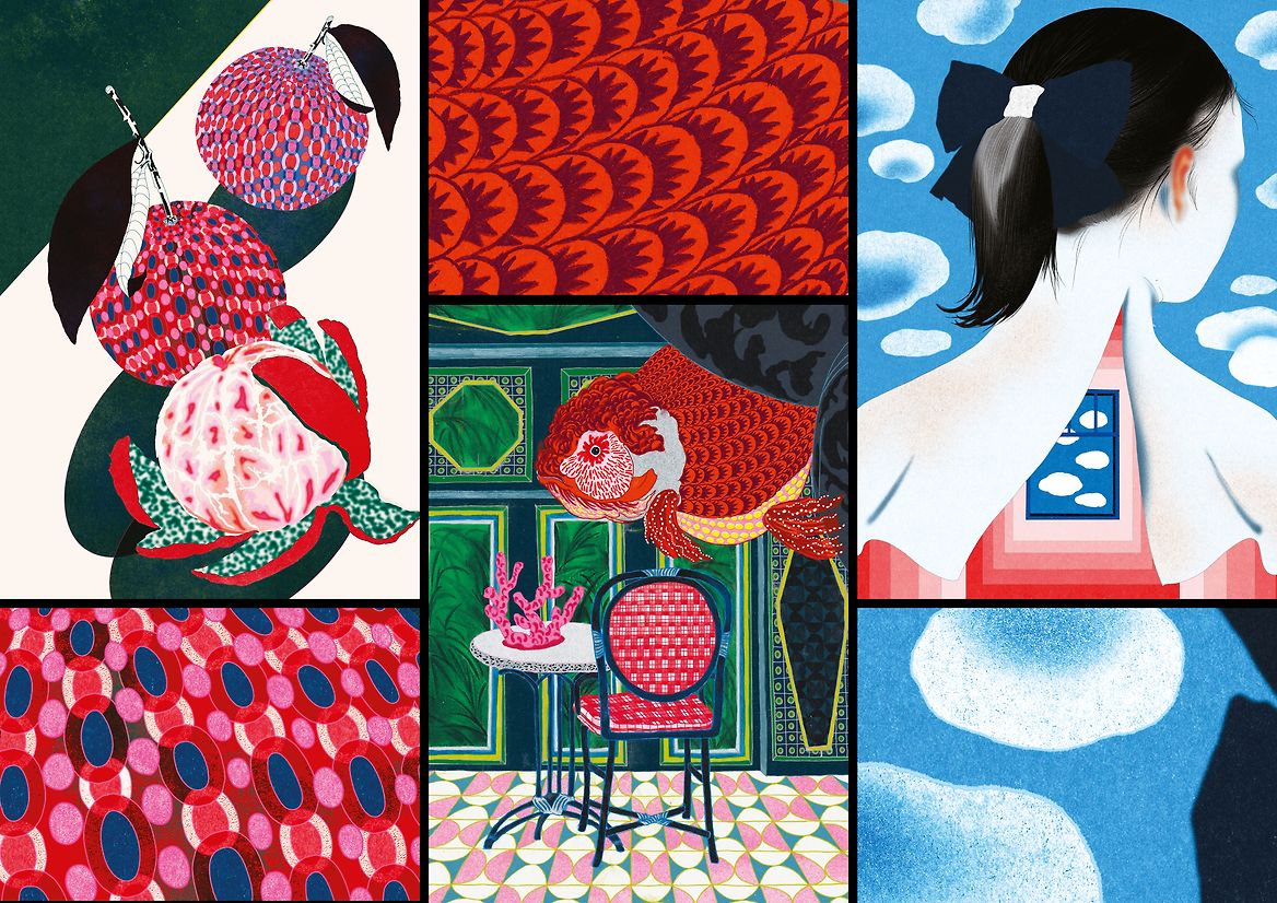
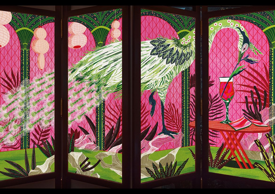
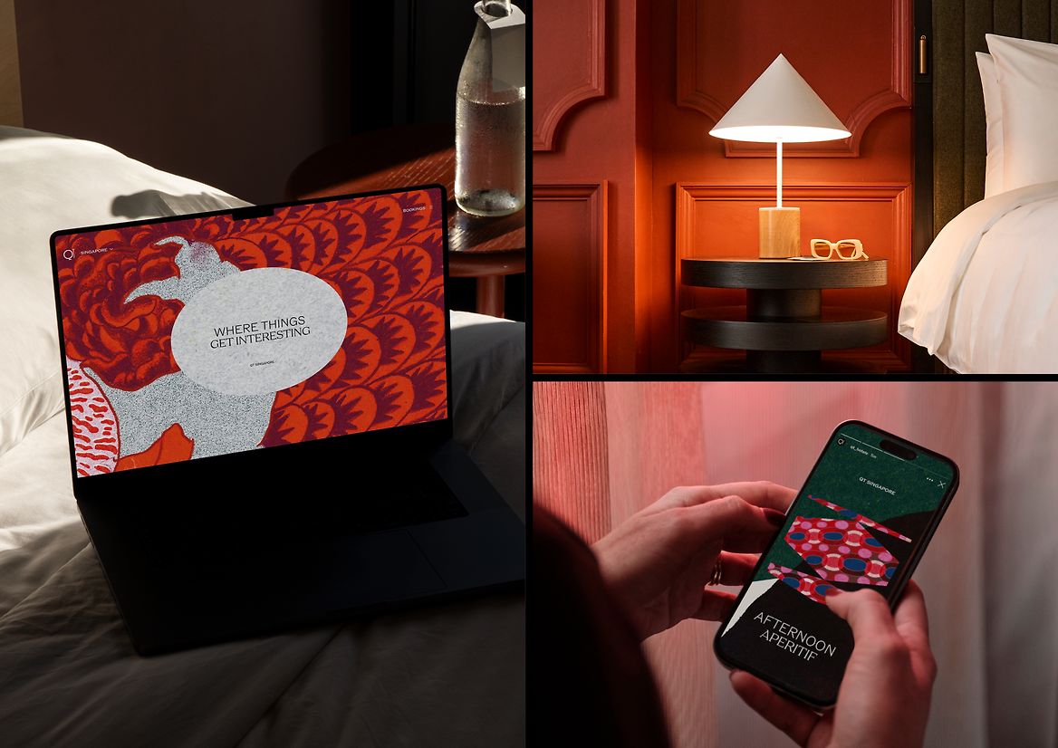
With QT Singapore, the brand’s first international location, came an exciting opportunity to push that curiosity in new directions. To collaborate with a local artist who was deeply connected to the place itself. Who brought a singular artistic lens to capturing Singapore’s vibrant character creatively.
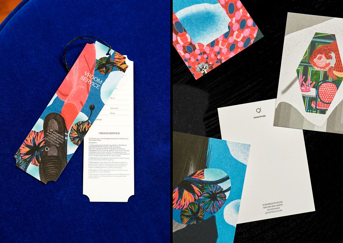
We set out to connect with an artist whose vision reflected ours and the brand’s. For Singapore, that was artist Jill Tran. Jill called Singapore home for six years, when she was first sparking her own curiosity and honing her creative craft – making her an ideal lens through which QT’s guests could ignite their curiosity too. We briefed Jill to craft a series of bespoke illustrations that four artworks that captured Singapore at its most idiosyncratic and inspiring. These original creations would be a gateway for taste‑makers looking to experience something new and unexpected from this iconic destination.
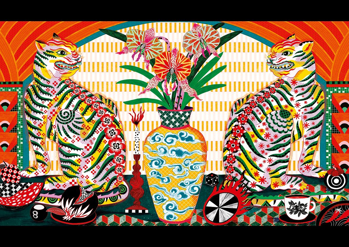
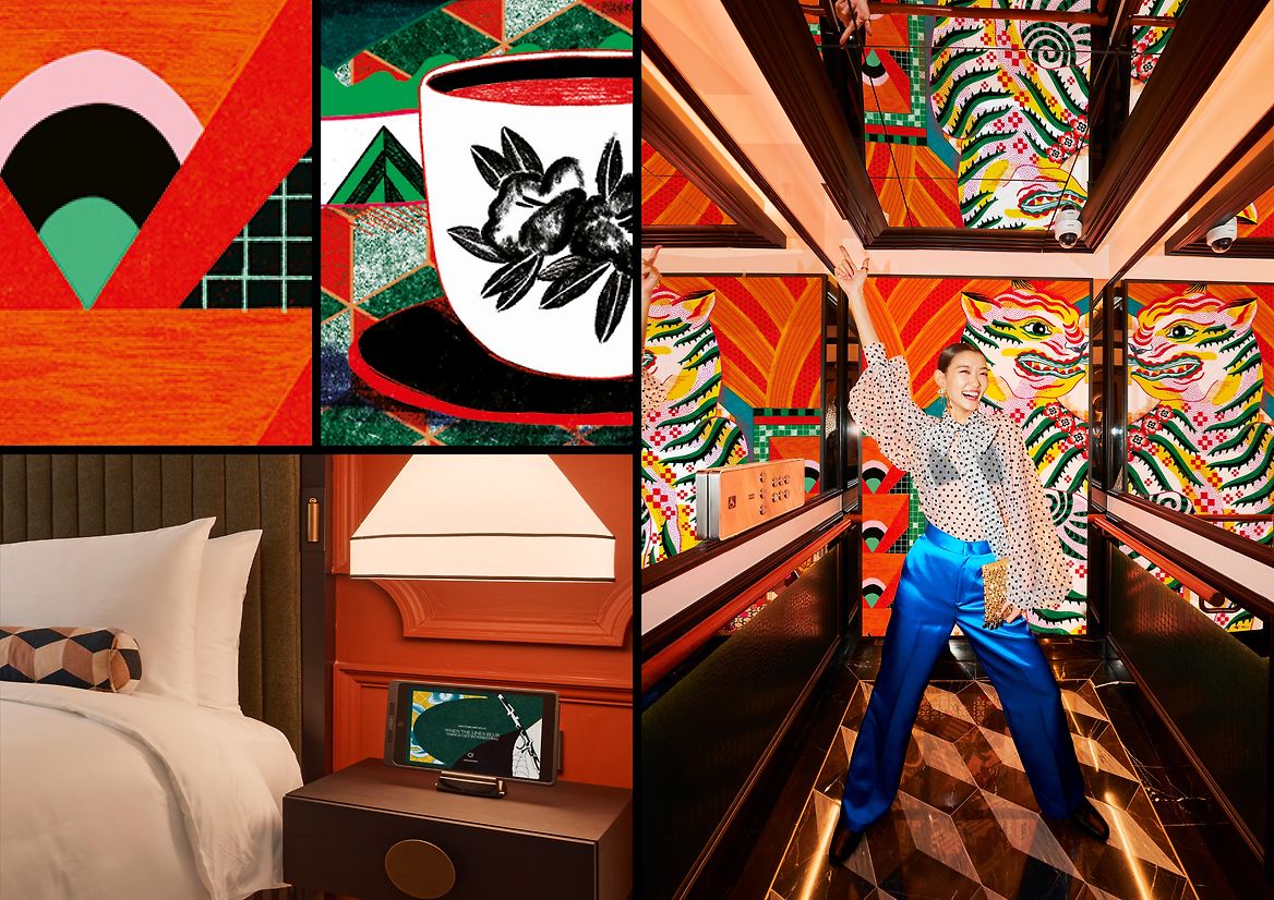
Taking her preferred approach of drawing by hand, the dreamlike‑yet‑authentic motifs reflected Singapore as a melting pot of contrasting sides, stories and styles. East and west. Old and new. Lavish and low‑key. Surreal and true. The artworks featured a peacock in a shophouse. Two tigers having a tea party. Another in a swimming pool. Fish swimming through a dining room and more. Jill chose these animals because they weren’t mythical or cliched, but bold and iconic for a brand like QT.
Each illustration balanced a traditional folk painting style with a vivid, contemporary flair – with the bold, brilliant colour palette created a captivating wonderland that became the foundation for QT Singapore’s design. Together, these artworks and their bespoke framing inspired a graphic language that felt both familiar and new – a glimpse of a world you’ve seen, a world you want to be a part of.
In doing so, QT Singapore became a space where curiosity, culture and character truly converge.
Judge's comments:
A subtle systemisation of lively illustration. A capsule of Singapore, without the clichés and stereotypes. It’s clear that complete trust was given to the illustrator, allowing the images to carry the identity.