Graphic
FCB New Zealand 19 The Craft Shop Return To The Script Department
-
Pou Auaha / Creative Directors
Peter Vegas, Leisa Wall
-
Ngā Kaimahi / Team Members
Hayley Marks, Hugh O'Connor, Ben Lockwood -
Kaitautoko / Contributors
Sean Keaney, Jenni Doubleday, Simon Pengelly, Sue Kipling, Philippa Mckenzie, Katie Heslop, Keegan Flood, Philip Cartwright -
Client
Fire and Emergency New Zealand
Description:
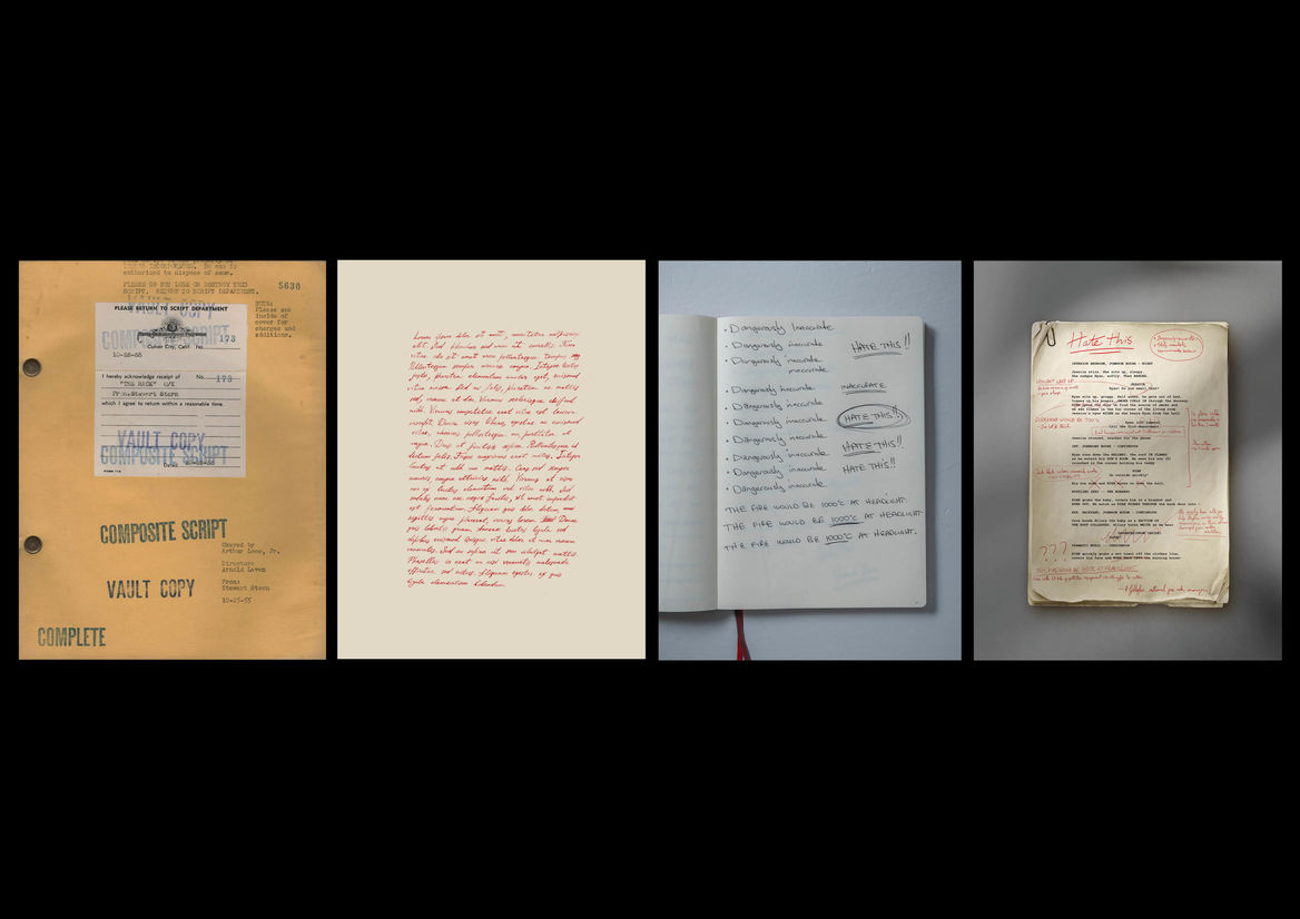
THINKING
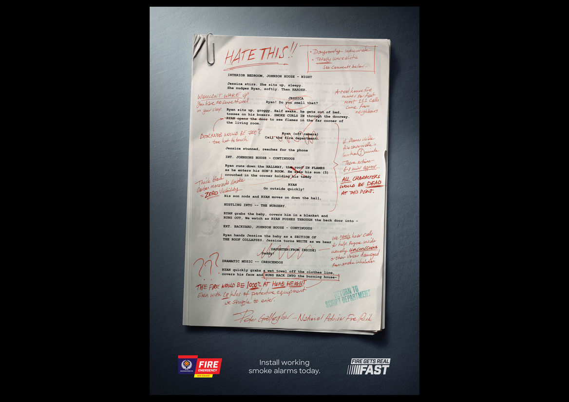
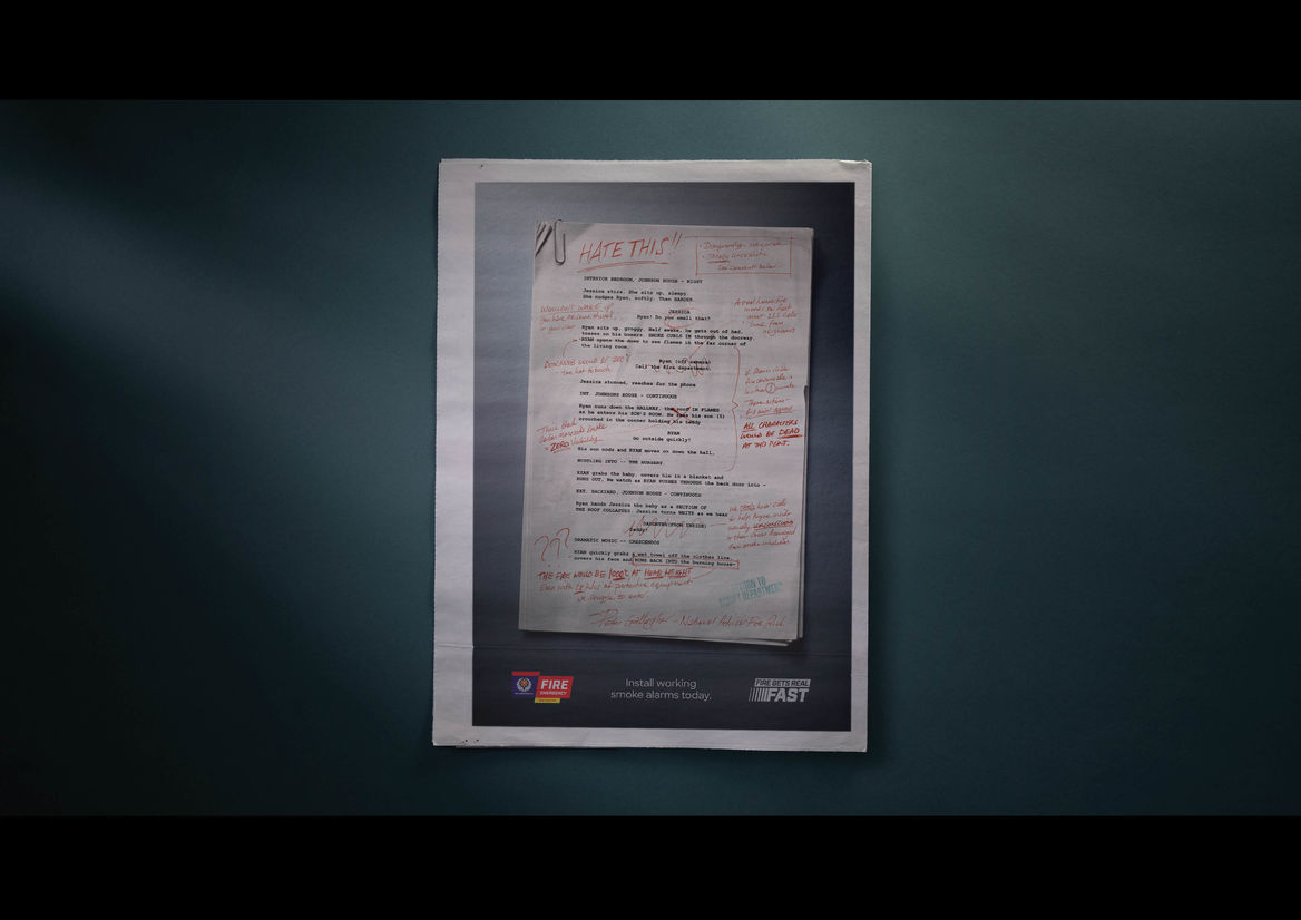
“Return to Script Department” was part of a nationwide campaign called “Firefighters Don’t Like Fire Movies” in response to a brief to draw to the speed of fire, and the need for smoke alarms to give you a warning. The campaign was created around the insight that people are complacent about the speed of house fires, because they’ve only seen Hollywood’s version of events. The dwell time of press was our opportunity to expand on all the chilling detail of the realities of fire, set against the most relevant backdrop for the campaign thought. A Hollywood movie script.
CONCEPT
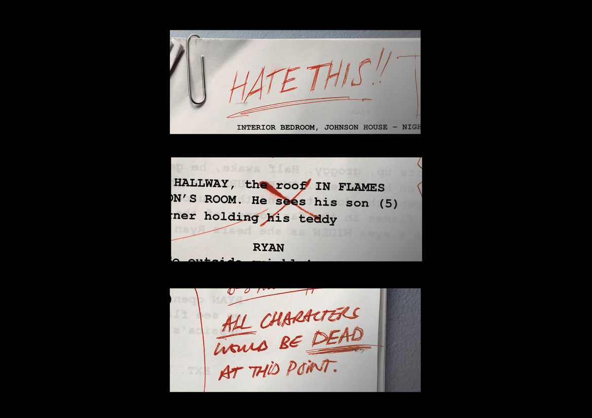
Playing with the instantly recognisable script format gave us a chance to educate the public about some of the misconceptions of fire, while also comparing and contrasting with Hollywood’s portrayal. Our eyes are guided down the page as we watch the firefighter correct inaccuracies like characters waking up to the smell of smoke or being able to see clearly across rooms that would be in darkness due to thick black smoke.
EXECUTION
The script pages were shot in-camera, while the lettering was created by hand to represent the mounting frustration and build-up of emotion as the firefighter corrects the dangerously inaccurate movie script. The more orderly notation at the beginning, descends into dramatic underlines, emphatic retraces and expressive pen work. Hierarchy was achieved by leading with a prominent, bold statement and utilising linework to guide the eye along the printed type, leading all the way down to the signature of Fire and Emergency’s Peter Gallagher at the base of the page - a detail which adds an element of real-world authenticity to the piece. A variety of handwriting styles were considered, with the aim of balancing fluidity and expression with legibility. Overall the piece was created to draw the public’s attention to the distance between fiction and real-life danger, so balancing clarity of communication with the expression of human emotion was key.