Graphic
FCB New Zealand 19 FS Fresh
-
Pou Auaha / Creative Directors
Leisa Wall, Peter Vegas
-
Ringatoi Matua / Design Director
Josh O'Neill
-
Kaitautoko / Contributors
Augusta Mercer, Daniel McQueen, Diane Clark, Jane Wardlaw -
Client
Foodstuffs New Zealand


Description:
The new visual identity for Four Square supermarkets aims to progress the brand expression into a new territory that connects with all Kiwis. It acknowledges the privilege of owning an iconic position in culture, and moves the brand forward under a new proposition that seeks to authentically connect with New Zealand.
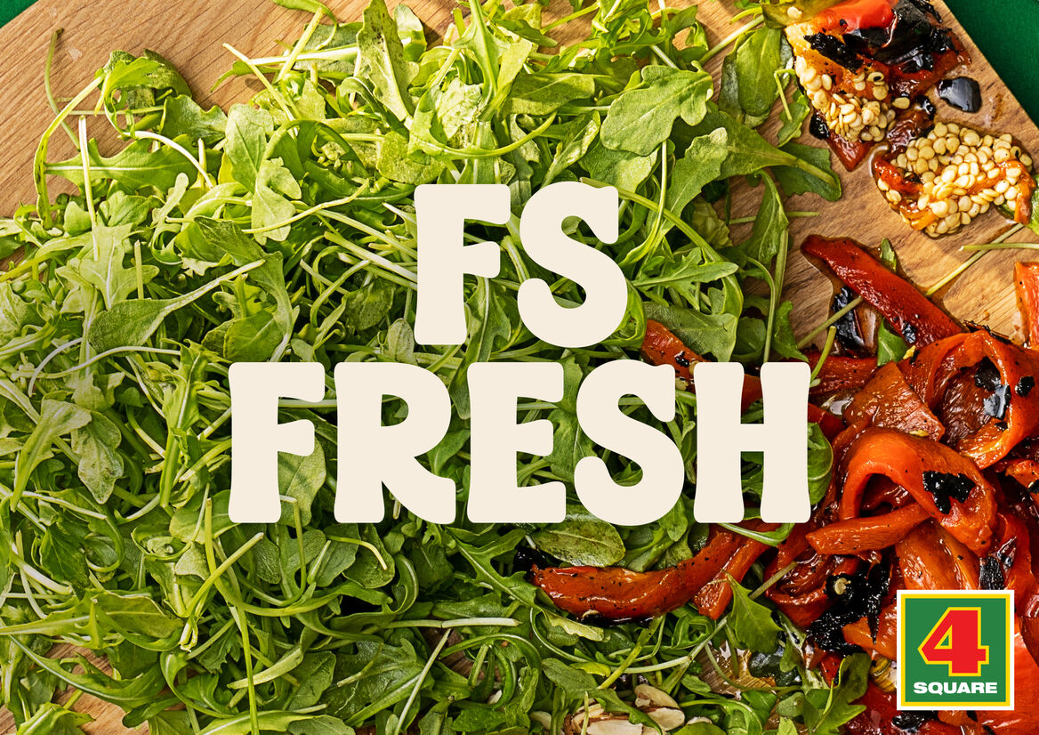
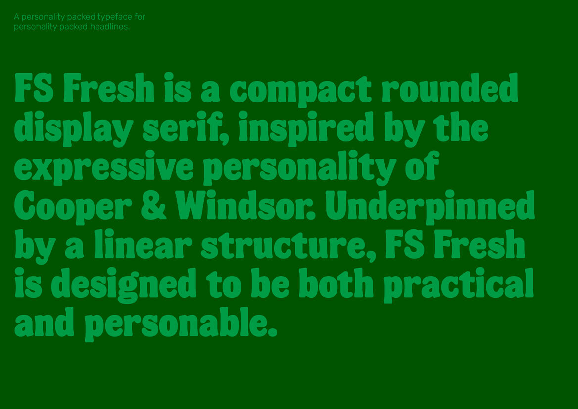
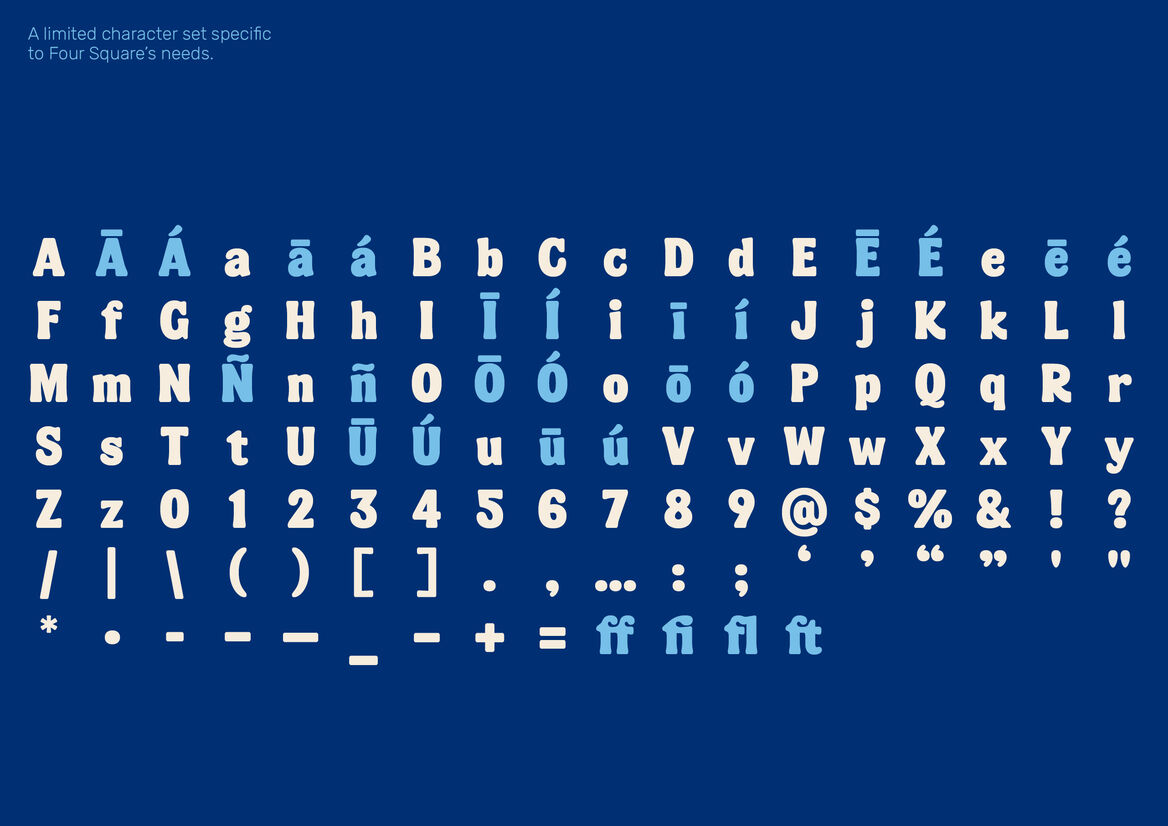
A key element to this new identity is FS Fresh, the custom rounded display serif, developed to carry the sentiment of the brand, adding visual flavour to the wit and humour inherent to the writing.
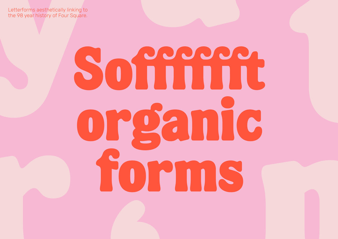
Inspired by the expressive personality of rounded serifs like Cooper and Windsor, it exudes a playfulness and enthusiasm. This subtle aesthetic link back to the past carries the 98 year heritage of the brand through into the contemporary era. FS Fresh has an underlying linear rhythm, and consistency in its letterforms.
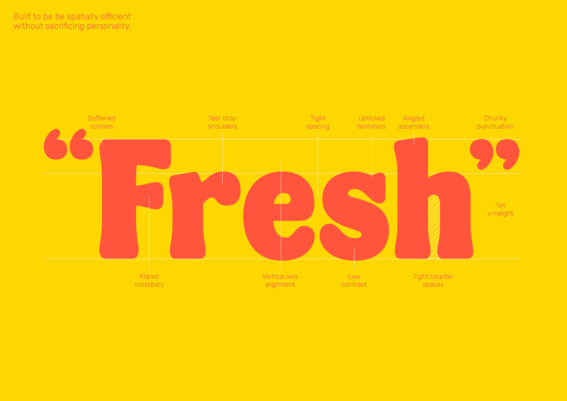
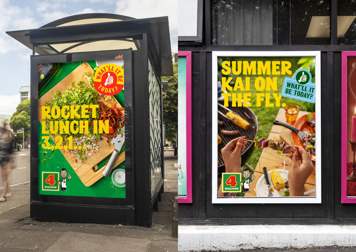
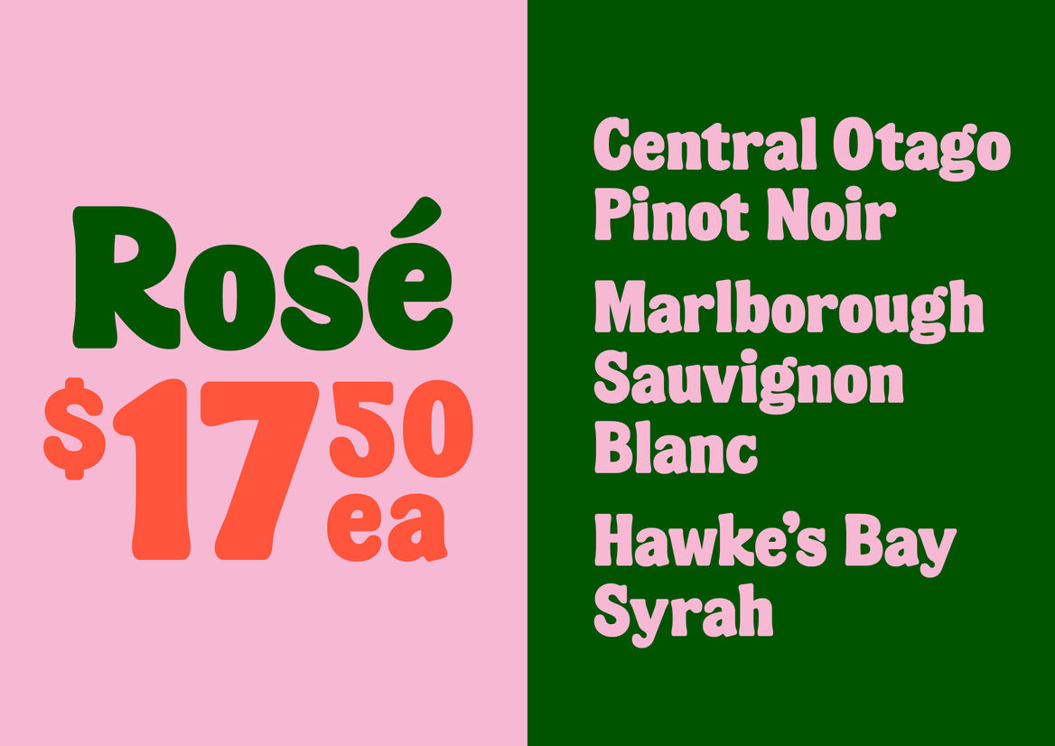
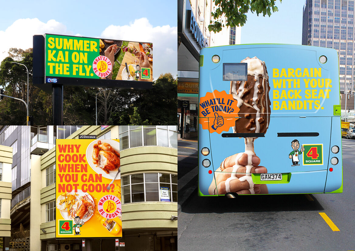
Generally typeset over imagery, or colour on colour, the letterforms needed to be sturdy. Their compact nature allows for scale in headlines, with short ascenders and descenders ensuring tight leading and efficient use of space.
FS Fresh balances practicality and character, the nature of the co-operative business model putting many demands on the overall identity. The typeface acts as a constant as it dispenses personality, whether that’s bringing charm to in-store price ticketing, or shouting that it’s finally BBQ season on a billboard.