Graphic
Extended Whānau 63 He Aka Ka Toro
-
Pou Auaha / Creative Director
Tyrone Ohia
-
Ngā Kaimahi / Team Members
Eva Charlton, Viv Teo, Aleisha Marinkovich -
Kaitautoko / Contributors
Williy-John Martin, Savannah Petero, Paul Ross Jones -
Client
MBIE

Description:
He Aka Ka Toro is a groundbreaking Māori Science, Innovation & Technology (SI&T) fund developed by MBIE. The fund radically rethinks the standard government funding model to reflect a Māori centric perspective. Often, Māori don’t apply for funding because they don’t think their project falls under SI&T. Because of this the parameters were rethought to reflect the breadth of mātauranga Māori practises. A national roadshow was run to speak directly to Māori communities in person and to answer any queries face to face. Additionally, people could submit written applications, record a video application, or request an in-person spoken application. With such an unconventional model, we were approached by MBIE to create an identity that reflected its intent.
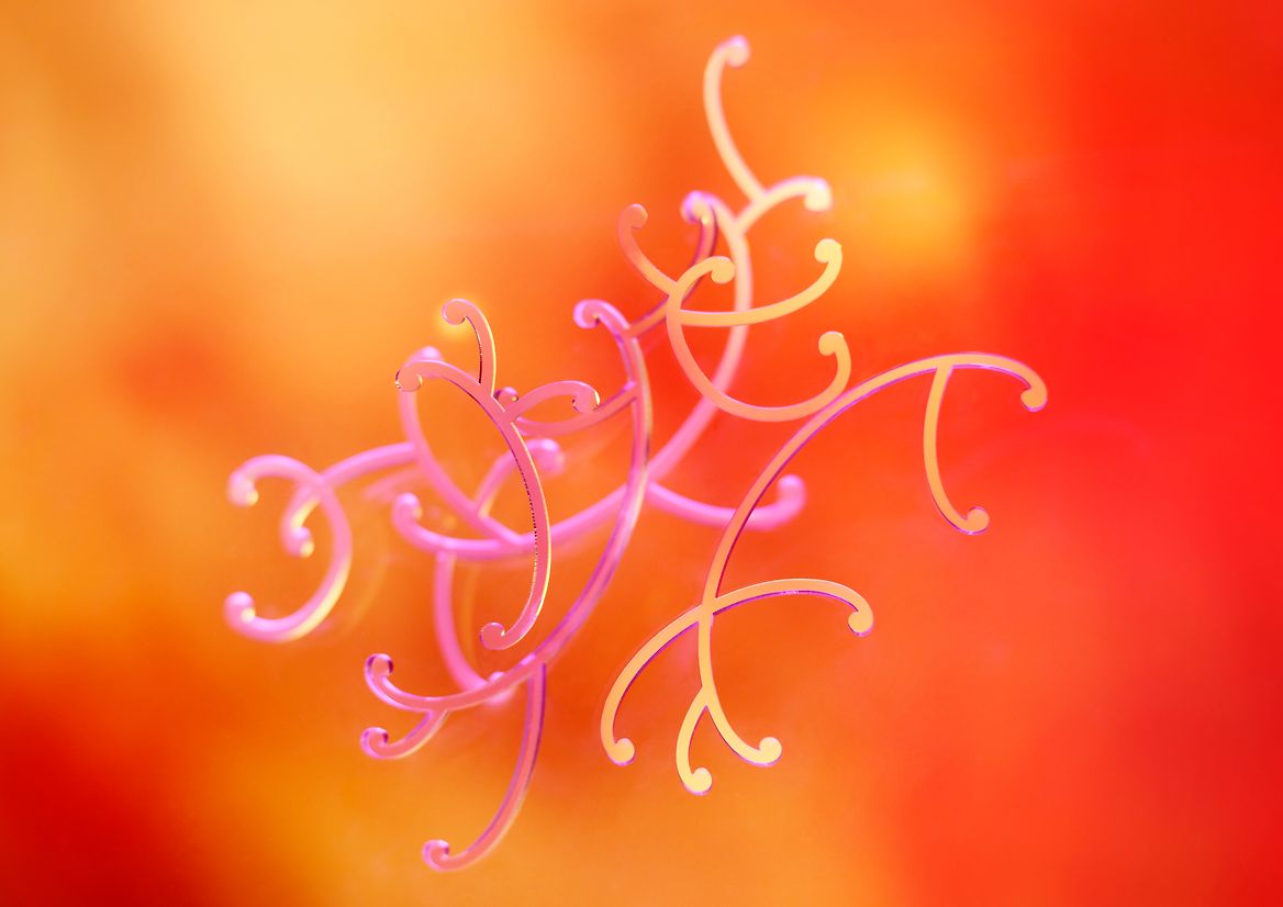
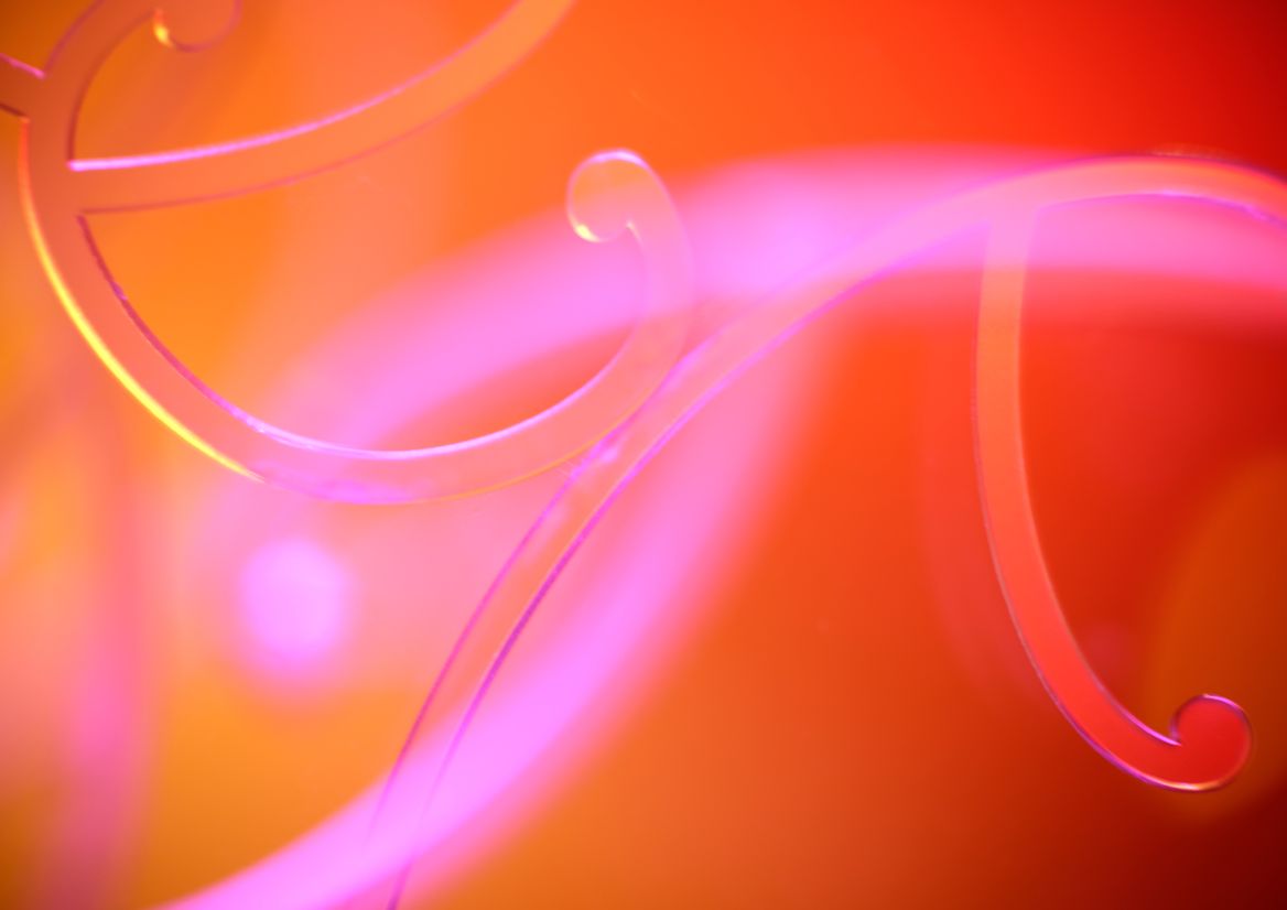
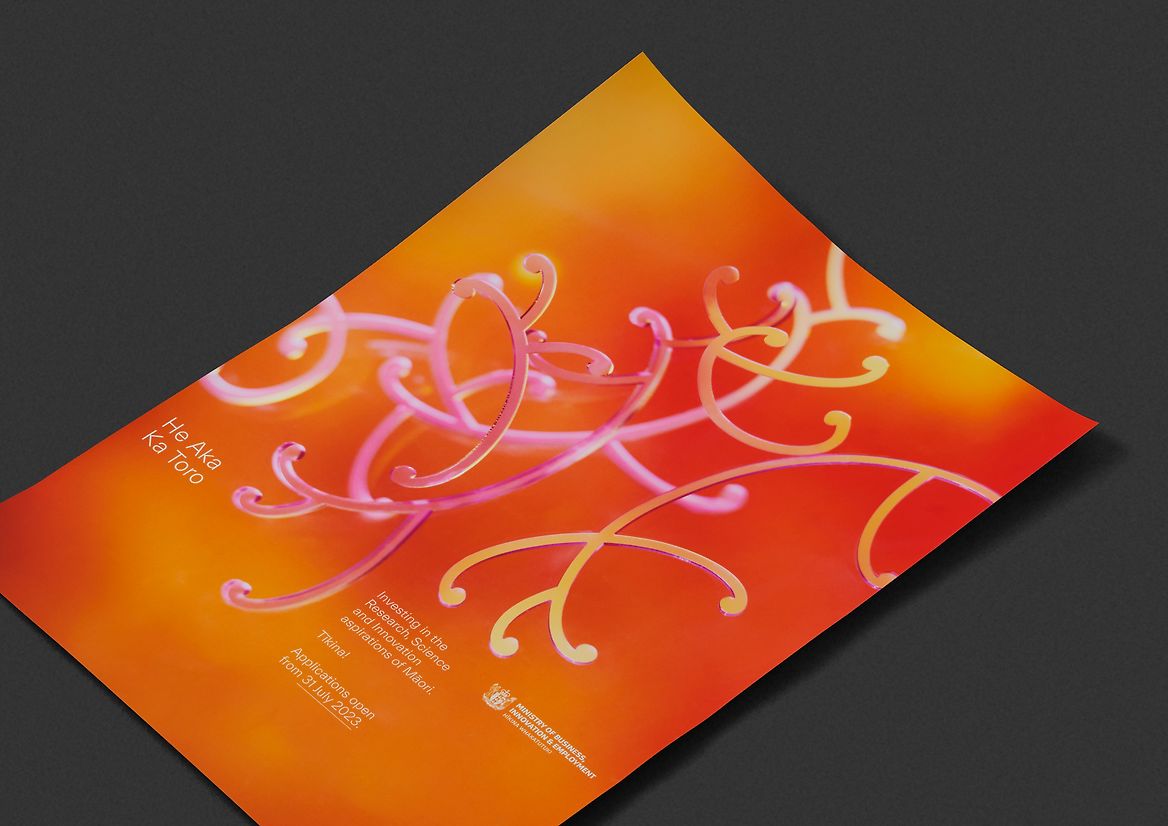
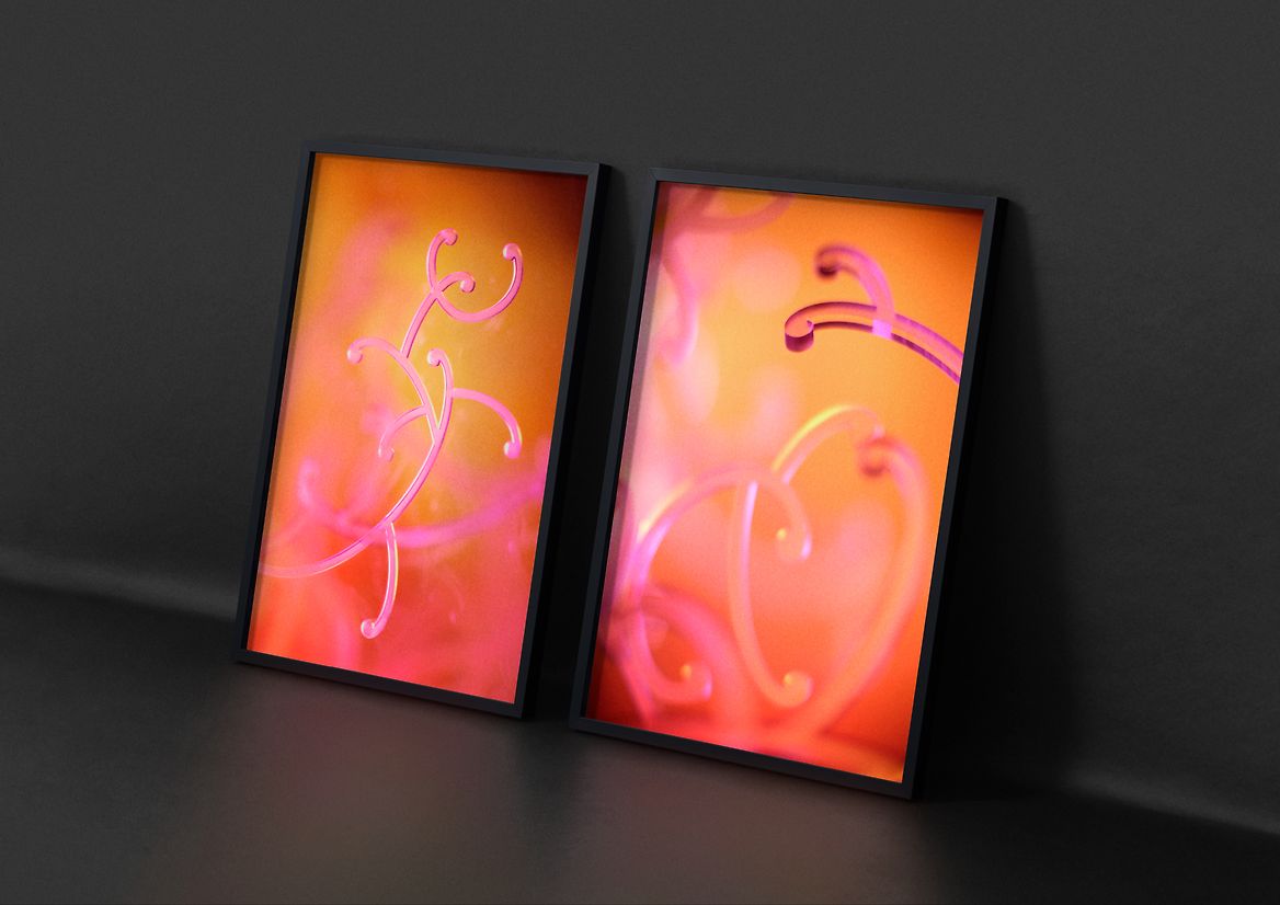
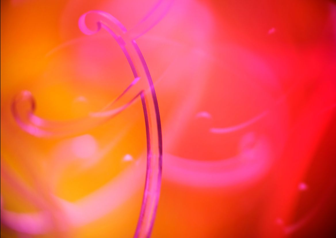
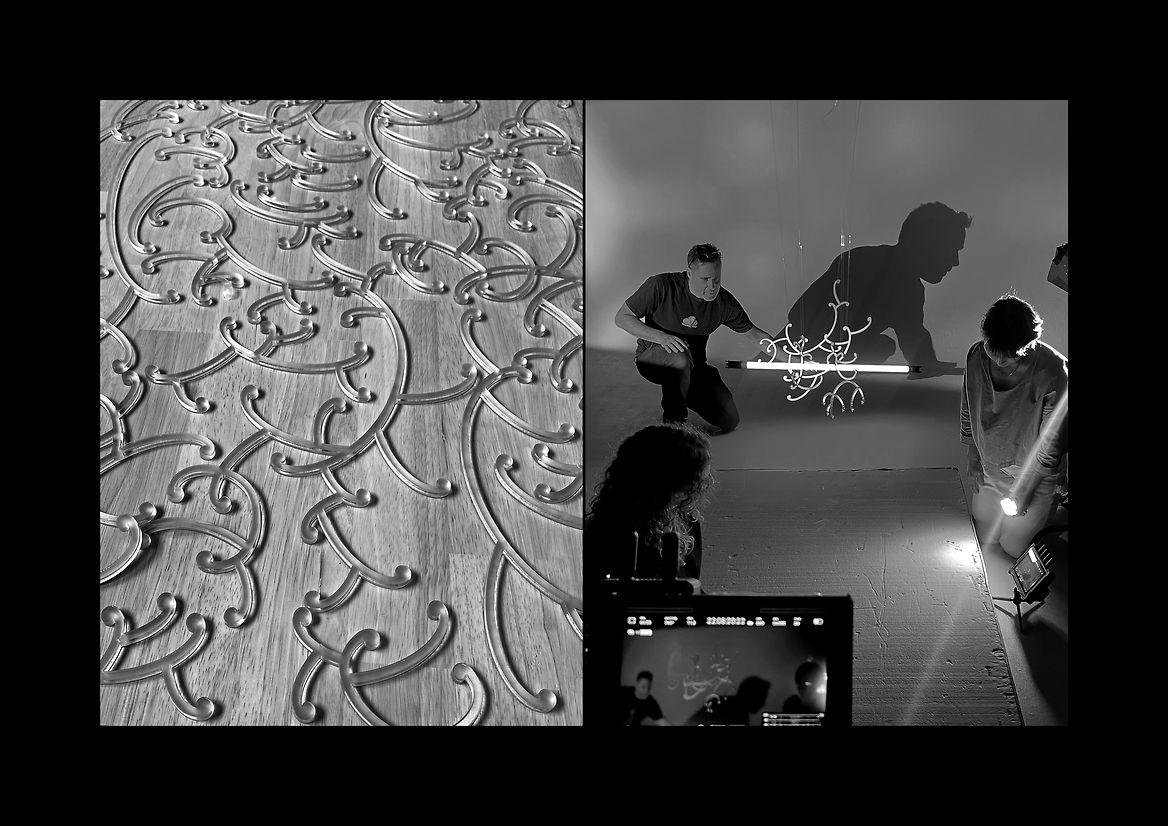
The funds name; He Aka Ka Toro, speaks to the idea of a vine or plant root growing and stretching outward towards its potential. The name was inspired by a well known karakia – Te Tīmatanga o te Ao (The Creation of the World). A section of the karakia speaks of te pū (the origin), te more (the taproot), te weu (rootlets), te aka (branching roots), te rea (sprouting growth) and so on. Likening the stages of creation to that of a plant growing from a seed and stretching its way towards the light and enlightenment. An apt metaphor for Science, Innovation & Technology. Our approach was to reflect the richness within this karakia. We chose to do this through creating distinctive photographs which could capture a depth and energy that is both organic and scientific.
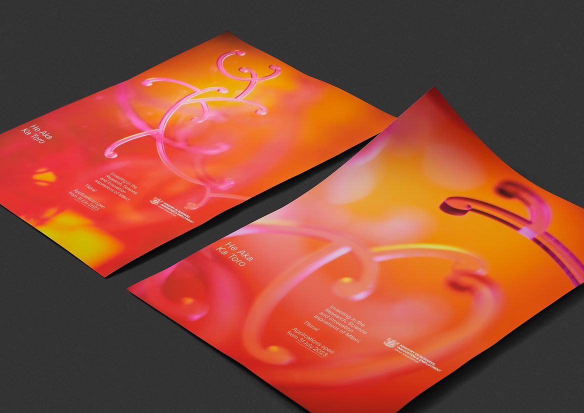
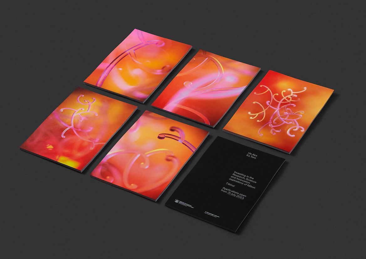
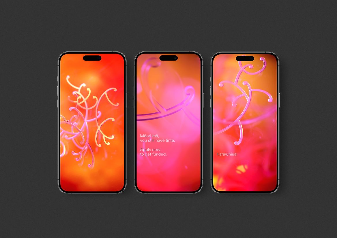
As a visual motif, the koru is undeniably (and proudly) Māori. It's symbolic of new life and ideas unfurling and taking form. To create our distinctive physical koru structures, we looked to traditional kōwhaiwhai patterning, but also took direct queues from the branching vines of our native plants. We then clustered these structures together to add further references, such as the creative process, the brain and our atomic makeup within the universe. Colour was another key aspect to the narrative. We chose a spectrum that spanned sunlight, through to the inner cells of a human body, symbolising our whakapapa (genealogical bonds) to our wider environment and the universe. The colours are turnt' up, vivid and vibrating with the vitality of innovation and life. A central hero photograph was created, as well a wide range of intimate, microscopic abstracts exploring aspects of the karakia. The overall result merges te ao Māori, the natural environment, human inspiration, and the world of science in an attempt to show the richness of mātauranga Māori. Because of the power of the photographs, we took a very simple approach to typography. These assets were rolled out across brochures, social media, digital and physical banners, stage backdrops and all necessary ministry comms.
Judge's comments:
A beautiful interplay of light and colour that pushes the medium. A technical marvel with ethereal qualities, and conceptually grounded within te ao Māori.