Graphic
Milk 75 Type Bee
-
Pou Auaha / Creative Directors
Anthony Hos, Sarah Melrose -
Pou Rautaki / Strategic Leads
Sarah Melrose, Ben Reid
-
Ringatoi Matua / Design Director
Ethan Lowe -
Kaituhi Matua / Copywriter Leads
Judah Finnigan, Bronwyn Williams
-
Ngā Kaimahi / Team Members
Harriet Campbell, Alyssa Miller, Jemima Christie-Limbrick, Gemma Scott, Josh Daly, Adeline Chua, Jacinta Conza -
Kaitautoko / Contributor
Dave Black -
Client
Honeysticks
Description:
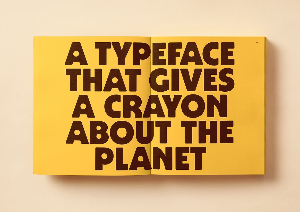
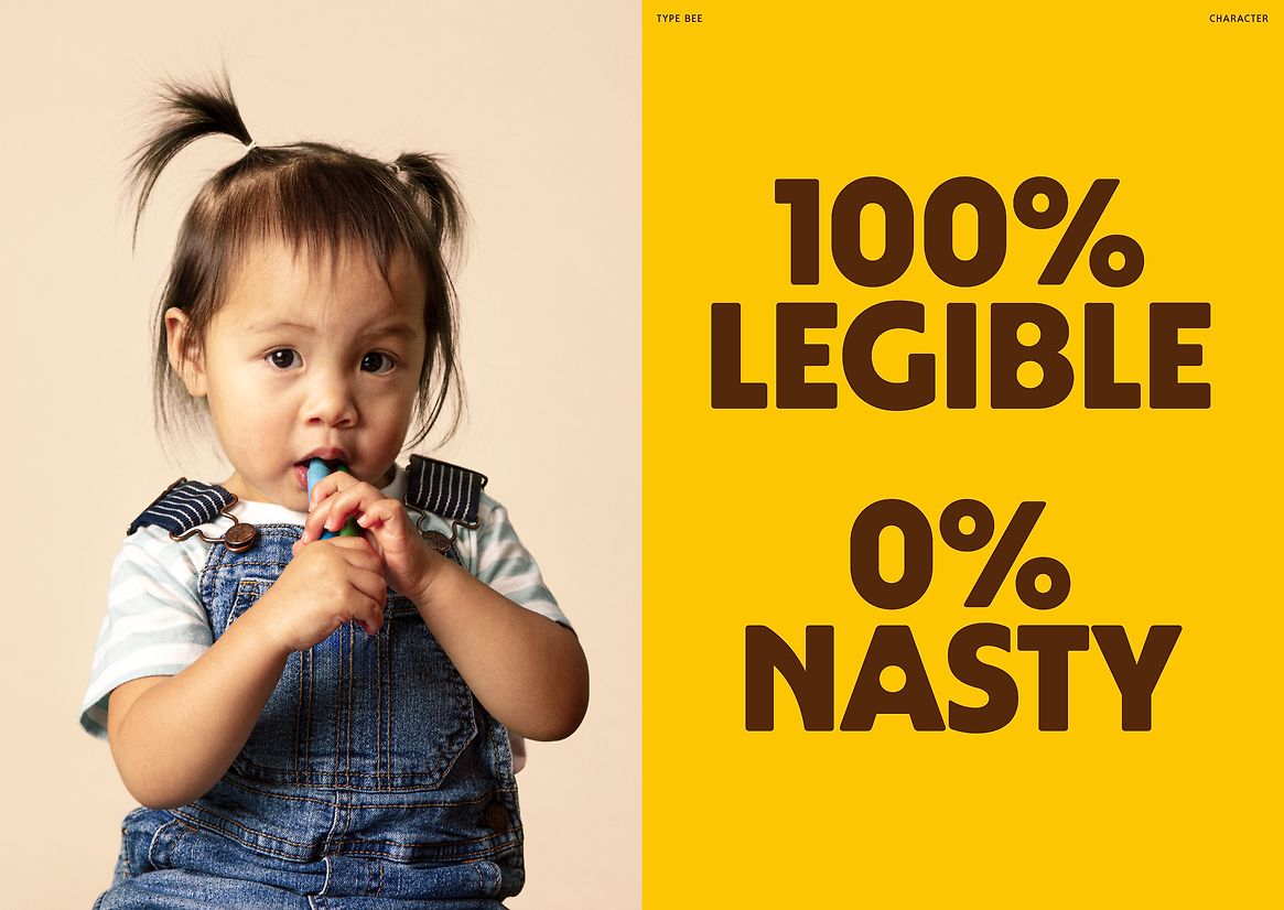
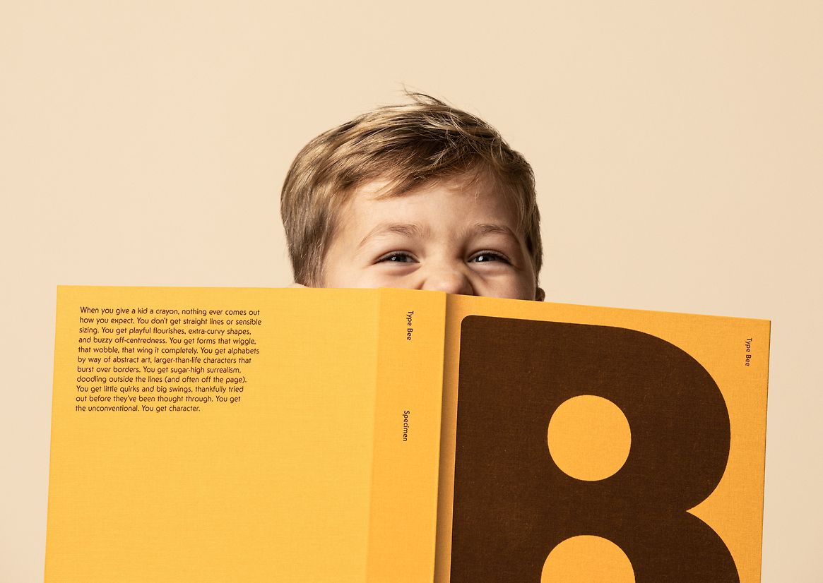
Honeysticks began in Aotearoa New Zealand with a simple goal: to make safer crayons for kids – using 100% natural beeswax and nothing nasty. Backed by NZTE, they’ve since become the #2 crayon brand in the world, second only to petroleum-based giant Crayola. Led by our overarching brand idea “A World of Pure Creation”, Honeysticks have positioned themselves as cheerful champions of creative play. To embody their imaginative and instinctive approach to self-expression, we created Type Bee: a custom typeface that effortlessly bottles the joys of being on your own creative buzz.
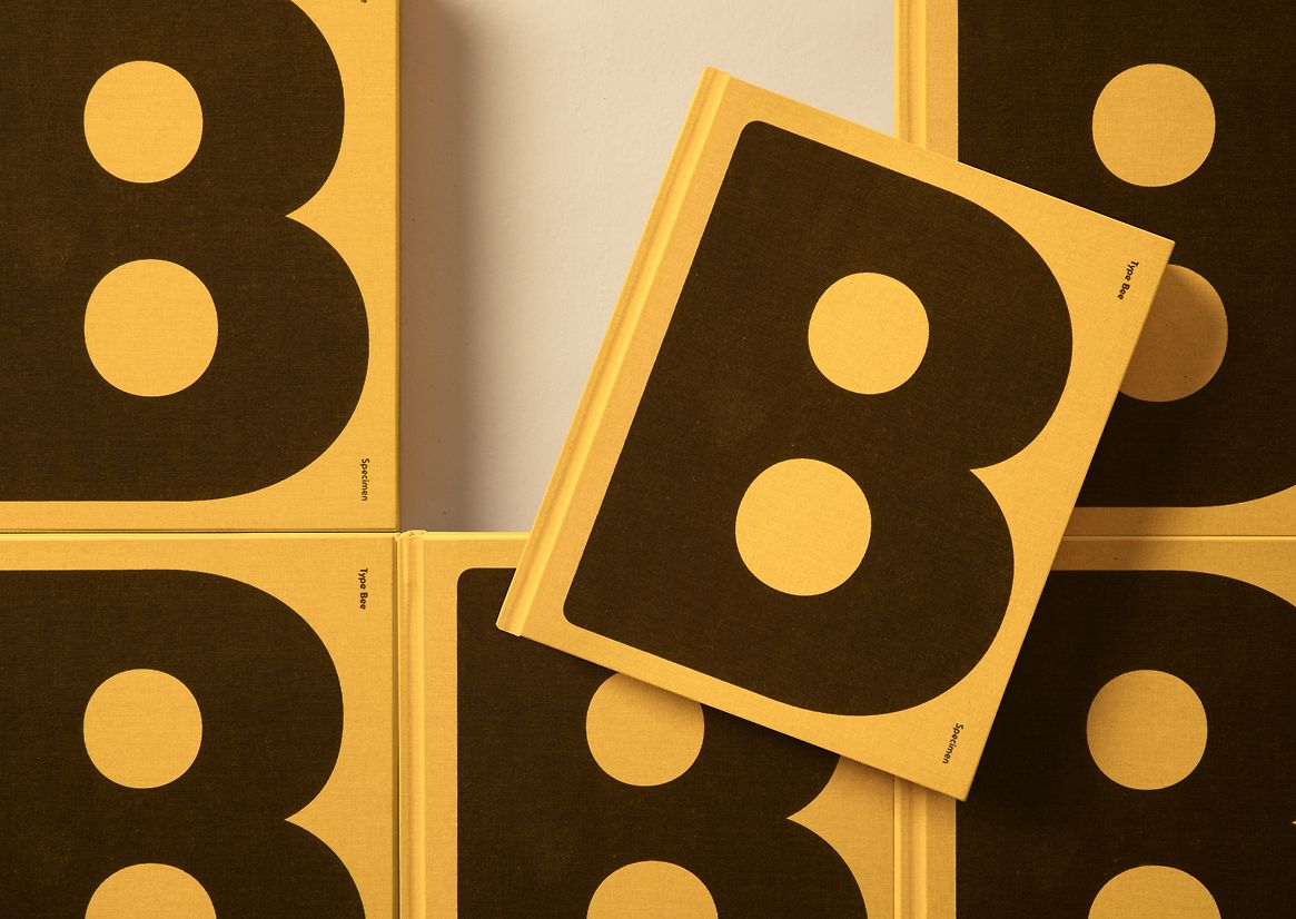
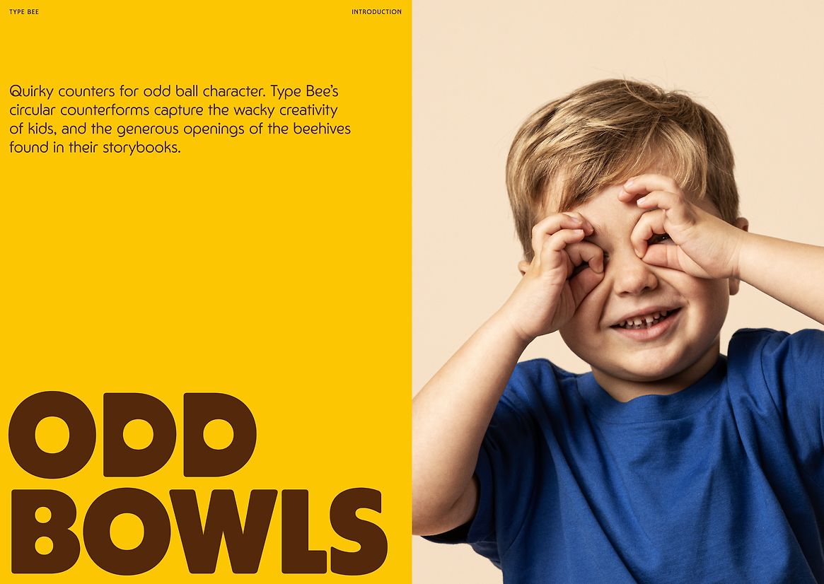
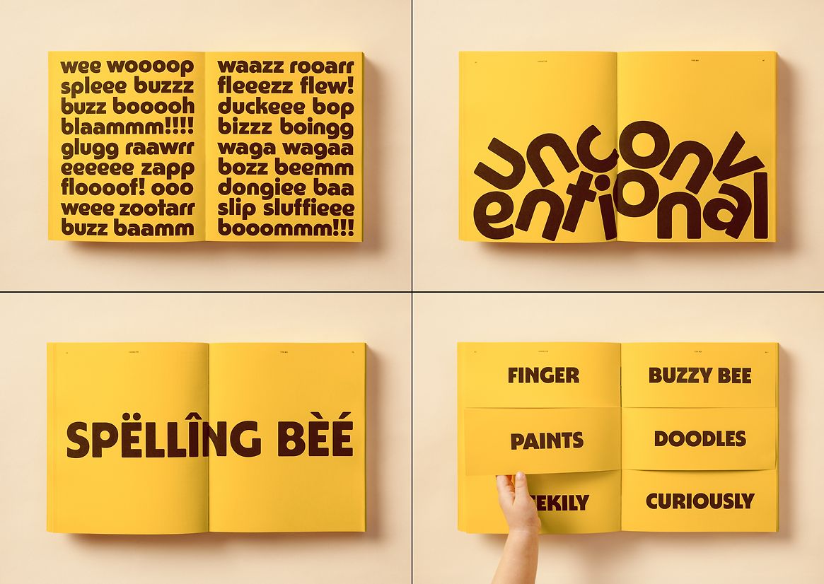
Like a kid with a crayon, Type Bee never quite goes where you expect it to. A family of nine different weights with a hive of whimsical alternates, Type Bee balances its functionality with proudly unconventional flourishes: exaggerated x-heights, circular bowls and hive-shaped curves. To best capture the spirit of Type Bee, we needed a specimen book that could showcase the vibrancy and versatility of the typeface, while seizing every opportunity for moments of play.
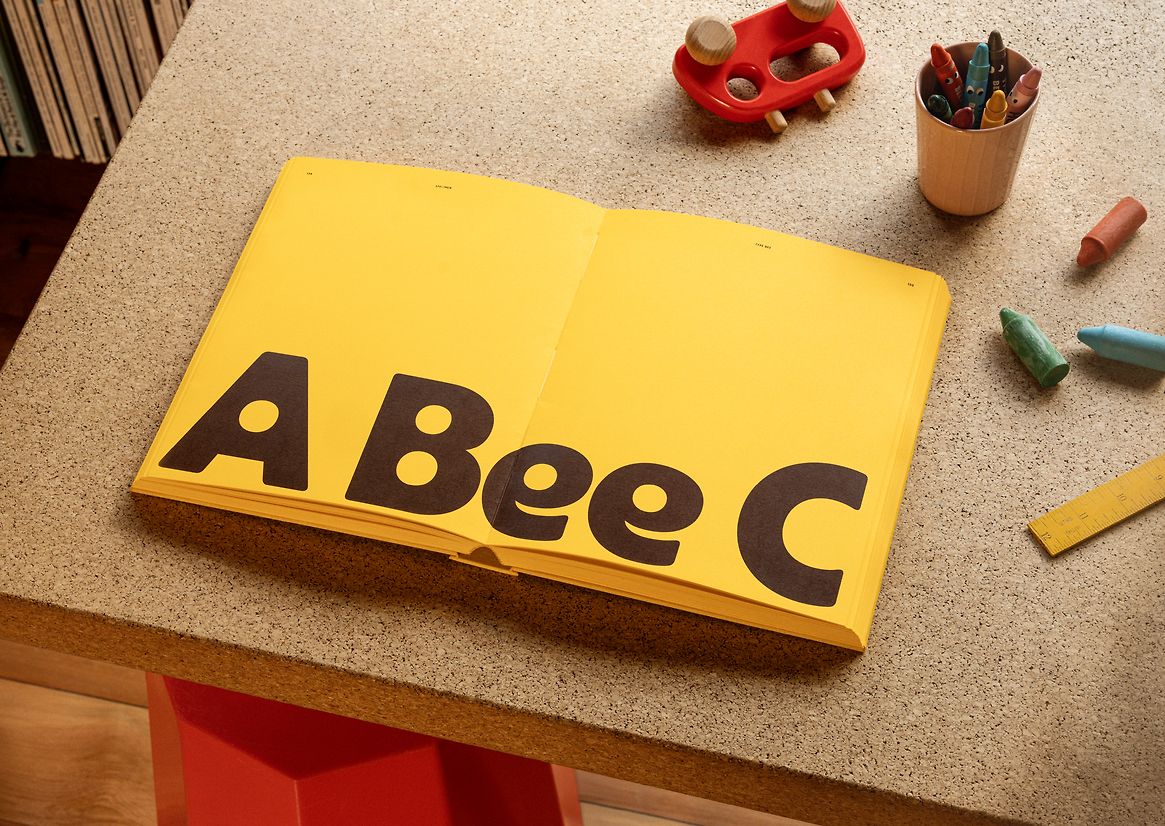
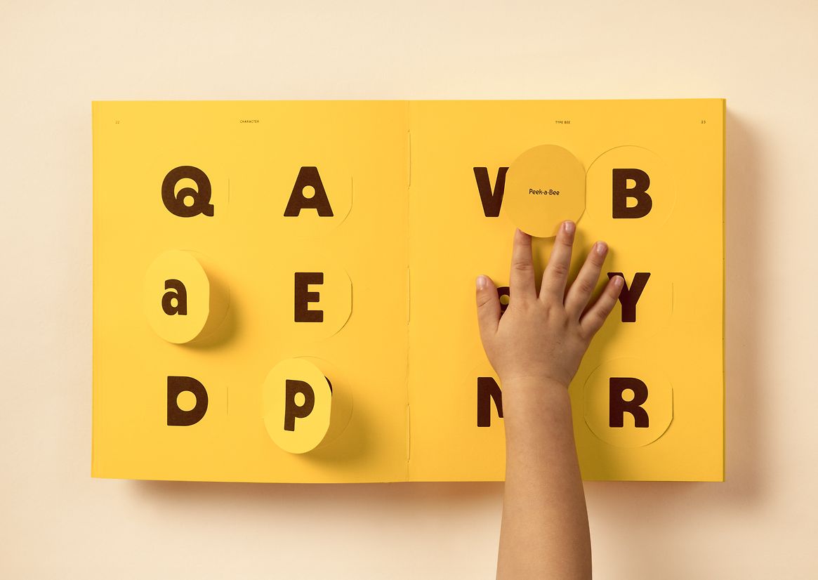
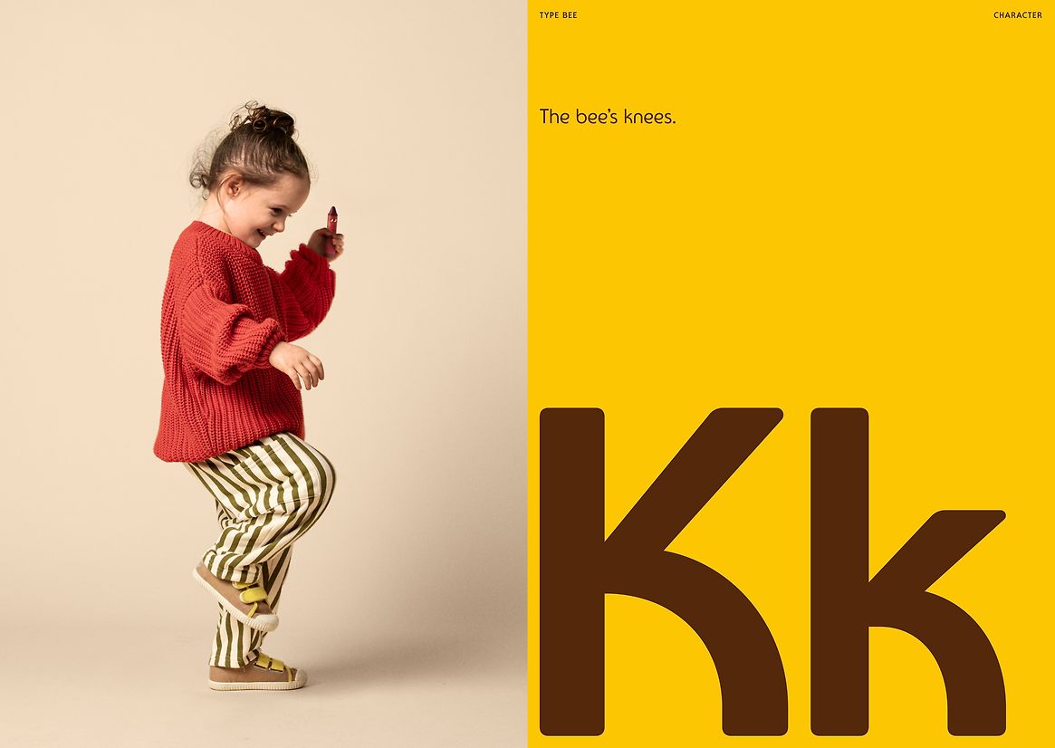
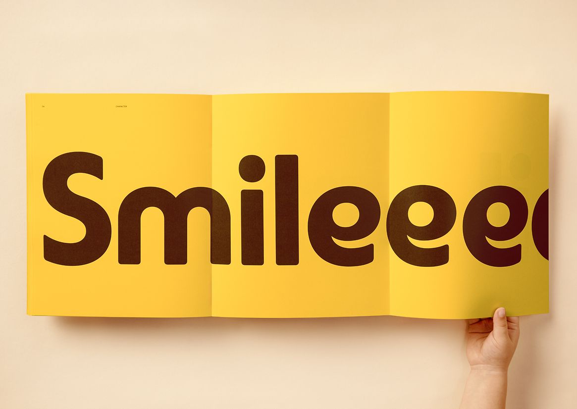
Structured like the picture-books of our youth, the Type Bee specimen is designed to both demonstrate and delight in equal measure. Each page invites the reader to engage with the type like a child might, with peek-a-boo details, die-cuts, foldouts, hidden messages, tactile surprises and nostalgic moments of discovery throughout. Specific letterforms get the hero treatment, blown up to larger-than-life sizes. Quirky characters are introduced, alongside their alter egos. Forms get jumbled, juxtaposed and joyfully formatted for maximum impact. Throughout, playful copy acts as another form of creative expression. From witty headlines like “Odd bowls” or “The bee’s knees”, to a whole page dedicated to childlike nonsense words, the messaging encourages the reader to approach typography, design and language with fresh eyes.
The result is a type specimen that never colours within the lines. It showcases Type Bee both at work and at play – bold and bouncy for our characterful headlines, robust and readable for long-form copy blocks. But as a work of comms, it isn’t just a showcase of a great typeface. It’s also an embodiment of the Honeysticks brand, playfully prompting other designers, dreamers and dabblers to find a corner, curl up in it, and follow their curiosity wherever it leads.