Graphic
Madeknown 15 Capture Christchurch
-
Pou Auaha / Creative Directors
Josh Thompson, Phillip Sunderland
-
Ngā Kaimahi / Team Members
Madeline Laffey, Hillary McOscar, Joel Reed -
Kaitautoko / Contributors
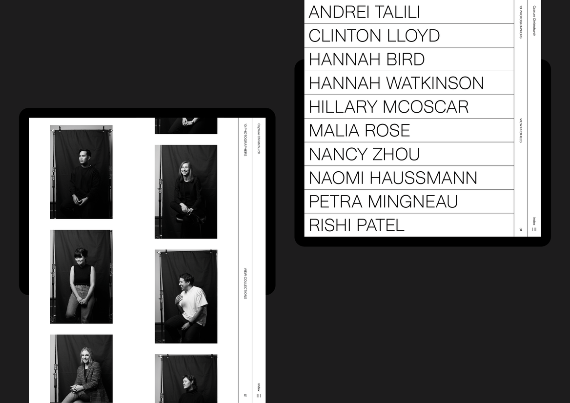
Andrei Talili, Clinton Lloyd, Hannah Bird, Hannah Watkinson, Hillary McOscar, Malia Rose, Nancy Zhou, Naomi Haussmann, Petra Mingneau, Rishi Patel -
Client
ChristchurchNZ
Description:
To commemorate the 10 year anniversary of the devastating earthquake that took 185 lives and changed the landscape and future of every Cantabrian, a unique photographic project was created to mark the significant occasion.
10 photographers were selected and 10 photographic categories/genre's were chosen. The photographers were then set free. The unique approach we took was to give each photographer creative freedom and time - let each participant shoot in their time, how they wanted. There was no brief other than to capture the 'new' of Christchurch - the project was not to capture the previous Christchurch, but the emerging Christchurch. There was no limit placed on quantity of photographs, style or composition.
The title of the project was the brief: Capture Christchurch - in your way, through your eyes, with your lens.
We intentionally selected younger, emerging photographers as we wanted to see the 'new' through their eyes. We chose some photographers that were eclectic and creatively curious, outside the norm of traditional commercial photography. The 10 photographers were also chosen to represent the future - intentionally diverse and reflective of where we are heading as a society and city. It was rewarding to see the unique approach that each took as they individually, but collectively captured Christchurch.
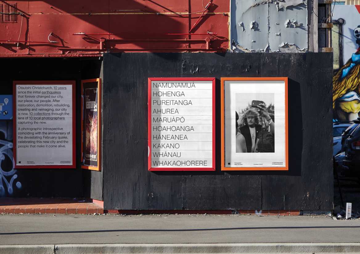
Creating a deadpan identity structure that was practical and resourceful - a tool to organise, collect and expand, allowed the collection of images stack into place with ease. Line divisions make reference to a book collection or binder of photographs. Utilitarian horizontal and vertical lines set a backdrop for the photographs to be the focus and as a metaphor for the new city.
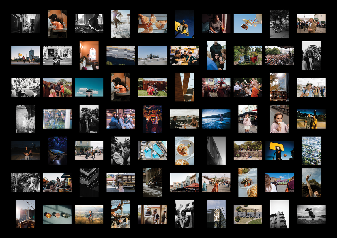
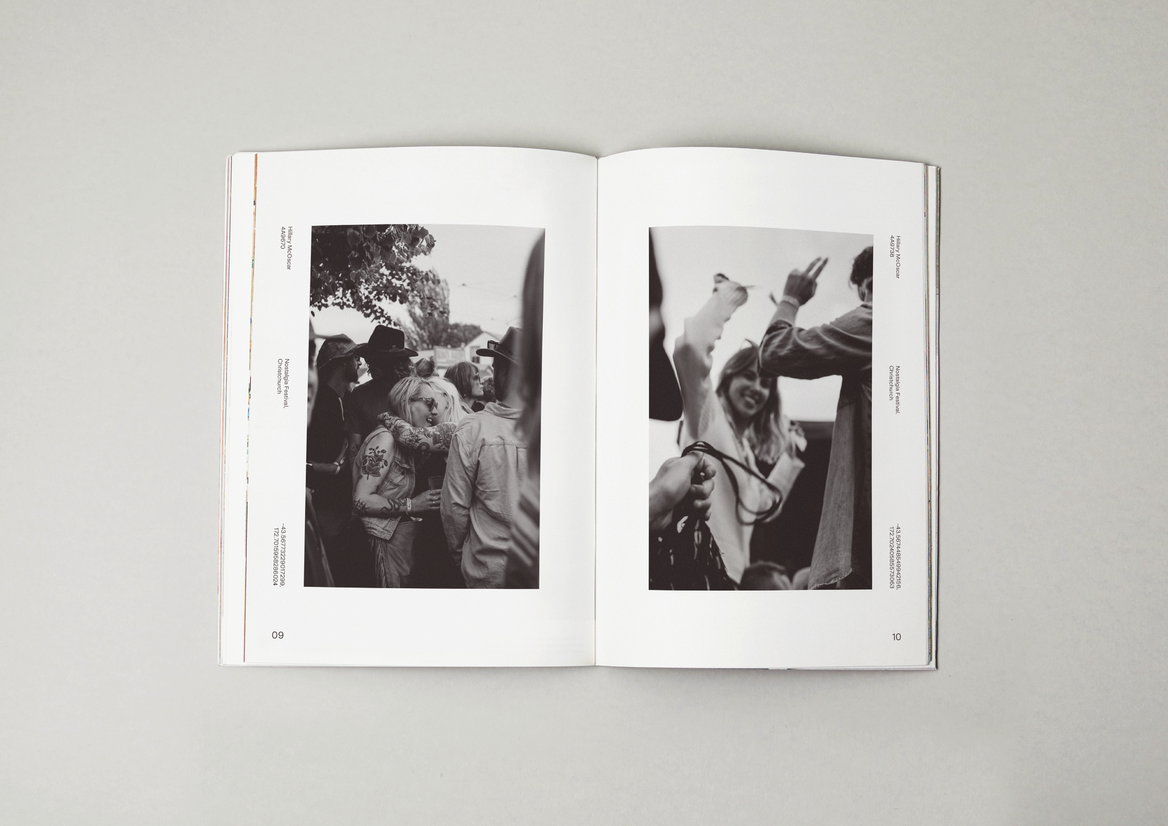
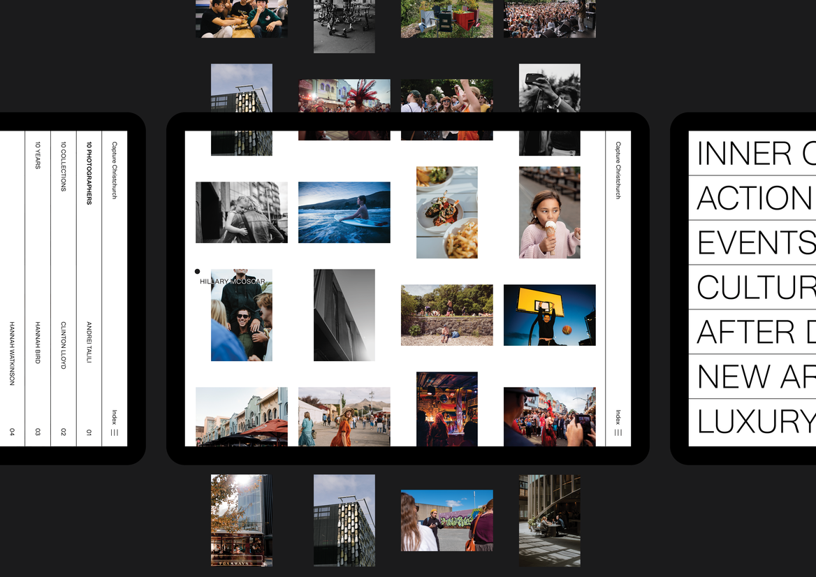
Photographs are organised in a grid arrangement to reflect a traditional photographer's contact sheet, in a modern, digital first format. The invisible square grid allowed both landscape and portrait images to display at the same size, while ensuring each image enough breathing room.
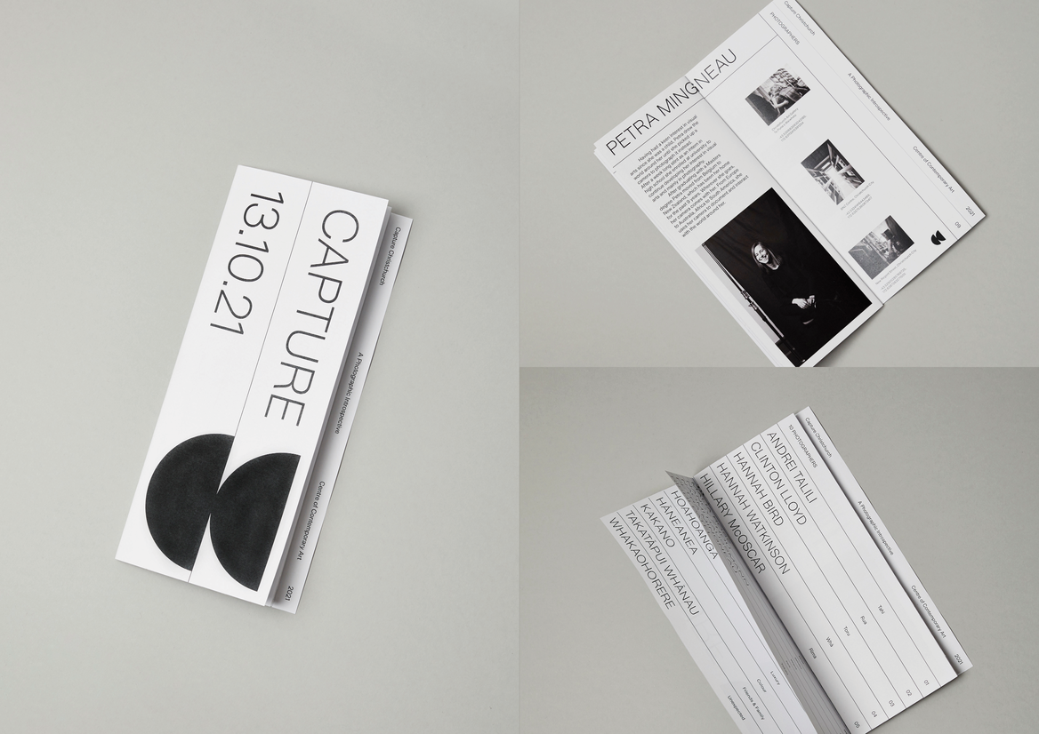
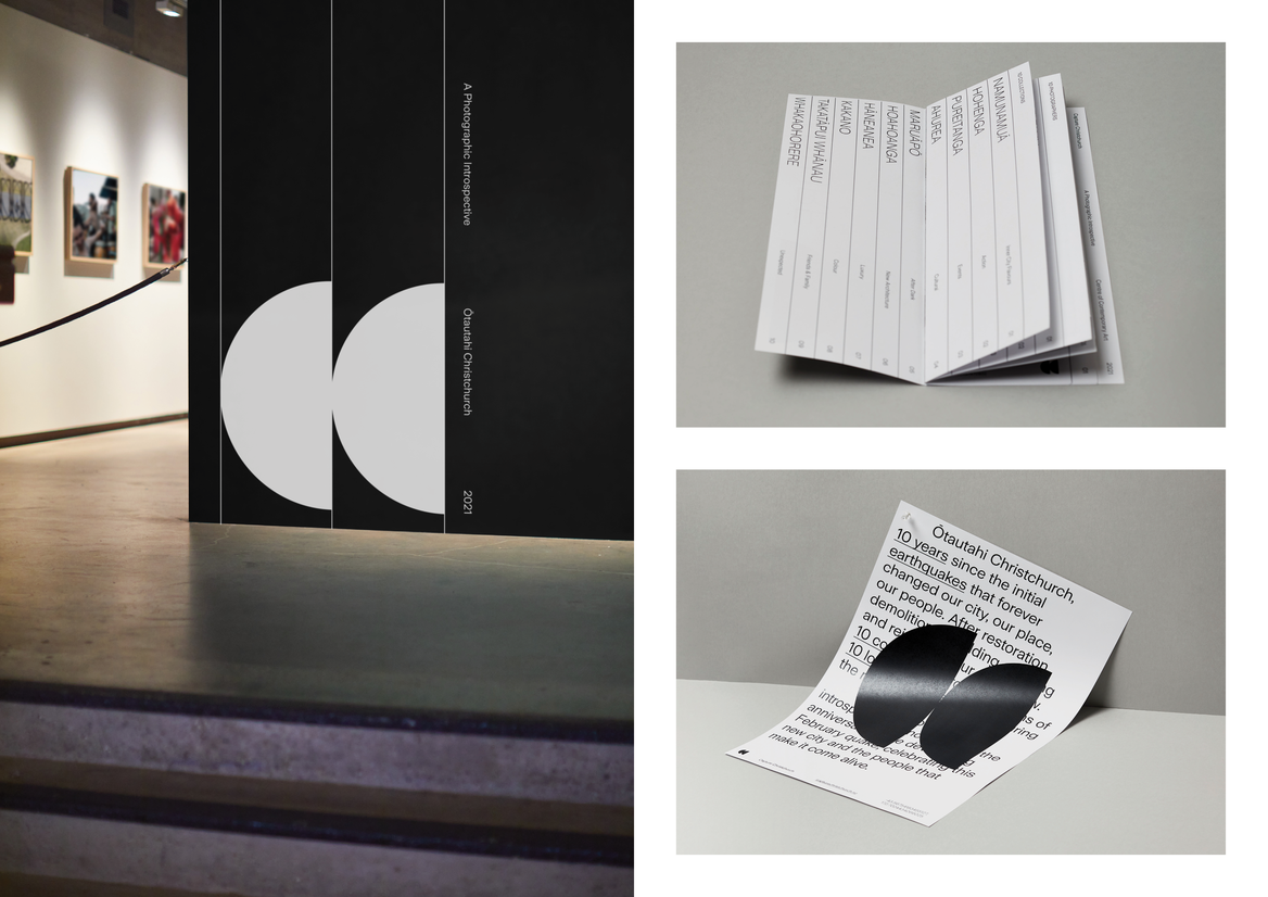
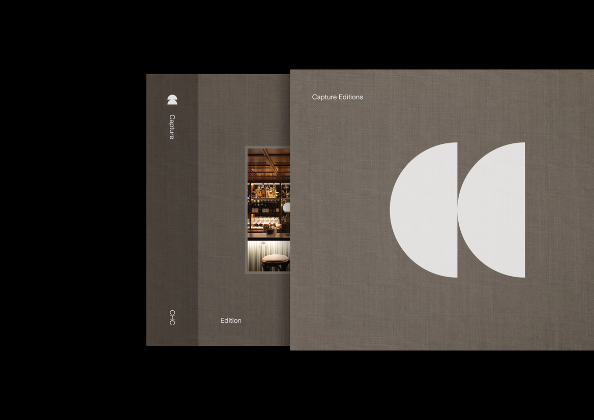
The double half circle mark is a reference to seeing the city from sunrise to sunset. As well as being an acronym for Capture Christchurch, the two shapes are derived from the form of a lens from which to look through.
10 collections were created, pulling from key themes and categories within the images. After the photographs are captured, key selections form an exhibition - a photographic introspective, a new perspective on the new, current city.
The website keeps a digital index of the photographs, and photographers and the project background. Tabs slide in and out to reflect stack of collections and scroll effects create movement between each element.
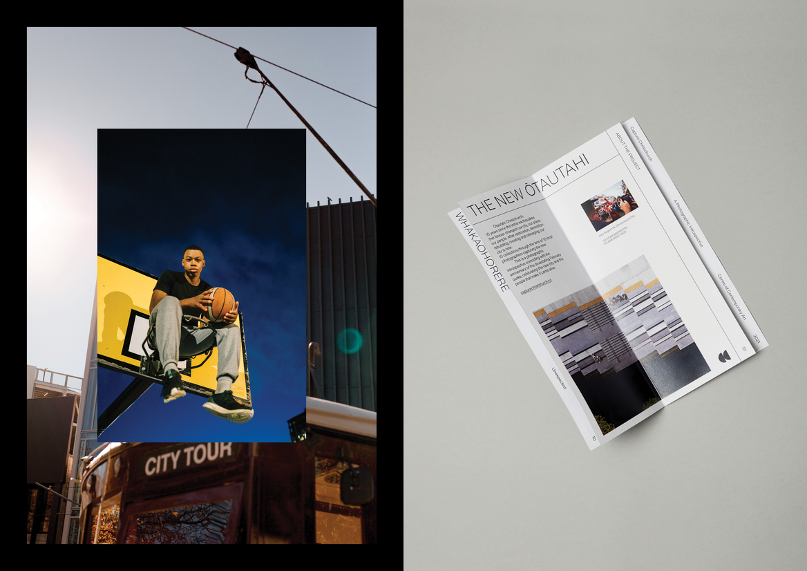
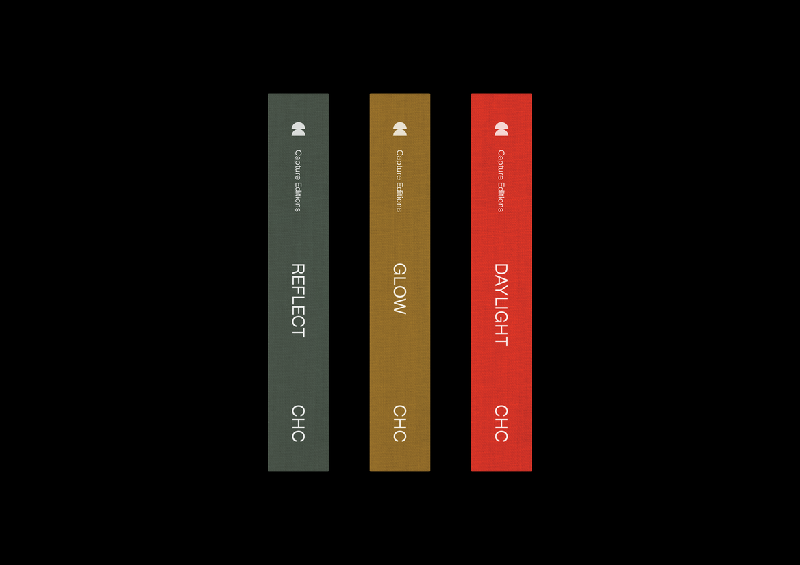
Various collateral was designed for promotion and distribution. An event invitation brochure echoes the structural elements of the identity in physical form, using staggered paper sizes to create a binder tab effect, organising each section. A small zine displays the photos in an easy to digest way, while the more in depth Capture Editions, a volume of coffee table books, forms the beginning of a future documentation of Christchurch, categorised and numbered and linen bound.