Graphic
Kiwibank Design Studio Kiwibank Te Kahukura Kāpuia (Pride Mark)
-
Pou Auaha / Creative Director
Garrick Sutherland
-
Ringatoi Matua / Design Director
Miranda Lees
-
Ngā Kaimahi / Team Members
Rosalind Bevin, Angela Lucas -
Kaitautoko / Contributors
Kiwibank, Simon Hofmann, Erica Beagley, Carly Roma -
Client
Kiwibank


Description:
Kiwibank is the largest New Zealand owned bank who are repositioning themselves to attract and retain a new progressive type of customer. A brand-led transformation across culture, product and technology.
The design challenge was to powerfully and authentically express the new brand strategy through a fresh and contemporary identity system while reflecting the internal cultural and bringing it to life for the team.
The refreshed brand identity is inspired by the Harakeke plant. A metaphor of a thriving community within Te Ao Māori. The centre shoots are the rito – the new, growing generation, our future with the surrounding outer leaves representing knowledge and wisdom - the nurturing parents and grandparents.
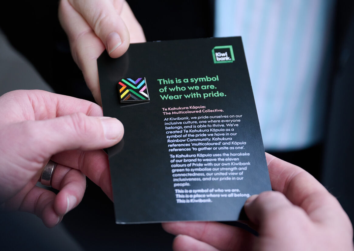
Kiwibank prides itselves on an inclusive culture, one where everyone belongs and is able to thrive. Being an ally to the Rainbow community helps them create a culture that embraces and represents the diverse backgrounds, experiences and needs of their people and customers.
Towards the end of 2019 Kiwibank created a Rainbow logo – like many corporates the world over. Evolving the brand to reflect a more modern, progressive and inclusive bank for Kiwi, the challenge is to better represent and communicate the commitment to the Rainbow community and express the culture at Kiwibank - one where everyone can belong - Ka tīmata i a tatou.
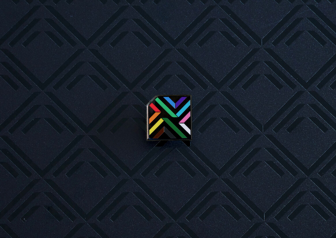
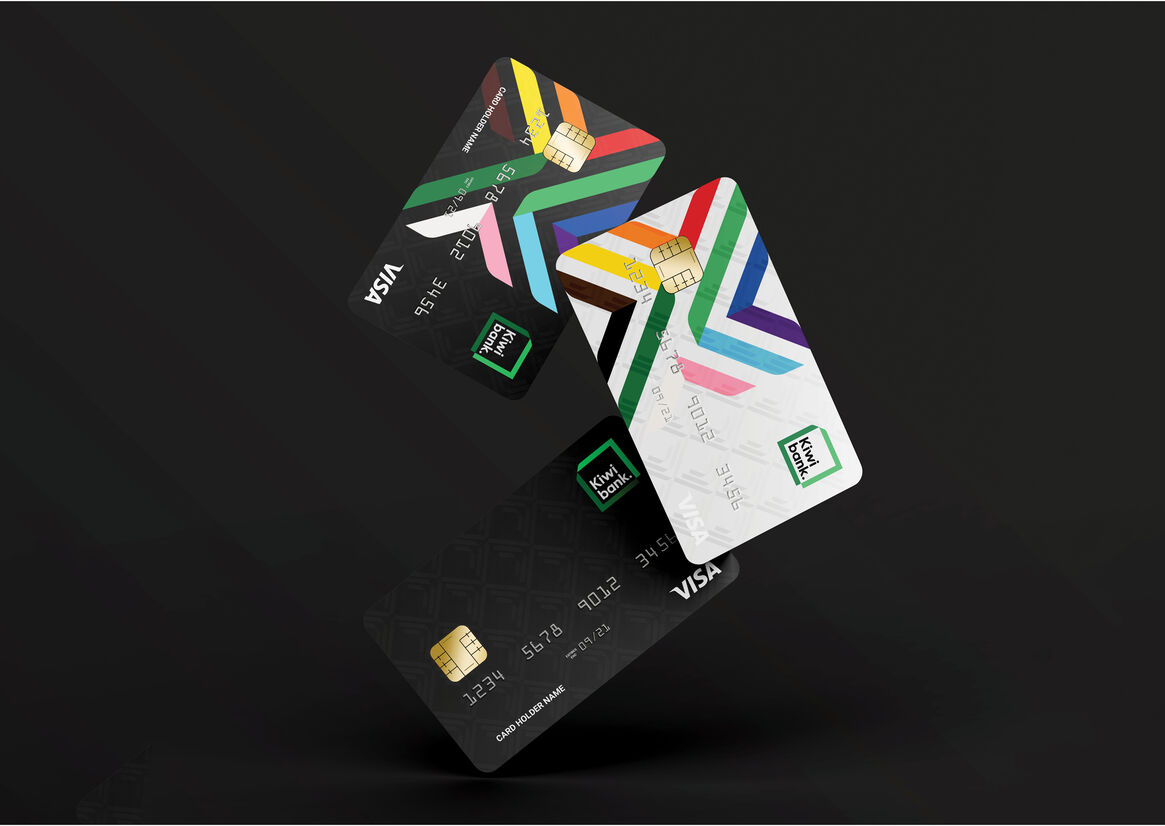
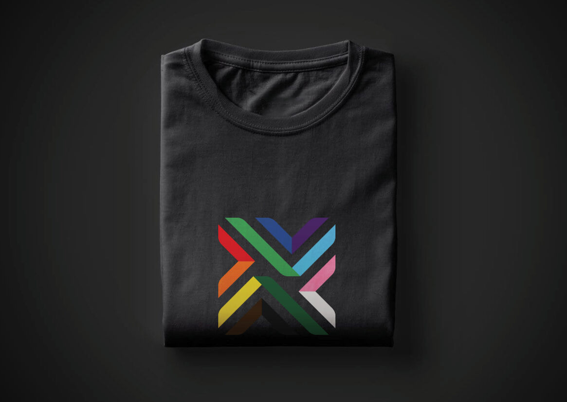
Te Kahukura Kāpuia was crafted as Kiwibank’s pride symbol – a unique identifier born from the new identity and one that recognises the ever-evolving Pride community itself. Kahukura references ‘multicoloured’ and ‘rainbow’. Kāpuia references ‘to gather’ or ‘unite as one’.
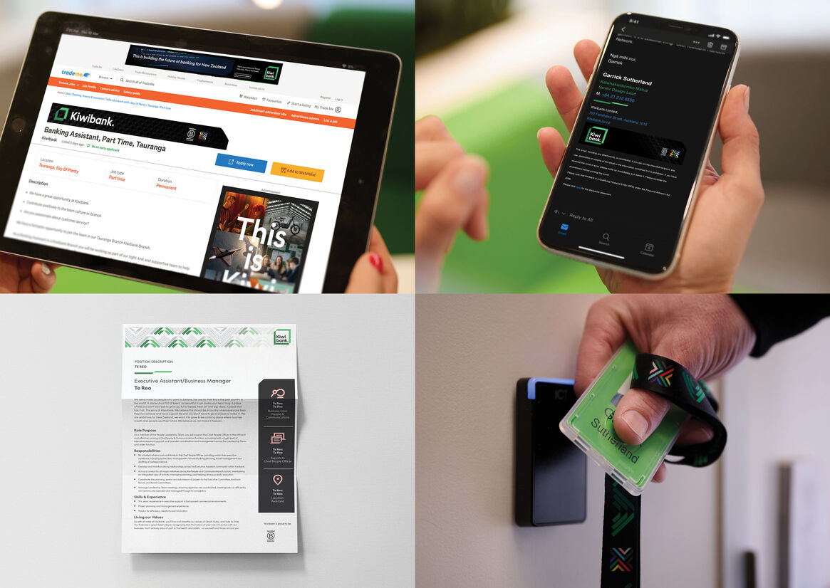
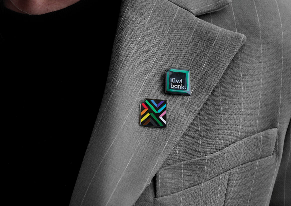
Te Kahukura Kāpuia works within the new brand architecture and design system while standing out from the sea of tactically used Rainbow logos, a symbol of pride that sits alongside the new Kiwibank logo and is proudly seen year-round across multiple touchpoints. It has quickly become a strong conversation creator with an authentic narrative that sits behind the mark.
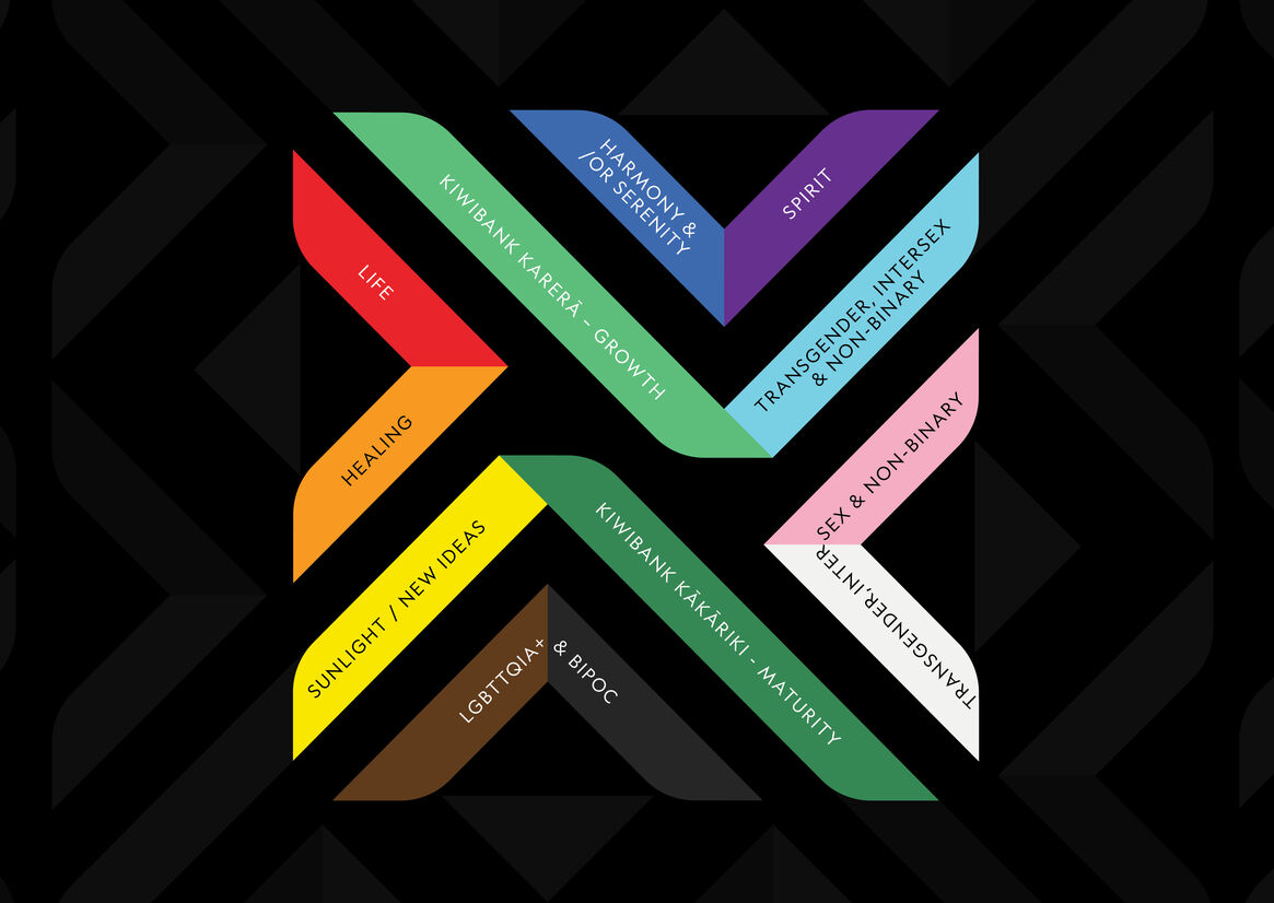
The design draws from Raranga, a weaving style used to make kete. It uses the harakeke leaves to weave the 11 colours of the Progress Pride Flag together with the Kiwibank kakariki green through the centre to acknowledge connectedness, a united view of inclusiveness, and banks pride in its people. The 11 colours of the Progress Pride flag better represent the spectrum of the Rainbow community. The mark mirrors the folded top corner of the Masterbrand logo and the weaving of multiple harakeke strands expresses the strength that lies within a community that creates a place to belong.
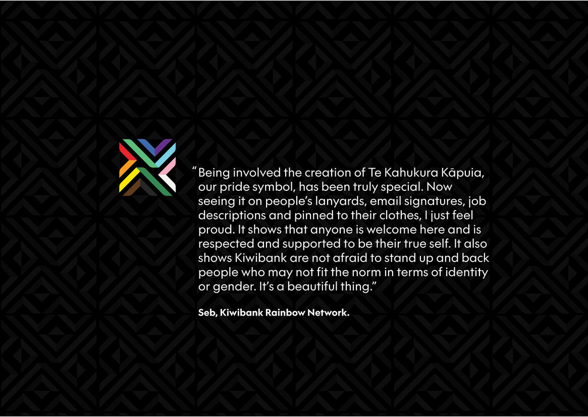
“Being involved the creation of Te Kahukura Kāpuia, our pride symbol, has been truly special. Now seeing it on people’s lanyards, email signatures, job descriptions and pinned to their clothes, I just feel proud. It shows that anyone is welcome here and is respected and supported to be their true self. It also shows Kiwibank are not afraid to stand up and back people who may not fit the norm in terms of identity or gender. It’s a beautiful thing.” Seb, Kiwibank Rainbow Network.