Graphic
Fuman 33 IQ COLOR
-
Pou Auaha / Creative Director
Jon Chapman-Smith
-
Ringatoi Matua / Design Director
Gio Trevilla
-
Ngā Kaimahi / Team Members
Katie Hamilton, Hattie Sadler, Zoë Tollenaar, Grace Chapman-Smith, Caleb Gopal -
Kaitautoko / Contributors
Fuzed, Matt Mills, Tegan Mills -
Client
B&F Paper
Description:
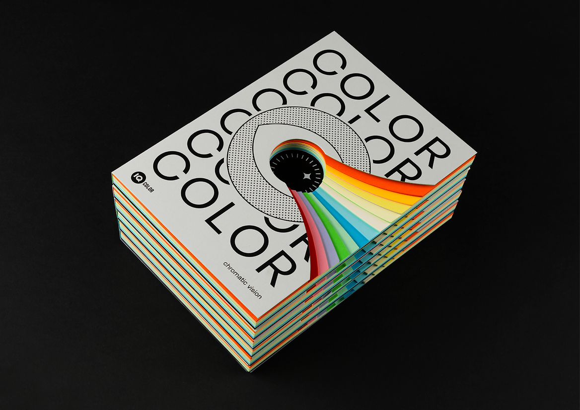
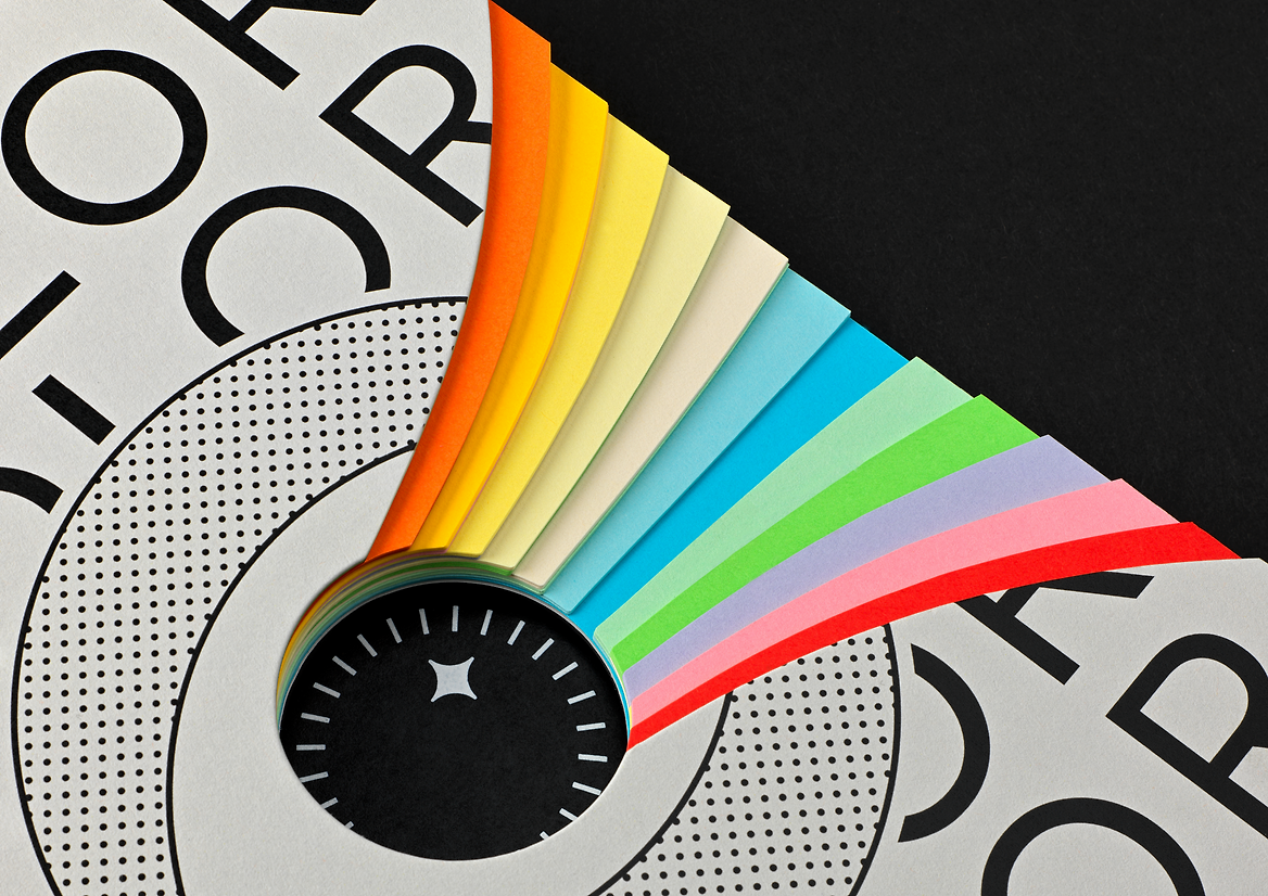
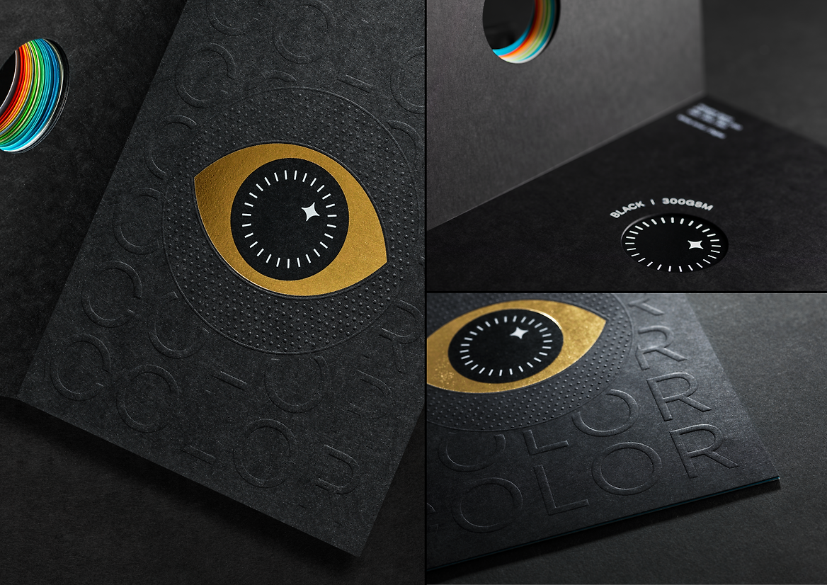
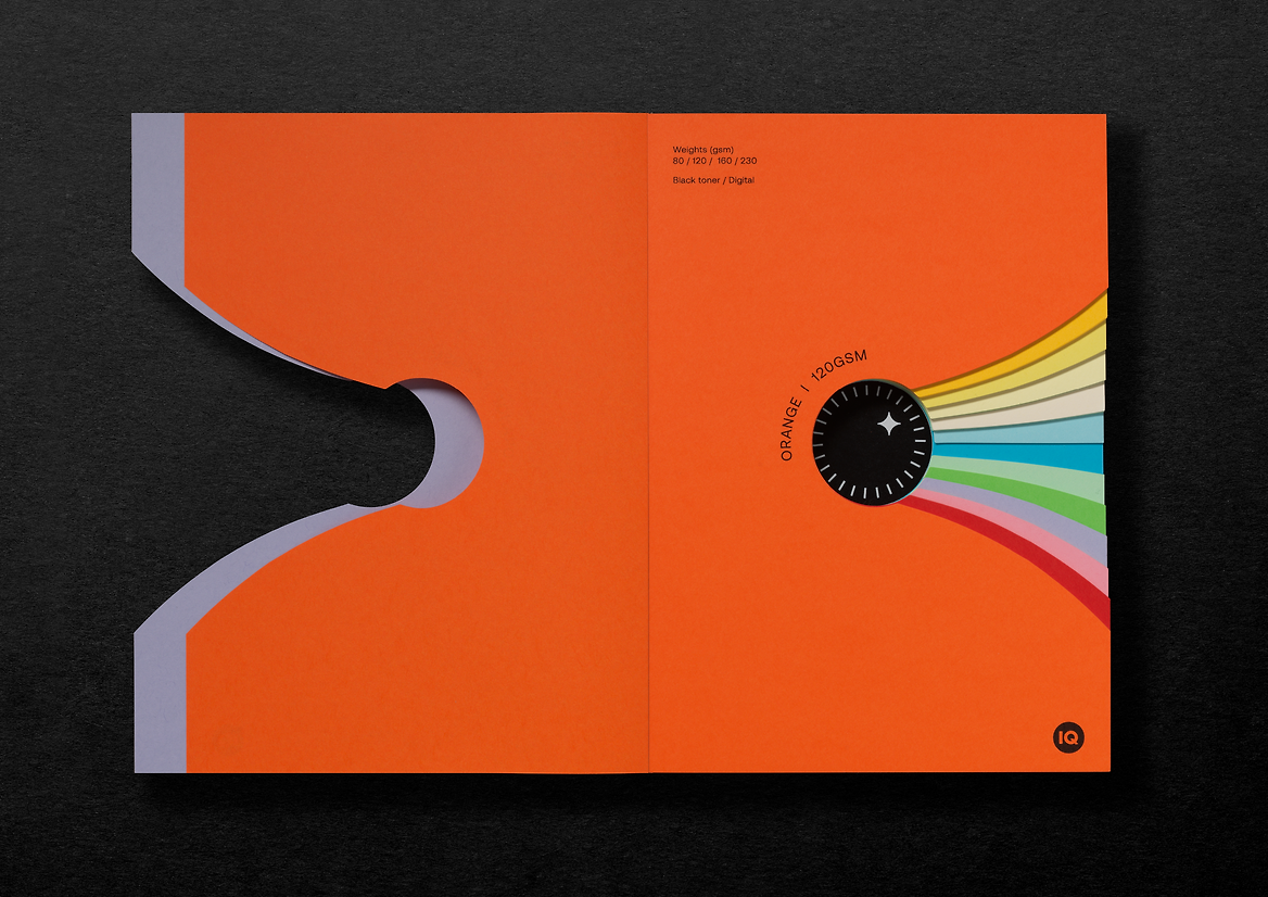
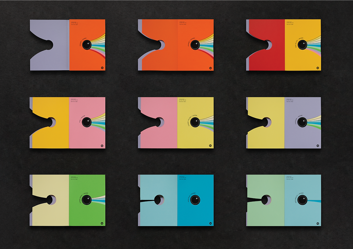
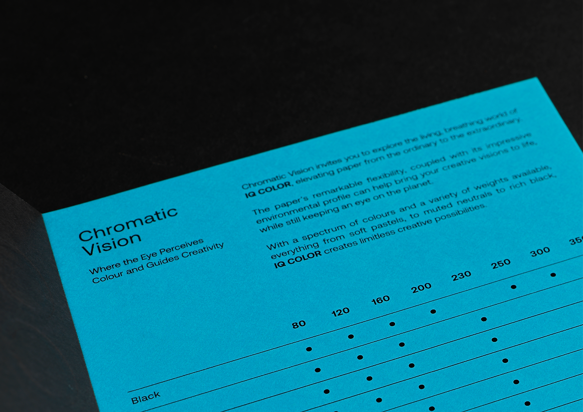
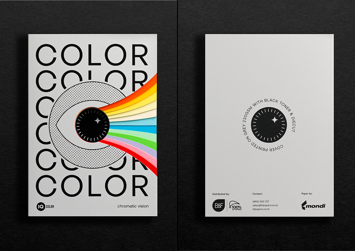
Chromatic Vision was our driving concept for the design of this promotional booklet. Specifically, chromatic vision refers to the ability for the brain to recognise colours in a spectrum. The human eye can perceive eleven million shades of colours. It became our goal to create a tool for designers and printers that would not only make their lives easier, but also delight the retina, and inspire them to create with colour.
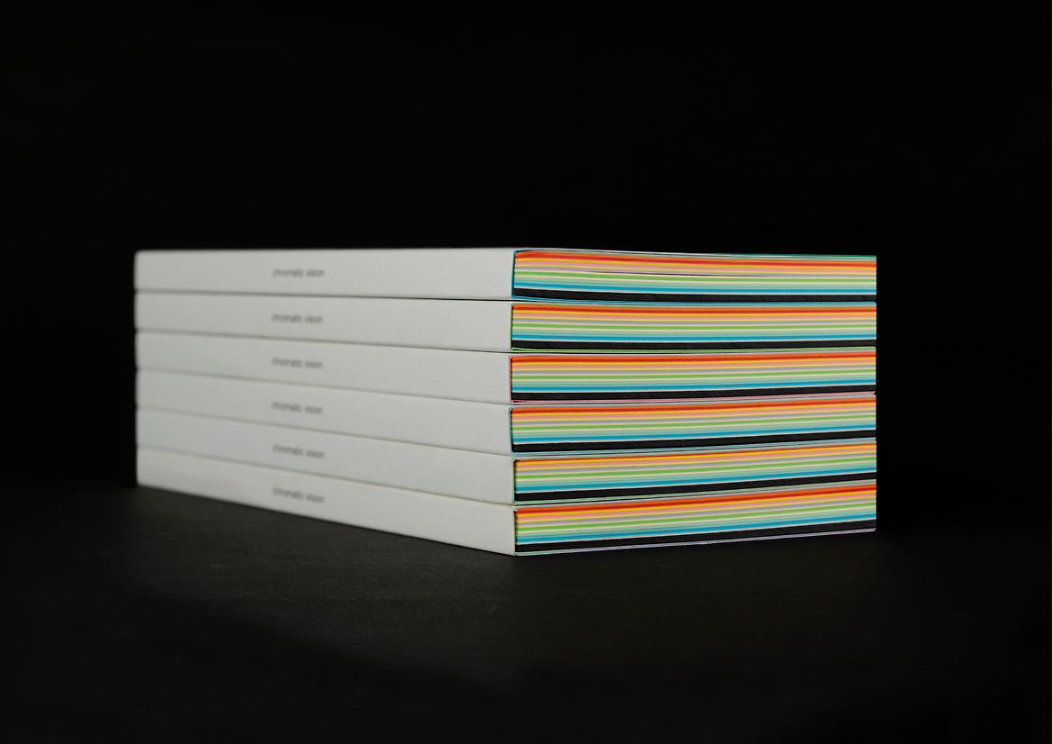
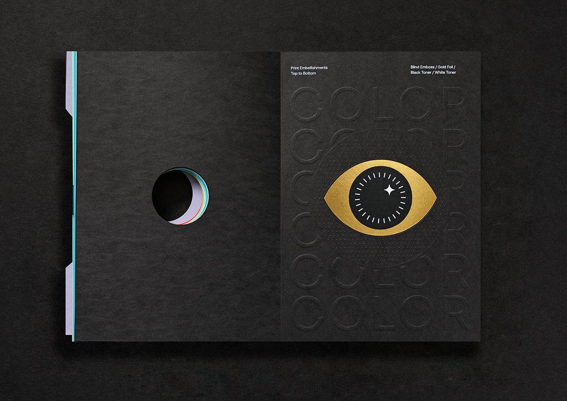
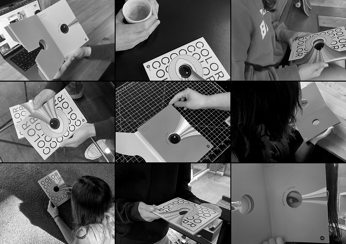
What doesn’t meet the eye, is the craft behind the scenes. This project required many hours spent in collaboration with our printer, ensuring the paper stocks lined up perfectly, and the staircasing effect didn’t compromise the structural integrity of the book. Wanting the book to be entirely crafted out of IQ COLOR (which in certain shades only goes up to 230gsm thickness) we also created the heavyweight cover by laminating two stocks together, showcasing the capabilities of IQ COLOR in production. And finally, we introduced a tearaway spine, enabling designers and printers to isolate paper samples, equipping them with that extra level of functionality.
IQ COLOR’s remarkable flexibility, coupled with its impressive environmental profile can help bring all of our creative visions to life, while still keeping an eye on the planet.