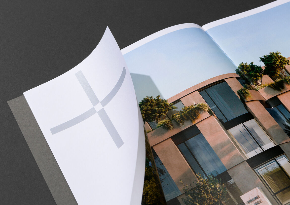
Graphic
Fortis 9 Pillar+Tide
-
Pou Auaha / Creative Directors
Kristina Granberg, Emily Matthews
-
Ringatoi Matua / Design Director
Emily Matthews
-
Ngā Kaimahi / Team Members
Liz Keene, Jess Garcia -
Kaitautoko / Contributors
George Hatton, Peter Maniaty, Tanya Zouev, Kendra McCarthy, Corey London -
Client
Fortis
Description:
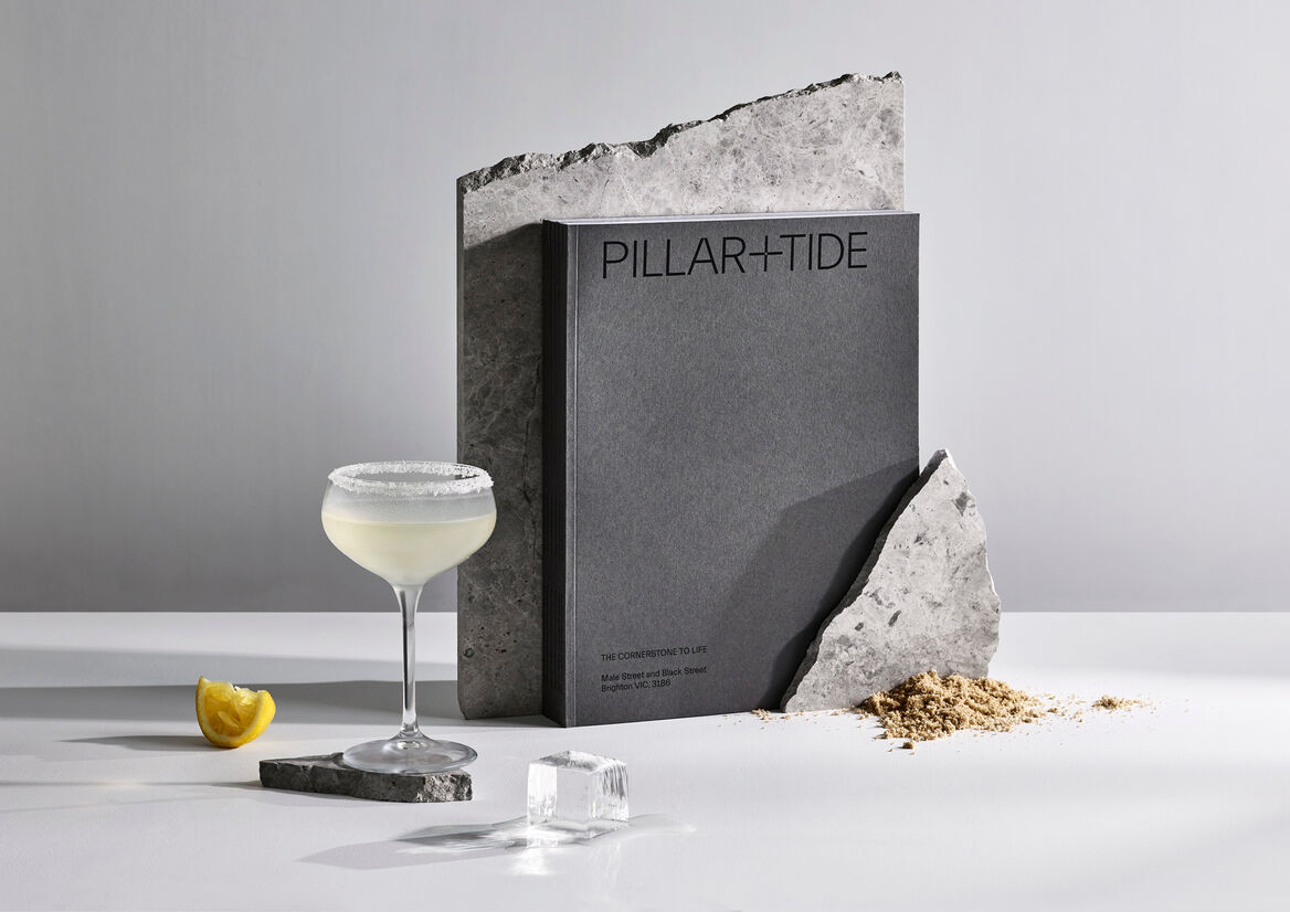
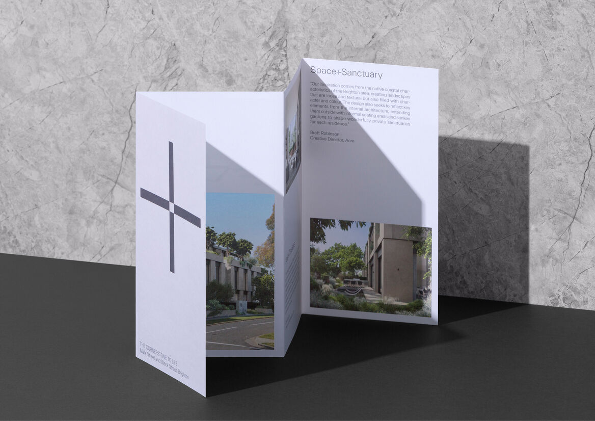
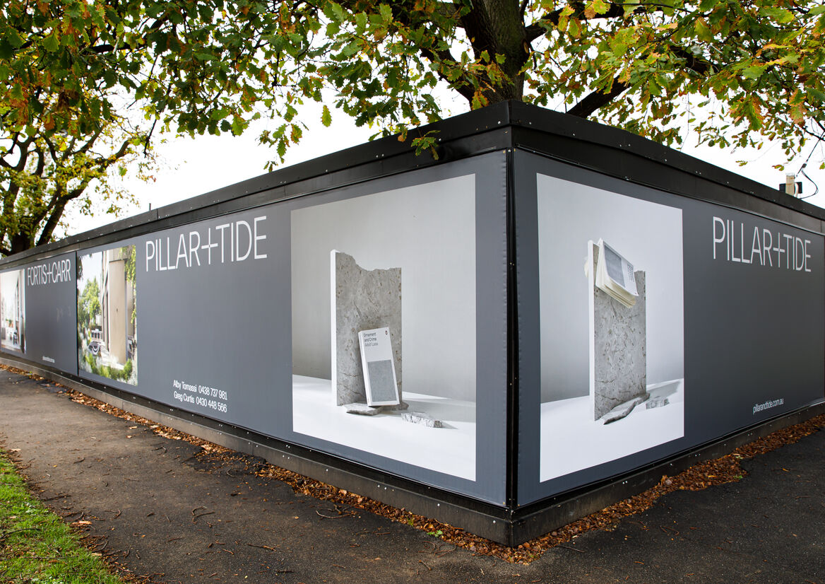
Pillar+Tide is a boutique collection of luxury residences in Melbourne, moments from the Brighton waterfront on Port Phillip Bay.
The architectural palette for Pillar+Tide is distinguished by a rich sense of timelessness and permanence. Our task was to create an equally timeless, yet endearingly human, brand campaign that resonated deeply with the needs of potential buyers, both emotional and rational.
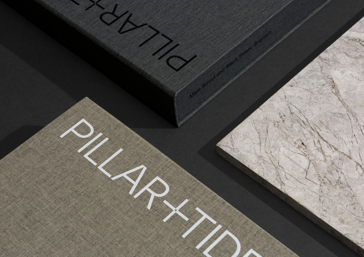
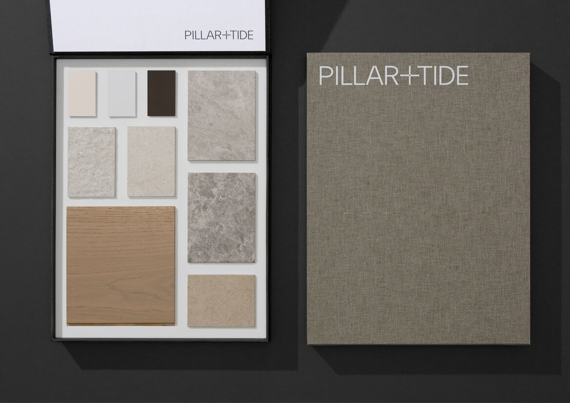
Informed by the Pillar+Tide name itself and the development’s ‘Still+Life’ positioning, an elegant design language was crafted to reflect the rich duality of the residences; a place where past meets future, indoors meets outdoors, community meets intimacy and time meets timeless.
Of course, no design exists in a vacuum. A significant challenge was to shape the Pillar+Tide campaign in such a way that its voice would be clearly heard, despite a cacophony of noise in the Brighton market, recently rezoned with multiple high-end developments all vying for the lucrative attention of downsizers.
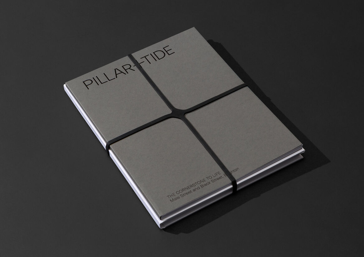
Rather than engage in a shouting contest – the default position for many developments – our design response was the exact opposite: understated, considered and quietly assured. Like an art gallery, each element was stripped back to the purest of details. Strong words, softly spoken. Equally, the campaign rejected the tired vernacular of the property market, flipping familiar language norms on their head. Instead of selling the building, the focus was the richness of life that flows within it.
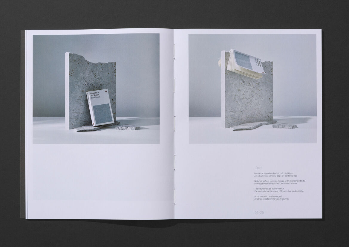
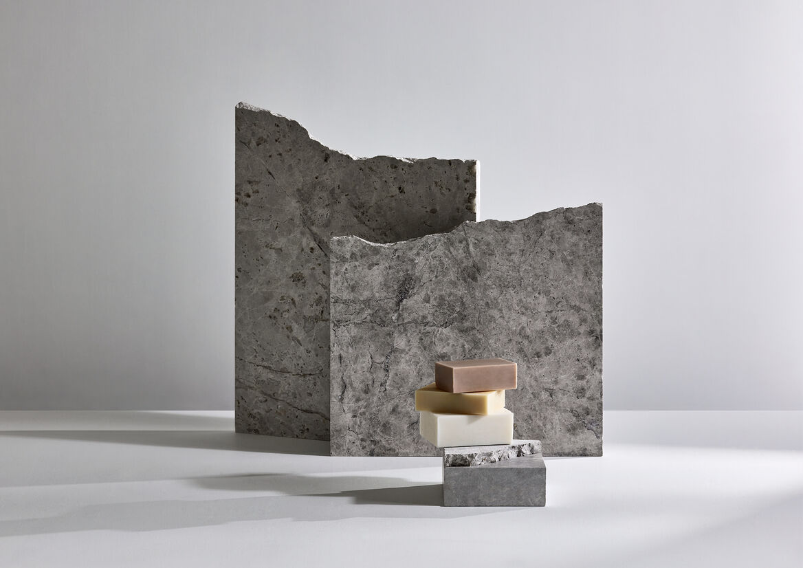
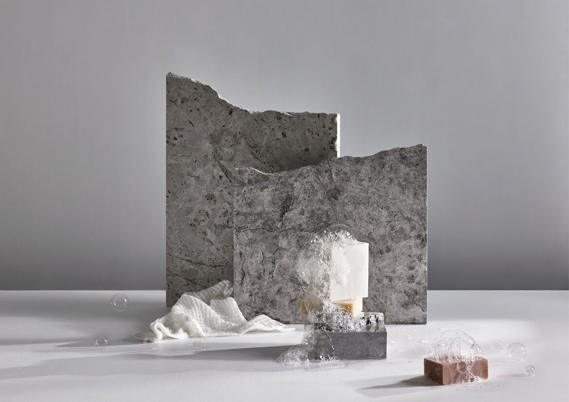
Conceptually, the structural form of Pillar+Tide presents as strong, constant and timeless, reduced to its raw, core elements – ‘Still’. In contrast, our customers’ lives are represented as soft, evolving, fluid, perfectly imperfect, where no two days are the same – ‘Life’.
Through images, words and typography, considerable energy was spent exploring ways to inject this duality into the Pillar+Tide brand experience. This included commissioning original poetry, coupled with an seductively simple photographic treatment reflecting the broader brand positioning – pairing a ‘pillar’ of the raw and robust materials from Pillar+Tide’s built form, with a contrasting object that tells a deeper, more personal story.
In total, five such image pairings were created for Pillar+Tide, with each representing life and movement over a space of time through subtle lighting changes, long shadows and stylised props, further adding to the story-telling. Together, they became the visual anchors for the entire campaign, helping to deliver a residential property brand as intriguingly human as it is unique within the category.