Graphic
Fortis 9 Colindia
-
Pou Auaha / Creative Directors
Kristina Granberg, Em Matthews
-
Ringatoi Matua / Design Director
Em Matthews
-
Ngā Kaimahi / Team Members
Liz Keene, Jess Garcia -
Kaitautoko / Contributor
Graziela Machado -
Client
Fortis
Description:
‘Awash with beauty.
Anchored in the exceptional.
Open to it all. Colindia.’
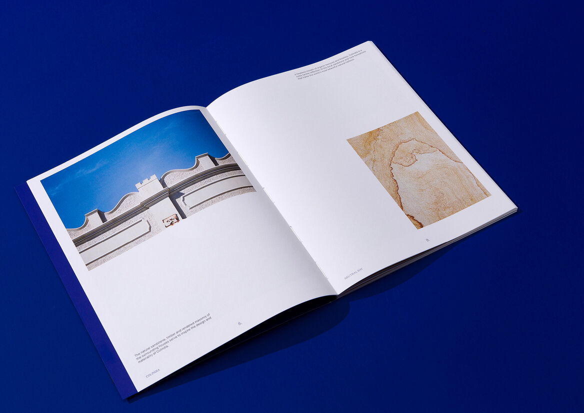
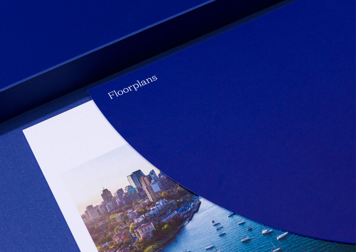
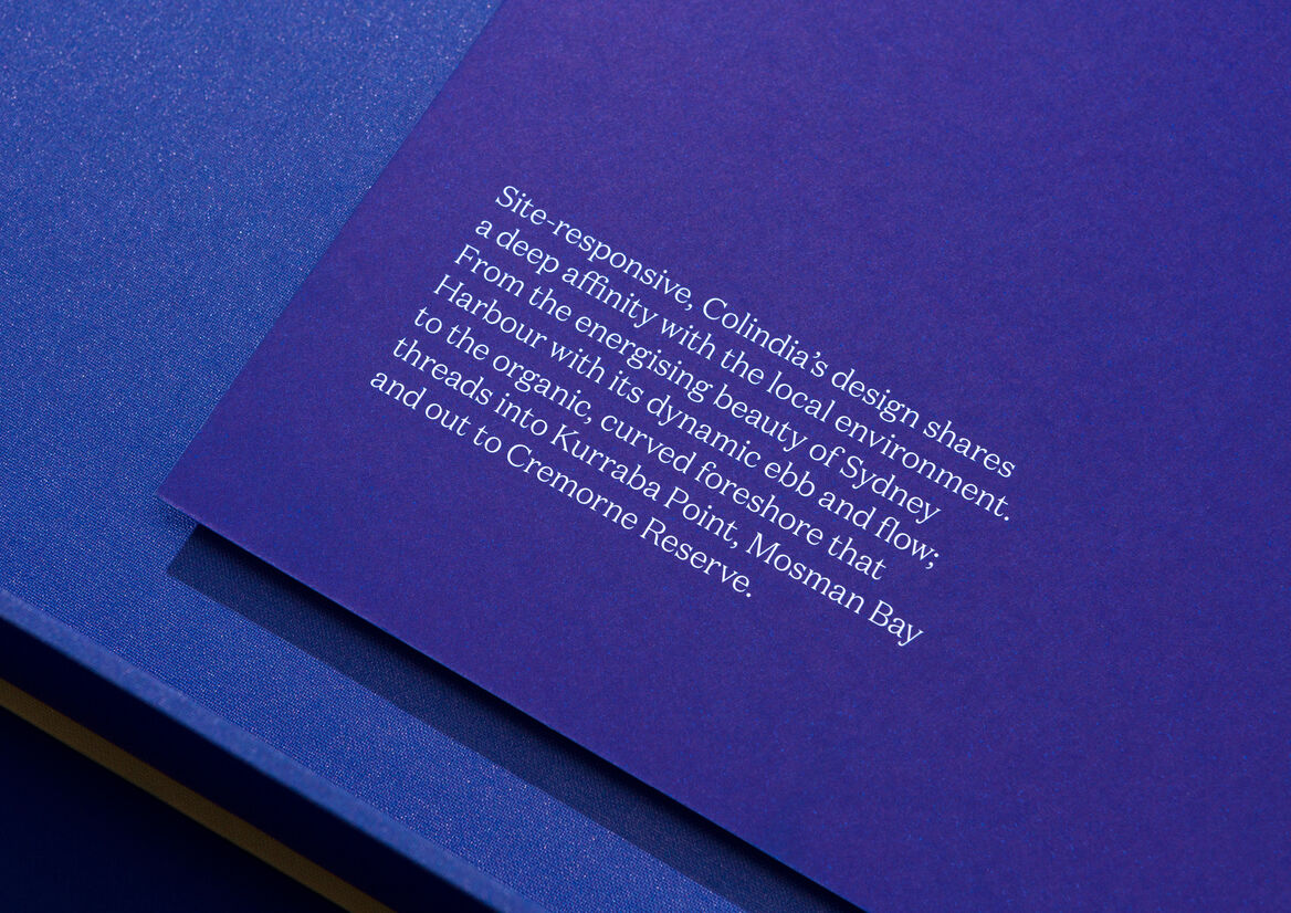
Nestled in the hills of Neutral Bay on Sydney’s lower north shore, Colindia comprises six half-floor residences crowned by a full-floor penthouse at the end of a quiet cul-de-sac.
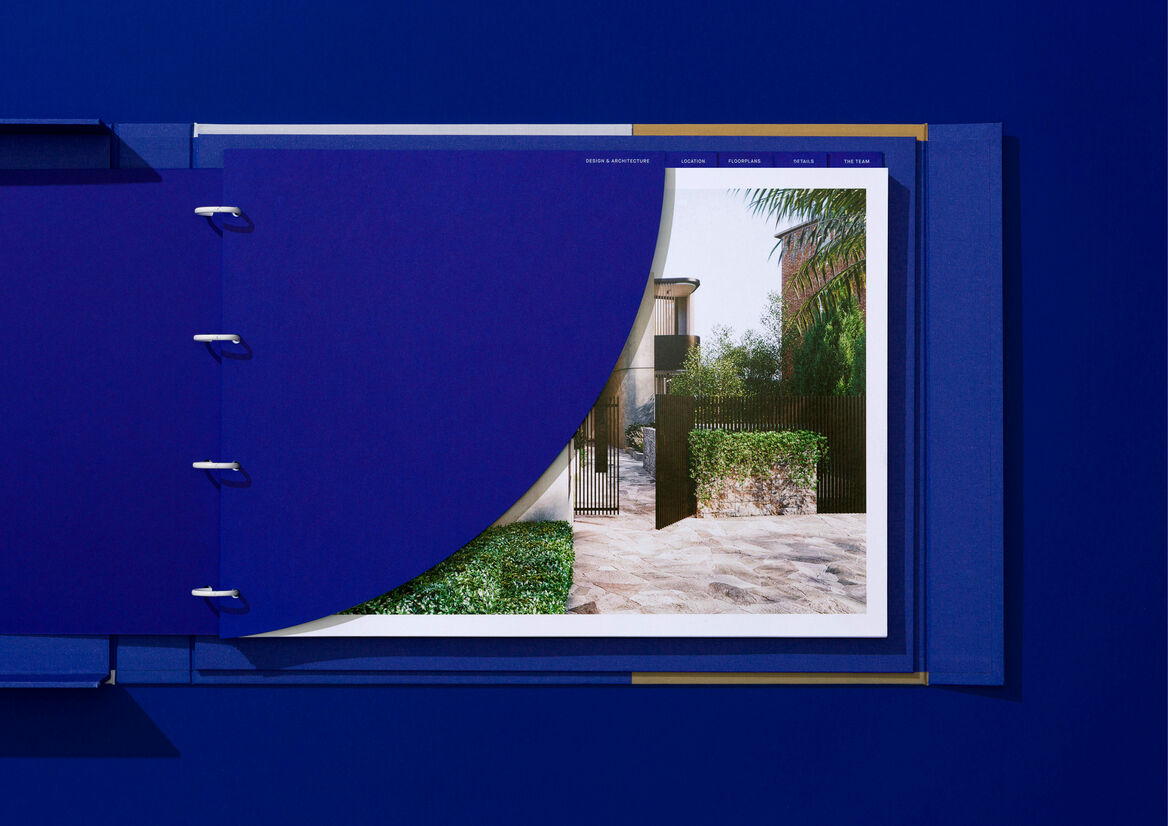
Intimate in both design and nature, the distinctive architecture of Colindia presents as a sculpted artform, with curved walls creating a soft and inviting spatial experience. It is an address overflowing with the best of all worlds: a private haven of harbourside bliss, with a world of amenity and possibilities on its leafy urban doorstep.
In saturated market with fierce competition, brand positioning was everything. It was essential for Colindia to be presented in a way that caught the hearts and minds of the highly sought-after downsizer target audience. Rather than pursue the broad brushstrokes of a ‘catch all’ brand campaign, we instead focussed on a far narrower cohort – downsizers who were ready for a fresh chapter of possibility – utilising designs and messages specifically crafted to appeal to those who were open to new ideas, new connections and new forms of self-expression.
We used the campaign content to illuminate those key attributes we knew Colindia competitors could not – the privacy of an end of cul-de-sac address with a small and unassuming street frontage, the independence and intimacy of the small number of residences, the proximity to amenity, and the exceptional architectural design.
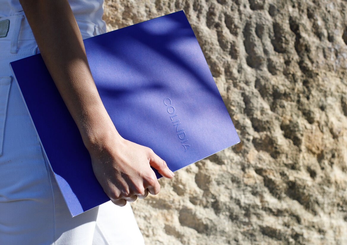
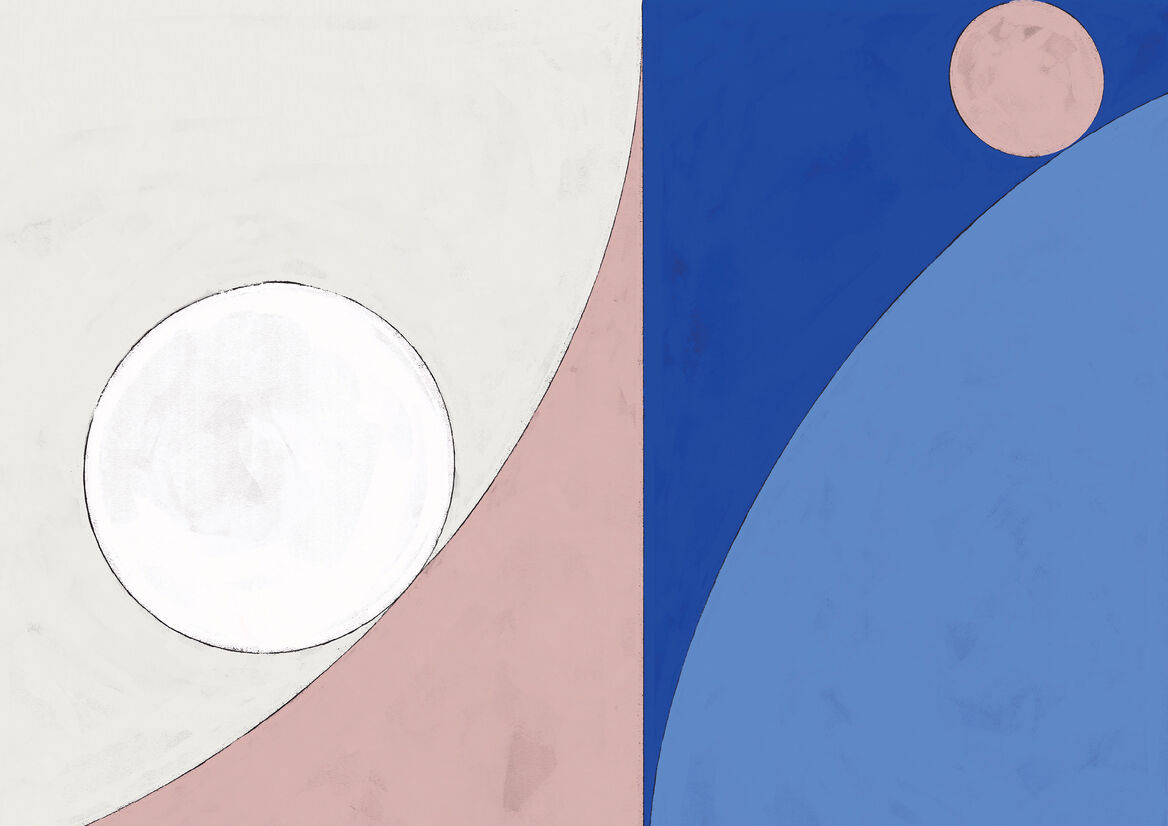
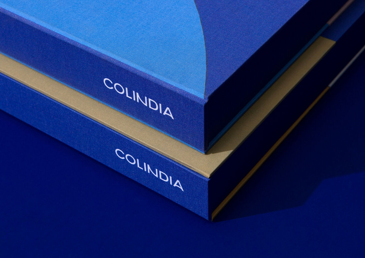
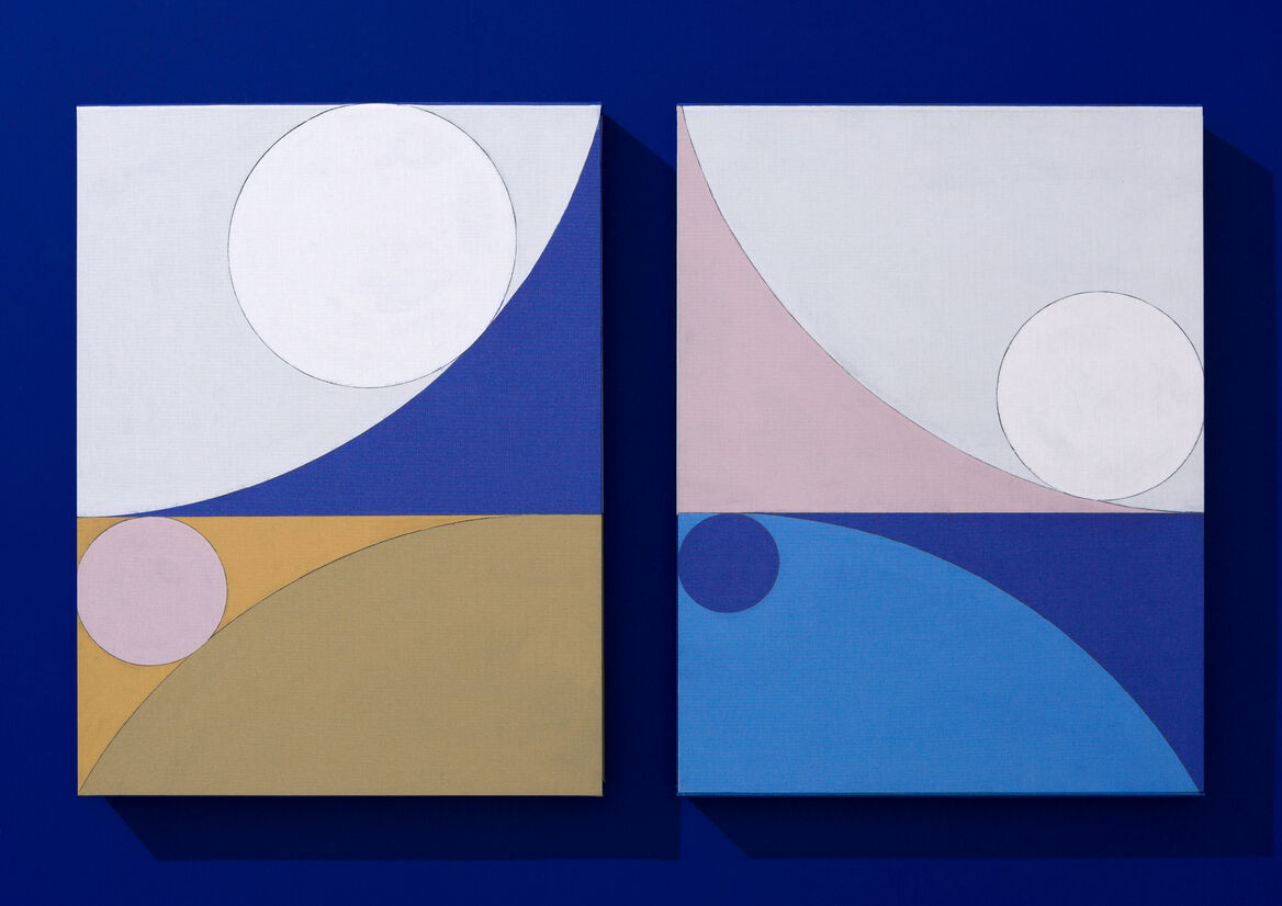
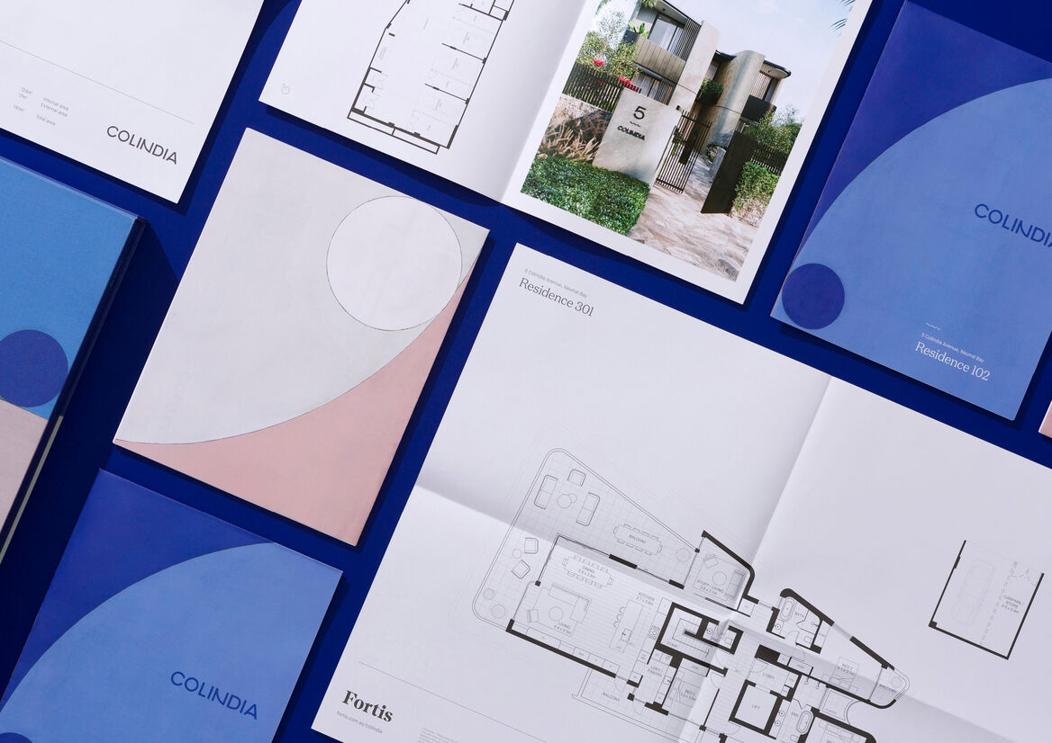
Executionally, the Colindia visual identity featured a series of commissioned artworks using fluid lines and natural hues evoking references to the architectural form, as well as Neutral Bay’s pristine flowing shorelines. Each original artwork was used to illustrate the unique characteristics of the building, framed in luxuriously spacious layouts with pops of striking cobalt blue – a nod to the panoramic backdrop of Sydney Harbour.
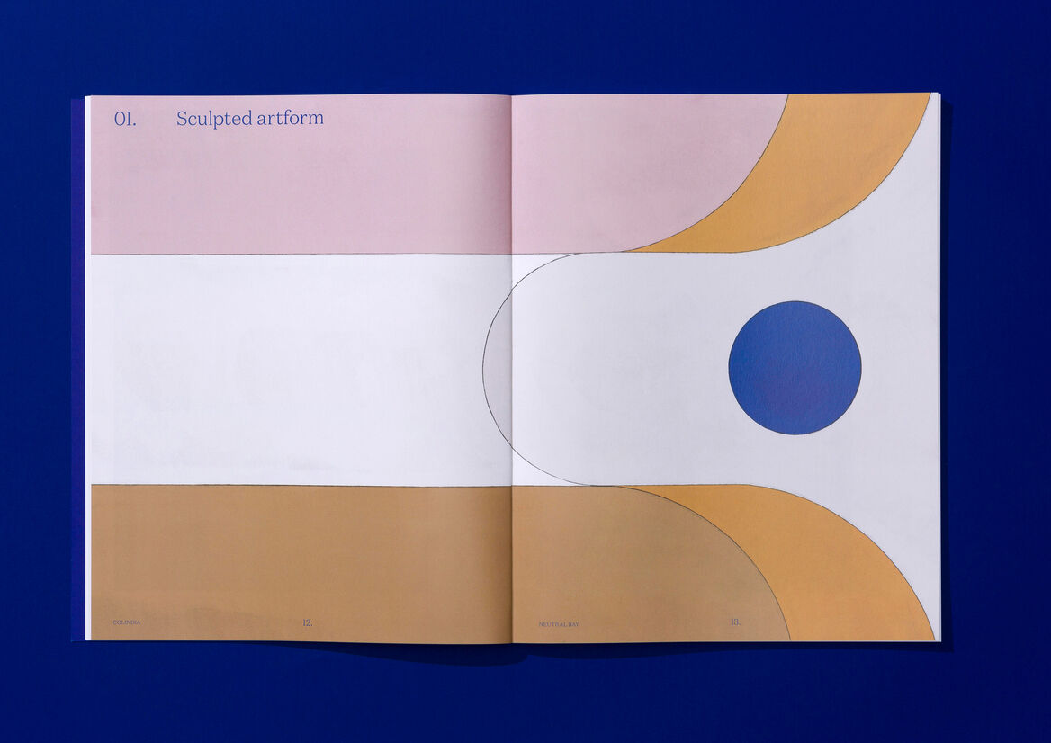
Buyers were taken on a carefully-curated journey, with the Colindia story presented through six chapters, each paired with its own illustration: 1) Sculpted artform; 2) Private and secluded; 3) Open and light; 4) Connected and convenient; 5) Functional and pragmatic; and 6) Crafted to perfection.
In a final, but equally noteworthy design touch, the ‘Colindia’ name itself was inspired by the serenity of the quiet Neutral Bay setting and the elegantly curved letterforms present within the word. A bespoke wordmark was created to emphasise these, using open rounded shapes and sweeping curves, delivering a subtle punctuation on what was a wonderfully successful launch campaign.