Graphic
FCB New Zealand 19 SweetShop Blockhead VFX Match Photographers You Can Sense It. You Can Stop It.
-
Pou Auaha / Creative Directors
Leisa Wall, Peter Vegas, Slade Gill
-
Ringatoi Matua / Design Director
Josh O'Neill
-
Ngā Kaimahi / Team Members
David Shirley, Melina Fiolitakis, Emilie Watts -
Kaitautoko / Contributors
Jenni Doubleday, Scott Kelly, Xavier Glass, David Thomason, Lloyd Thomason, Sean Keaney, Amanda Langkilde, Simon Pengelly, Pip Mayne, Ruby Black -
Client
WorkSafe New Zealand


Description:
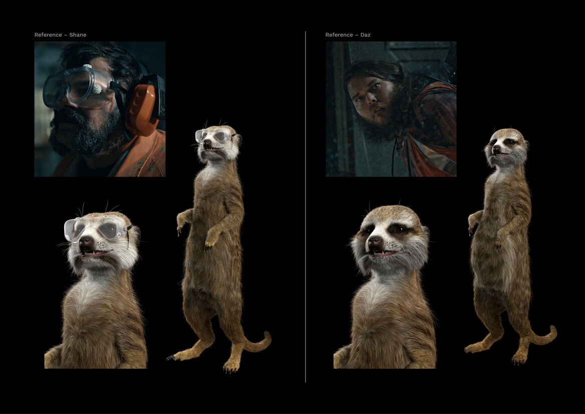
Historically, workers have been told to follow the rules to stay safe. And, to be fair, they’re great for the basics. But, you can’t write a rule for everything. We needed to make New Zealand’s workers aware of a new kind of safety, which empowers them to be proactive. It asks them to look for the signs of danger and, if they think something could go wrong, to step in and stop it. This sense for danger is a power we all possess – it’s like we each have a pack of inner-meerkats, who stand to attention when something doesn’t feel right.
Our campaign would hero the ‘moment of awareness’ – that point when your inner-meerkats stand to attention and tell you something isn’t right. We set about developing 3D models of meerkats that would feel like extensions of the person they belonged to. The process involved developing families of meerkats – each one individually crafted to have unique physical features, grooming and patterns, but each feeling like they were part of a sub-group, that had the physical features of their human owner. The person’s brow line, their facial hair, complexion, hair colour – all were used to inform this sub-group design.
The photography was dramatically lit and composed to give a feeling of suspense, while giving our characters a heroic demeanour. Then, by capturing a 360 degree image from the perspective of our character, we were able to light our 3D meerkats in exactly the same way, so that they feel like they’re really in the space and heightening that moment of awareness that was the focus of our campaign.
Our typography was inspired by the stamped metal safety signage that’s adorned the walls and fences of hazardous workplaces for decades. Utilitarian and emphatic, while retaining some humanity and approachability.
Our goal for the overall feeling of the work was that it would have an urgency to it. That its surreal construct would draw you in, while our heroic characters and heightened sense of awareness would stimulate viewers to follow suit, and take action in their own workplaces.