Graphic
Extended Whānau 51 Toi Tū Toi Ora: Contemporary Māori Art
-
Pou Auaha / Creative Director
Tyrone Ohia
-
Ngā Kaimahi / Team Members
Rob Lewis, Rosabel Tan, Nigel Borell, Taarati Taiaroa, Brook Konia, Kirsten Lacy, Sarah Farrar, Tania Stoyanoff, Sara Laver, Clare McIntosh, Hilary Moloughney, Rachel Salazar, Samantha McKegg, Scott Everson, Hannah Manning-Scott, Emma Pritchard, Emma Jameson, Moira Russell, Charlotte Minards-Black, Lizzie Baikie, Alice Tyler, Emma Elsom, Jennifer French, Paul Chapman, Jeremy Sherlock, Chelsea Winstanley, Maree Sheehan -
Kaitautoko / Contributors
Auckland Art Gallery Toi o Tāmaki, Haerewa Māori Advisory Group, Britomart Group, Angus Muir Design -
Client
Auckland Art Gallery Toi o Tāmaki
Description:
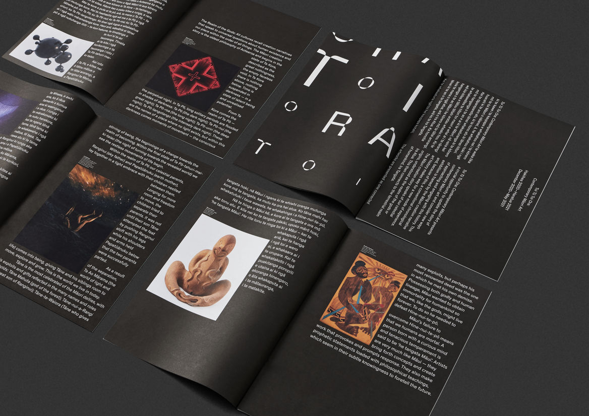
Toi Tū Toi Ora: Contemporary Māori Art is a landmark survey exhibition at the Auckland Art Gallery Toi o Tāmaki. It celebrates the dynamic, ever-changing expression of contemporary Māori art and is the largest show in the gallery’s history, featuring over 300 artworks from 111 artists.
We were tasked with designing the identity and all accompanying design communications for the exhibition.
Our approach was to reflect the unique Māori curatorial framework of the show, based on the Māori creation narrative.
Rather than using conventional Western chronology to organise the works, Māori celestial origins become the organising idea.
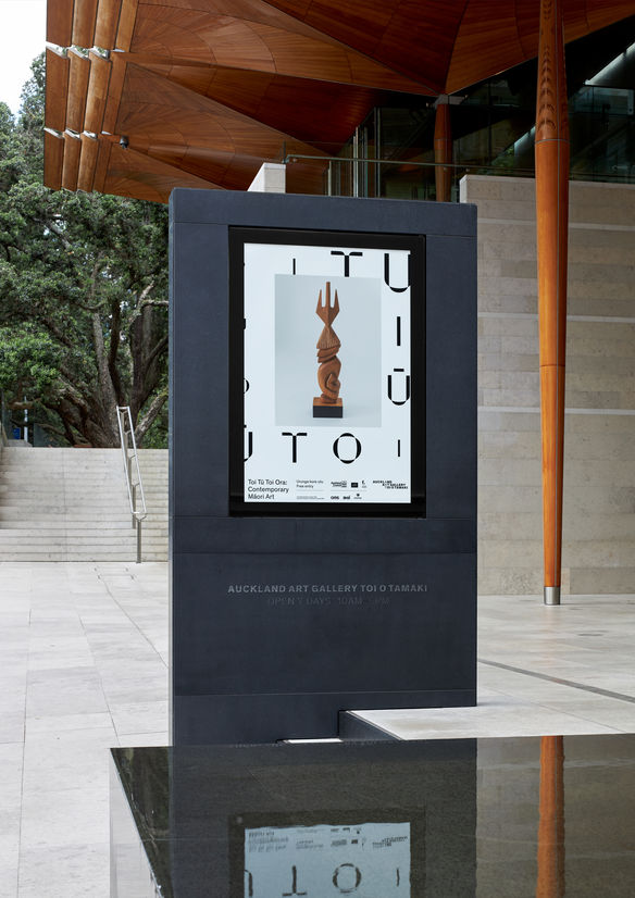
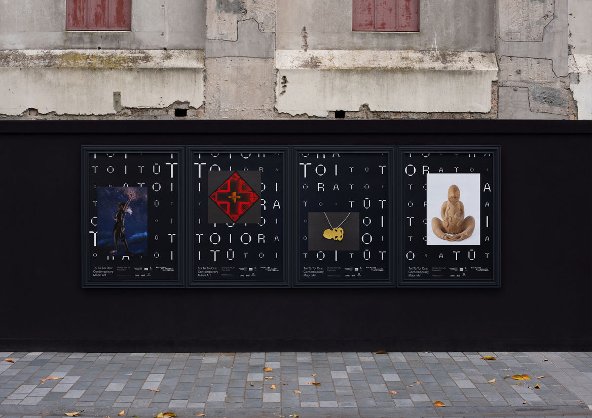
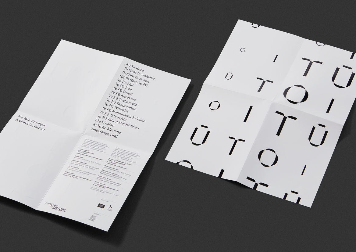
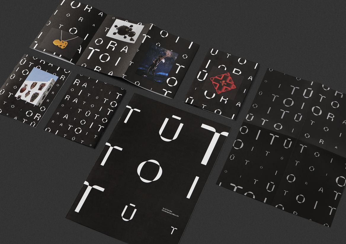
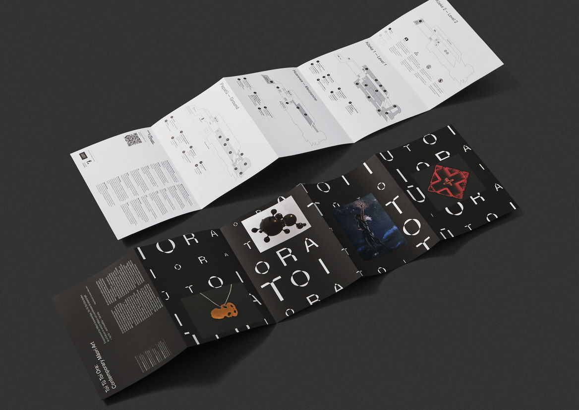
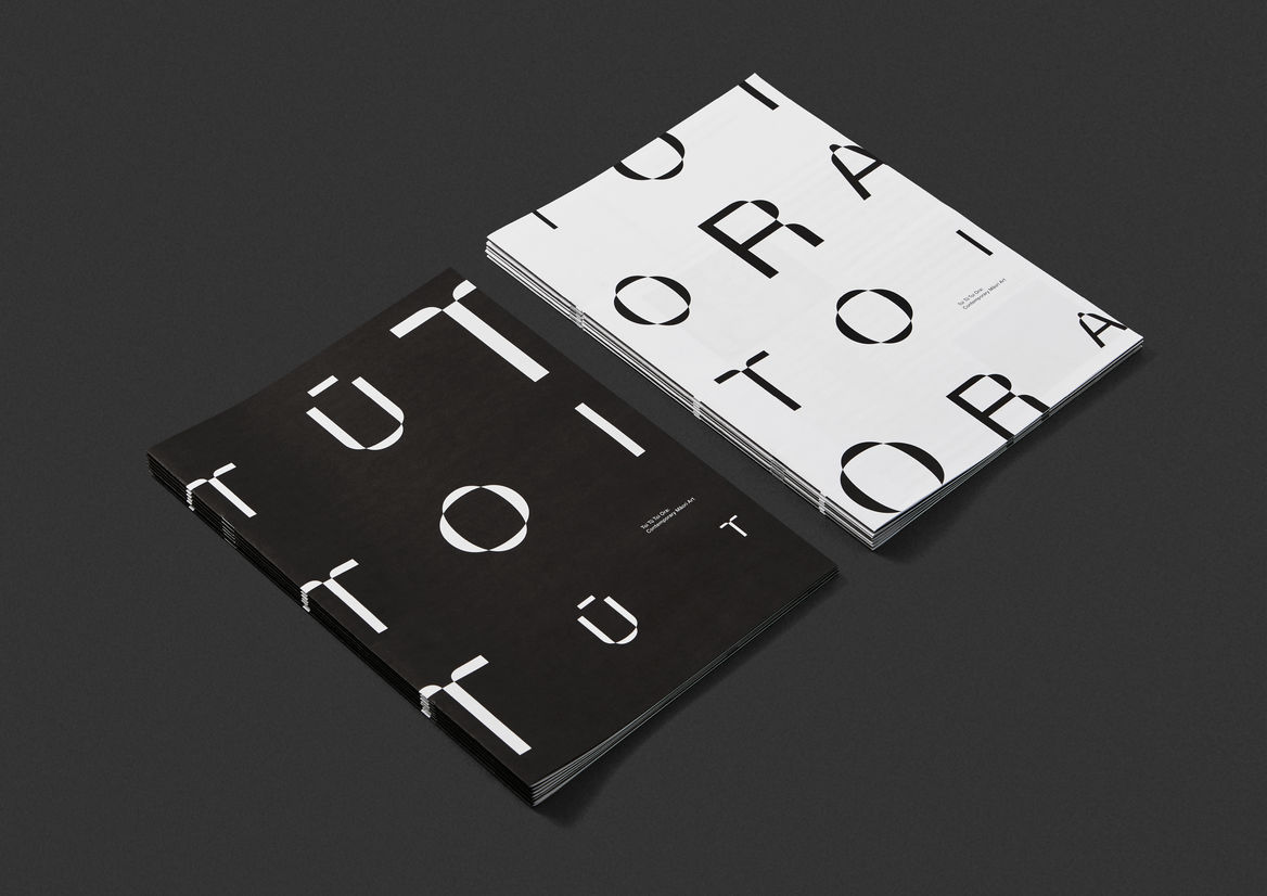
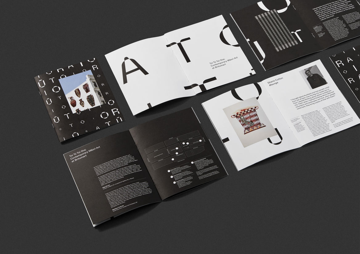
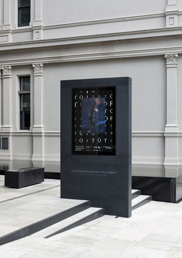
Privileging these Māori concepts of time and space, the show’s title becomes an interwoven time scape and takes the form of an infinite, ever-changing pattern that spills out of the gallery and draws us into the Māori universe.
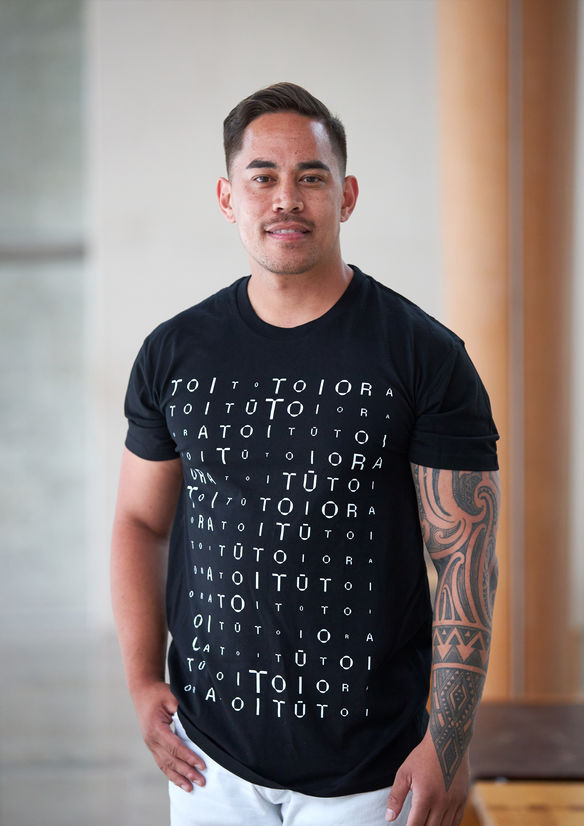
The words Toi Tū Toi Ora repeatedly chant their way through the gallery space and throughout all the design elements. Proudly affirming the meanings within – Māori art stands strong and in good health.
The titular typeface has straight edges, but also warps and bends in mythical ways to reflect the straight lines of Māori woven art forms, as well as the organic curves of carved art forms.
Artwork images are placed into this typographic pattern, linking all our artists together within the whakapapa of our Māori universe.
Being a survey show, we chose to use a wide and diverse range of artwork images, in place of a single hero image. Care was taken to ensure an inclusive balance of male and female artworks were paired and represented.
Shifting between black and white, our colour scheme reflects the extremes of the Māori creation narrative – moving from darkness into the world of light, echoing the many dualities within Te Ao Māori.
A wide range of design touchpoints were created across print, environmental, and merchandising. Items included invites, guide maps, catalogues, kids trail brochures, posters, print ads, and billboards.
All design material was bilingual – a first in the gallery’s history – and rolled out nationwide.
Judge's comments:
Evolving Maori design in such an aspirational & iconic way that showed such bravery. True branding through pattern, that is instantly recognisable. A design system that was executed seamlessly over so many touchpoints that enhances the artwork.