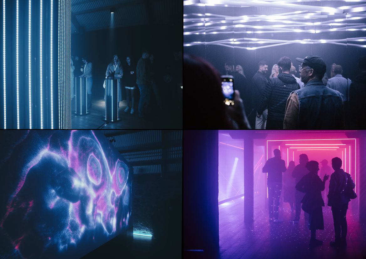
Darklight is a new immersive light and sound experience created by Angus Muir Design and Dan Move. Their ambition is that over time, temporary Darklight experiences pop up globally in different locations, offering a different experience and narrative each time.
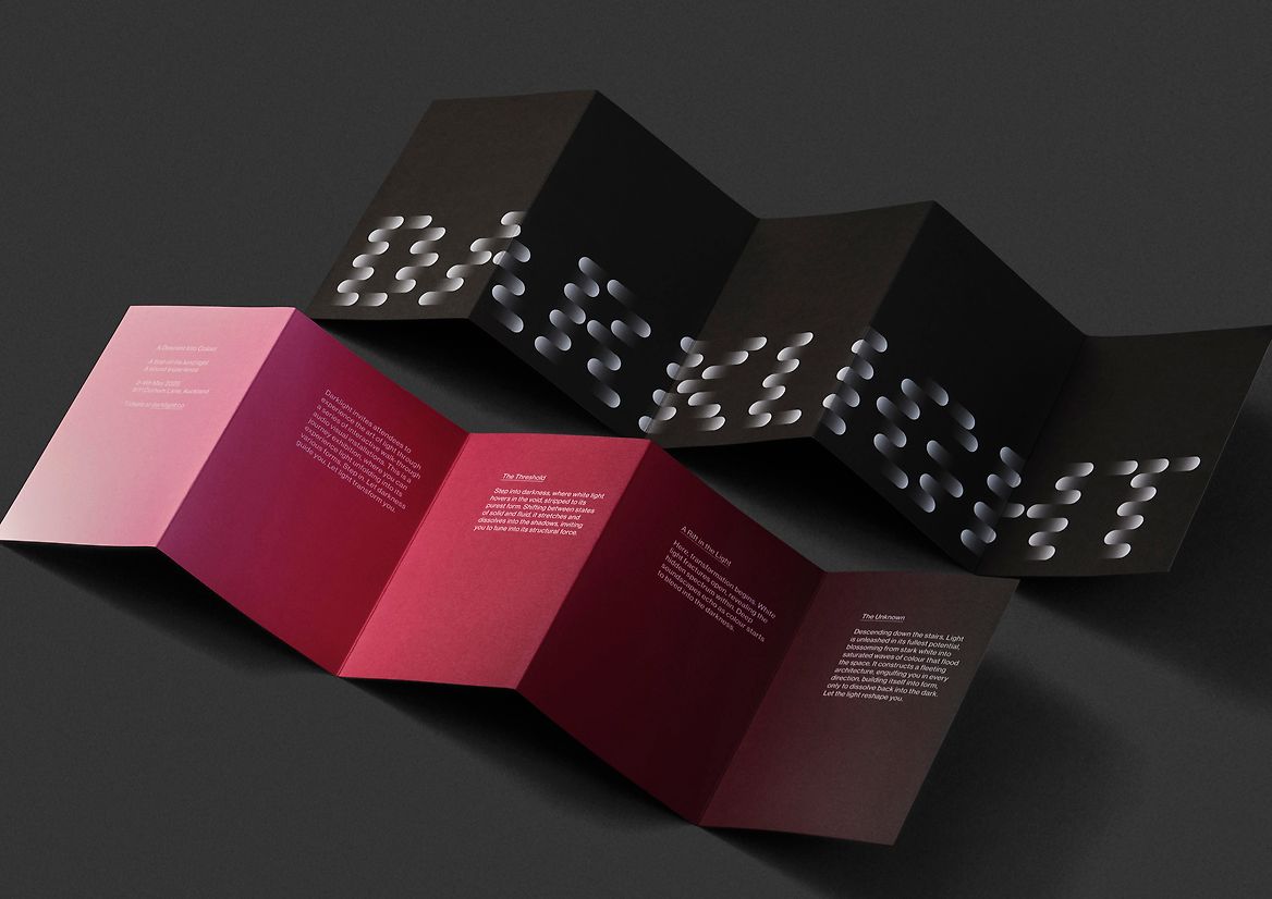
We were approached to create the identity for Darklight as well as the collateral for the first event; Darklight: A descent into Colour.
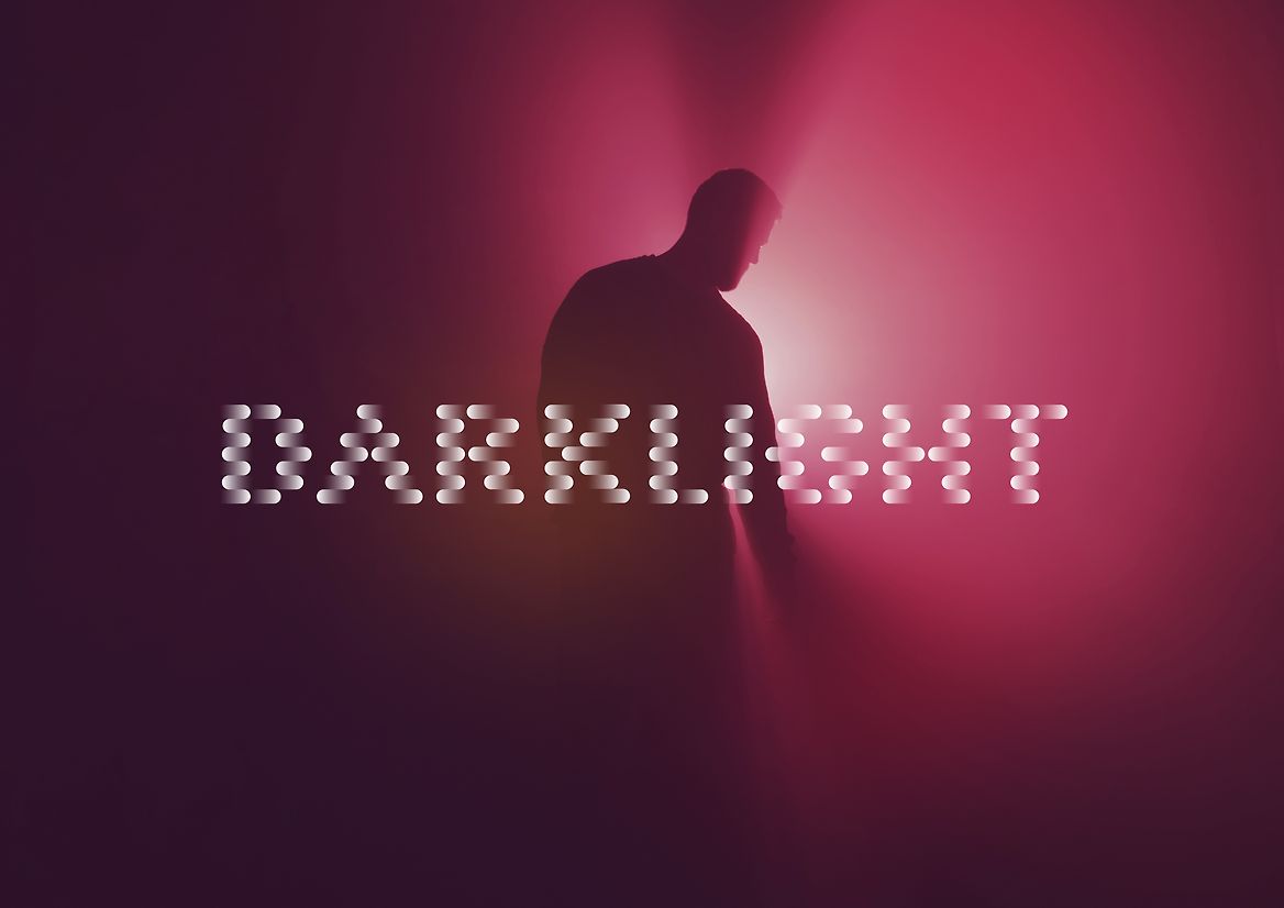
For us, the name says it all. At the heart of the experience is the idea of taking people on a journey from darkness into light, and back again. Traversing everything that comes with that in terms of curiosity, discovery and awe. That sensory magic at the core of all good light and sound experiences.
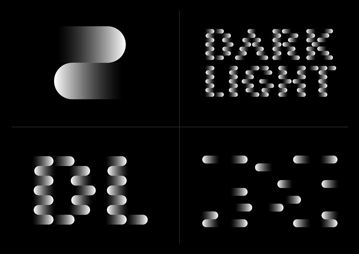
We started with a symbol. A simple stack of two gradients that transitioned from black to white and back again. For us it represented the transition, the motion, the energy, the different shades, the spatial play, and the trickery between the two extremes. The ability to see things from new perspectives, new beginnings, and new endings. Its ends circular like a light source, both natural and technological at the same time.
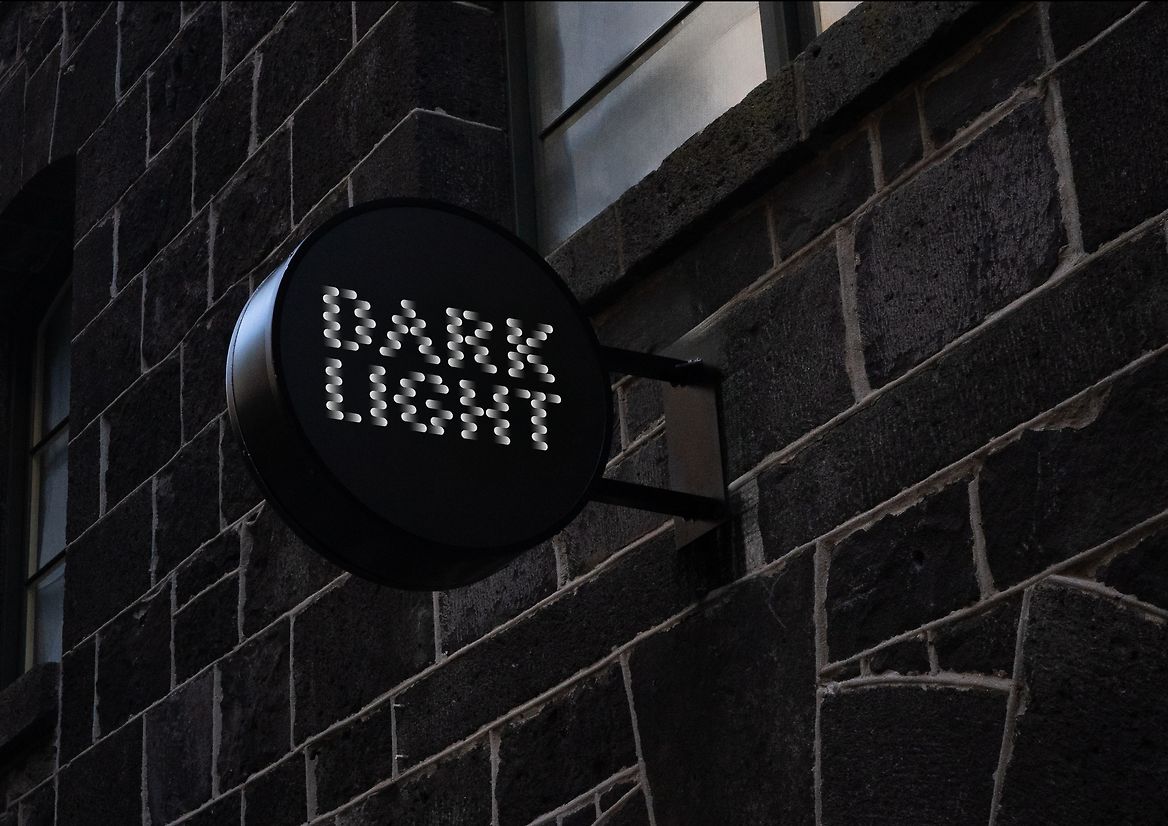
This symbol became the unit used to create the Darklight wordmark. A rather distinctive wordmark that aims to capture the magic of light and sound in letters. Transitioning in and out of itself and its surroundings.
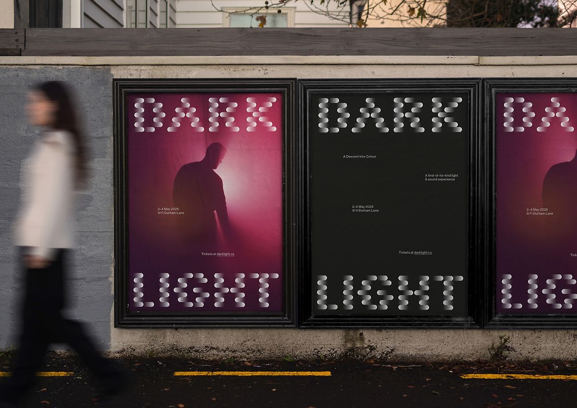
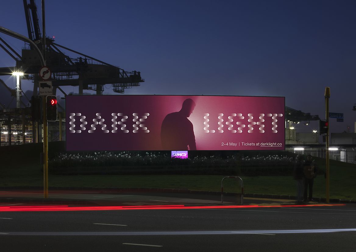
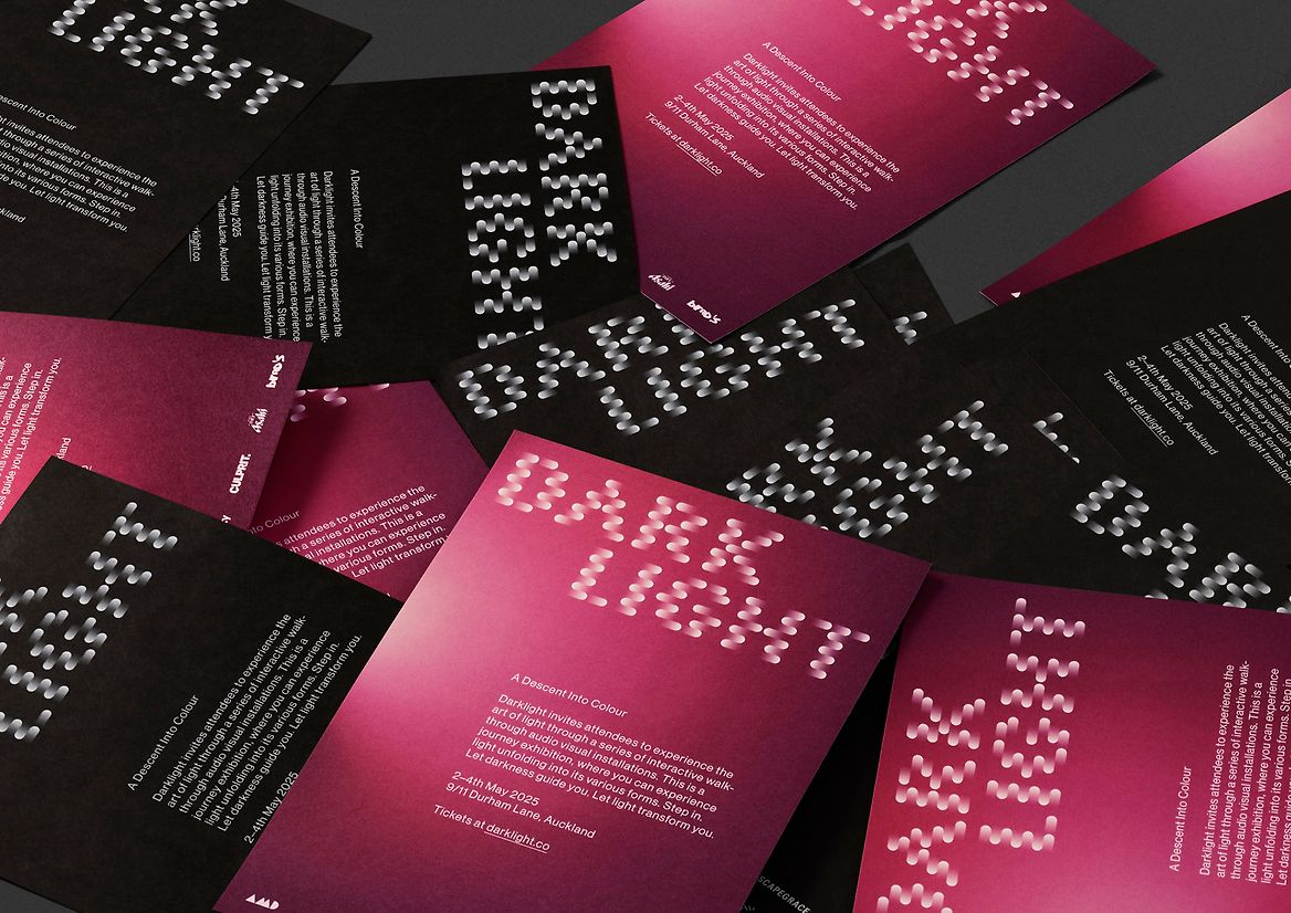
The aim is for Darklight to be a premium package of exhibitions with a strong, but sophisticated brand presence. Because of this, other than the wordmark, things are kept simple, and crafted. And copy is kept to a minimum to encourage curiosity.
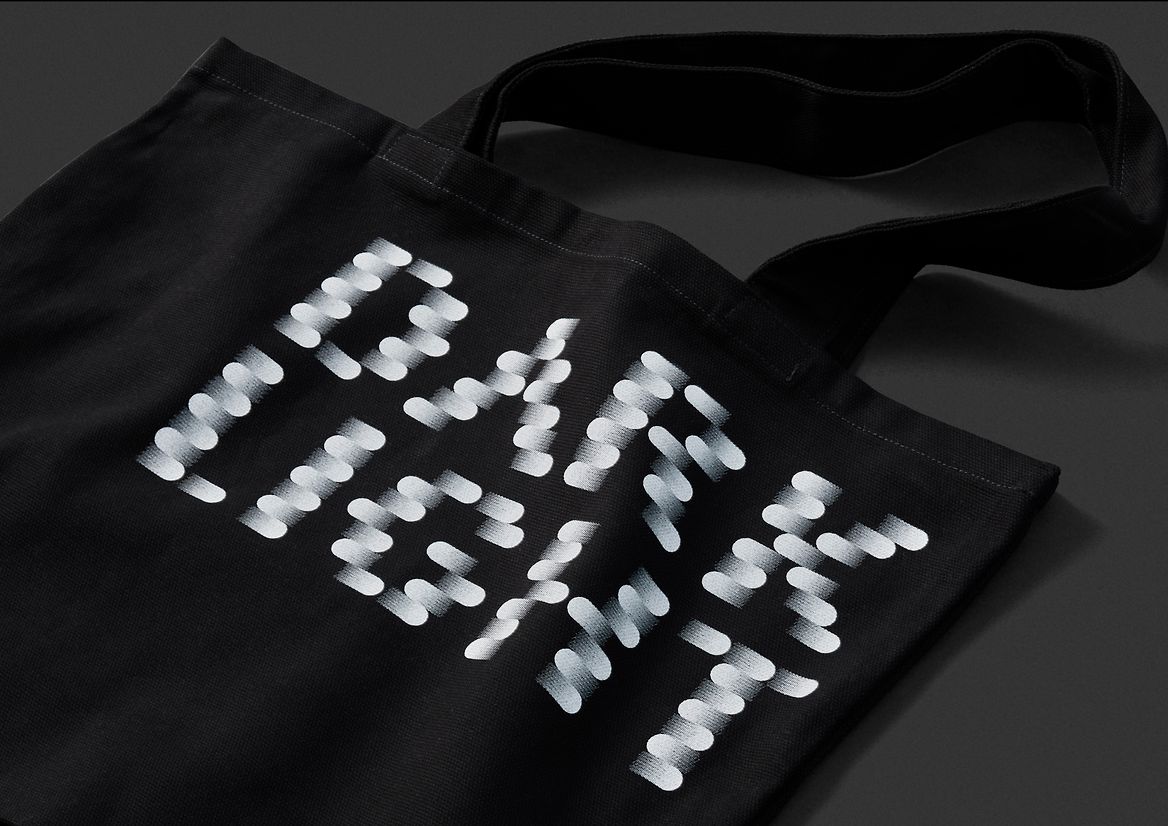
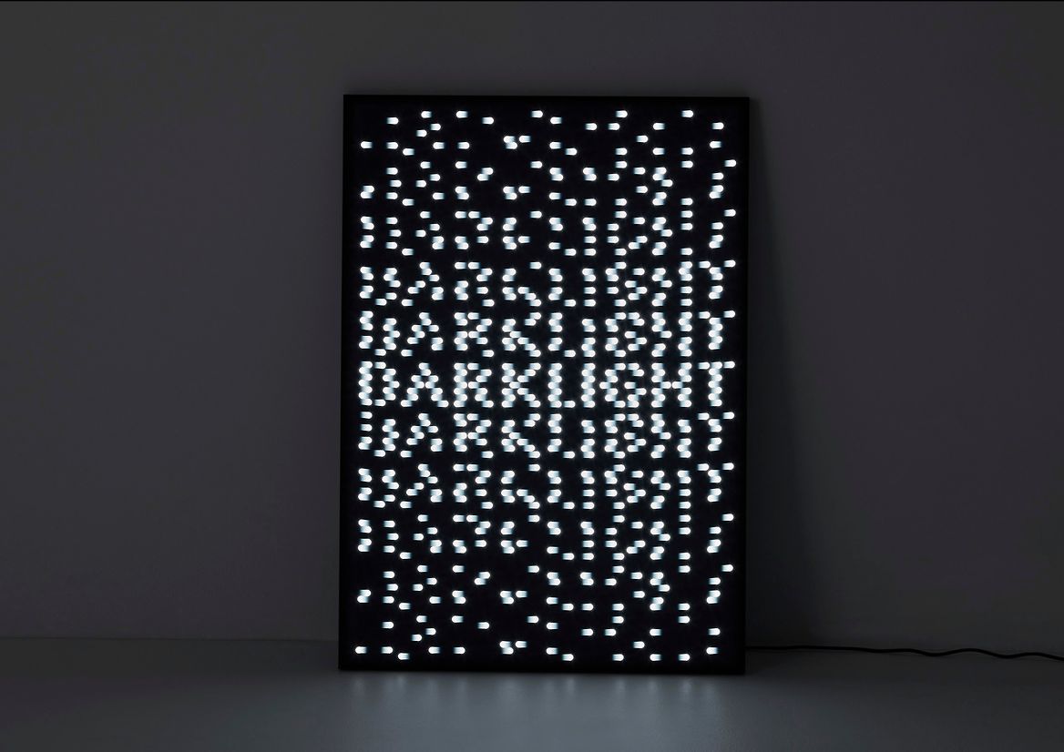
Posters and brochures bounce between black and the colourful hero image. The website and brochures transition between light and dark, and exhibition lightbox signage scatters the wordmark into a dispersement of textural fragments. These comms elements were backed up with a range of screen printed merch items.
Description:
Darklight is a new immersive light and sound experience created by Angus Muir Design and Dan Move. Their ambition is that over time, temporary Darklight experiences pop up globally in different locations, offering a different experience and narrative each time.
We were approached to create the identity for Darklight as well as the collateral for the first event; Darklight: A descent into Colour.
For us, the name says it all. At the heart of the experience is the idea of taking people on a journey from darkness into light, and back again. Traversing everything that comes with that in terms of curiosity, discovery and awe. That sensory magic at the core of all good light and sound experiences.
We started with a symbol. A simple stack of two gradients that transitioned from black to white and back again. For us it represented the transition, the motion, the energy, the different shades, the spatial play, and the trickery between the two extremes. The ability to see things from new perspectives, new beginnings, and new endings. Its ends circular like a light source, both natural and technological at the same time.
This symbol became the unit used to create the Darklight wordmark. A rather distinctive wordmark that aims to capture the magic of light and sound in letters. Transitioning in and out of itself and its surroundings.
The aim is for Darklight to be a premium package of exhibitions with a strong, but sophisticated brand presence. Because of this, other than the wordmark, things are kept simple, and crafted. And copy is kept to a minimum to encourage curiosity.
Posters and brochures bounce between black and the colourful hero image. The website and brochures transition between light and dark, and exhibition lightbox signage scatters the wordmark into a dispersement of textural fragments. These comms elements were backed up with a range of screen printed merch items.