Graphic
DDB Group Aotearoa NZ 31 Blue - ANZ Bank New Zealand
-
Pou Auaha / Creative Directors
Peter Wujkowski, Gaelyn Churchill, Haydn Kerr -
Pou Rautaki / Strategic Lead
Matt Jarman
-
Ringatoi Matua / Design Directors
Dean Pomfrett, Marcin Sulewski, Kasun Ilesinghe
-
Ngā Kaimahi / Team Members
Tessa Stewart, Phoebe Furley, Liz Knox, James Blair -
Client
ANZ Bank New Zealand

Description:
We needed to create a consistent creative construct that would embody the ANZ brand promise of We Do How, to deliver offers, news, services, and advice in an entertaining and engaging way. A construct that could come to life as content fit for all social platforms. Our device would also need to be executed in a fast, reactive and cost effective way but with a level of polish and craft befitting a major financial institution.
We saw an opportunity to create a friendly face that could connect with the breadth of our existing customer base.
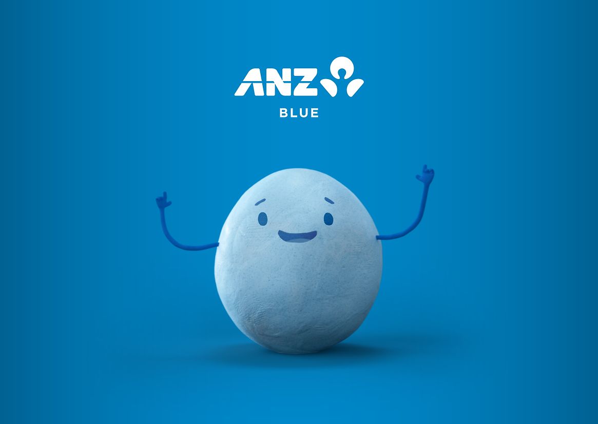
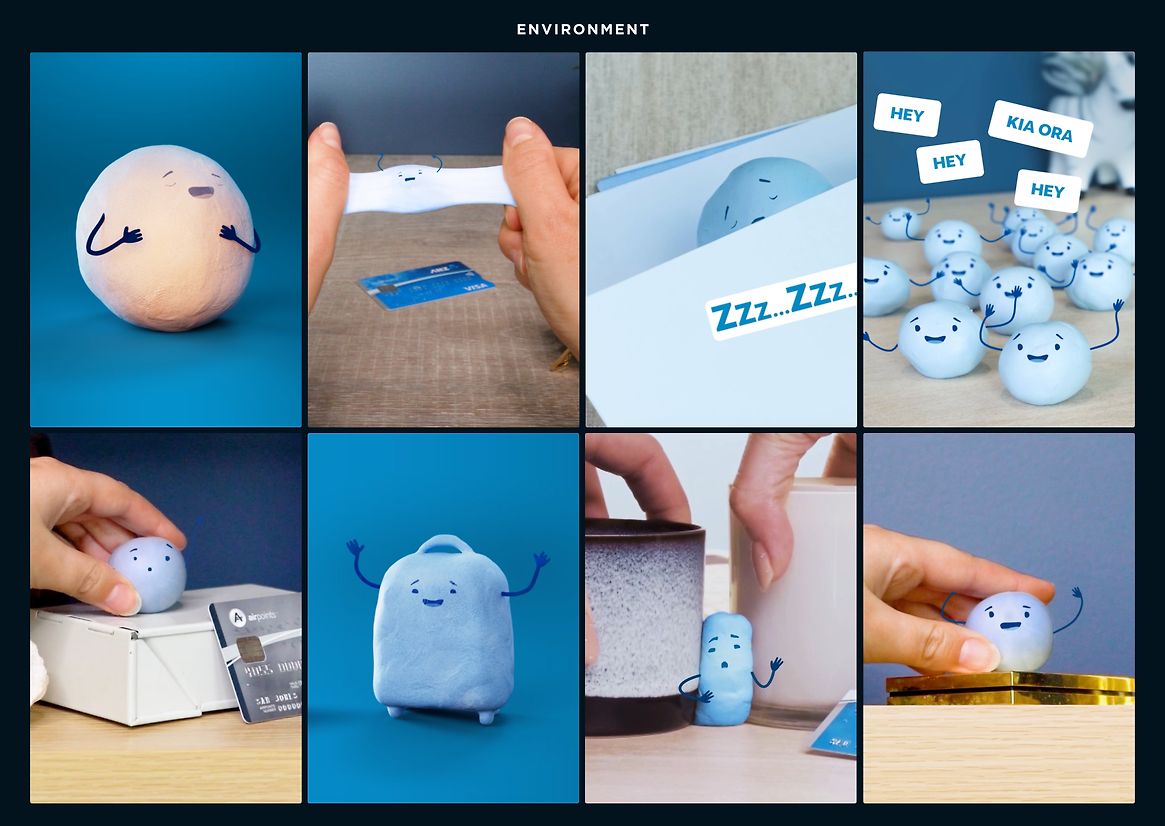
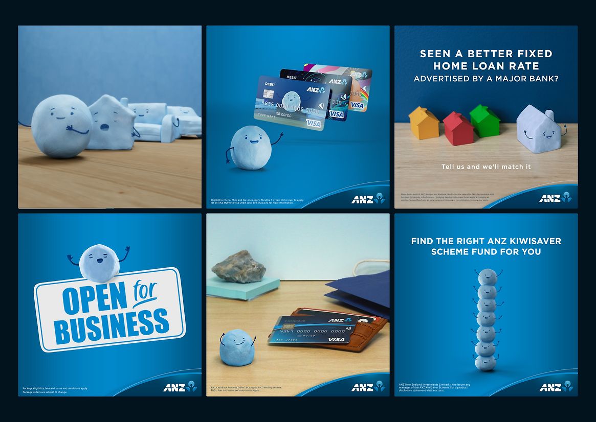
Meet Blue, he’s seen it all. He held up the map for a bucket list trip and looked at all the bills that made travel tricky. He’s sat in on life-planning sessions, seen baby scans and even doubled as a stress ball. He knows how ‘How’ is done and what our customers need.
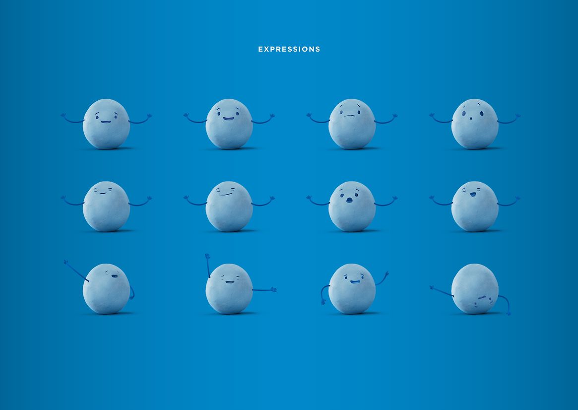
He is blue and round, a little bumpy and textured. He isn't perfect or machined, but strangely human and relatable in that way. He has a face, two eyes and a mouth, little eye brows – simple features, stripped back and basic, just enough to show emotion without feeling cartoony or childlike. An abstraction loaded with meaning and a vehicle for quick storytelling in demanding channels.
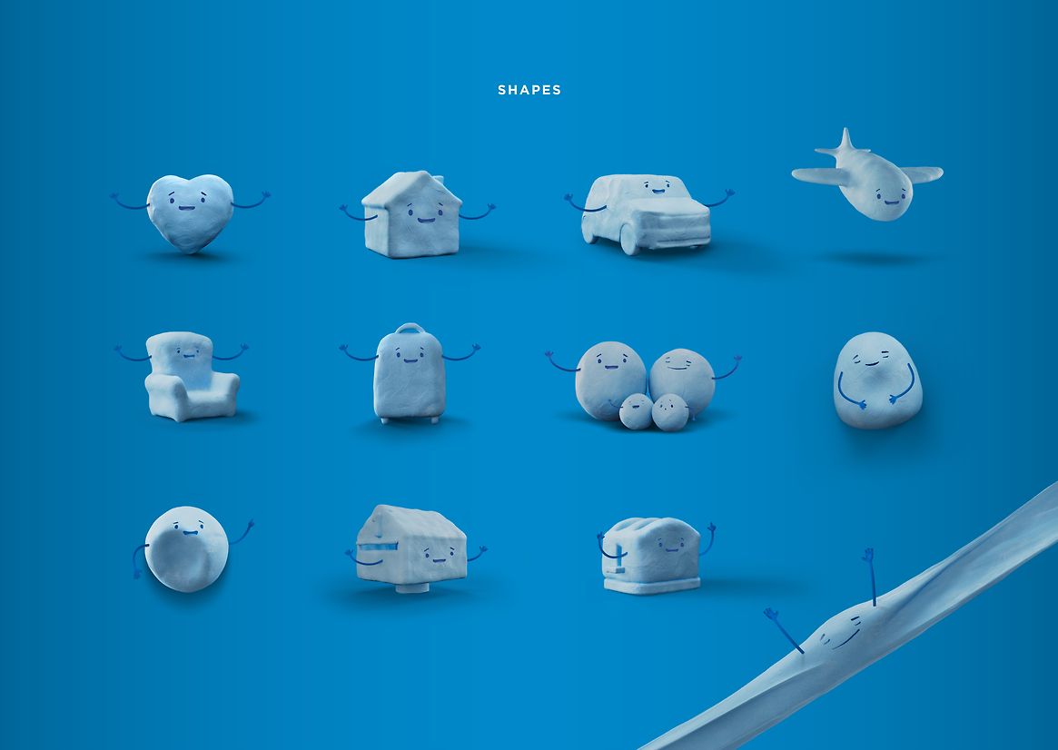
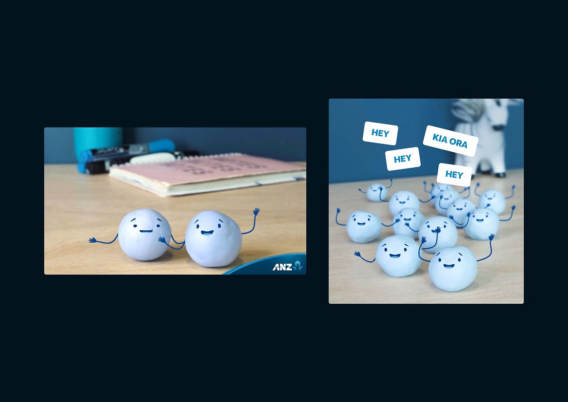
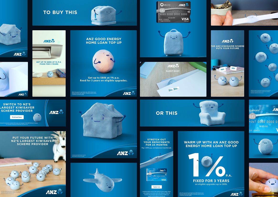
He can be anything: a plane, a suitcase, a house, car, couch, toaster, stress ball, surfboard, a decimal point, appear in multiples of twos, threes and fours, as a family, a community, a helper, a guide, always with a smile, a cute pair of eyes and his imperfect, endearing bumpiness.
He’s not just a character but a functional design system. An icon and a suite of icons with personality.
Blue's true strength is in his consistency, malleability, and speed of delivery. We use data to identify in-market audiences and serve relevant, personalised messages. Then, we track how each execution performs and optimise on the fly.
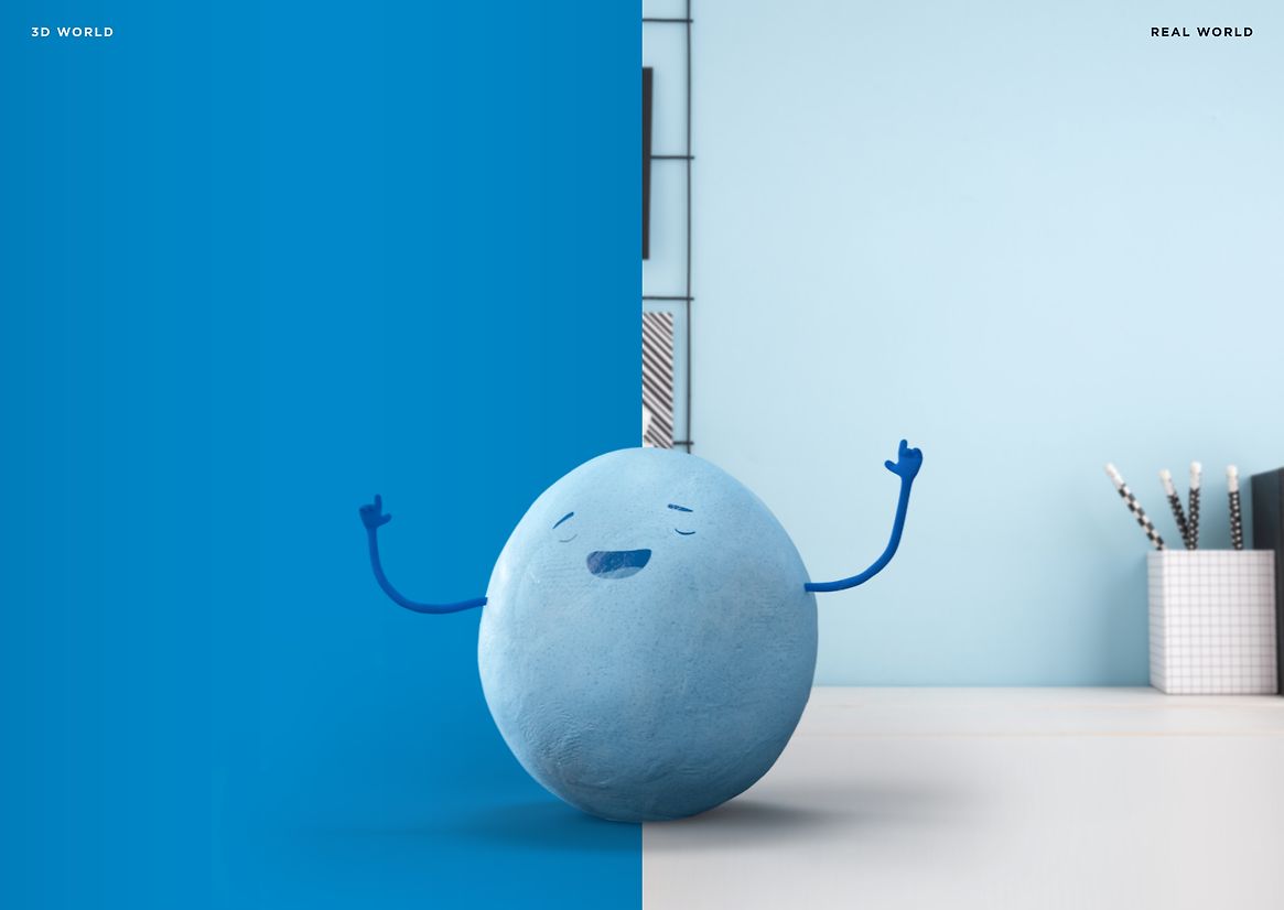
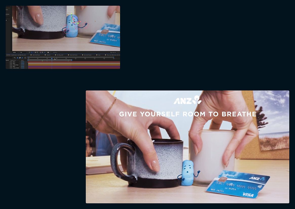
To deliver helpful information in short-form social channels, where connection with a younger audience demands a certain amount entertaining ‘non-brandyness’ Blue has been designed to be moulded and shot in real-world environments and then animated using 2D animation techniques. This is an extremely quick process with consistency achieved across multiple creative and design teams.
Where higher levels of branding are required, he can be rendered fully in a 3D environment quickly and efficiently, owing to the existence of a pre-populated rig.
He looks simple. But the thinking behind him is very smart.