Graphic
Curative 25 Canteen Aotearoa
-
Pou Auaha / Creative Director
Logan Bradley -
Pou Rautaki / Strategic Leads
Eddy Royal, Anna Cernis
-
Ringatoi Matua / Design Director
Kaan Hiini -
Kaituhi Matua / Copywriter Lead
Anna Cernis
-
Ngā Kaimahi / Team Members
Lauren Wepa, Jono Cole, Georgia Hoffman, Laura Gamble -
Client
Canteen Aotearoa
Description:
Canteen wants to ensure rangatahi across Aotearoa never face cancer alone. But they weren’t sure how the marketing of the 25 year-old brand was being received by young people and their whānau. The team wanted to shift their messaging to address the needs, barriers, and motivations of rangatahi needing support.
From our insight-gathering process, we discovered a nostalgic public connection to Canteen, yet a slightly outdated perception that this was a charity solely for young people directly impacted by cancer. In reality, the organisation represents a dynamic community of support led by, and for, rangatahi themselves. Canteen is all about creating a safe space to connect – for rangatahi with cancer, but also for their communities.
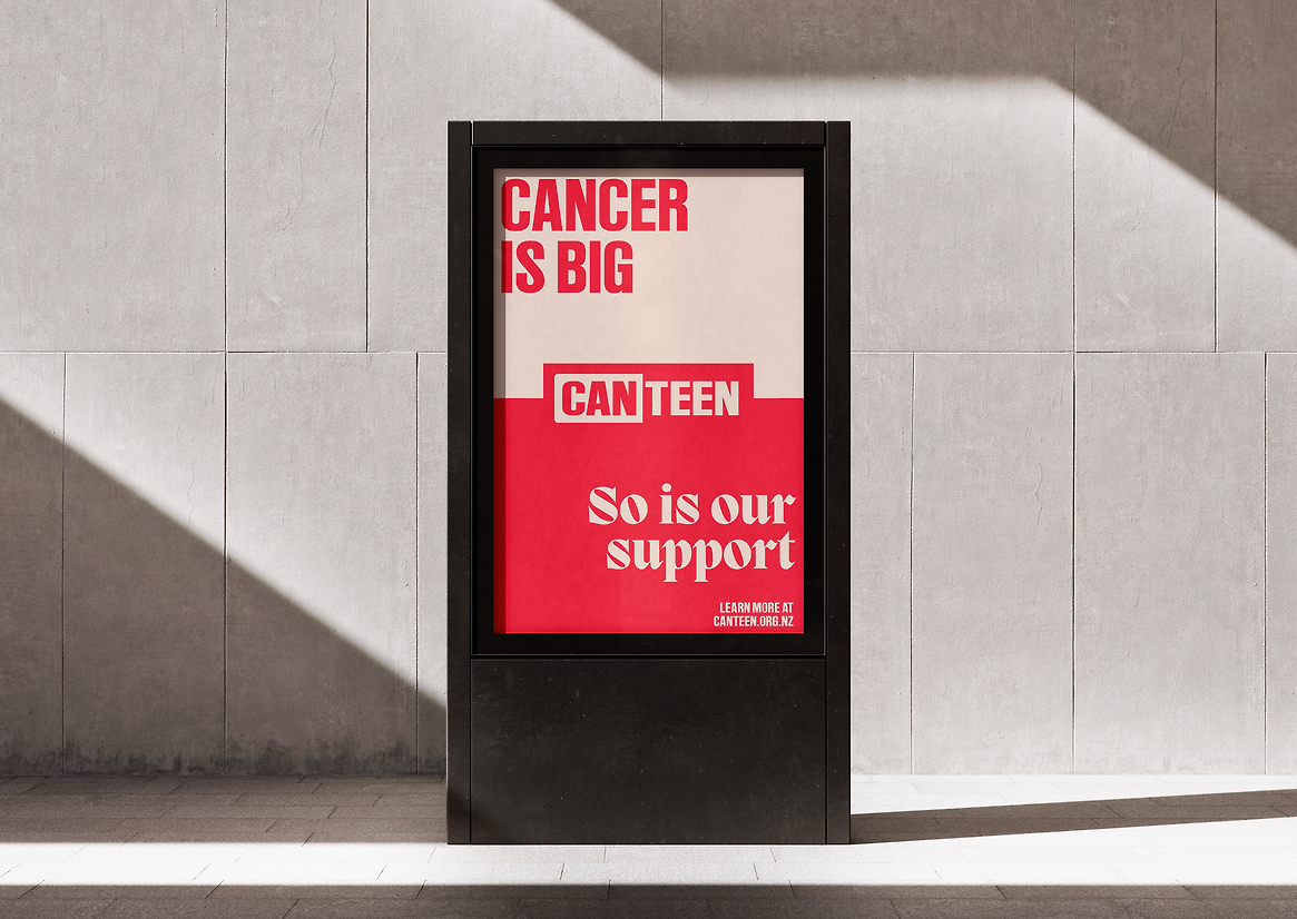
So alongside a brand refresh which dials down the more clinical aspects of the former brand and offers the charity a relevant and contemporary design update, we launched an awareness campaign to communicate that Canteen is a space of connection and support for all rangatahi – not only those directly impacted by cancer.
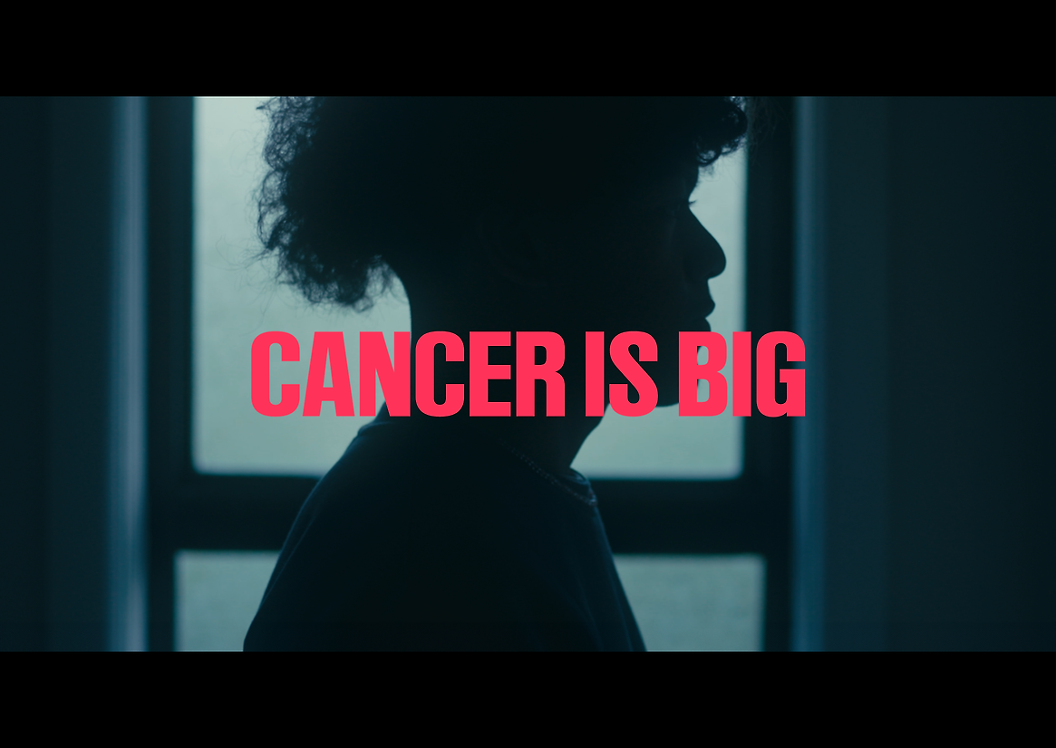
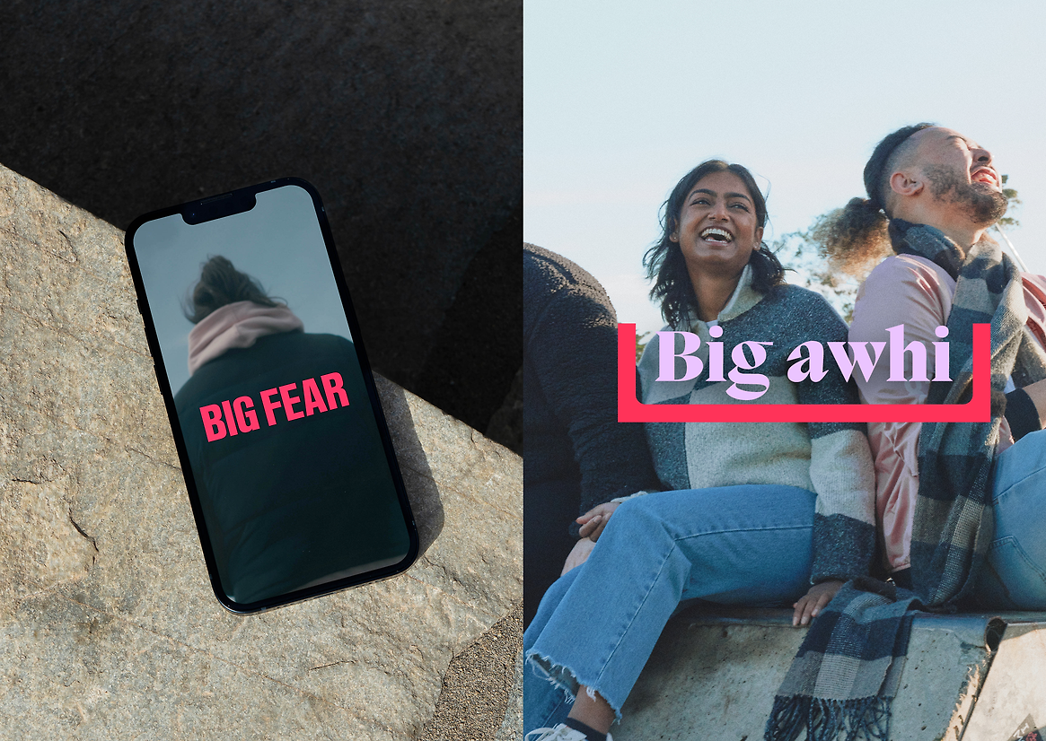
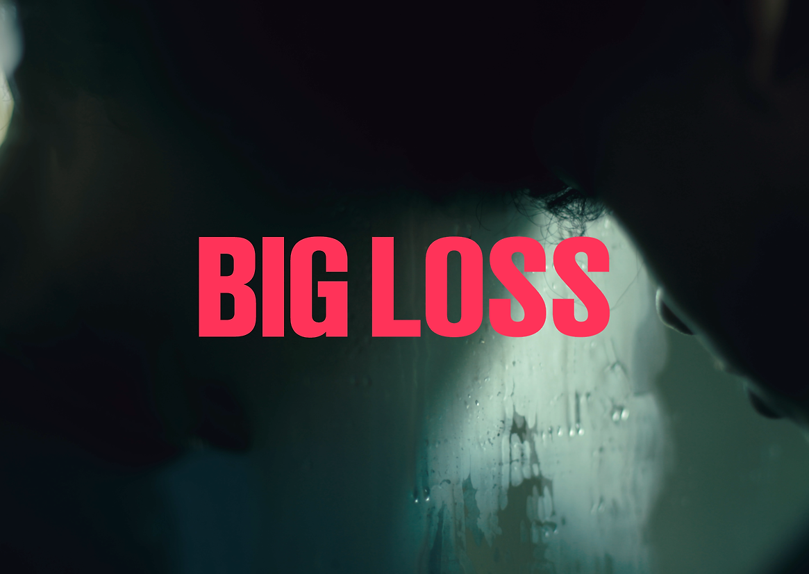
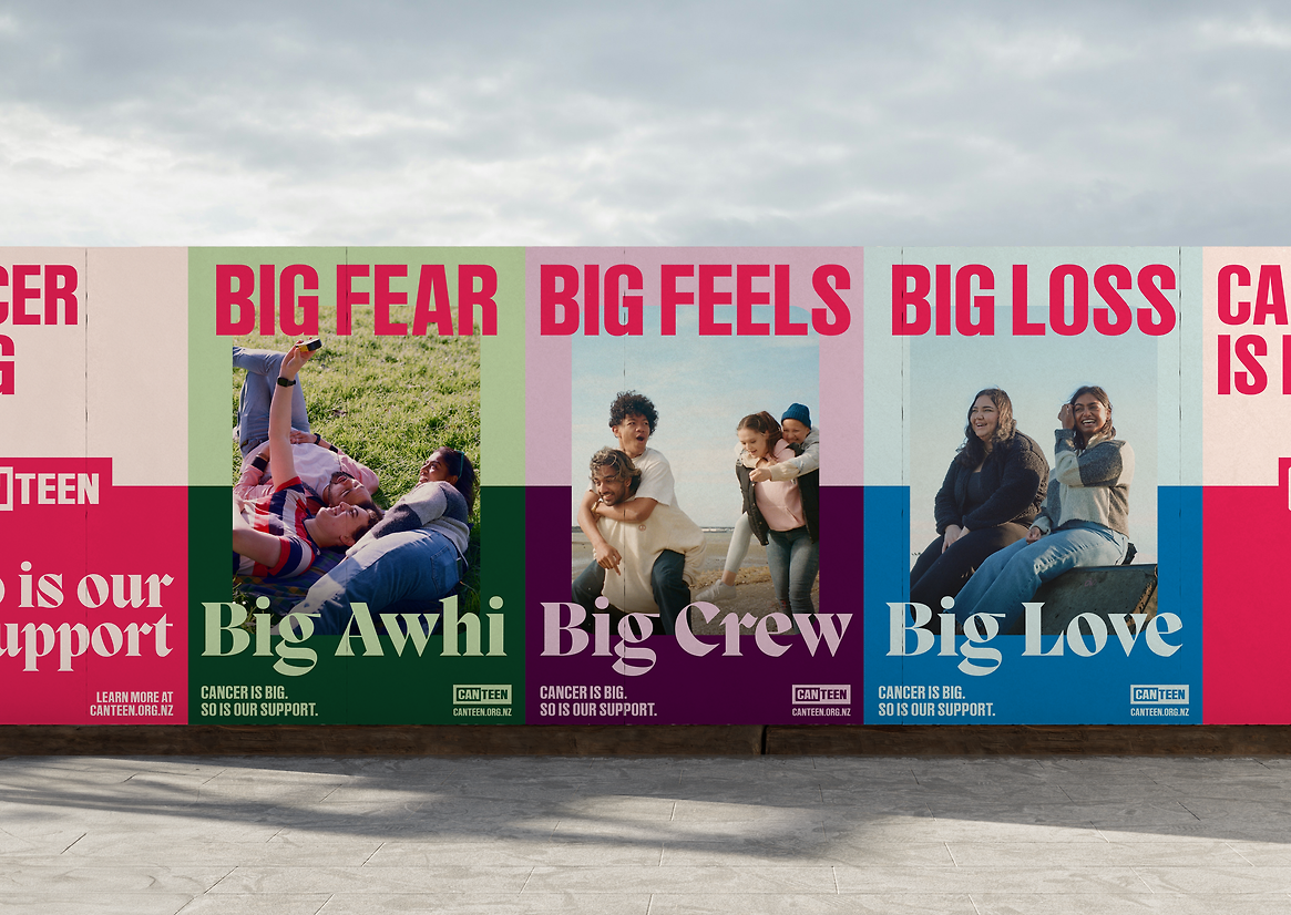
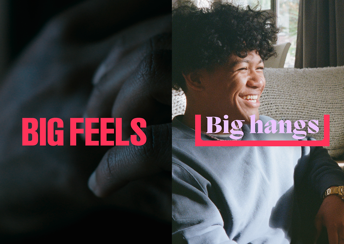
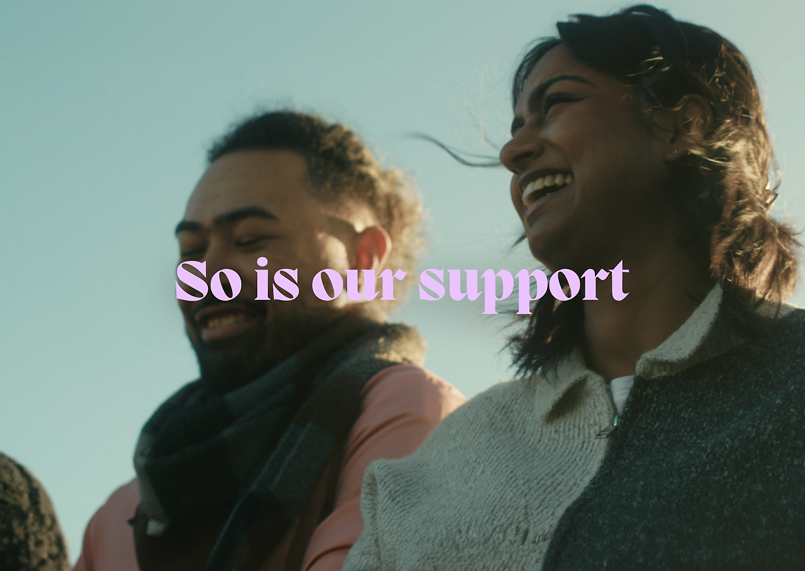
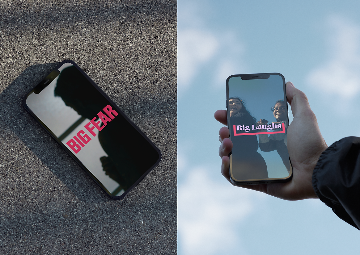
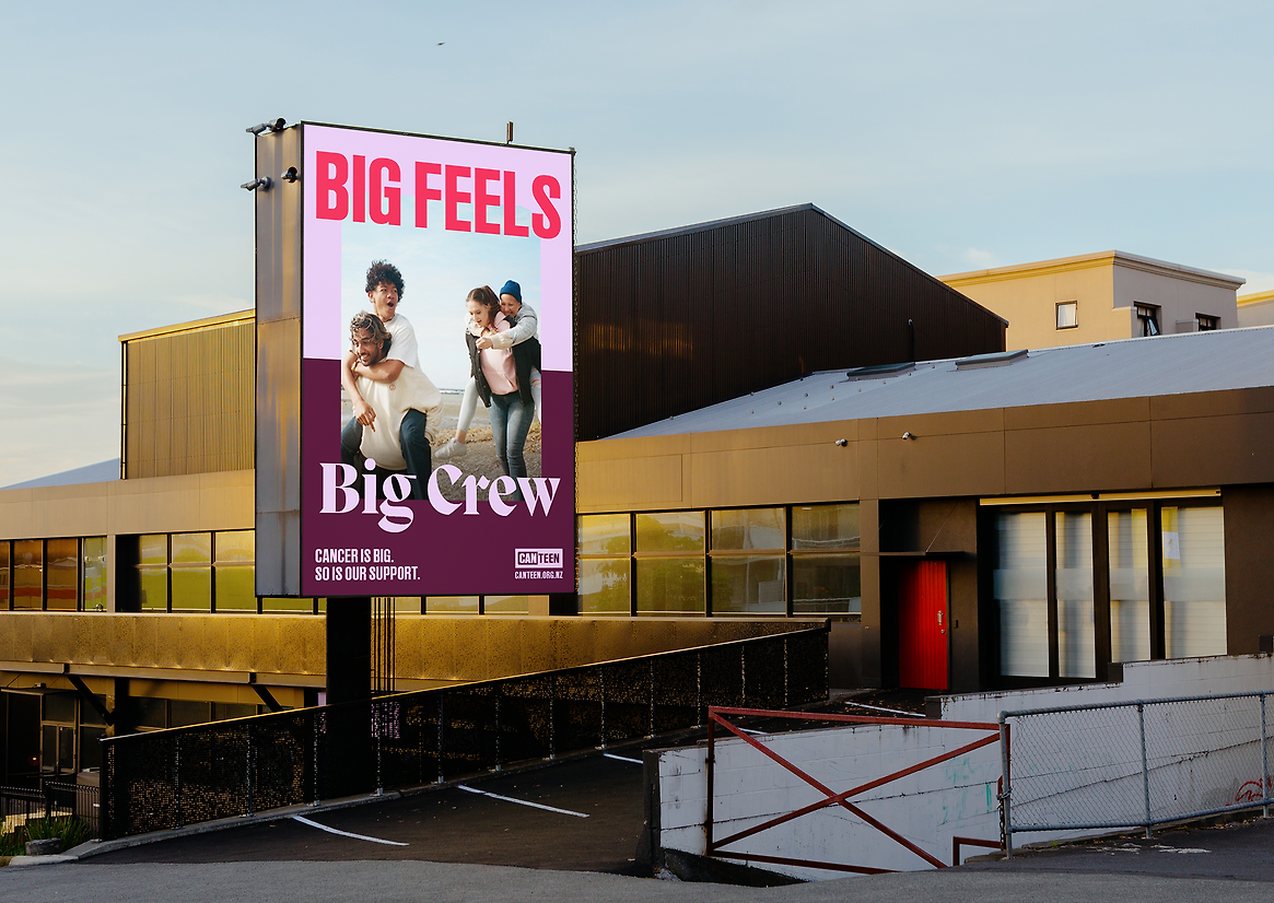
At the heart of this campaign is the acknowledgement that cancer brings big, tough feelings – fear, loss, grief and worry. But ‘the big’ is matched by the support offered by Canteen and their community networks. It’s strength-based messaging promoting the things that Canteen knows can make a difference – community, kindness, fun, and connection.
This sense of balance is at the heart of the messaging formula that’s used throughout the awareness campaign and will continue to be part of Canteen’s communication framework. Big loss is balanced with big love. Big fear is balanced with big awhi. The messaging doesn’t shy away from the realities of living with cancer, but offers a sense of hope by speaking to the togetherness and support that comes from being part of the Canteen community.
The visual treatment of our Canteen commercials also plays with this sense of balance, where darker, grainier moments are balanced and contrasted with soft, natural light. The moving image shifts between film formats, offering an authentic, intimate, handmade quality that suggests there’s another friend just behind the camera.
Alongside an updated logo and colour palette, we developed a flexible graphic device that acts as a strong brand identifier. Taking its lead from the concepts behind the word ‘canteen’, it represents ideas of support and sustenance, and underlines the power of community support to revitalise you and ‘fill your cup’. It can be used to hold imagery, emphasise text, and create bespoke patterns.
A partnership with the MediaWorks Foundation allowed us to spread the campaign far and wide. Delivered across a wide range of social media, radio, MediaWorks station websites, digital billboards, and public transport panels and decals – the campaign certainly made an impact.
In the months following launch, Canteen’s website traffic rose by more than 7,000% when compared to the same period last year, and the charity experienced a 396% increase in web-tracked income. Canteen’s referrals also dramatically increased – demonstrating that the brand is reaching and resonating with those who need support.