Graphic
Alt Group 159 AGI Aotearoa New Zealand 2023
-
Pou Auaha / Creative Director
Dean Poole -
Pou Rautaki / Strategic Lead
Ben Corban
-
Ringatoi Matua / Design Directors
Rei Konza, Tim Gomez
-
Ngā Kaimahi / Team Members
Dean Poole, Rei Konza, Tim Gomez, Janson Chau, Megan Au, Jeff Nusz, Mitchell Clement, Giordano Zatta, Jungie Choi, Shaun Naufahu, Stephanie Zwerink, Hamish Clark, Mike Barrett -
Client
Alliance Graphique Internationale
Description:
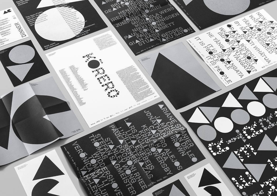
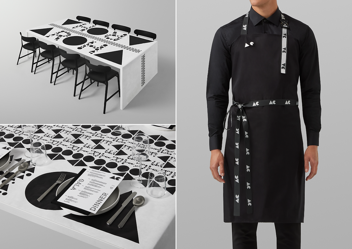
From the pioneering work of Lance Wyman and Otl Aicher for the ’68 and ’72 Olympics respectively, which defined large-scale identity systems for city-scale events, and Liza Enebeis’ work for DEMO, a festival that took over the whole of Amsterdam with motion graphics, AGI members past and present have set the bar for exceptional design communication.
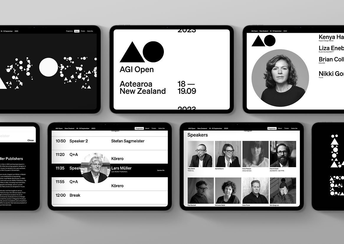
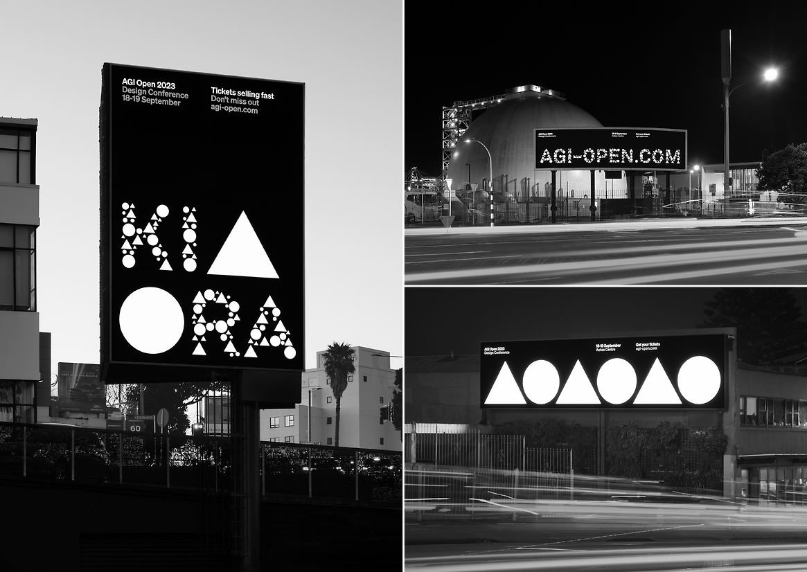
Against this backdrop and for this discerning audience, all elements for AGI Aotearoa 2023 had to be rigorously considered and executed at the highest level. We wanted to prove that Aotearoa New Zealand, in thought, invention and execution could equal any ‘traditional centre’ of design and, in addition, create moments where unique expressions of our culture and identity could contextualise our design language for a diverse and influential international audience.
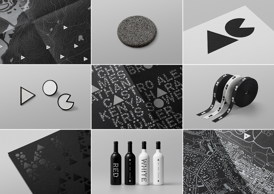
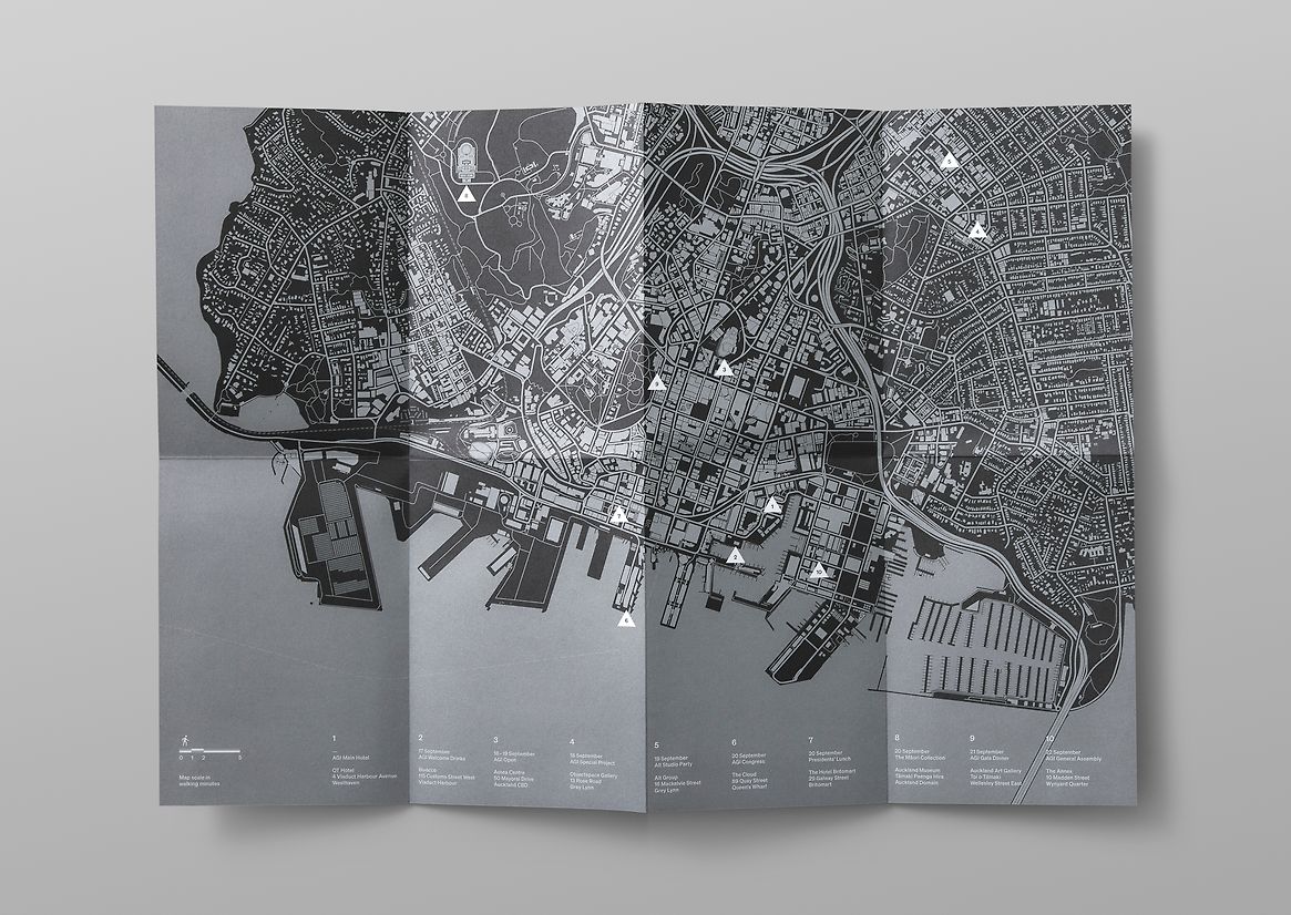
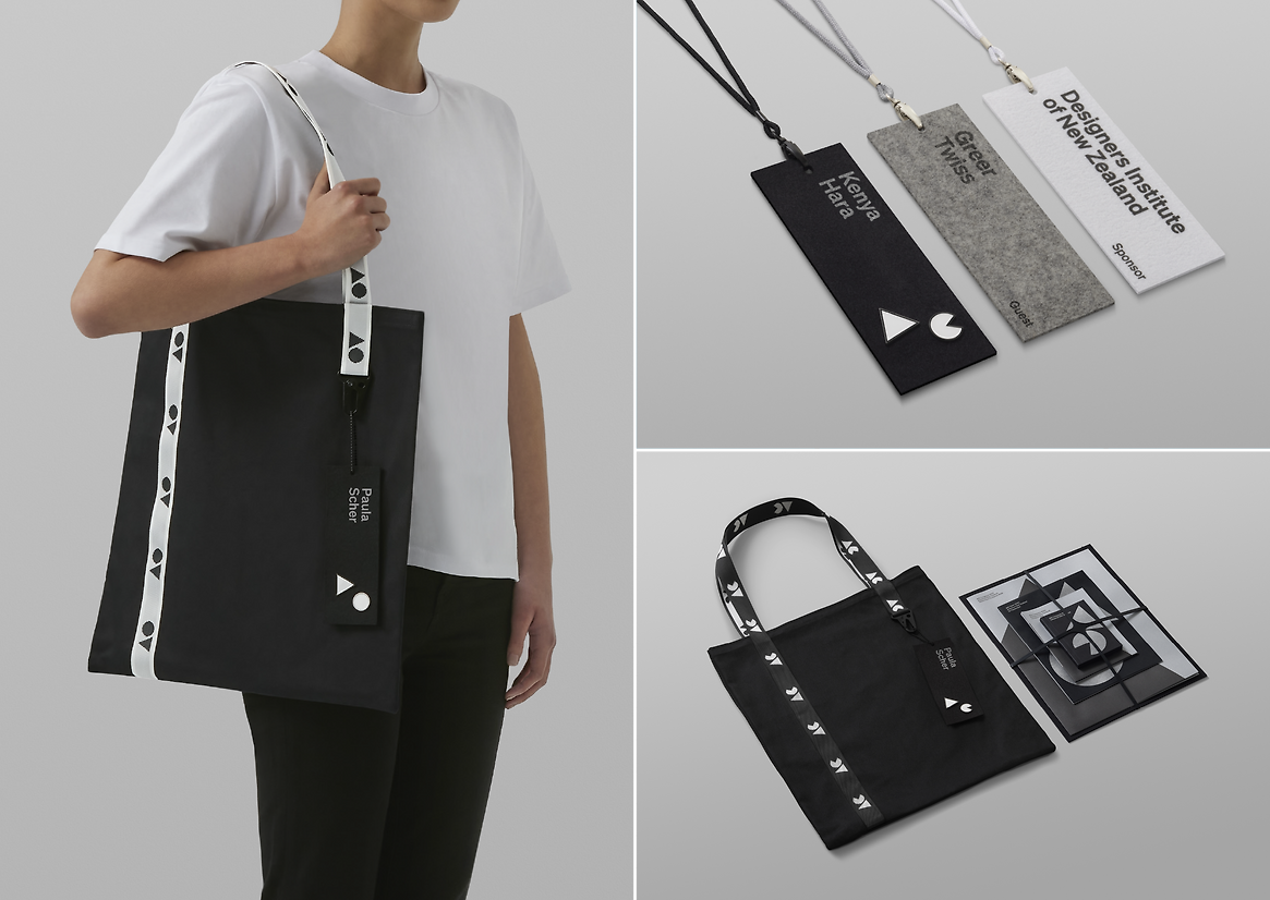
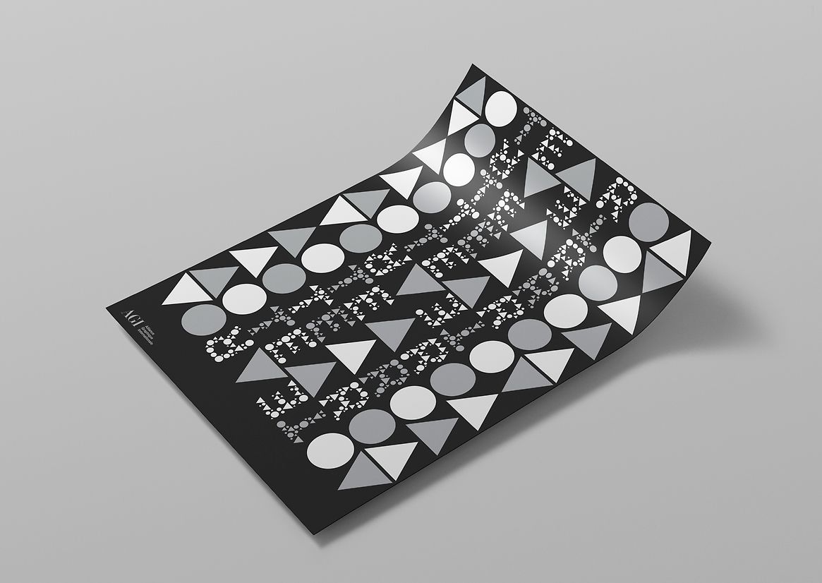
A modernist approach referencing the Swiss Style origins of the AGI was implemented, with a rigorous grid, measured typography and a system of sizes extending across all material. For efficiency, all collateral was derived from ISO standard B paper sizes. Scaled up and down, this approach ensured that every element was proportionately related to another—from lanyards to books and posters to plinths.
A rational colour palette of black, white and silver—a nod to New Zealand identity and the quality of light in southern skies—and multiple printing methodologies were employed to create unique finishes. Rather than the typical plastic conference lanyard, eco-friendly latex printing was used on New Zealand wool felt to create something from here, that would feel good to wear.
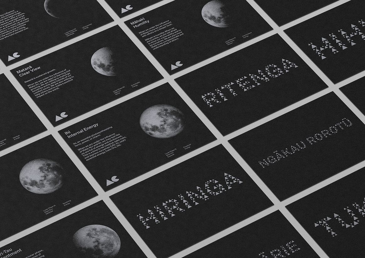
Expanding the traditional ideas of conference communications, the knowledge extended to us by our international guests was reciprocated through a sharing of tikanga and key concepts from the Te Ao Māori worldview, such as maramataka. In collaboration with Rōpata Pāora (Te Taoū, Ngāti Whātua Ōrākei), a series of cards were created with reflective silver inks to illuminate the different phases of the moon along with their meaning.
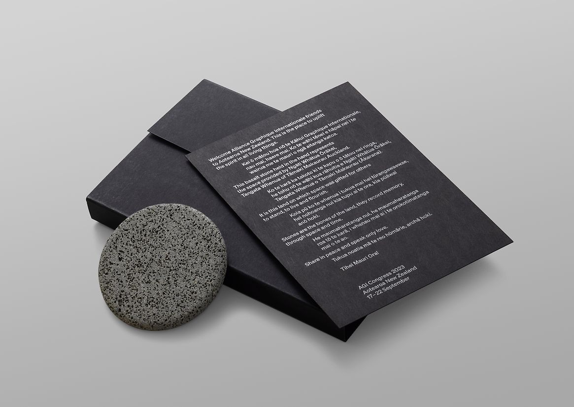
As a parting gift, all the attending AGI members also received a basalt disc representative of the geological foundations of Tāmaki Makaurau. Individually blessed by Ngāti Whātua Ōrākei, these artefacts represent the space provided, and symbolise the importance of whenua—land and place.
Judge's comments:
A mind-blowing example of a singular idea applied across many outputs. Each piece is consistent but carries its own spirit and energy, and everything felt alive, breathing. The level of discipline and consistency is exemplary.