Graphic
ZURU Edge 35 DAISE Beauty
-
Pou Auaha / Creative Director
Monique Robins -
Pou Rautaki / Strategic Lead
Kelly McCauliffe
-
Ringatoi Matua / Design Directors
Nikki Ravlich, Fiona Kerr
-
Ngā Kaimahi / Team Members
Jevin Yan, Paul Groenendijk, Sam Brock, Marc Day, Maria Wilches, Hannah Avery, Brandon Mann, Stacey Leong, Grace Costello, Zanri Vermeulen, Nicole Miller Wong -
Client
ZURU Edge - DAISE
Description:
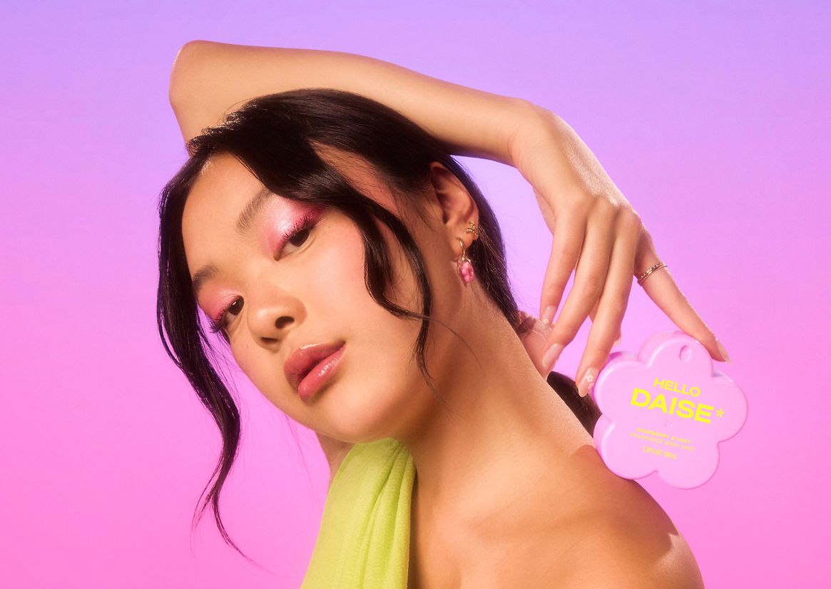
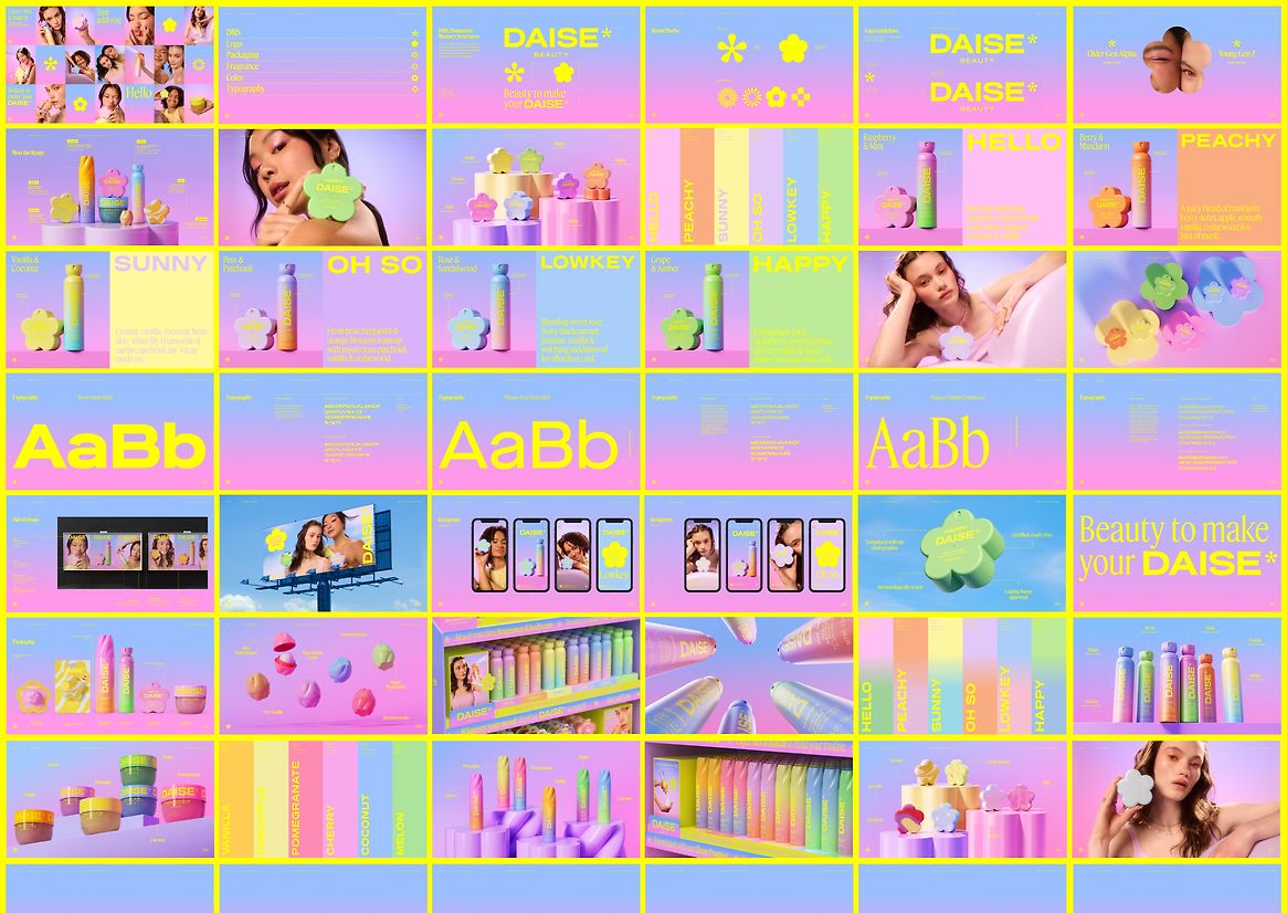
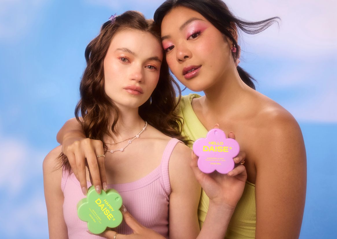
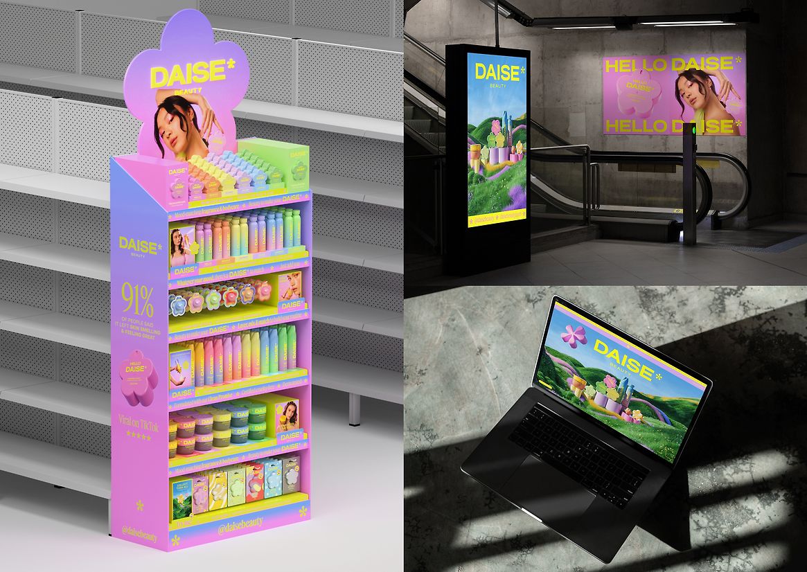
Enter DAISE: a bold new season in beauty.
Rooted in play and bursting with expressive colour, DAISE reimagines what beauty can look and feel like—vibrant, joyful, and immersive.
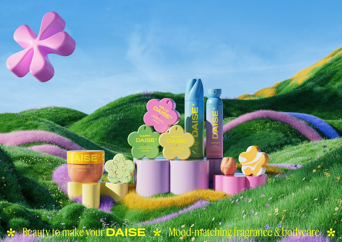
From first glance to final use, DAISE evokes the feeling of walking into a spring garden in full bloom—soft light, layered scent, and a spectrum of colour that lifts the senses. The design draws on this natural richness, where colour and form work in harmony to build emotion, story, and standout.
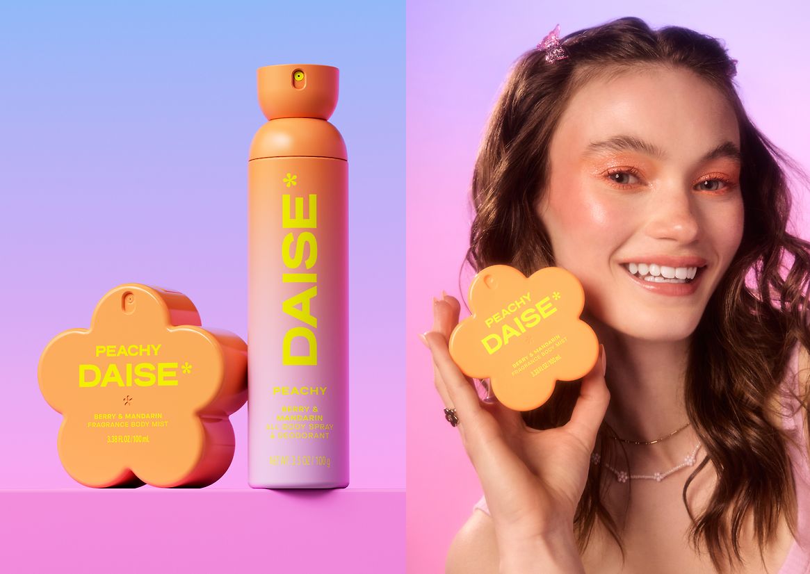
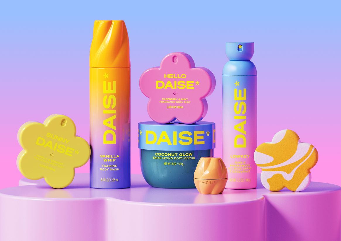
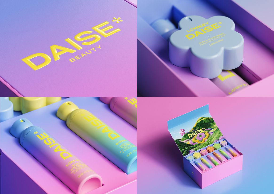
Ombré gradients deliver emotional cues and vibrant standout, carefully refined through rigorous press testing for consistency across substrates. A bold neon contrasts with soft, mood-driven pastels—creating visual tension that captures the brand’s expressive identity: balancing innocence and attitude. From the glossy, chubby mist bottle to the swirling lids, colour is not an accent—it’s a storytelling device, guiding navigation, evoking emotion, and inviting discovery at every touchpoint.
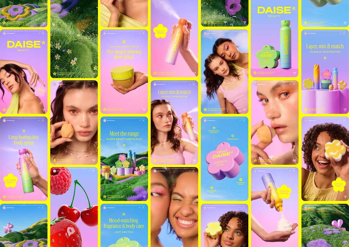
The range includes five fully custom-designed formats: the hero flower-shaped mist bottle anchors the collection, supported by a cohesive line of sculptural expressions. The foaming whip rises in a swirl from the lid; the lip balm features a bubble-like twist-off cap edged in petal shapes; while both the aerosol and scrub tub take bud-like forms—echoing a garden just before bloom. The bath bombs echo the flower motif, fizzing to fill the bath with colour, and reveal a surprise mini packaging form inside—an unexpected moment that deepens delight and brand storytelling.
Inside, the journey continues through airy mists, velvety balms, and whipped foams—each designed to be layered, mixed, and personalised. DAISE calls this “playability”: a design philosophy where colour, texture, and scent converge to support emotional self-expression.
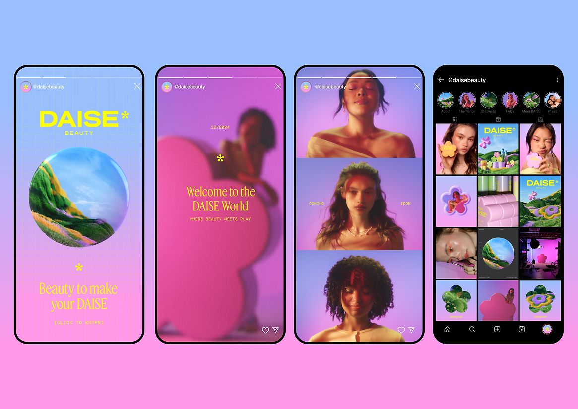
More than just packaging, DAISE is a fully realised, chromatic world. It surrounds the user with warmth, colour, and curiosity—like stepping into a garden of beauty designed to be explored, one joyful detail at a time.
Beauty to make your DAISE.