Credits
-
Pou Auaha / Creative Directors
Nick Worthington, Blake Enting -
Pou Rautaki / Strategic Lead
Derek Lockwood
-
Ringatoi Matua / Design Director
Kane McPherson
-
Ngā Kaimahi / Team Members
Billy Worthington, Dave Brady, Matt Oak, Nigel Sutton, Jen Storey, Rob Linkhorn, Anna Higgins, Katie Murray, Georgia Mahaffie -
Kaitautoko / Contributors
Susannah Winger, Tina Brooke, Amanda Gould, Andrew Stone, Matty Burton, Laura Davies, Henry Curchod, Jonathan Kneebone, Michael Ritchie, Pip Smart, Jasmin Helliar, Mark Foster, Max Horn, Rob Marsh, Luke Crethar, Jon Baxter, Al Guthrie
-
Client
One NZ
Description:
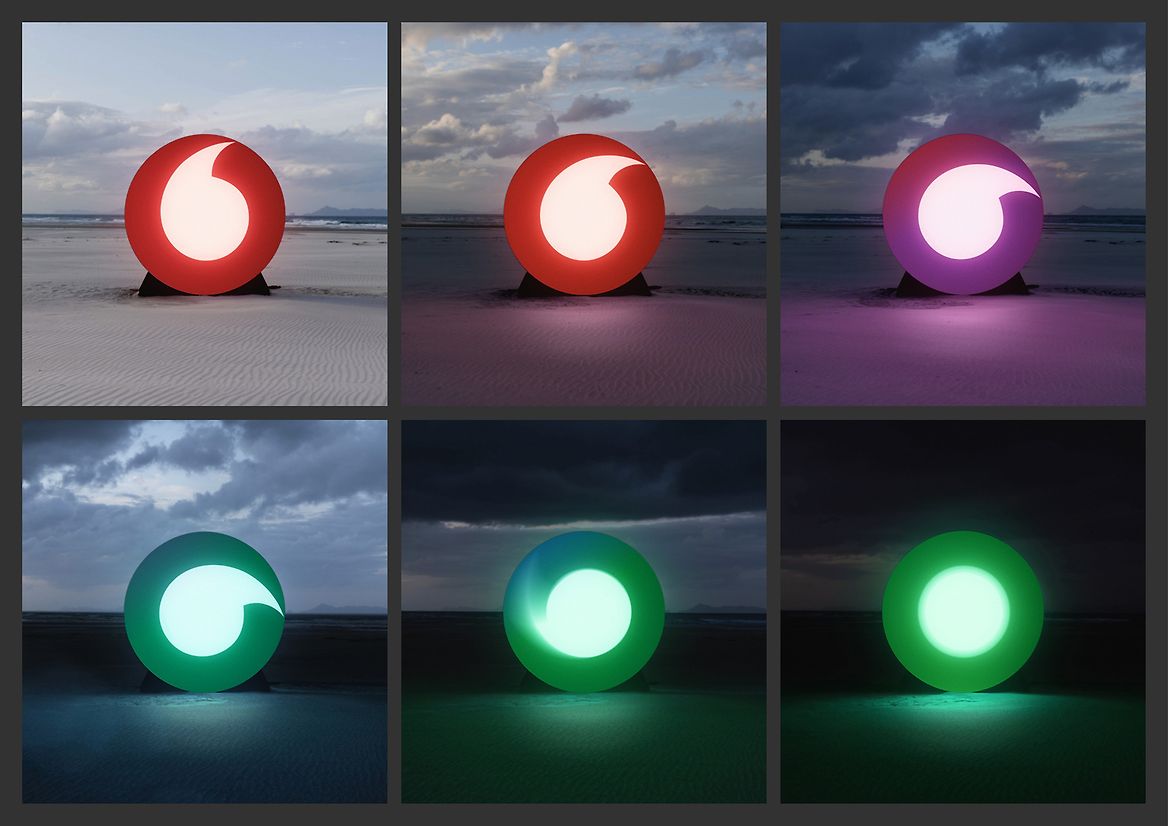
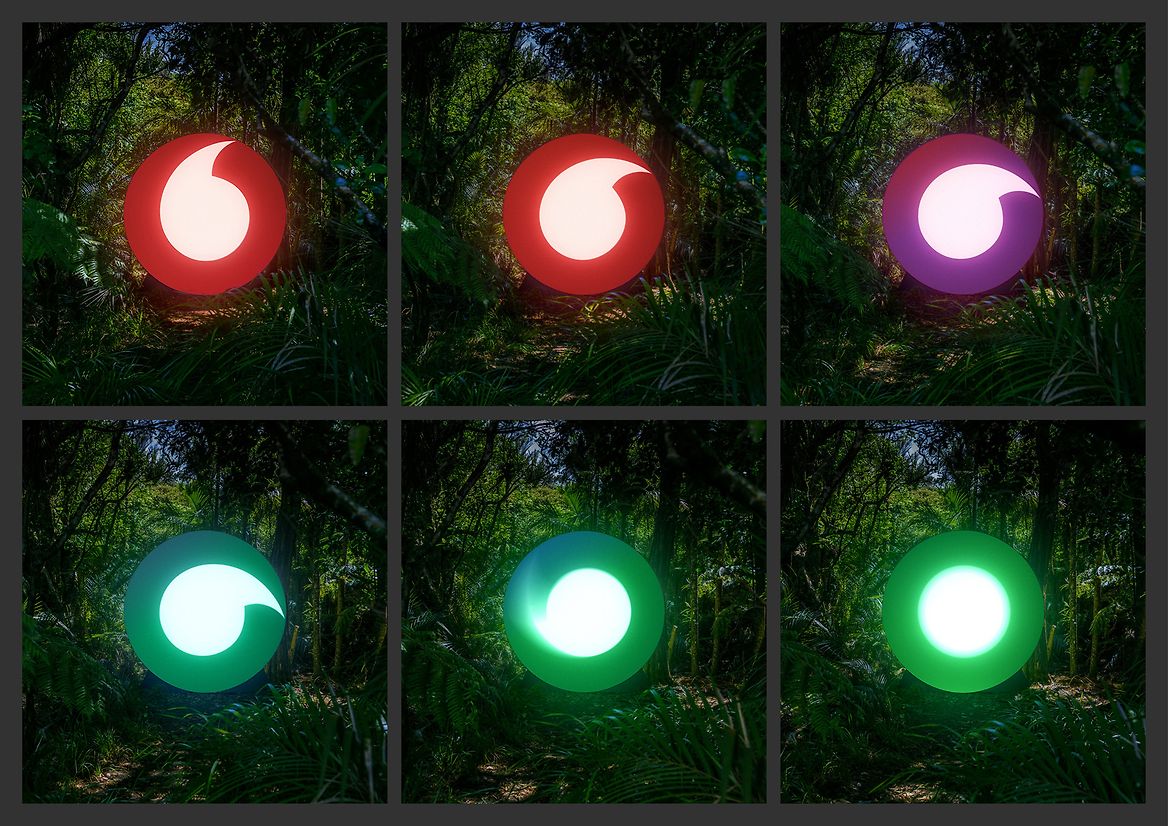
From red to green.
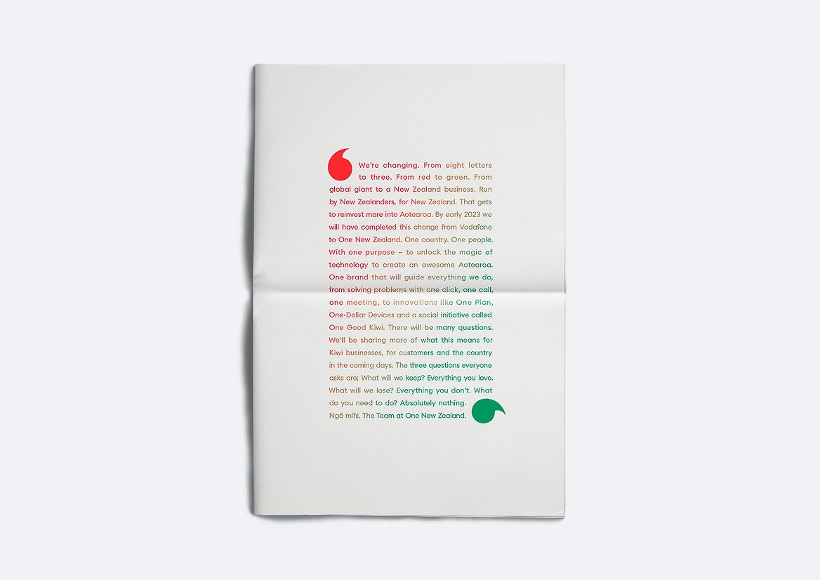
In 2020, the management of Vodafone New Zealand decided to buy the company back from its global owners and rebrand as a New Zealand company, run by New Zealanders for New Zealanders.
The company needed a new name, a new brand, and a new story.
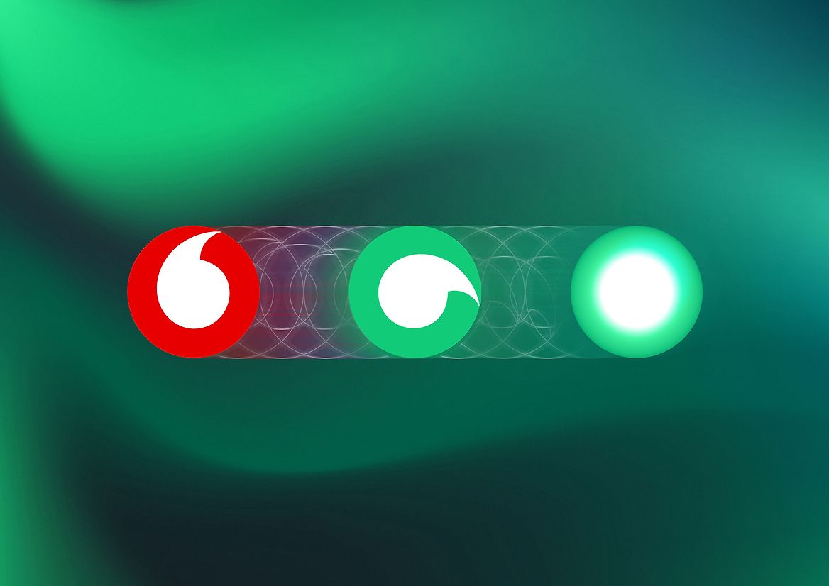
The change from red to green represented both the colour of New Zealand and also a cultural change from stop to go.
Rotating the logo 90 degrees and changing its colour from red to green instantly communicated the story of change from a global giant to a kiwi owned company, in one image.
The new name, taken from the last three letters of Vodafone, and the colour change from red to green recognised Vodafone NZ’s whakapapa but also represents a new beginning as One NZ.