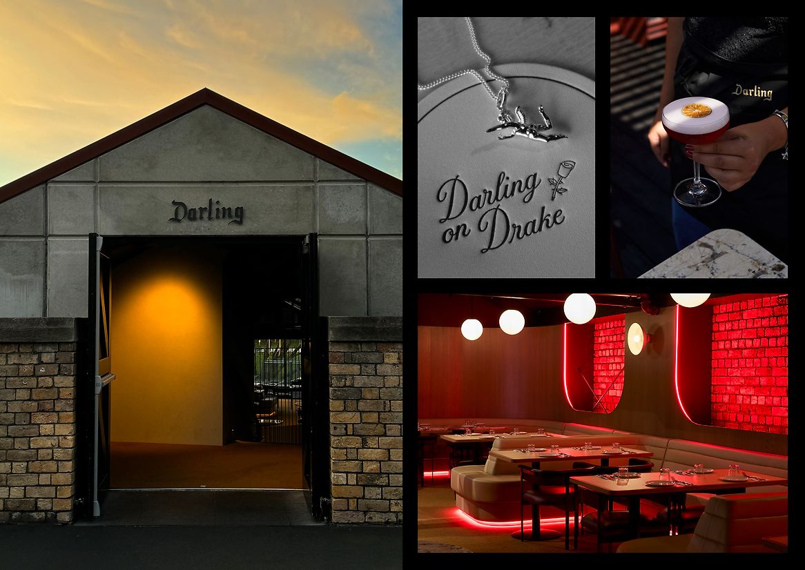
'Darling' is defined as 'a person who is very much loved or liked'. It can be used to describe people or things, so we felt there was a strategy that spoke to this idea of creating a place with a defined personality. It might be loved, it might be hated but it was going to be itself.
It's a loaded word that brings to mind a certain feeling. A little old world, a little fancy and loving. Not fancy in a minimal, exclusive way. Fancy in a way that was a little self-deprecating, attainable and fun. Fancy in a Las Vegas kind of way.
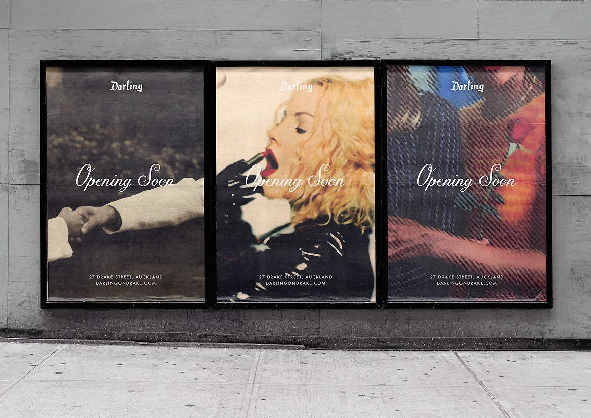
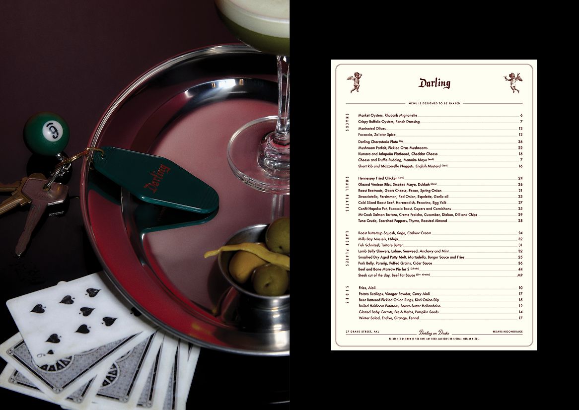
The strategy was based around this idea of 'international nostalgic romance', A love letter to going out and having a good time with those you cherish - friends or lovers.
We wanted to build tension in the brand. It wasn't about fairy tale romance, it had to be real and a little unpredictable.
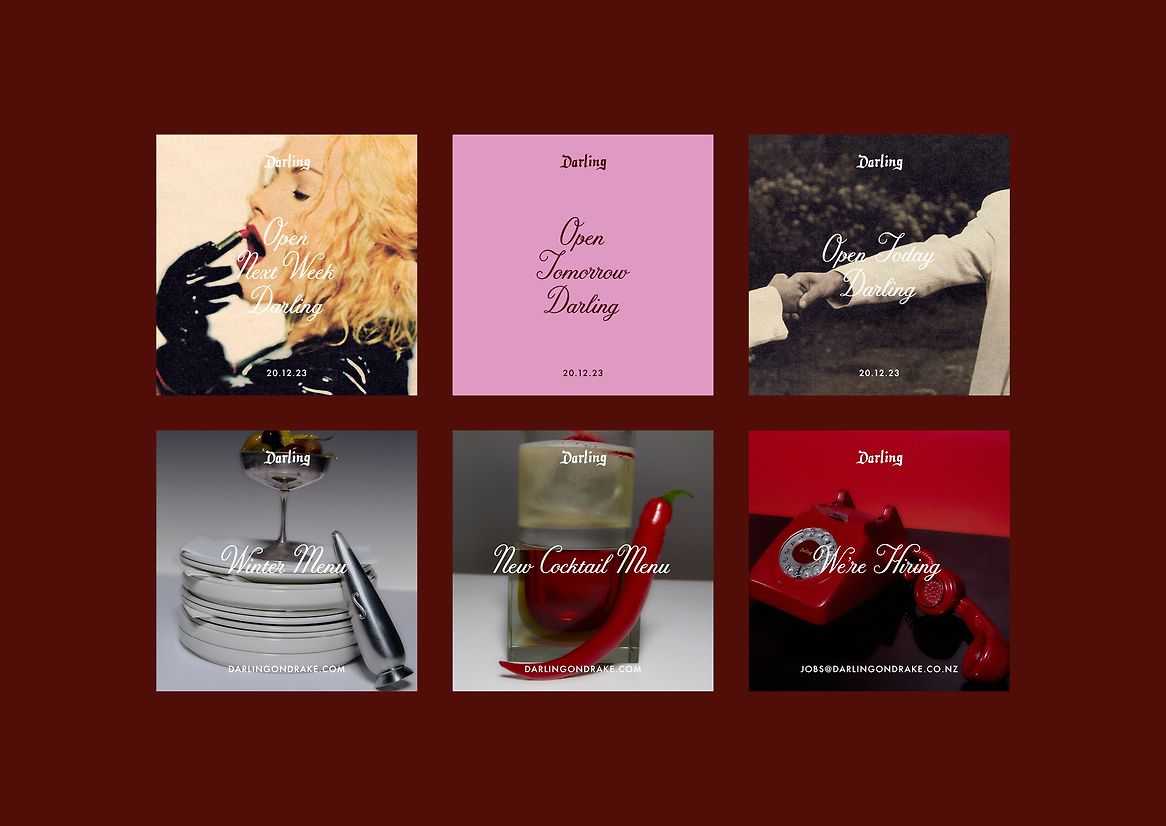
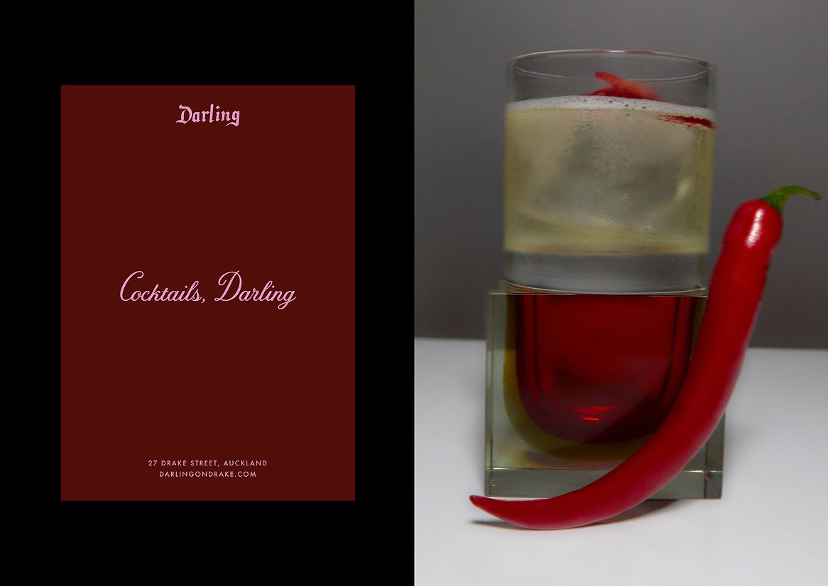
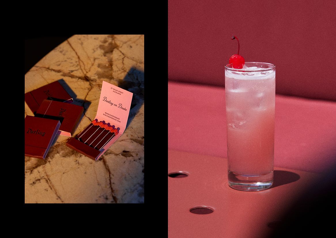
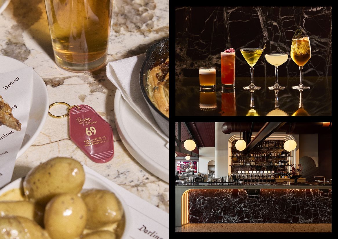
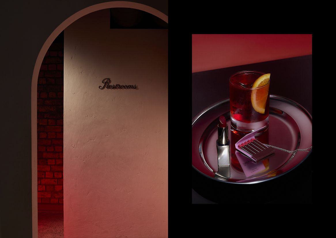
Colour played a big role. We liked this idea of Burgundy. It felt unique, coupled with a feeling of richness and old-worldliness that the word darling does.
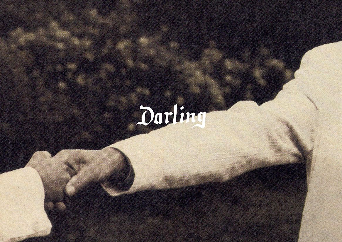
Darling had this very feminine feeling, so we wanted to offset that with something a little masculine feeling. We explored blackletter and calligraphy for the logo and landed on something hand drawn, that under close inspection; isn't perfect.
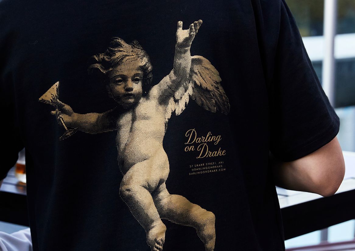
This idea of old-world nostalgia that came from the idea led us to trawling through old magazines. We found inspiration in the pages of 80s and 90s fashion magazines. We scanned, cropped and manipulated these images. When focussed on particular details in these images, it had a different feeling. Intimate and a little mysterious.
Description:
'Darling' is defined as 'a person who is very much loved or liked'. It can be used to describe people or things, so we felt there was a strategy that spoke to this idea of creating a place with a defined personality. It might be loved, it might be hated but it was going to be itself.
It's a loaded word that brings to mind a certain feeling. A little old world, a little fancy and loving. Not fancy in a minimal, exclusive way. Fancy in a way that was a little self-deprecating, attainable and fun. Fancy in a Las Vegas kind of way.
The strategy was based around this idea of 'international nostalgic romance', A love letter to going out and having a good time with those you cherish - friends or lovers.
We wanted to build tension in the brand. It wasn't about fairy tale romance, it had to be real and a little unpredictable.
Colour played a big role. We liked this idea of Burgundy. It felt unique, coupled with a feeling of richness and old-worldliness that the word darling does.
Darling had this very feminine feeling, so we wanted to offset that with something a little masculine feeling. We explored blackletter and calligraphy for the logo and landed on something hand drawn, that under close inspection; isn't perfect.
This idea of old-world nostalgia that came from the idea led us to trawling through old magazines. We found inspiration in the pages of 80s and 90s fashion magazines. We scanned, cropped and manipulated these images. When focussed on particular details in these images, it had a different feeling. Intimate and a little mysterious.