Graphic
Semibold 2 Finders & Keepers
-
Pou Auaha / Creative Director
Scott Bolton -
Pou Rautaki / Strategic Lead
Hayden Baker
-
Ringatoi Matua / Design Director
Scott Bolton
-
Ngā Kaimahi / Team Members
Amelia Dunbar, Tom Dunbar -
Client
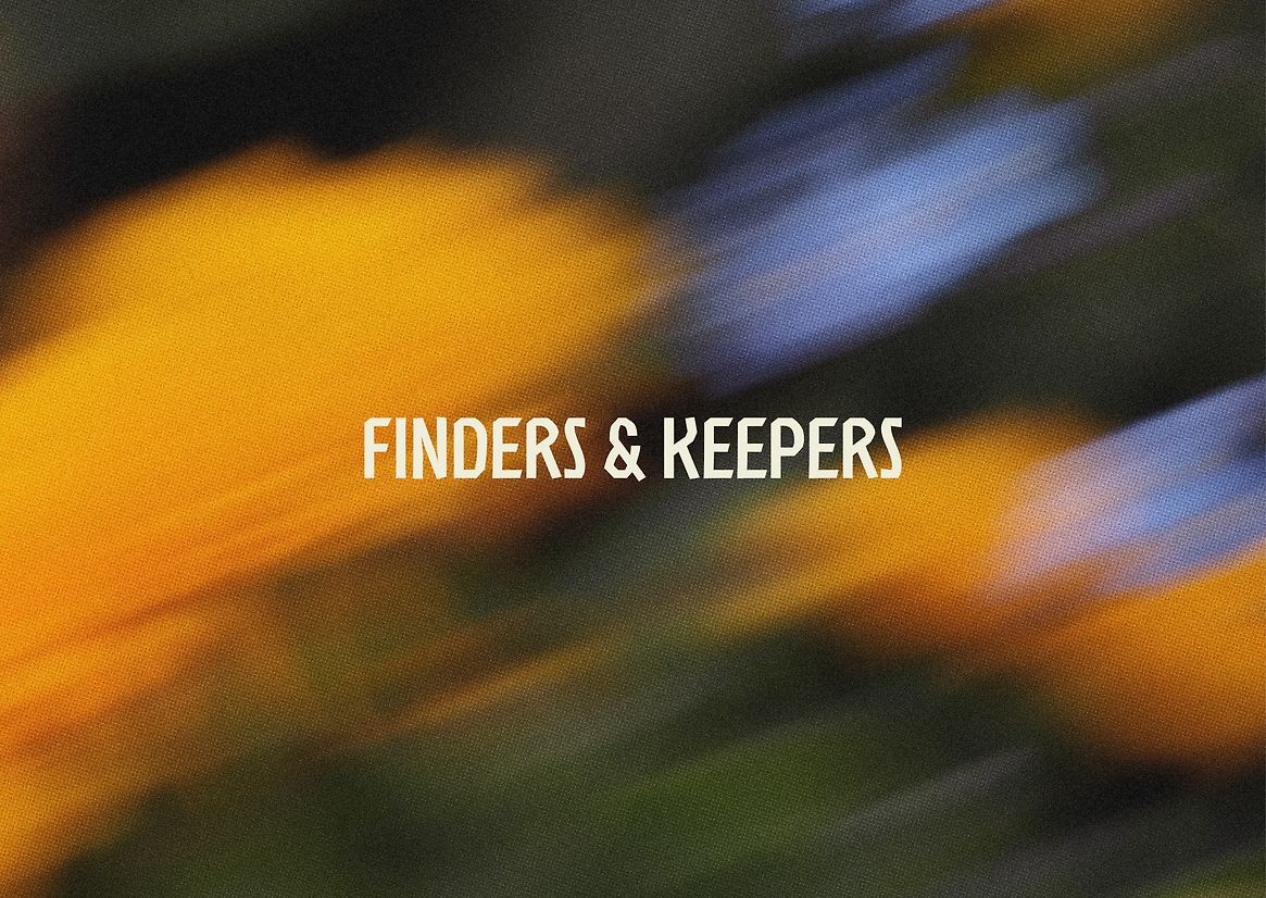
Finders & Keepers
Description:
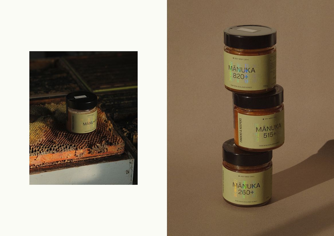
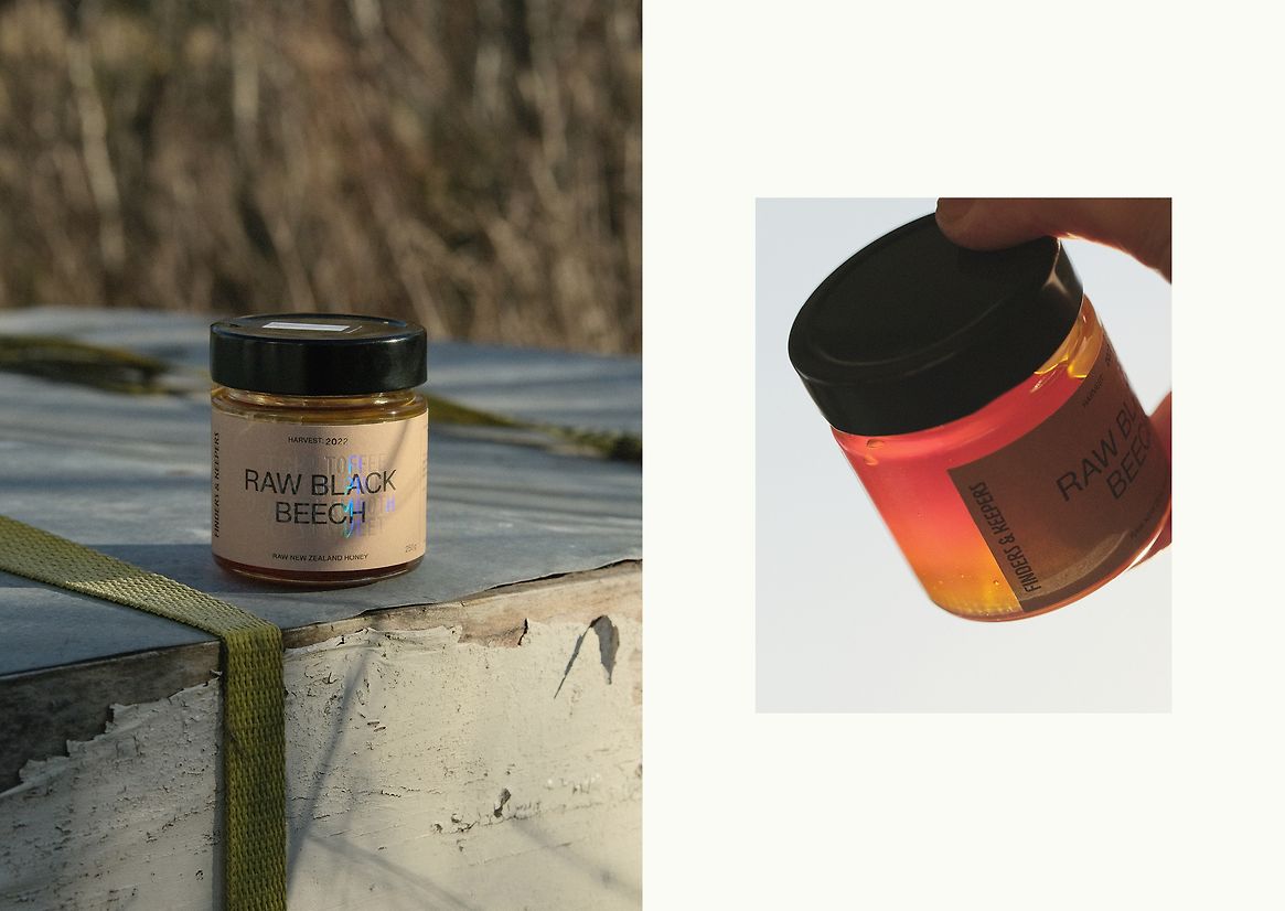
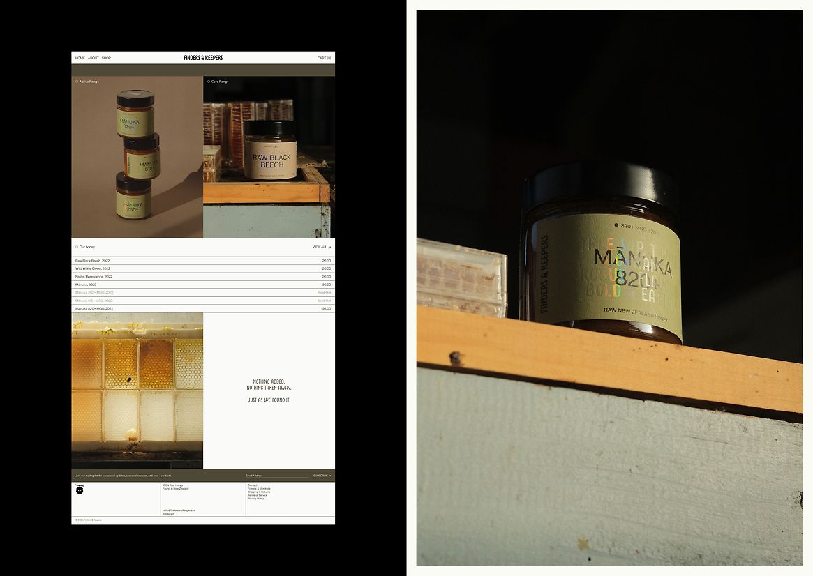
A celebration of the season, flora, and nuances of the bees’ forage. Finders & Keepers is raw, unpasteurised honey for the enjoyer of fine foods — a product that feels at home displayed on the kitchen shelf alongside your favourite natural wine.
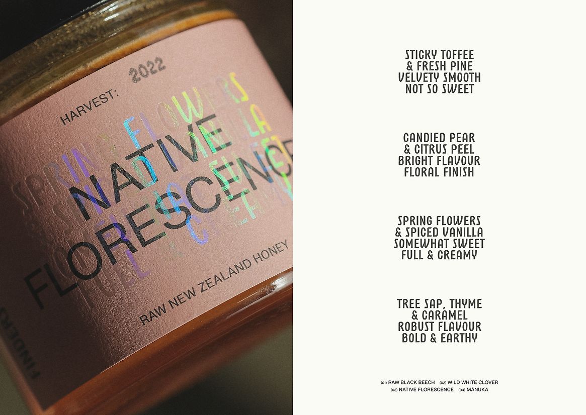
To many, honey is honey — but being an apiarist for many years, Tom could notice quite distinct differences in honey collected from hives just a stone’s throw apart, as well as seasonally. This variation in taste, depth, and colour is much akin to vintages of wines, and are a trait of honey worth celebrating.
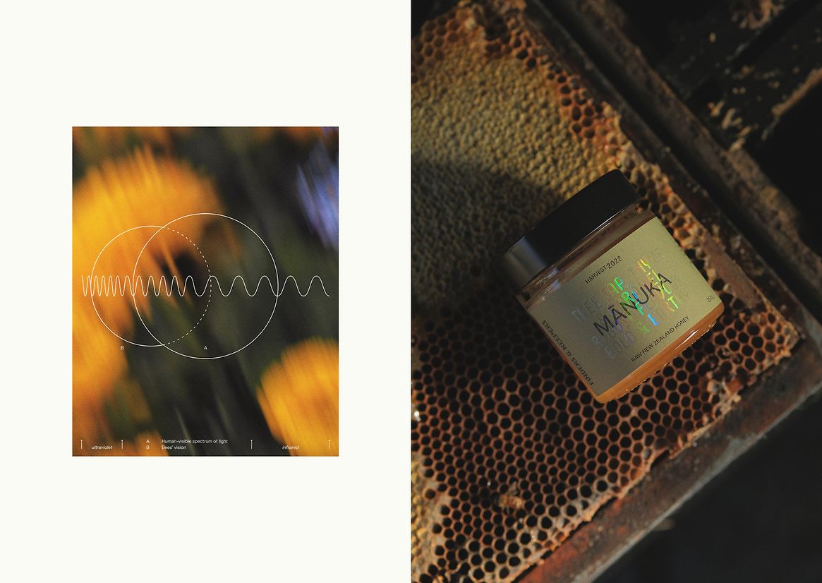
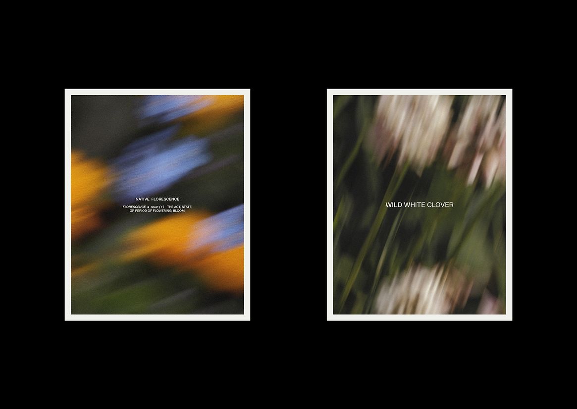
While researching social and foraging behaviours of bees, we found some interesting science about the way their vision works and how it enables them to locate flowers and nectar. With eyes sensitive to wavelengths in the ultraviolet spectrum of light, bees see bold patterns and shapes (like bulls-eyes) on flowers that are invisible to the human eye. Furthermore, nectar on the flower appears to glisten with iridescent colours in the sunlight.
We took this visual concept of iridescence and applied it in the form of a clear holographic foil to the typography — boldly stating the tasting notes directly over the varietal name. The foil changes in colour and intensity depending on the angle and light it’s viewed in — appearing transparent under flat indirect light, and refracting a vibrant spectrum of colours when it encounters a light source.
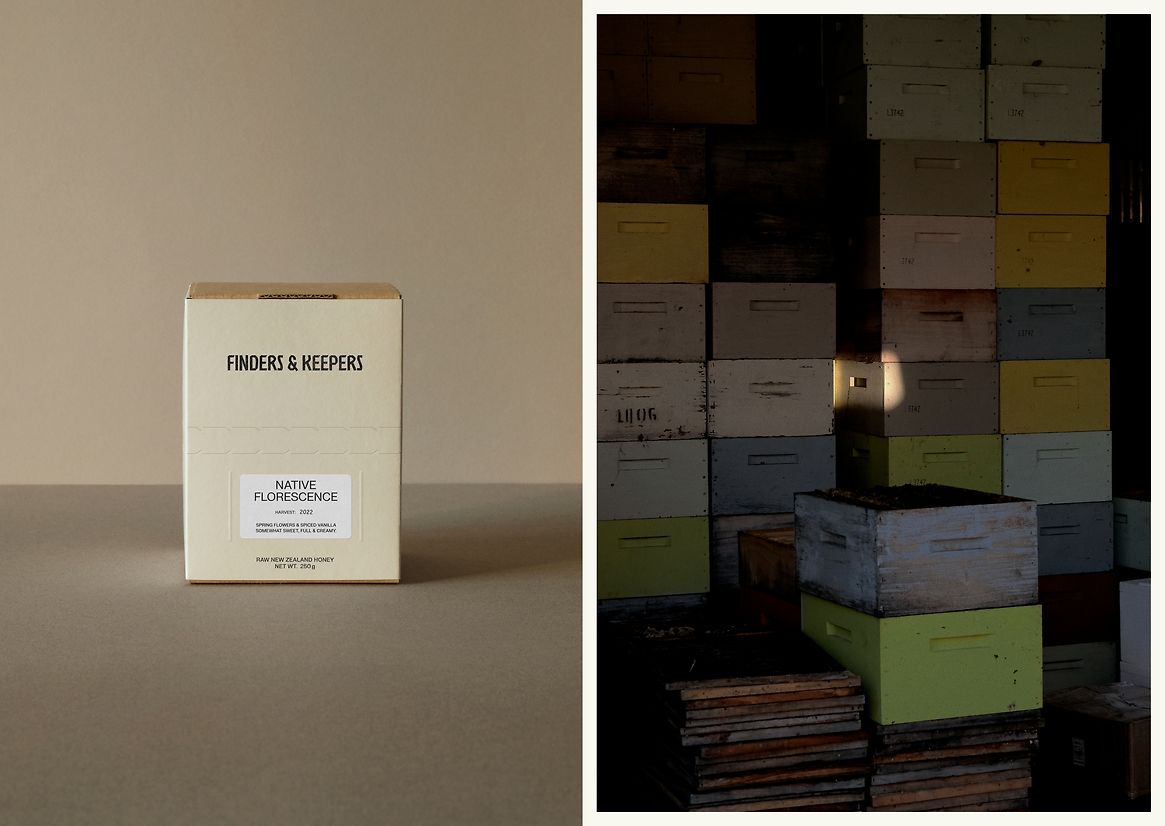
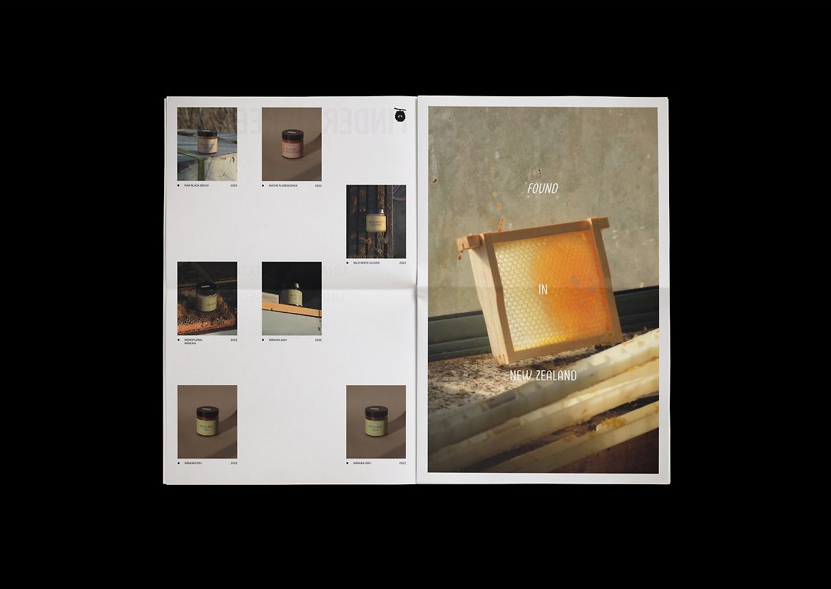
To balance this colourful approach, we chose to keep the rest of the identity natural and restrained with muted colour tones for the labels, paired with simple typography and textural photography across printed materials, web, and social.