Graphic
Principals 28 Kiwibank Cards
-
Pou Auaha / Creative Director
Jodine Bell
-
Ngā Kaimahi / Team Members
Etana Zaguri, Stephen Kane, Helen Chapman -
Kaitautoko / Contributors
Garrick Sutherland, Rachel Somerville Smith, Simon Hofmann, Erica Beagley, Vesna Nixon, Eyes and Ears -
Client
Kiwibank


Description:
Cards for all Kiwi
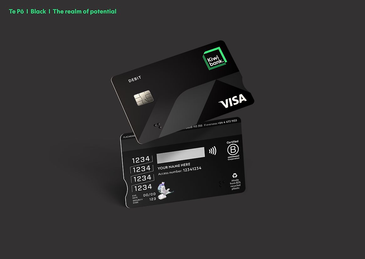
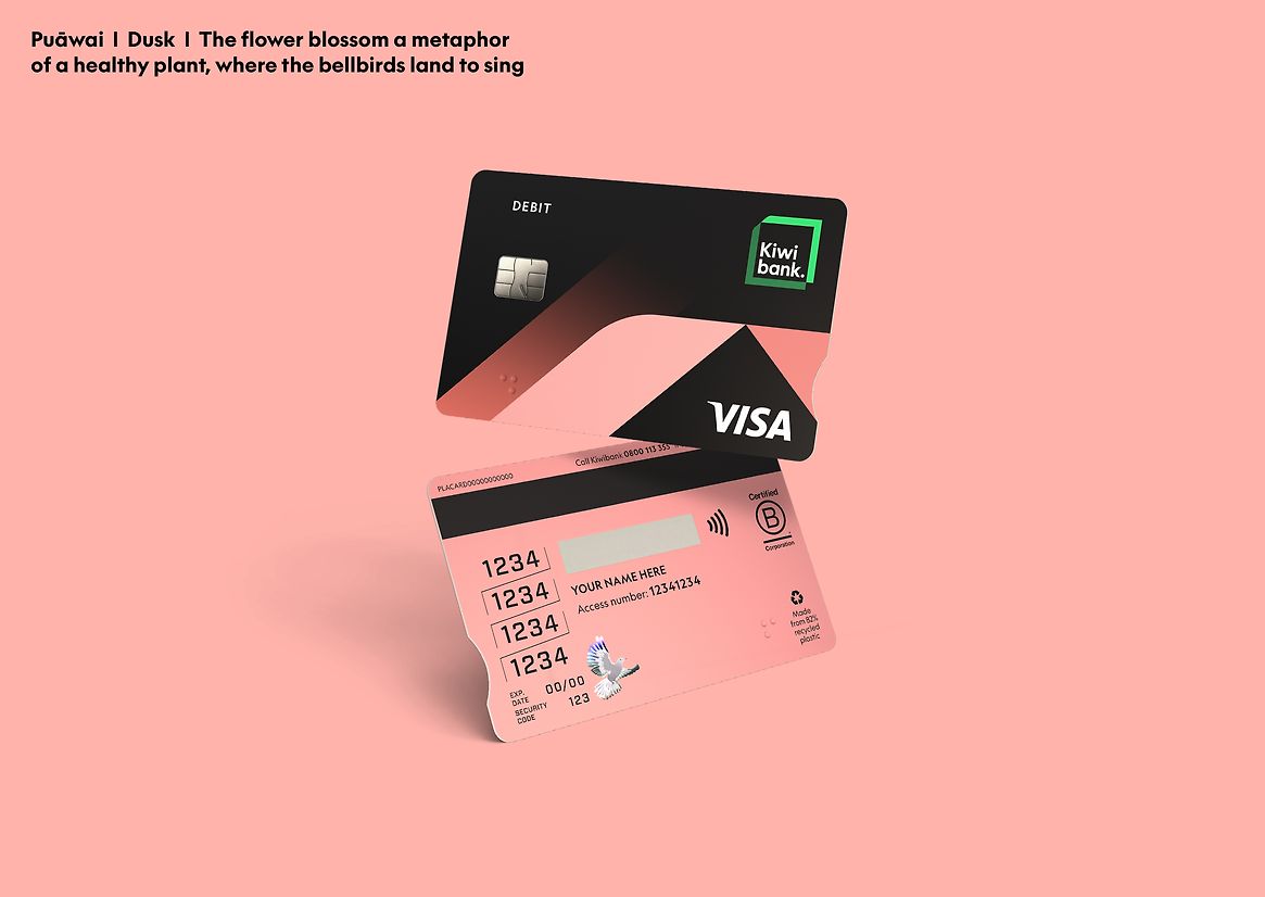
Kiwibank has been repositioning the bank through a brand-led transformation. At the heart of the repositioning sits the native Harakeke plant – the te ao Māori metaphor of a thriving community. The harakeke informed Kiwibank’s new identity and is woven through every touchpoint across the bank.
Cards are one of the highest customer interaction points for Kiwibank. The design challenge was to create a cohesive set that communicated Kiwibank’s identity in a bold, distinctive way, as well as also significantly improving useability, sustainability and inclusiveness for all Kiwi — where everyone belongs and can thrive.
Design
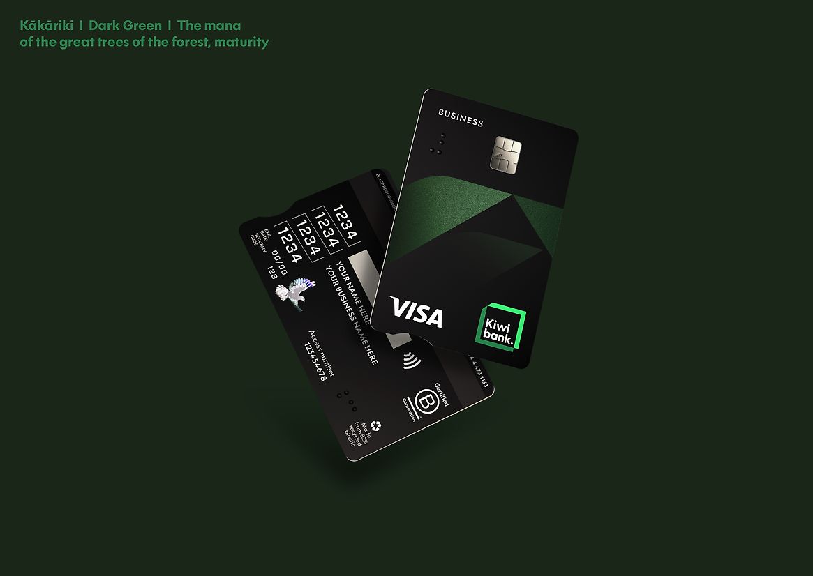
We created a personality brief for each card type, which guided the design of the harakeke expressions and determined how colour could be used to differentiate and define them, while feeling cohesive but easy to tell apart.
We also designed for format, with retail customers telling us that landscape cards were the preference and aligned with digital card application. The Everyday suite heroes the core identity palette with the Zero card using a minimalist approach with subtle colours for a fresh, youthful feel. Businesses told us they wanted something distinct from the retail cards and not boring. The vertical card and stacked harakeke tells a story of growth, with premium matt black and subtle dark kākāriki reinforcing the mana of our business customers – giving them an aspirational feel.
Of all the cards, the most popular selection by 1/3 of customers is the rainbow celebration card incorporating our bespoke Te Kahukura Kāpuia Kiwbank pride mark, complete with glitter detailing.
In line with long term sustainability objectives, all cards were made from 82% recycled plastic, which meant no coloured cores.
Accessibility
Before design was started, Kiwibank researched customers card needs, seeking advice from the Disabled Persons Assembly and Blind Low Vision NZ on making the cards accessible for all customers. Key new accessibility features included high contrast colours in a quick-read format making reciting or entering numbers easier. As a result, Blind Low Vision NZ says the new cards will drastically improve the banking experience for blind and low vision customers.