Graphic
Onfire Design Ltd 19 Nutrideer
-
Pou Auaha / Creative Director
Matt Grantham
-
Ringatoi Matua / Design Director
Matt Grantham
-
Ngā Kaimahi / Team Members
Alice Ferner, Natasha Alimova, Kendal Dunlop, Lisa Capel -
Kaitautoko / Contributor
James Stweart -
Client
Rebecca Davidson


Description:
Premium pet food and supplements are booming and pet owners are spending more disposable income on their beloved pets dietary and health requirements.
The premium end of this category is growing fast, with brands offering various combinations of organic, sustainably sourced ingredients and superfoods. Consumers gravitate towards Human grade in quality to show love, affection and care to their at-home pets. This was the category that the team at Nutrideer targeted with a product range that was truly 'world first', unique, powerful and proudly New Zealand sourced. The team consisted of three devoted pet parents with a wealth of experience in the deer farming industry and owning a sustainably run deer farm in Southland. Having seen the incredible healing powers of deer products in human nutrition, they were determined to bring this astonishing goodness to pet owners.
In 2022, Nutrideer launched into the South Korean market to test the premise of superfood pet supplements powered by deer milk and byproducts. In an off-the-shelf plastic tub, the product quickly found a need in the super-premium category. The team approached us with a clear goal - the proposition is sound, and the product had since been tweaked and extended from deer milk to a small range that covers pets' various needs and ages with deer milk as the hero ingredient. But the packaging did not represent this.
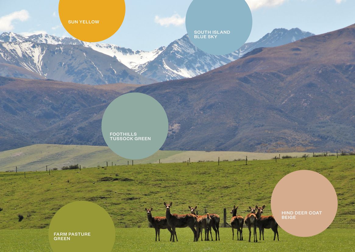
The business growth strategy targeted the Asian export market, where we found our inspiration. Deer are considered a mythical beings in traditional Chinese medicine and have been used for generations in human-related medicines. Ancient tapestries and manuscripts represented the deer in ethereal shimmery whites and silvers. A hero illustration of a stag and hind deer in mirrored stance, embellished with various icons and landscape elements, takes pride of place on the front face of the new packaging in silver foil while unifying the range. A new tactile, uncoated tub reduced plastic usage and allowed a radical shift in how colour will play a part in the brand. Inspired by the deer farm in Southland, the colour range reflects aspects of the landscape and the deer. Soft yellow sun, lush grass green, moss teal, crisp, clear sky blue and a notably light shade of hind deer beige. While these help navigation within the range, the colour palette subtly suggests provenance, care, husbandry and pride in the deer. With type set in a darker shade of each, the range exudes premium confidence and warmth for the target affluent pet-owning consumer.