Hubbards has a history of creating category-disrupting breakfast foods since the business's inception in the 1980's. The brand had identified an opportunity for a category-challenging product in granolas's 'affordable health' section. Focusing on younger families looking for more affordable but healthy muesli options, a range of simple Low GI granola which is better for you, great value, and sets you up with the right combination of nutrition to tackle the day.
The existing granola category options offered conventional and 'safe' product offerings. Neutral colour palettes and traditional design language leaned towards earthy goodness and earnest propositions. Hubbards new offering would be the antithesis of this commoditised category language.
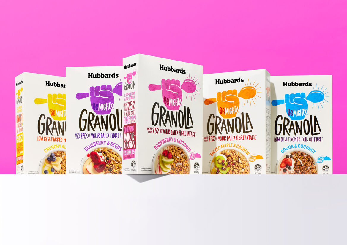
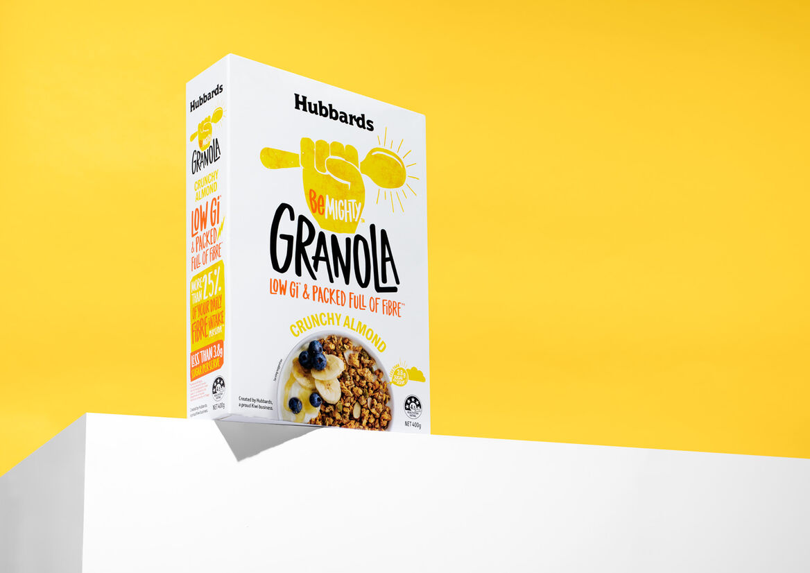
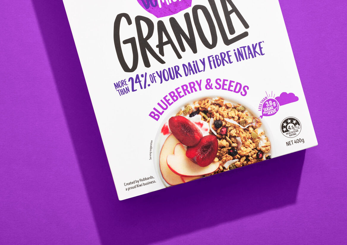
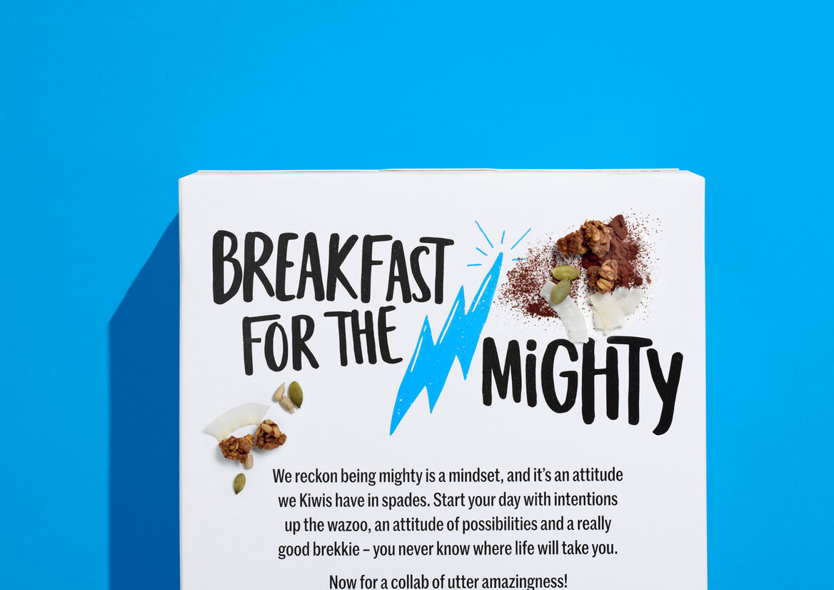
BeMighty captures the sentiment of the product - an energetic, inspirational and 'up-for-it' attitude. Packaging design language reflects this new optimistic outlook. Clean white packaging references the clean energy from LOW GI and fibre content. The fist pump (with breakfast spoon) is the universally understood visual for consumers to identify the products on shelf - upfront, proud and unapologetic. Typography is equally active and energetic, which is used across the prominent sales faces of the boxes. Back of pack copywriting celebrates the positive mindset of New Zealanders and inspiring them to get into their day.
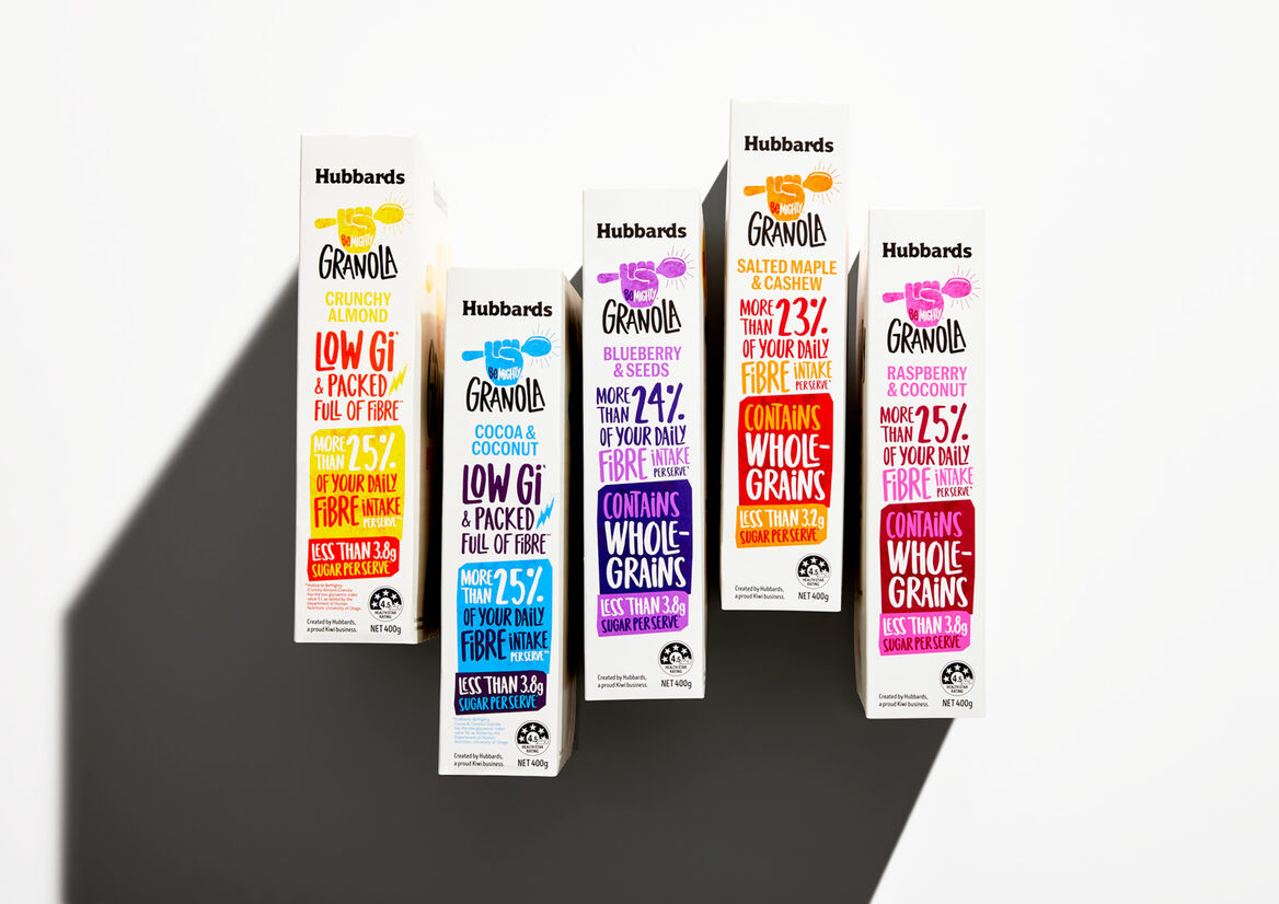
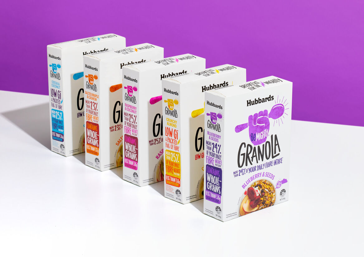
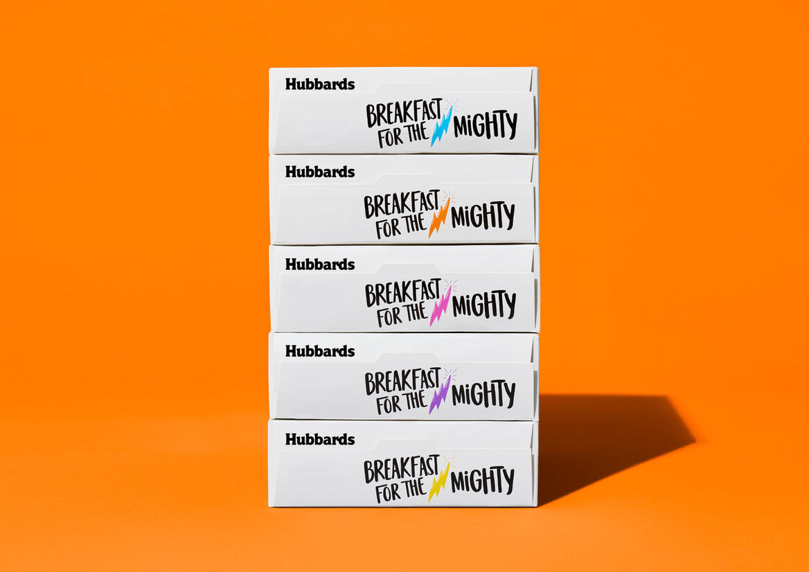
Colour is a crucial component for this sub-brand. Bright neon pops of colour are used to denote flavours within the range and turn the volume up on the tone of voice. Against the white background of the boxes, BeMighty is a dramatic new entrant into the granola category. Loud, playful and joyous.
Description:
Hubbards has a history of creating category-disrupting breakfast foods since the business's inception in the 1980's. The brand had identified an opportunity for a category-challenging product in granolas's 'affordable health' section. Focusing on younger families looking for more affordable but healthy muesli options, a range of simple Low GI granola which is better for you, great value, and sets you up with the right combination of nutrition to tackle the day.
The existing granola category options offered conventional and 'safe' product offerings. Neutral colour palettes and traditional design language leaned towards earthy goodness and earnest propositions.
Hubbards new offering would be the antithesis of this commoditised category language.
BeMighty captures the sentiment of the product - an energetic, inspirational and 'up-for-it' attitude. Packaging design language reflects this new optimistic outlook. Clean white packaging references the clean energy from LOW GI and fibre content. The fist pump (with breakfast spoon) is the universally understood visual for consumers to identify the products on shelf - upfront, proud and unapologetic. Typography is equally active and energetic, which is used across the prominent sales faces of the boxes. Back of pack copywriting celebrates the positive mindset of New Zealanders and inspiring them to get into their day.
Colour is a crucial component for this sub-brand. Bright neon pops of colour are used to denote flavours within the range and turn the volume up on the tone of voice. Against the white background of the boxes, BeMighty is a dramatic new entrant into the granola category. Loud, playful and joyous.